Software
Houzz Logo Print
stephanie_kendrick95

Don’t know what paint to choose! Help!!

5 years ago
last modified: 5 years ago
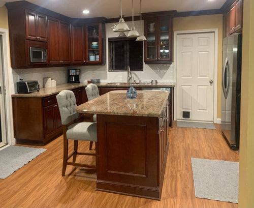
Hi everyone! Im in need of some advice. Im just not sure what off white paint to choose or a slightly darker paint to choose for my decor. Its for a dining room that connects to the kitchen. So all one big space. I want to lighten the paint currently on the walls and make everything light and airy without it being too cold and sterile. I am currently trying to update and slightly modernize a house that had a very outdated tuscan kitchen. We switched out the previous darker beige kitchen backsplash to a more modern white subway tile with the hopes that the granite can be changed out to a lighter color in the future. Im confused if I should choose a cool toned paint to match the furniture or if i need a warm toned paint to match the warm wood floors and cabinets.

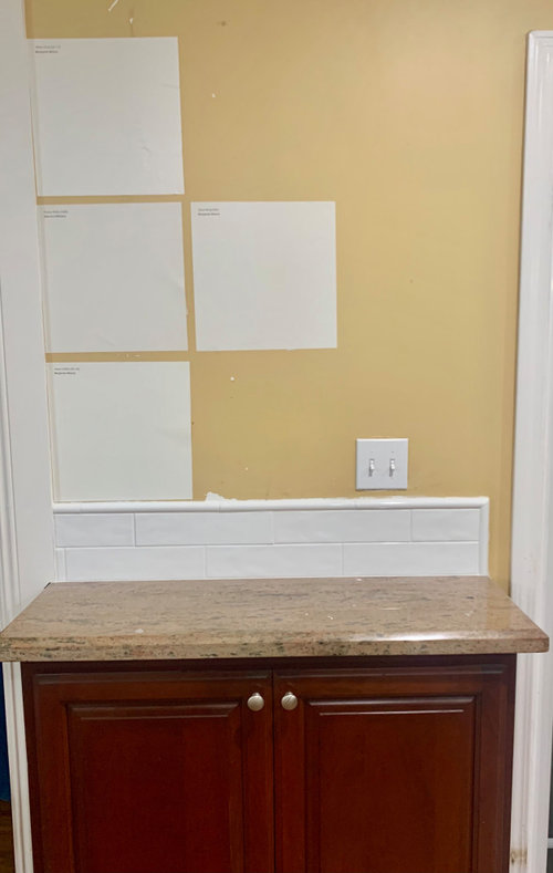
I like BM Swiss Coffee, but am worried it will be too warm for the very cool grey blue furniture and white subway tile. I kind if like BM Dove white but not sure if it will be too white. I cant tell by just the swatch. Im open to other colors, but I dont really want to go green, blue or too beige. Ive also put up Classic Grey and Gray Mist but they were a bit to grey. I also tried Agreeable Grey but it was much darker then I want to go. Im loosing my mind trying to figure this out. Sorry for the bad quality photos. I tried haha.


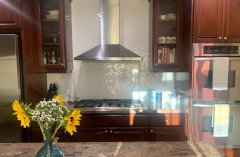
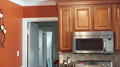
Kitchen view from dining room


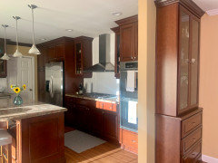
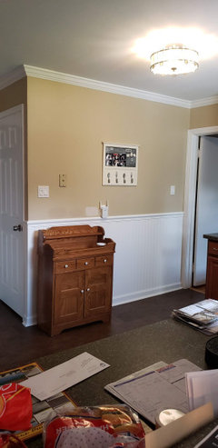
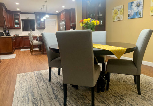
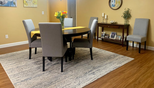
View from other side


Current paint samples. Top to Bottom White Dove, Pearly White, Swiss Coffee. On the right is Dove Wing.


Comments (32)

  • PRO
    5 years ago

    This is one of my faves for wall color . Before choosing any get all your lighting changed to LEDs 4000K

  • 5 years ago

    Follow Patricia’s advice. This is a lovely color for your kitchen and works great with cabinets.

  • 5 years ago

    I also agree on the Gray wisp. Its a beautiful color.

  • 5 years ago

    Thank you for the color option! It looks beautiful. Not sure if my Aunt who I live with will want to do a greenish color but ill def pick up a sample. I agree it would look great with the cabinets. I also think this would look beautuful in a beach or lake house!

  • 5 years ago
    last modified: 5 years ago
    Jennifer Hogan, Thank you for your advice. So, a bit of back story. Its my aunts home that I have some input with, but I only have so much. We did the floors back in January. The plan was to get a new couch, dining room chairs, change out the kitchen backsplash and counters, and paint all at about the same time. The plan was to have everything finished in a few months. We went furniture shopping and bought said items. I ended up buying accents to match the furniture while waiting for it to arrive since I got so excited lol. However, for some reason my aunt stopped going forward and we didn’t get anything else done until July when the backsplash was finally done. Now it’s almost October and she is only now looking for painters. So thats why it has now turned into doing one project at a time which is def not ideal. Its driving me crazy lol.


    Anyways, I like to spend a lot more time picking things out and making things match. She, however, is not interested in that and gets overwhelmed easy. So, things get picked hastily. That happened with the floors. I personally wanted something a bit lighter. Then the backsplash was picked when she also wanted to change the counters at the same time. We picked out a few different backsplashes, however, she didn’t want to look at anymore shortly after and just didn’t care about what was picked. She went with the white thinking it would go with more options of granite. White was also picked to get away from all the brown in the kitchen. I love it against the cabinets. I think it makes them pop. However, she decided she didn’t want to change the counters after the backsplash was put in because of the expense. Now they don’t match at all.


    I do regret picking out furniture that was light grey before really seeing it first with the other elements in the house. Oh well learned a lesson on that. It looks much better that what was there before, but I def should have brought swatches and samples home first.


    I’ve never really decorated or picked out things for a whole open concept home before. I’ve only done bedrooms. I definitely realized having a plan in place and choosing a color scheme before hand is important. My aunt is really into blues and greys right now, so that’s why those colors are there. I personally like more creams and neutrals. Although blue is very pretty.


    Sorry for the long rant haha. But yes the struggle is real now. But youre right, paint can be changed in the future if needed. I do like your idea of something creamier. Doors and trim will also be painted. It’s going to be hard to pick something that will go perfect with cool furniture and accents then warm counters cabinets and flooring. I don’t think that exists but I’m going to try lol.

  • 5 years ago

    I suggest SW Alabaster. You may as well go with a white that will blend with all of the warm colors and not clash with the upholstery. It's just a hair more neutral than SW Creamy.

  • 5 years ago
    last modified: 5 years ago
    homechef59 perfect! I will try that as well. I also ordered a sample of Benjamin Moore’s White Down which is just a tad darker then BM Swiss Coffee, SW Alabaster and SW Creamy but still neutral I think.

  • 4 years ago

    @Stephanie Kendrick - your okay.


    The idea of whole home color palettes is not something most of us deal with until we renovate a whole home or build.


    I also fully understand that sometimes this whole renovation process can get overwhelming and the best laid plans sometimes need to change. I bought a home a few years ago knowing it needed to be renovated from stem to stern. While in Escrow I needed surgery and was diagnosed with cancer (I am fine now). A year later I fractured 4 vertebra and the year after that I had a heart attack.


    I still have a home that needs renovated from stem to stern, but the timeline changed quite a bit and my budget had to be adjusted as much of my reno budget ended up going to medical bills.


    I am glad to hear that you are going to paint the trim and doors. If you want to keep the backsplash I would suggest using a very white white for the trim and doors - SW High Reflective White is the brightest white I know of.


    My mother always told us to look to nature to know if colors work together. I think there are some great examples from Mother Nature where cool and warm neutrals work beautifully.


  • 4 years ago

    @Jennifer Hogan oh my gosh, im so sorry you had to go through all of that!! Talk about things coming to a stop. But im glad you are doing better! Nothing ever seems to go as planned does it. Yes its turned out to be a lot more complicated then I thought lol. My aunt has no sense of style at all, her own words, so im trying to pick out things we would both like. However, we just have a very different view on these things. I love decorating and picking things out while she doesnt like it at all. We also have 3 dogs and 3 cats so we cant get anything light colored. It all very much limits what we can get. Well thank you for the pictures! Nature is beautiful and should def be used for inspiration!

  • 4 years ago

    Am I missing something. I see the sink, the microwave and the fridge......but where's the STOVE ??

  • 4 years ago

    It looks like the stove is to the right side of the frig. In one picture, you can see a bit of hood, and in another you can see a rug on the floor, that appears to be in front of the stove.

  • 4 years ago

    @cat_ky Thanks. I thought in my be in that alcove by the fridge, but that just didn't seem too convenient to me.


  • 4 years ago

    If you go white, Jennifer's choice of SW Creamy looks best in the samples she posted. It marries better than Swiss Coffee with golden floors, countertops, and furnishings. Get a couple large posterboards to try out SW Creamy and Gray Wisp in different locations throughout the space and different light conditions day and night with lights on and off.

  • 4 years ago

    Stick with a white. I don't see how any grey looks even remotely good.

  • 4 years ago
    last modified: 4 years ago

    @housegal200 thank you! Im def going to pick up a sample of creamy. I did originally like gray wisp, but I think it was a smidge too grey.

  • 4 years ago

    @judygilpin yes the stove and oven are right next to the fridge.


  • 4 years ago

    My kitchen is a combo of white cabinets, grey/white calacatta marble, pale grey subway tile... for a neutral color wall color try Benjamin Moore "Revere Pewter"... it weems to work with everything!!!


  • 4 years ago

    My girlfriend has cherry cabinets and the same granite as you. She did sw crushed ice for her walls. It is gorgeous with cherry cabinets. I would pair it with sw alabaster for your trim. It will give your house a more modern feeling. It is just a touch of light gray and lighter than the famous agreeable gray.

  • 4 years ago

    SW crushed ice will pair beautifully with all your blue accents.

  • 4 years ago

    @mdefree oh how pretty. I ended up looking it up in photos and I like it. Seems like it would match both the cool and warm tones like you said. Hopefully it won't look too dark. Our dining room is east facing but is seperated from the windows by the family room. The lighting is pretty good but changes all day long. The kitchen has east facing windows though. Would you say it is a light color in your friends home?

  • 4 years ago

    Yes, it has a perfect LRV light reflective value of 66 (light). It is definitely a light color. In her home it doesn’t look dark at all. It is so pretty.

  • 4 years ago

    Since one of the givens is the white tile, then leave the doors and trim white even if you go SW Cream for the rest. It is too bad, as Jennifer Hogan says, that your aunt didn't want to make global decisions at the outset. Usually the most harmonious palette in an open plan is to take the very lightest shade from the granite for the walls while harmonizing with the floors, then the furnishings--not easy. Fortunately, the rug is well chosen, so the different whites will work.


    To repeat, get very large posterboard for your samples and put them against every single element, first the givens: cabinet, granite, floors, white tile, then the rug and furnishings. Test them under daylight and nightlight and on different walls. This is what color consultants do--take it all in together. Good luck!

  • 4 years ago

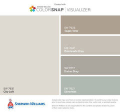
    Try SW City Loft. We just repainted our interior and City Loft was our second choice. We wanted something more creamy looking with less gray tones so we went with Shoji White, but I really loved City Loft, too. It's very neutral and can go with warm and cool tones. In some lights I saw gray and some I saw cream, depending on the time of day and which room I was in.


  • 4 years ago
    last modified: 4 years ago

    @housegal200 thank you for the advice! Yes whichever color I end up doing the trim and doors will be white for sure. I did know about needing to pick out one of the colors in the granite for the backsplash to make a cohesive look. However, the granit has brown, black, beige, green and even pink (picked in 2005) I hate it lol. The reason for the white was to get away from any form of brown. But now I wish we would have done a more off white subway tile to match the granite a bit more. But too late lol. Now im very used to it and it doesn't look as intense as it does in pictures. I would love love to change out the granite since it is now the one thing that doesnt go with anything else. But hopefully someday soon!

  • 4 years ago

    @George-Tina Rosello awesome thank you!

  • 4 years ago

    I do white dove everything and have recommended to so many friends so far no complaints!

  • 4 years ago

    Sorry to add to your choices, but have you looked at Dimity by Farrow & Ball?

  • 4 years ago

    I like the white dove.

  • 4 years ago

    @mimsha no i havent. It looks very pretty tho!

  • 4 years ago

    Hi, I've spent alot of time researching facts about paint.  Ever paint a wall that takes on a different hue than you wanted?  Because of my research, I repainted a kitchen wall. It was initially painted a neutral color. Poor lighting made it look like a dirty mustard. I researched articles, the best of which you can find via the link below. Happy I found it because it lead me to repaint it with a deep terracotta color. Really happy. I hope this helps.

    https://www.kylieminteriors.ca/paint-colours-and-lrv-the-ultimate-guide-to-choosing-the-right-colour/

  • 4 years ago

    Swiss coffee