

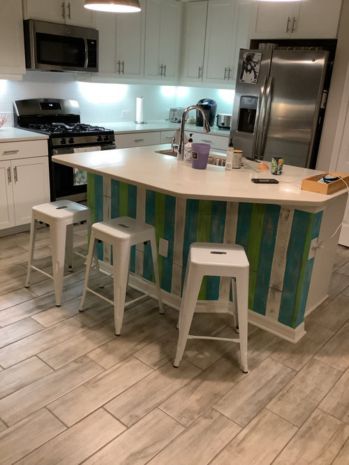
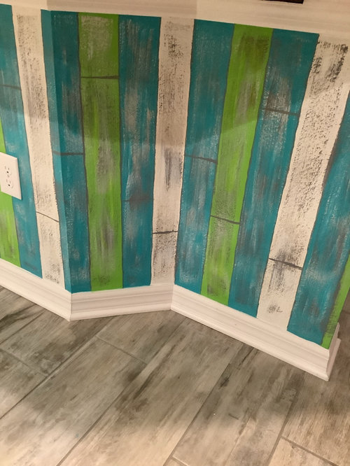
yes or no …opinions wanted
4 years ago
Featured Answer
Sort by:Oldest
Comments (30)
 4 years ago
 4 years ago
Related Professionals
West Palm Beach Interior Designers & Decorators · Shreveport Interior Designers & Decorators · Natchez Interior Designers & Decorators · Athens Interior Designers & Decorators · Worthington Interior Designers & Decorators · Pueblo Interior Designers & Decorators · El Dorado Architects & Building Designers · Baton Rouge Architects & Building Designers · Lawton Architects & Building Designers · Philadelphia Architects & Building Designers · Fort Collins Architects & Building Designers · Eugene Architects & Building Designers · Paducah Kitchen & Bathroom Designers · Brooklyn Kitchen & Bathroom Designers · Grand Junction Kitchen & Bathroom Designers 4 years ago
- PRO4 years ago
- 4 years ago
 PRO4 years ago
- 4 years ago
- 4 years ago
- 4 years ago
- 4 years ago
- 4 years ago
- 4 years ago
 4 years ago
 4 years ago
- 4 years ago
 4 years agolast modified: 4 years ago
- 4 years agolast modified: 4 years ago
- 4 years ago
 4 years ago
 4 years ago
- 4 years ago
- 4 years ago
 4 years ago
 4 years ago
- 4 years ago
- 4 years ago
 4 years ago
- 4 years agolast modified: 4 years ago
- 4 years ago
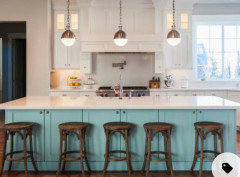
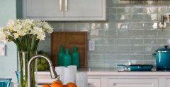
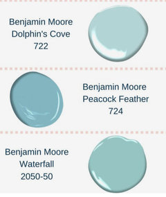
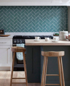

Related Stories
ORANGE10 Reasons to Decorate With Peach (Yes, Really)
Is it time to dust off this shade so beloved by 1980s decorators? Find out why you might want to give it a try
Full Story
Yes, Please: Parisian Hotel Flair
Bring on the Bling to Recreate the City of Romance at Home
Full Story
DECORATING GUIDESNo Neutral Ground? Why the Color Camps Are So Opinionated
Can't we all just get along when it comes to color versus neutrals?
Full Story
INSIDE HOUZZDecorating Trends: A New Houzz Survey Shows What Homeowners Want
Is the TV gaining or losing ground? Are women or men trendier? Find out and learn more about people’s decorating plans right here
Full Story
REMODELING GUIDES9 Ways Grout–Yes, Grout–Can Add to Your Design
Choose From a Palette of Grout Colors for a Warm, Unified Look
Full Story
ACCESSORIESCool Crochet? Yes, It's Possible
An old-fashioned favorite gets a sassy spin in bright colors and mod patterns, bringing homey warmth to modern rooms
Full Story
BATHROOM DESIGNYes, You Can Go Bold With Wallpaper in a Powder Room
The smallest room in the house can make the biggest design impact. Here are 10 of our favorite papered powder rooms
Full Story
INSIDE HOUZZA New Houzz Survey Reveals What You Really Want in Your Kitchen
Discover what Houzzers are planning for their new kitchens and which features are falling off the design radar
Full Story
LIVING ROOMS8 Reasons to Nix Your Fireplace (Yes, for Real)
Dare you consider trading that 'coveted' design feature for something you'll actually use? This logic can help
Full Story
BATHROOM DESIGNWhy You Might Want to Put Your Tub in the Shower
Save space, cleanup time and maybe even a little money with a shower-bathtub combo. These examples show how to do it right
Full Story


Black_Rain_11