

Color Perception - please comment
4 years ago
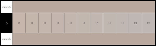
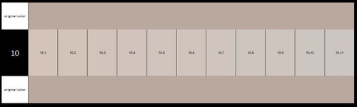
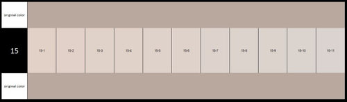
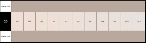
Featured Answer
Sort by:Oldest
Comments (6)
Related Professionals
Carbondale Interior Designers & Decorators · Chambersburg Interior Designers & Decorators · Montgomery Bathroom Remodelers · Elizabethtown Kitchen & Bathroom Designers · Lawton Architects & Building Designers · Syracuse Architects & Building Designers · Enid Kitchen & Bathroom Designers · Lexington Design-Build Firms · Elizabeth City Design-Build Firms · Barnstable General Contractors · Bemidji General Contractors · Pullman General Contractors · Cheyenne General Contractors · Jacksonville Flooring Contractors · Colorado Springs Flooring Contractors 4 years ago

Related Stories
OUTDOOR KITCHENSHouzz Call: Please Show Us Your Grill Setup
Gas or charcoal? Front and center or out of the way? We want to see how you barbecue at home
Full Story
SUMMER GARDENINGHouzz Call: Please Show Us Your Summer Garden!
Share pictures of your home and yard this summer — we’d love to feature them in an upcoming story
Full Story
MOST POPULARCrowd-Pleasing Paint Colors for Staging Your Home
Ignore the instinct to go with white. These colors can show your house in the best possible light
Full Story
HOME OFFICESQuiet, Please! How to Cut Noise Pollution at Home
Leaf blowers, trucks or noisy neighbors driving you berserk? These sound-reduction strategies can help you hush things up
Full Story
BATHROOM DESIGNUpload of the Day: A Mini Fridge in the Master Bathroom? Yes, Please!
Talk about convenience. Better yet, get it yourself after being inspired by this Texas bath
Full Story
You Said It: Hot-Button Issues Fired Up the Comments This Week
Dust, window coverings, contemporary designs and more are inspiring lively conversations on Houzz
Full Story
BEFORE AND AFTERSMore Room, Please: 5 Spectacularly Converted Garages
Design — and the desire for more space — turns humble garages into gracious living rooms
Full Story
DECORATING GUIDES10 Bedroom Design Ideas to Please Him and Her
Blend colors and styles to create a harmonious sanctuary for two, using these examples and tips
Full Story
KITCHEN ISLANDSKitchen With Double Islands Pleases a Baker and a Smoothie Maker
With multiple refrigerators and ovens, this space easily accommodates a couple of cooks and their guests
Full Story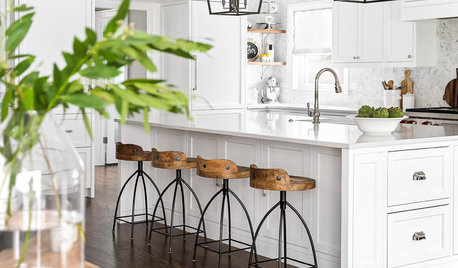
KITCHEN DESIGNKitchen of the Week: White Cabinets With a Big Island, Please!
Designers help a growing Chicago-area family put together a simple, clean and high-functioning space
Full StorySponsored

Customized Award-Winning Interior Design Solutions in Franklin Cnty OH



threers