Software
Houzz Logo Print
birdkkk

Are these shutters necessary?

4 years ago
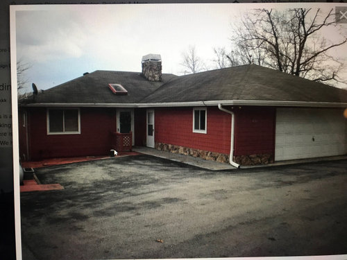
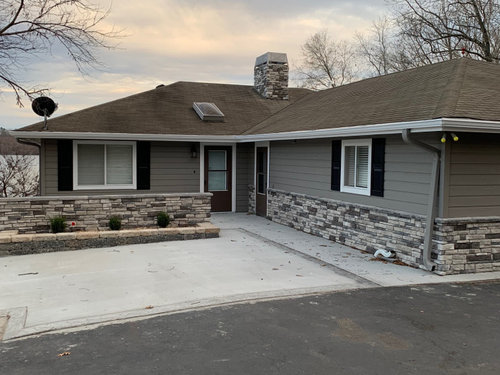
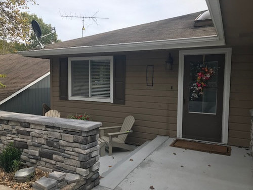
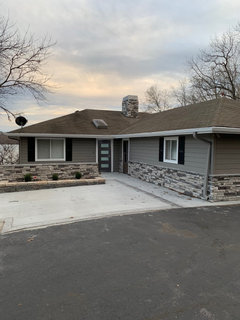
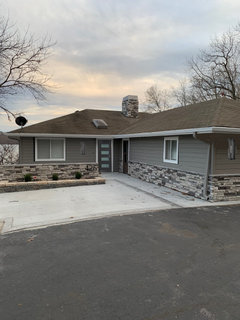
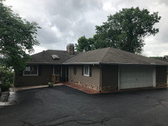
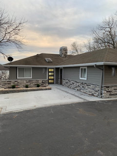
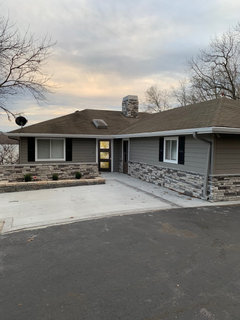
We have done some updating to this 1980's L shaped ranch lake house. Am I missing the mark for an updated look? We have outside lighting ordered for left of door and sides of garage and an updated front door in the same color as the shutters. Here are some before and after pictures, We chose the wall to create a privacy "courtyard" for grilling and add some greenery. The last picture is before painting it gray. Thanks for your input!


Comments (33)

  • PRO
    4 years ago

    Those windows should not have shutters and what was the reason you added them?

  • 4 years ago

    The shutters aren't necessary. Normally I would advise you to do some landscaping, but you don't have room for any. When it's time to replace the roof you will want to do more of a gray color. What you have now looks brown against the new paint.

    birdkkk thanked kandrewspa
  • 4 years ago

    IMO, the house will look good either way. With or without the shutters.

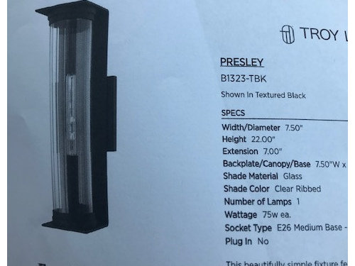
    OTOH, the proposed new light pushes the house to a more modern look so likely better w/o shutters. For the modern look to work best, I would have continued the stone to the eaves.

    As is, I would use more of a carriage house type lamping and keep the shutters. Rather than end up with a house that looks confused--half traditional/ half modern???

  • PRO
    4 years ago

    The improvements look great but I would remove the shutters.


  • 4 years ago

    Definitely no shutters, especially on double windows.

  • 4 years ago

    Thanks for the input. We added the shutter a long time ago and it was an afterthought to take them down. Originally I thought the house needed more interest and the windows were kind of small, but now I think it is too traditional. Maybe I can photoshop the final picture without the shutters and see how it looks.

  • 4 years ago

    The roof is next on our list. Would welcome color choices. I also need to decide on light fixture placement. It was suggested to center between the window and the door and do the same on the garage sides.

  • 4 years ago

    Wow, lovely transformation! Hope the garage door is no longer white.

  • 4 years ago

    Absolutely! Painted the garage door the same color as the house.

  • 4 years ago

    Here are photoshopped pictures of the house with and without shutters. Which do you think looks better? The second picture has the lights we will be installing. Forgive the bad photoshop!


  • 4 years ago

    I think the shutters look better. No, they are not necessary but that doesn't mean they aren't attractive :) If you look up "shutters" in design dilemma about 95% people will say remove them, just like paint your brick house or fireplace. I suggest you do what looks better to you personally. Shutters are just another architectural feature, so to me it's all about personal preference. On your house, they break up long swaths of siding (which is also nice, but I think a little break is good.) . My opinion only! Your house is just adorable!

    birdkkk thanked User
  • 4 years ago

    If I go without the shutters, I could maybe use some modern metal art to break up the long wall. I need to decide on the shutters because it will alter placement of the light fixture. Thanks again!

  • 4 years ago
    last modified: 4 years ago

    Not a pro ... but for me the look of it without shutters is all about simplicity, so I wouldn't add clutter which to me metal art would be. If you decide no shutters I think it will just take you time to get used to the more minimalist look.

  • 4 years ago

    They aren’t large enough to be functional, which makes them look cheesy and fake. I’d take them back off.

  • 4 years ago

    About 98% of shutters in the US are not functional (I made that statistic up!). They don't look cheesy and fake - they look like a design element- which appeals to some and not to others. Shutters don't always look good to me, but in this case they do as they add some visual relief from an expanse of siding. The house looks good without as well, and agree with doods that adding other doo-dads (get that??) is unnecessary if you like the "no shutters" look. Birdkkk I like what you've done with your house, regardless of what you decide on the shutters. What about walkway lights? That is safety and nice looking! P.S. I love your stone wall that creates a little patio area. How cozy!

  • 4 years ago
    last modified: 4 years ago

    Mimimomy... "doo-dads".. I get it ;). I agree shutters or no shutters looks very nice either way.

  • 4 years ago

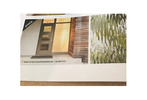
    With the new door and selected light fixture, the shutters don't work. (I am not in the "no shutters ever" camp, BTW).

    I agree with you that the windows by themselves do come across as too small, though.

    What I would do is add a little bit more trim/molding - maybe only 1" - around the windows and door, then paint the exterior trim and frames from white to either black or to match the new door (with proper prep and the correct paint, this will last for at least 15+ years as mine did - even on vinyl)

    I wouldn't put the new light fixture halfway between the door and window - it needs to be farther from the door than currently, but not that far away.

    birdkkk thanked raee_gw zone 5b-6a Ohio
  • 4 years ago
    last modified: 4 years ago

    I am not a professional, but I like the house better without the shutters. I'm not offended by them; the style of the house just looks more consistent without them. I also agree with those who suggest keeping the light closer to the front door than you've shown on your photoshopped pic.

    You have created simple and clean horizontal lines with your wall in front of the patio (and narrow garden bed running the length in front of it) and the continuation of those lines with the stone on the house. You also have horizontal lines in the accent stone of driveway or parking area in front of it. Those horizontal lines (which remind me of Japanese architecture) work well with the more modern front door and lights you have chosen.

    As an aside, I would also suggest painting the secondary door (the one leading into the garage), the same color as the body of the house - to de-emphasize it. Let the front door be the focus.

    It occurs to me that you may have been motivated to add the shutters to create a focal point behind the seating on your lowered patio. I like your patio kept simple and your chairs themselves seem to me enough focus, but if you want more, perhaps some standing lanterns or planters on the patio itself would serve that purpose (provided they don't crowd the space or create a trip hazard). Edited to add: I took a second look at your patio photo and it doesn't look to me like there is room for lanterns or planters anywhere near the chairs.

  • 4 years ago

    Another vote for NO shutters.

  • 4 years ago

    Thank you so much for your advice. I grappled with where to place the light fixtures. It was suggested to center them between the space, both sides of the garage and the front door. Not sure I love that idea. Would it be odd to have the garage door fixtures centered and the front door fixture more towards the door?


  • 4 years ago

    Much better without the shutters. If I'm understanding your question, no, it would not be odd to center the garage door lights and have another light close to the front door.

    One suggestion...paint the garage door the same color as the siding. The white door right in front pulls a lot of focus.

  • 4 years ago

    Chloebud, just had the house painted which included the garage door! Painted it the same color as the siding. Can't get it to load tho.


  • 4 years ago

    I think the house looks great. You don't need art to break up the space. Look at the whole (nice, plenty of interest), don't focus on one spot taken out of context.


    The one thing I would do is get rid of the big slab of concrete in front of you patio wall. If you put a garden there, or even just grass it would look a lot better.

  • 4 years ago

    Sigrid, thank you for your suggestion. This is a lake house where parking is a premium. That pad is where visitors park. Not exactly pretty, but necessary.

  • 4 years ago

    “Painted it the same color as the siding.”

    Good to know!

  • 4 years ago

    I have been thinking all along the new front door was going to be with 3 glass panels. Looks like I'm getting a 4 panel. The good news is I think I like it better and may provide more privacy. Might not be a big change one way or another! Opinions welcome!


  • 4 years ago

    And while we're at it, any advice on house number placement/size? I thought I would put it on the right upper corner of the wall. I have landscape down light under the lip of the wall cap but it is centered on the wall. I think the numbers might look better off set, as in the photoshopped first pic..

  • 4 years ago

    @birdkkk Love the new front door. Love the no shutters look - they don’t match style of front door or lights both of which are modern. I don’t like the house numbers on the stone because they are not visible with busy background of stone & you said the cement is premium parking so no one will see house numbers when cars parked. What about placing them under light on left side of garage - side closestto walkway. Can they be seen well from street? Also suggest big squarish font for them - Arts Crafts look - fits light fixture & door style.

    birdkkk thanked KW PNW Z8
  • 4 years ago

    That would make installing the numbers easier! I will consider dong that.

  • 4 years ago

    I like the 4-panel door too! (Did you notice that your garage door ALSO has rows of 4 stacked panels...? So, 4 is consistent with that look too!)

    birdkkk thanked dianeinwa
  • 4 years ago

    didnt notice that!!!