Software
Houzz Logo Print
webuser_811308884

Blue wall pink couch dilemma

4 years ago
Hi
I'm looking for advice.
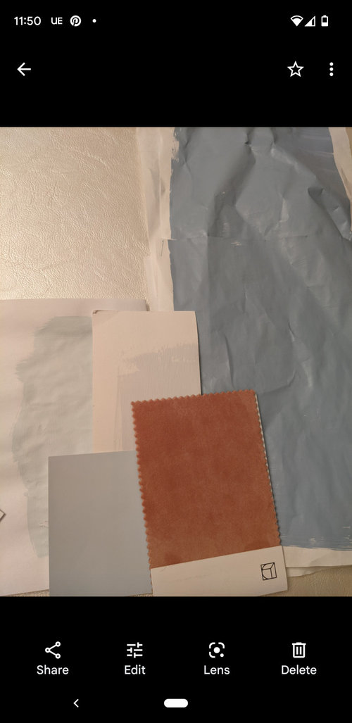
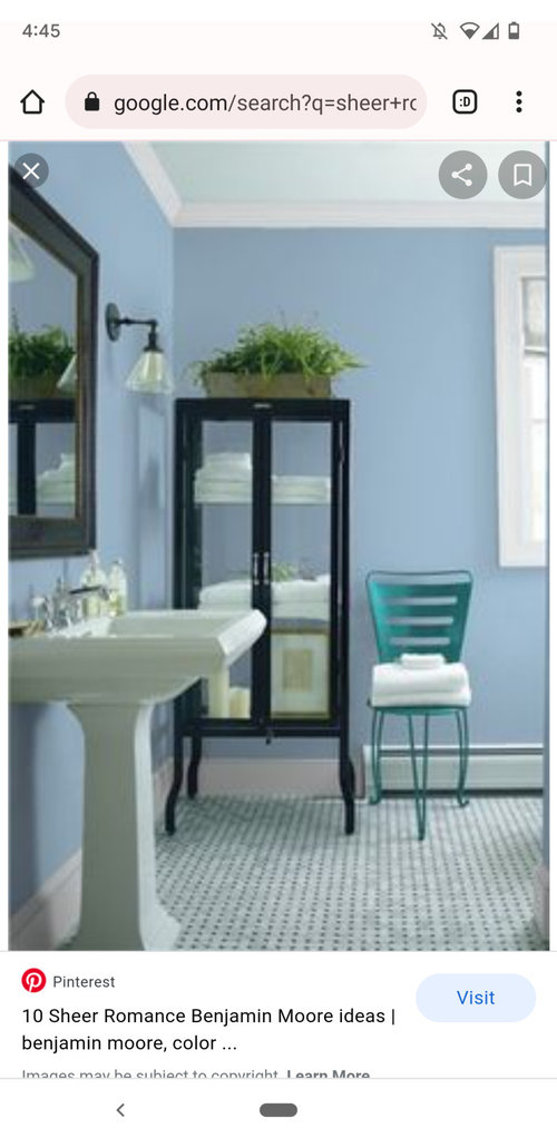
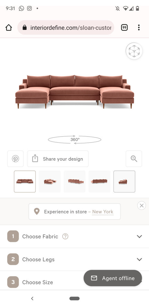
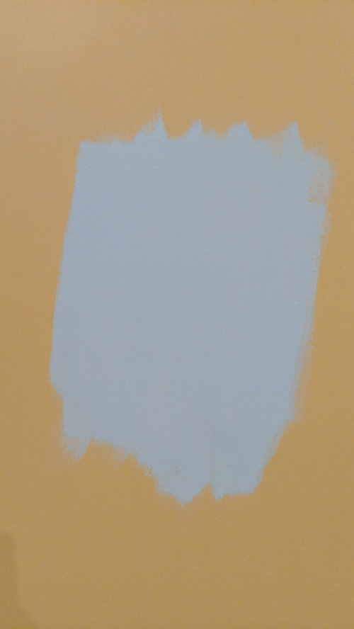
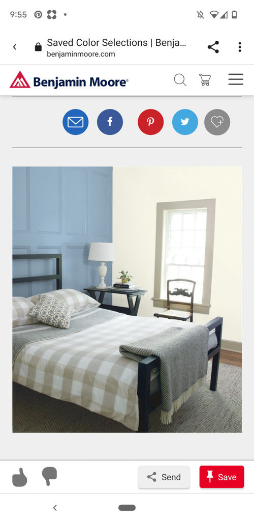
My designer told me the color Benjamin Moore sheer romance would go very well with my living room. The pink couch is the color and somewhat the style of the couch I will be having in this room. There are tall ceilings and it's a very big room. I keep feeling unsure about the color with the couch and it also looks different in pictures I found online and on a paper and then on my wall so it's very confusing. Do you think it's too bright for the couch and also just too bright for a big huge room? Should I do more tones down blue or a light pale blue? I want the room to feel nice and cozy.

Comments (20)

  • 4 years ago

    it’s probable she’s steering you toward “Grand Millennial” style. (Basically, it’s rehashing the 70s & 80s with a sprinkling of anything that catches the eye at the Goodwill, as far as someone who is happy to leave the 80s in the past is concerned 😉 - but I digress) it’s a much more eclectic and colorful style than the bland white & grey we’ve been seeing with the modern farmhouse style now fading. There is a tendency to layer unmatched large components, but pull them together later with accessories. The blue is definitely on trend, if not on fad. If you’re not feeling the blue, then ask for a compatible neutral. You can always do blue later. (It’s a pain, but possible.) maybe a barely-there blush to blend, instead of contrast. Or, ask your designer to help you see her vision for your room more clearly. She has not done her job, since you don’t seem confident.

  • 4 years ago

    You hired the designer because you admired her taste and trusted it.

  • 4 years ago

    I think the Sheer Romance color is sufficiently muted (not bright) and will be lovely. You want the room to be cozy, so I wouldn’t go with a light blue. (Btw, if you wanted a light blue, you would have to choose a “cool” gray if you didn’t want a baby blue.) The pink couch looks somewhat coral to me and orange and blue are complementary colors that look great together. Also, the Sheer Romance sample looks very different on your wall because your current wall color isn’t white!

  • 4 years ago

    Thanks, but I'm thinking it's too sky blue for this couch... What do you think of the color to the left of the couch swatch? Is that going to be too light for a big room I want to make feel smaller? Also In the pictures above those are other walls with the Dave paint color, I just want to know what else I can do to pull the room together...

  • 4 years ago

    The color on the left bottom is sheer bliss*

  • 4 years ago

    I'm a summer color and need delicate beautiful colors and design, rounded furniture etc.

  • 4 years ago

    I do not think of “Grandmillennial Style” when I look at that sophisticated color combination of Benjamin Moore Sheer Romance and your fabric swatch.

  • 4 years ago

    I'm not so familiar with design and style, do you mean very old and a bit dated? What if I want soft and not too interesting but still want to make room feel smaller... Is there a better blue that isn't grey ... But similar to this

  • 4 years ago

    These feel different than the sheer romance...a bit better to be, not sure the colors or why I like them better.

  • 4 years ago

    Blues look very different online than in real life. Talk to your designer about your concerns with the color she picked and what your goals are for the room.

  • 4 years ago

    Are these the blues you prefer? There are many swatches here to consider

    https://elizabeth-choi.github.io/post/haint-blue-paint-sherwin-williams/

  • 4 years ago

    Is the big painted swatch to the right of your fabric swatch the Sheer Romance? It looks much more toned-down there than in the photos of random online rooms. That could be differences in your lighting, which has a huge impact on how a color looks in a room, or the room photos could have been lit to a fare-thee-well by the photographer, making them look brighter than they really are.


    Where it is painted on the gold, all I can say is don't ever try to assess a swatch against anything but white. Framing matters, and a color will look totally different framed by gold than it will on it's own with all the gold covered. Human brains can't process a color independent of its context. The other problem is that the gold on the walls reflects onto your sample and changes how it looks. If you can, priming the whole room to cover the gold before you make the final color decision will help.


    FWIW, if the color to the right of the swatch is Sheer Romance, I think it will look smashing with the sofa. If you think it is too baby blue (as evaluated in your room), you could ask your designer about something a touch grayer. If you want cozy, I wouldn't go lighter. I like the mid-tone.

  • 4 years ago

    BM Sheer Romance

  • 4 years ago

    This is the couch color, I don't give it to be coral....

  • 4 years ago

    Your swatch doesn't look pink on my screen - it looks rust. Does it actually look pink to you? My sofa looks very similar to what your swatch looks like on my monitor. (sofa looks less bright red IRL than it does in below photo)


  • 4 years ago

    I dont see pink in your swatch in the picture either. It appears to be a bit more on the rust side.

  • 4 years ago

    It's not rust, picture isn't accurate I guess.. But I posted the couch above.

  • 4 years ago

    The color in daylight is not like at night... It's middle swatch. Doesn't look as nice

  • 4 years ago

    I think I like it better than the blue with green in it. Try a lighter shade of that color. Just a little less saturation, maybe.

  • 4 years ago

    Or maybe one darker is better:  it's bm denim wash

Sponsored
Whisler Home Improvement
Average rating: 5 out of 5 stars9 Reviews
Franklin County's Committed Home Improvement Professionals