Software
Houzz Logo Print
kathy_harrington20

Mindful gray looks blue

4 years ago
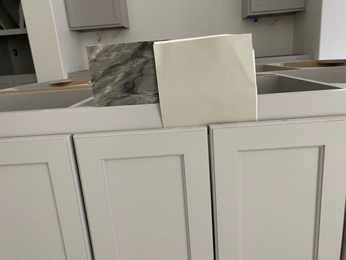
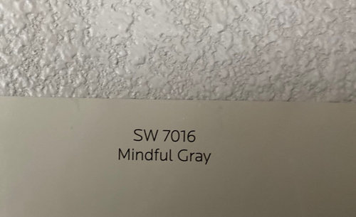
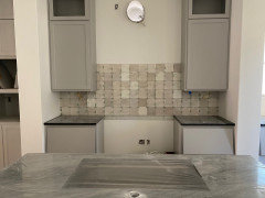
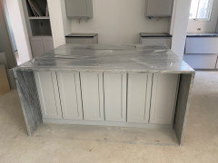
building a home and just had the kitchen cabinets painted SW Mindful Gray. I chose that color for the depth and muddy green undertone, but the cabinets do not look that way but instead have a purple/blue undertone and feel very cool. They also don't match the sample I have, but the paint rubbed on a small chip looks like a match. Wondering if the lacquer added changed the color?? Any suggestions as what is causing this. We do not have our lighting in yet. Our builder is going to the painter to find out his thoughts but I'm wondering if I should just find a different color. Any help appreciated


Comments (28)

  • PRO
    4 years ago

    Yeah, Mindful Gray sits in a pocket on the color wheel where we know low chroma colors can shift blue. Depends on the light and what's nearby. Here's the whole Colorography: https://thelandofcolor.com/mindful-gray-7016-by-sherwin-williams/


    Also, definitely true that mixing the color in product that isn't Sherwin-Williams specific can affect color appearance so that could be contributing.


    but the paint rubbed on a small chip looks like a match.


    The only way to know for sure is to measure the colors. Every cabinet person should have a Spectro 1 or at least a Color Muse to check color matches.


  • 4 years ago

    Change your lighting. It is close enough . You can never ever expect a 100% match from different coating chemistries.

  • 4 years ago

    As of now we have no lighting but they should be installed next week. I’ve heard it’s important to us lighting with at least 90 CRI. I’m not too familiar with that but any suggestions for what type of lighting will tone down the blue.

  • 4 years ago

    Also, the painter the builder uses is not a person who specializes in painting cabinets. He generally uses the same paint/lacquer combination in every house and I wouldn’t expect him to be concerned enough about the color to have a Spectro 1 or Muse to check color. Can you explain what that is and if I can get one?

  • 4 years ago

    place lighter counters. whether you have an issue with blue ? it doesnt matter. with those counters the painted surfaces will look cool..probably grayish........ You need lighter adjacent surfaces to assist in pulling the warmer undertones from a greige formula..... I like the cabinets I would not place those counters.

    Luxury Kitchen Remodel · More Info


    Lofty Open Concept · More Info


    Sprawling One Story · More Info


  • 4 years ago

    I actually think those counters will probably help pull the green out with the cabinets. What are your floors and don’t do anything drastic until you get the proper lighting in place. I also agree it looks close enough to the sample.

  • 4 years ago

    I am so sorry this happened to you. It is always important to get a large size sample when dealing with neutrals and especially a neutral like Mindful Gray that is really on the cusp of shifting either blue or green.


    The larger sample you have is definitely less gray (causes the blue) and more colorful (green) than the cabinet color.


    Even the sample painted on the color swatch appears more gray from the photo, but it is difficult to discern color differences on tiny samples.


    When doing an expensive project like painting cabinets you really should get a sample of the cabinet door or minimally a drawer front painted with the color to approve the color match.


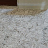
    The two colors pull color from the counter top very differently.


    If your desired outcome is a warmer color palette I would have the cabinets re-painted with a warmer, greener gray. The person creating the color match may be able to adjust the formula or they may need to match a different color.


    Silver gray may be a better choice:


    This chart explains where the hue families change:


    Yellow is centered at a focal hue of 87, yellow green at 116, so Silver Gray is just slightly more green than Mindful Gray.


    At a chroma (colorfulness) <5 colors become more gray than colored and are considered Achromatic. Mindful Gray has a chroma of 5.7 where Silver Gray has a chroma of 8.95 making it just a bit more colorful. Silver Gray is also just a tiny bit darker (Luminosity). LRV of 45 vs 48.

    Kathy Harrington thanked Jennifer Hogan
  • 4 years ago

    Thank you all. The countertops can not be changed. It’s possible that he didn’t use Sherwin Williams paint. Still awaiting an answer. We will proceed with the countertops and lighting to see how that works. If we need to repaint I will specify emerald urethane for cabinets and trim and look at silver gray.

  • 4 years ago

    You can order a Color Muse (colorimeter) for yourself, online via Amazon.


    it was approx $59 dollars.


    The Spectro 1 Pro (spectrophotometer) can also be ordered online, but is much more expensive, as it is more sophisticated in its measurements.


    The Color Muse is more than efficient for most colour decor challenges.


    if you are able to take a phone photo? You will be able to use these devices.


    They are fast and efficient in their ability to measure colours.


    The Land of Color shows you ’how to’ simply, via YouTube.


    Everything else is guessing.


    A CRI of 90+ can help a lot.

    But useful, if the colour shift you notice, only happens at night.

    Even then, it will depend upon how well ’bulbed’ your room is.


    If the shift you notice occurs in the day? Then bulbs are irrelevant.


    You can measure these coloured surfaces yourself to see how close they are.

    Is the match incorrect? or will both original colour and match, shift blue?


    🌈


    Kathy Harrington thanked Marylee H
  • 4 years ago

    I love the counter tops. I prefer the counter with the greener color for the cabinets, but it works with both the greener and grayer colors.

  • 4 years ago

    when one enters your kitchen :"'wow I love your island" NOT... " isn't that paint a little too _____?" split hairs all you want. it is a neutral greige color. the island top carries the show.

  • 4 years ago

    Thanks for all the comments. Got the countertops in and it didn’t really help. The painter is tracking down sherwin williams paint and spraying a shelf for us to see if it changes.

    Trying to understand where I went wrong so I don’t keep repeating the same mistake. Wondering if the fact that this is a north facing room with limited natural light. We have one north facing window and one east facing window and it opens to the living room looking south with east facing glass doors that open to screen porch. I’ll post some more photos.

  • 4 years ago

    I will say that looking at the photos it looks better than in person😊

  • 4 years ago
    last modified: 4 years ago

    the last pic looks pretty good, but his one w/the tile, you can really see the color diff


    this tile is way too taupe/pink to work w/the other two elements.

    what kind of floors are you doing?

  • 4 years ago

    Republic Flooring Post Oak. Here is a photo from a friends home. I can’t seem to post the photo at the moment

  • 4 years ago

    Honestly, I think it looks ok! I know it's a bummer that it doesn't match the sample. But it's a nice color! Easier to pick a different tile than to repaint your cabinets.

  • 4 years ago

    Yes but unfortunately I can’t return the time and repainting will be the cheapest thing.

  • 4 years ago

    The tile

  • 4 years ago

    @Lori A. Sawaya Thank you for popping in, lucky us!

  • 4 years ago

    Kathy, what's that countertop stone you have? very pretty

  • 4 years ago

    Thanks Blue Tahoe on the island and black Cambrian on perimeter

  • 4 years ago

    We loved the Blue Tahoe when we picked it out but it’s been challenging finding the right paint to go with it. My original plan was to go walnut on the island but I changed my mind at the last minute and I regret it. I needed to write that so I can let it go. I suppose if money and time were not an object I would replace the island and do the walnut but I’m not going to do that just not because of the reasons above but also because it feels wasteful and I’m committed to making it work and loving it

  • 4 years ago
    last modified: 4 years ago

    looking good. and yes, that walnut on the island would have been stunning w/those colors. even a white oak would have worked. are you doing oak on the floors?

  • 4 years ago

    Yes a light oak color and I agree walnut would have been amazing but that ship has sailed 😊

  • 4 years ago

    I agree that it doesn't look like the sample at all. I would repaint and see if the color isn't altered by the lacquer because that's probably what made it shift.

  • 3 years ago

    We used Mindful Gray in our living room and it looks blue! Found out our painter used Menards paint and that could be the reason. Does anyone know if we repaint with SW brand paint, if that will help?

  • 3 years ago

    It would be still worth viewing a large paint chip or sample in situ as Mindful Gray has the capacity to shift and appear perceptibly blueish in areas with very imbalanced lighting.


    🌿