Software
Houzz Logo Print
sharon_voshell

Backsplash help, please.

4 years ago
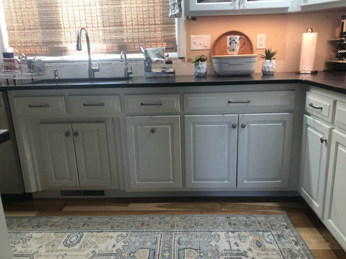
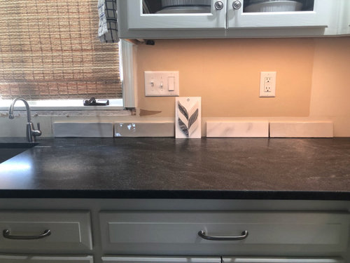
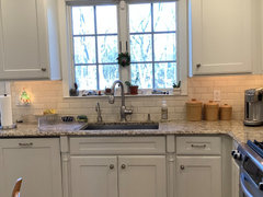
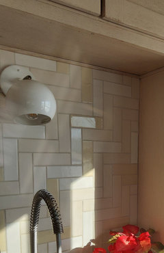
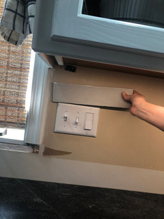
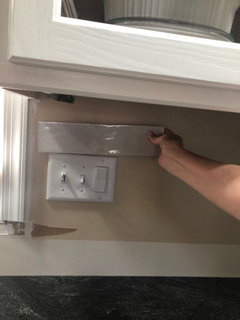
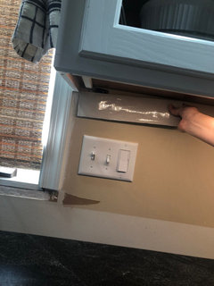
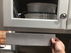
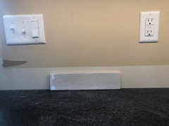
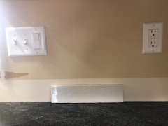
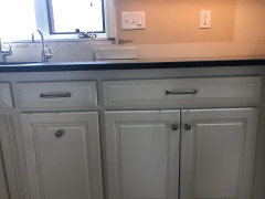
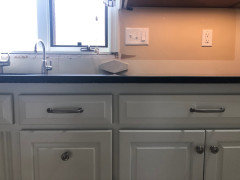
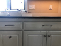
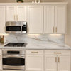
My kitchen cabinets are painted BM White Dove, my countertop is honed Virginia Mist, and my walls are SW Agreeable Gray. My floors are a natural hickory. I’m trying to choose a backsplash that will complement everything and not look too dated too fast as it will have to remain in place for awhile. It’s a small, L-shaped kitchen, and I would be putting the backsplash beneath the cabinets. From left to right is a matte gray, a glossy gray, a marble leaf mosaic, a glossy Calacatta, and a glossy light gray. I’m striving for a casual elegance. Are any of these a move in the right direction? I really don’t know what I’m doing.

Comments (43)

  • 4 years ago
    last modified: 4 years ago

    For someone who doesnt know what they are doing, you’ve done a really good job so far.

    I am not a fan of any of those choices.

    Your vibe feels almost like farmhouse to me.

    I would go with a more rustic hand made tile. You can do a blueish gray simikar to your rug.

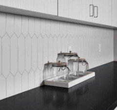
    White picket tiles could work either vertically or horizontal.

  • 4 years ago


  • 4 years ago

    Thanks for the feedback. I like the tiles in the pictures. I’m not a real fan of the rustic tiles as they come off with a dirty vibe for me. I would always feel like I hadn’t cleaned, lol. I’m also worried about going blue as I have to live with it for a long time, and I may want to move colors in a different direction at some point.

  • 4 years ago
    last modified: 4 years ago

    Very true.

    Although the backsplash is the easiset to swap out down the road. But it’s best to go simple if you are not a fan of a particular color.

    Greens are big, with people doing it on the cabinetry!

    I have two white kitchens. One with cream 3x 6 subway, the other with gray 3 x 12.


    I appreciate when other people use color, varied shapes or even go bold!

    It’s all a matter of your comfort level.

  • 4 years ago

    It would be helpful if you could explain to me what you dislike about my choices. Just trying to understand what to look for…

  • 4 years ago

    Lovely kitchens.

  • 4 years ago

    And I think we’re alike in terms of simplicity.

  • 4 years ago
    last modified: 4 years ago

    To be clear, any of your choices can work.

    For me though, your counter has veins so I would not pair it with marble.

    You can certainly do the light gray tile, but many here will say gray is on the way out, therefore trendy. I happen to like gray so I used it.

    The marble leaves are nice but you have to make sure you get a good installer.

    I like glossy tiles, and honestly in all my years participating on this forum, I’ve yet to see anyone use matte tiles for a kitchen backsplash.

    Many people are still using herringbone pattern.

    What is the overall vibe of your home?

    For me, kitchen one is transitional.

    Kitchen two is traditional.

    With your hickory floors and Virginia mist, I get farmhouse vibe. Honed Virginia Mist reminds me of soapstone.

  • 4 years ago

    Thanks so much! That’s helpful.

  • 4 years ago
    last modified: 4 years ago

    Post again so we can see your final choices! The backsplash is the hardest choice to make.

  • 4 years ago

    Thank you! I have to say that I certainly stalled once I hit the backsplash, lol. Talking about patterns is helping me. It would be just like clothes. Unless you’re really good at matching a group of patterns, steer clear! I was actually leaning toward the last glossy one. It’s a light gray that can read gray or white depending on the time of day and what’s t to it. You were correct about the picture. There was a terrible glare with the shade open.

  • 4 years ago

    I'm not a fan of the mosaic in the center. At all. To my eye, the 2nd tile and the 5th one are a little warmer and look amazing with your rug (I have something similar in my kitchen 🙂). I think you have good options. I like 2 best, then 4, 1, and 3.

  • 4 years ago
    last modified: 4 years ago

    I agree with OP about 5, especially after hearing it described as sometimes light gray, sometimes whitish. I'm assuming it's good with the cabinet color - it's a bit hard for me to judge from the photos - but it looks great with the countertop!

    honestly in all my years participating on this forum, I’ve yet to see anyone use matte tiles for a kitchen backsplash. FWIW, I mixed matte tiles and gloss tiles from Mercury Mosaic and Tile in my kitchen refresh about five years ago. At the time, someone else on Houzz did the same thing with Fireclay tiles.


  • 4 years ago

    Thanks to both of you! I’m definitely leaning toward 5 unless someone gives me good reason not to, lol. Arlosmom, I thought I liked the 2 tile, but at certain times during the day, it gets almost too gray for me.

  • 4 years ago

    Welcome to the ABB club. A gardenweb term that stands for All But (the) Backsplash. So many of us find choosing the backsplash the most challenging. I was in that club for about 3 years lol!

  • 4 years ago

    😂Fingers crossed that I can pull the trigger faster, lol.

  • 4 years ago

    Good luck, S Voshell! @rebunky, your ABB saga gave me hours of scrolling pleasure 😄

  • 4 years ago
    last modified: 4 years ago

    "...and honestly in all my years participating on this forum, I’ve yet to see anyone use matte tiles for a kitchen backsplash."

    Ooh Ooh! I have matte tiles -- and COLORED ones to boot!


    But OP -- I do agree you should stick with something plain. I love your granite, it was what I was intent on getting before this green one seduced me, and I occasionally get pangs of lament that I didn't get the Virginia Mist. Don't detract from its quiet, understated beauty with anything too fussy -- a plain subway will show it off beautifully. You could certainly do a soft color or even a soft grey. I do like the leaf mosaic but it's not the right choice, and I also question whether because it's so small it's going to look ultra-busy once installed and the look is going to go the way of the long, skinny mosaics that were in vogue just a few years ago.

  • 4 years ago

    I love your cabinets, and I can see why you chose that backsplash. It complements them well. I definitely understand (now) that I don’t want to create competition with my backsplash. I’m going with the 5th one unless I get more info that shows me it isn’t a good choice. I appreciate this site. I get an education every time I use it.

  • 4 years ago

    ^^ Thank you. I love my cabs -- hickory can be bossy and needs something with some visual weight to stand up to it, which is why I shied away from a plain white matte subway (which would have looked great with the counter but too wimpy against the cabs).


    Anyway, can you take better pics of just your #5 tile against the cabs and the granite? Can be kind of tricky because while pretty much anything will go with a black countertop, with white cabs in the mix you need to get the tone right (cool vs warm). A few more pics will help us help you.

  • 4 years ago

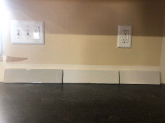
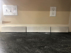
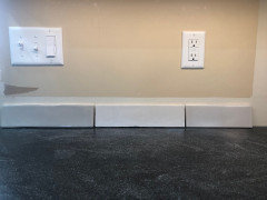
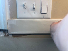
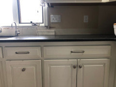
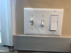
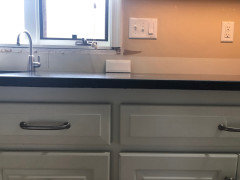
    Okay, I’ve taken a bunch of pics with overhead lighting alone and also with the under cabinet lighting. They aren’t great, but hopefully, you can get a better idea of the tile with the counter and cabinet. I couldn’t get one with natural sun because the sun was directly at the window causing massive glare. Honestly, there’s a glare there most of the day.

  • 4 years ago

    First 4

  • 4 years ago

    Others

  • 4 years ago

    Hmmm, IDK -- in some of the pics the tile seems to have a pinky undertone, which looks muddy with your cabs, but in some of the other pics I don't see it. Very hard to tell sometimes viewing on a monitor. What do you see when you're looking at them IRL? Do you see any taupe/pink undertones? Or does it look cooler/grayer?

  • 4 years ago

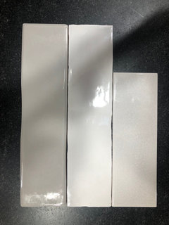
    You’re moving into an area in which I struggle. When I chose paints throughout the house, I had to resort to the science (numbers) because I couldn’t always see the tones. I don’t see pink undertones at all in this. (FYI, I hate them.) Here are some pics with two other tiles. The top is what I see as gray. The bottom is more taupe to me. The middle is the lighter gray I’m leaning toward. What do you think? I recognize pics and computer screens make it difficult.

  • 4 years ago

    Here they are.

  • 4 years ago

    Sometimes, the best way to "see" colours in whites is to compare them. Have you placed your tiles against a plain sheet of white paper? That usually helps me see if a white skews pink, purple, blue, etc. Don't forget to view the backsplash from further away as well. Sometimes, it can provide a stronger "feel" for what works in the space. Fwiw, your tile choice is lovely. I agree the marbles, especially the mosaic, didn't have the right vibe for your kitchen. Too formal, especially with the hickory floor.

  • 4 years ago

    Thank you for the great ideas. I tried the white paper trick. I see no pink, but I’m still not confident in my ability to tell, lol. I will say that have looked at the tile from a distance, and I like it. Compared to the darker gray, it provides a deeper contrast with the counter and seems, to me, to blend well with the cabinets. I’ve enjoyed renovating right up until this point. I know it will have an important impact on the room as a whole, and I’m worried about making the wrong choice.

  • 4 years ago

    While I think the lighter gray looks good, I’m open to hearing it if anyone else does not. Just please explain why and what you think would work better.

  • 4 years ago

    I wasn’t understanding the “looks muddy with your cabs” statement, so I looked it up online. I saw a gray paint used with an off white shower that looked “muddy.” I get it now. I’m not seeing it here, but if others are, I believe it. Any suggestions on where to go from here?

  • 4 years ago

    "I know it will have an important impact on the room as a whole, and I’m worried about making the wrong choice."


    Totally understand this! And let's face it, it's not easy to decide a whole backsplash based on one tile. Sometimes, what helps me decide is figuring out additional ways to get closer to a decision. For example, can the tiles be returned if they're not the perfect choice once dry set in the space? Can I buy my top two options (one box of each) and return the one that doesn't work? Putting things in perspective can also help. What's the worst that will happen if I install it and don't like it? Will I be able to redo it in X years? Etc. (You may have considered these ideas already but thought I'd suggest them in case you hadn't.)


    Of the three tiles in your latest pic, my vote is for the longer tiles (going by elimination is another decision method... :)) but I couldn't tell you which of those two would be better. For one, colours can't be trusted on monitors and for two, I'd need to see a picture from further away, with the cabinets and floor in view to get a better feel of the whole.


    Don't forget though: your instinct can be trusted. It's done very well so far. :)

  • 4 years ago

    Thanks. I appreciate your help. Just for the record, the shorter tile is actually the same length as the others. It was just a free sample from a local tile shop. I should have stated that when I showed it.

  • 4 years ago

    I’m ba-ack with a new, hopefully better round of tile choices. I heard what you all were saying regarding the tones, and I feel like any of these new ones will work. I’m posting 5 possibilities. Would love to hear what everyone thinks. I struggled with the pics and hope they are good enough to indicate what the tiles look like in my kitchen. I’m going to post each separately with a description.

  • 4 years ago

    Manchester Vanilla polished ceramic 3x12

  • 4 years ago

    Manchester Dove Gray polished ceramic 3x12

  • 4 years ago

    Also Manchester Dove Gray polished ceramic, but in a 4x8 hexagon.

  • 4 years ago

    Manchester Bianca polished ceramic 3x12

  • 4 years ago

    Tilebar Basic White polished beveled ceramic tile that comes 3x6

  • 4 years ago

    Thanks to Maddie at Color Concierge who helped me find tiles with the correct undertones. Decision made. Going with the vanilla subway.

  • 4 years ago

    I have beveled subway in my bathroom, and I won’t use them in my kitchen. They look nice, but there’s just too much going on visually for me to have them in the kitchen.

    Sometimes when I can’t make a decision, i just go with a neutral one because I clearly don’t LOVE the other options. Also, you don’t have to LOVE everything about the kitchen. The rest of your kitchen is so nice I imagine you won’t regret having a backsplash that’s just fine. Fine is fine! (My vote would be plain white subway, either 3x6 or 3x12. It’ll still look good and untrendy no matter how long you have your kitchen.)

  • 4 years ago

    Thanks, Stefanie. I think you and I are agreeing. I chose the tile in the first pic of that series, Manchester vanilla. It’s a polished 3 x 12 subway.

  • 4 years ago

    Whoops, I missed that you’d already replied with that. Good luck with your beautiful kitchen!