Software
Houzz Logo Print
petey2254

Need help picking which color....

13 years ago
last modified: 13 years ago
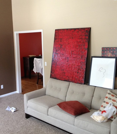
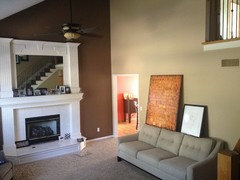
I am trying to decide which color art work to use as an accent in my living room. It is a small room with high ceilings and a fireplace. The kitchen wall can be seen when walking in the front door, so I will have to repaint the kitchen wall if I go red because they clash a bit, kitchen is a orangish red. (repainting is not a big deal) The long tall wall around the fireplace is chocolate brown. Thanks for your help!!!
(please excuse the shoes/shopping bag etc! )

Comments (40)

  • 13 years ago
    I like the red - it goes well with the couch and the brown wall. I'm not convinced you have to change the kitchen but then again, colors in real life always look different.
    petey2254 thanked User
  • 13 years ago
    I agree with Laurie. Love the red. Makes everything else pop! From what can be seen of the kitchen, I don't see the need to paint that either. I would, however, turn the art piece horizontally so that it can make more of an impact on its own and be more proportional with the couch. That piece needs to speak for itself without being interrupted by smaller less important (looking) ones.
    petey2254 thanked User
  • 13 years ago
    last modified: 13 years ago
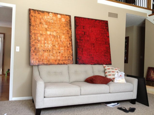
    I'm not a professional but I really like the orange because as Andrea mentioned it is soft and warm.

    Actually, I love it. May I ask where you purchased it from??
    petey2254 thanked Kari
  • 13 years ago
    it does make everything pop, but if you are coming home to relax you may not feel that way when you come into your room..what I mean is, the colors and the room are great, but do you want to pop when you are tired? :)
    petey2254 thanked mousemaker
  • 13 years ago
    I really like the red. But the bottom line is what do YOU like? Art is personal. What speaks to me and what I want hanging on my walls could be something completely different than what you like. Go with your gut. It won't be wrong.
    petey2254 thanked sandkshouse
  • 13 years ago
    Love the red. I also really like the smaller pieces you show with it. Are you planning to group them? That
    seems to soften the red a bit. The frame on the large print looks to be a chocolate or expresso which
    should compliment your fireplace wall?
    petey2254 thanked denjen
  • 13 years ago
    last modified: 13 years ago
    I like the red in this space. Your art choice made me think of an artists whose work I admire on Etsy .. very inexpensive and she will work with you on sizes/colors if you need to change. Her name is Christine Krainock and she is in CA. Website: http://www.etsy.com/shop/ChristineKrainock

    This is one of her pieces ... $250 ... 24x18
    petey2254 thanked indianpatti
  • 13 years ago
    last modified: 13 years ago
    @mousemaker. Actually, when I'm pooped, I need to see some pop. Plus, this room looks like more of a formal area rather a relaxation area. However, you are correct in pointing out the need to address the feel that homeowner wants from the room.
    petey2254 thanked User
  • 13 years ago
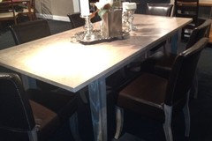
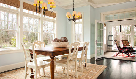
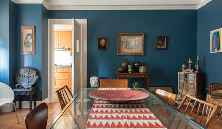
    what do you guys think of this dining set, in a color of a room like this one done by Ellen?
    It was this or a light gray!
    https://www.houzz.com/discussions/should-i-use-this-color-dsvw-vd~628588
  • 13 years ago
    rngp, it's fine :) it was just a thought from my fibromyalgia brain :)
    petey2254 thanked mousemaker
  • 13 years ago
    Red! I don't necessarily think you have to repaint the kitchen. Frankly, I'm one of these crazy people who think that red and orange don't clash. The fact that you said when you get home you Ned to be energized, makes me think that in your heart-of-hearts, you want the red too!
    petey2254 thanked jen046
  • 13 years ago
    A crazy idea...keep both! I like the photo above where you have them propped side-by-side.
    petey2254 thanked jen046
  • 13 years ago
    ...add two simple (narrow) side tables and maybe a could of lamps, and you'll be there. Of course, this is in a vacuum because we have no idea whatever the rest of the room looks like.
    petey2254 thanked jen046
  • 13 years ago
    Love them. What does the orange one look like in the kitchen? I agree you don't need to paint.
    petey2254 thanked Debp
  • 13 years ago
    some nice pillows to go with the orange art. I know you didn't ask but I thought I would mention it :)
    Contemporary Living Room · More Info
    petey2254 thanked anne dee
  • 13 years ago
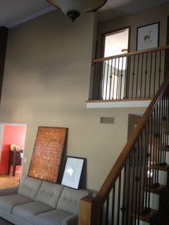
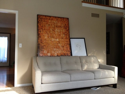
    Love the comments. I'm torn between "pop" and "warmth". Here are a couple more pictures to give a feel for the room. More time will be spent in the kitchen and eventually down stairs....once it is completed. Also I am going to change the tile around the fireplace....that will be another post : ) thanks for the comments and ideas!!!
  • PRO
    13 years ago
    I like both. Red is a great choice to go with your chocolate walls. If this is your starting point, I agree with those above, choose which ever you like best.
    petey2254 thanked Interiors Unleashed
  • PRO
    13 years ago
    ah, more photos... I would choose the red. It is bolder, but not much, because your neutral and chocolate walls mellow it. The orange is looking a little blah with the rest of the space.
    petey2254 thanked Interiors Unleashed
  • 13 years ago
    last modified: 13 years ago
    And yes my original thought was to have a console table behind the couch, hang the large canvas and use the smaller print grouped with it, either hang it or lean it. This is not my area of talent, AT ALL. So any ideas are welcome! Lamps and tables to come ASAP once I find what fits.
  • 13 years ago
    Red for sure. I dont think you have to re paint
    petey2254 thanked Hillary Moers
  • 13 years ago
    Absolutely red.
    petey2254 thanked groveraxle
  • 13 years ago
    HI -- Oh , the red please !
    petey2254 thanked lefty47
  • 13 years ago
    I'm voting for the orange! Soothing color...and will look great with some turquoise or blue green sofa pillows in an Ikat print.
    petey2254 thanked Laurie Tillett
  • 13 years ago
    Can you get another red one? 2 would be better over sofa. Hang 6" from top of sofa, and 2" apart. They will make more of a statement. What color were you thinking of painting kitchen? I would not do red. Red is bold and can be over done. It's just a accent. Not meant to go into every room. I like the cream print pillow go those, and put in a black also. As long as you are in same color tones, OK to use different shades and tones of same color. Use some creams to break up color.
    petey2254 thanked Nancy Travisinteriors
  • 13 years ago
    Love the fireplace!
    petey2254 thanked sanjack0
  • 13 years ago
    last modified: 13 years ago
    Please ;)
    The red is so predictable
    This tone of yellow will work nicely with the brown wall
    And as Travis Interiors says(and we listen) too much red can be overdone thus loosing its effect.
    petey2254 thanked anne dee
  • 13 years ago
    pop and warmth. let's see once :) POPCORN!!!!!
    you know you can have both pictures up and then change them every few months. art doesn't have to be permanent :)
    petey2254 thanked mousemaker
  • 13 years ago
    I love the orange, especially when I see more of the room.
    petey2254 thanked Emily Hurley
  • PRO
    13 years ago
    If they are the only two to choose from...I vote Red...but a Rothko type with BOTH colors would be ideal.
    petey2254 thanked Terracegallery
  • 13 years ago
    I think red looks better
    petey2254 thanked ligh007
  • 13 years ago
    It makes all the difference to see the whole room. Fantastic room! The colors are great!

    Ms. Wacky again...I'd hang two of them (orange and red, or red and red) vertically one the left side of the sofa and hang one or two smaller pieces on the right side. Another idea would to hang two of them side-by-side up above over the doorway (to the left of the sofa, up high) and then do a horizontal group of maybe three more subtle, and smaller, frames pieces...like the one you show...over the sofa. So may ideas...so little time!
    petey2254 thanked jen046
  • 13 years ago
    I liked,the red better but when I saw the whole room the orange looked great. I agree too much red is tough. Your room looks large. I wonder if you can use both pics in the room?
    petey2254 thanked bevballew
  • PRO
    13 years ago
    I agree with what someone said earlier,, the red is a bit predictable so many people use red I think it is a bit overdone.. I think the warmth and energy of the orange is far more interesting.
    petey2254 thanked Amy Wax
  • 13 years ago
    the room doesn't really have a lot of floor space, just a tall ceiling.
  • 13 years ago
    Wow petey2254 what is the world will you do!! Do many comments. I just put my own dilemma on here to see if I can get some good feedback! Can't wait to see your decision.
    petey2254 thanked User
  • 13 years ago
    I like them both very much in the room. I agree that red and orange together are fine too. For over the couch, I'd choose one or the other and hang it horizontally as previously suggested. No need to repaint the kitchen in either case.
    petey2254 thanked Ann
  • 13 years ago
    If you do not paint the kitchen pick the color that matches best with the kitchen wall, so the accent color flows from one room to another.
    petey2254 thanked Karin Bernard
  • 13 years ago
    Love them both! My vote is for orange over sofa and hang the red in the kitchen! Two reds that clash is a good thing!
    petey2254 thanked joyannello
  • 13 years ago
    Well, Petey, what did you do?