Software
Houzz Logo Print
roseanna_prkr

I think I don’t like my NEW counters

4 years ago
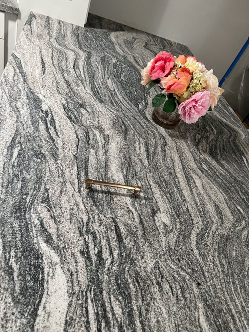
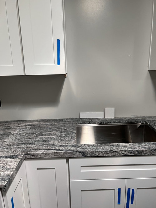
I had my Viscount White aka Silver Cloud granite countertops installed yesterday. They look much darker in my kitchen than I thought. The sealer made them a little darker but was told they’d lighten up in a couple of days when the sealer fully dries. My previous counter was light gray plain tile (32 years old). The new counter is such a statement! Maybe my eyes need to adjust to it? Please be brutally honest: is it too intense? My cabinets are dove white shaker, and I planned on 3 x 12 glazed white subway tile backsplash. Stainless steel appliances. Champagne bronze hardware and faucet.

Comments (85)

  • 4 years ago

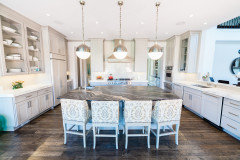
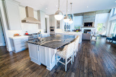
    "The counters are a bit intense but perhaps when everything is installed and kitchen accessories are in place they will tone down a bit"

    This from @Norwood Architects who has the kitchen below in their project file. Let's see...2 different counter stones, an island counter that is much more strongly pattered than the OP's, stripey floors paired with stripey fireplace, counter stools with nailheads and heavily-patterned fabric. Norwood Architects evidently favors a busy look, but makes this comment to the OP?


  • 4 years ago

    Stunning.

  • 4 years ago

    I love @Shasta advice! Spot on. I think the countertops are really pretty, but they are bold. Anything with a stark contrast (like white) is going to emphasize the bold and perhaps finding a backsplash tile that bridges the divide between the crisp white cabinets and the bold darker countertops would help.

  • 4 years ago

    Ok. The countertops are gorgeous. You bought them because of that. So why do you want to tone them down? Let them shine and be the star they are supposed to be. I wouldn't want a kitchen to be all one color and one tone and one texture. That would be boring. Every time I would step in a kitchen where that stone is the star, I would be smile. It's gonna be breathtaking. I like the gray backsplash that Shasta showed. It emphasizes the stone perfectly.

  • 4 years ago

    Everyone, seriously, thank you for all your comments, pros and cons. They are so helpful. I need a lot of hand holding right now 😂 Please chime in with whatever is on your mind.

  • 4 years ago

    Tara: that’s exactly why I picked this counter. Although I LOVE all white kitchens, it just didn’t work in my space. At all. My granite did look calmer, softer, and lighter before the sealer, outside, and in daylight (slab yard during business hours). The sealer they used is not color enhancing but it has lightened up a lot in the last 2 days. Well, off to the tile store I go!

  • 4 years ago

    @Roseanna Prkr


    I know next to nothing about granite counters but as a nearly 20 year member of the Garden Web, I've seen a lot of granites come and go. I really love what you have, the fact that it presents a narrow color palette of grays and whites makes it a winner in my book. That stone is gorgeous. Congratulations!

  • 4 years ago

    One thing I noticed is that the countertops are a very "clean" color and the wall color and cabinet colors are "muted/dirty". I wonder if you had a clean grey and a clean white if it might fit right in.

  • 4 years ago

    Kristin: I know exactly what you’re talking about! I don’t know if you’re familiar with color expert Maria Killam. The picture did intensify the colors, giving them a cleanish black, gray, and white color, but the actual stone also has “muted” colors like gray, taupe, beige, and cream with lavender, blue and undertones. I’m at the tile store looking and will get those samples and see how it looks in my kitchen. The wall color will not be visible next to the counter after the tile goes up. Thanks for the tip!

  • 4 years ago

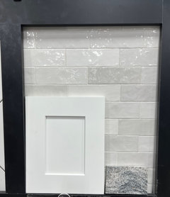
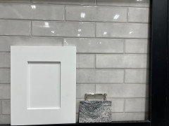
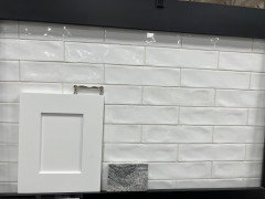
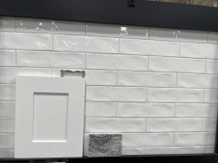
    I tried the smooth, matte, and glossy white subway tile but I didn’t like it at all. I also tried grays but husband mixed those. So for now, this is what I’ve got: zellige in pearl opal, artisan white, and smooth glossy “purity” color tile. Thoughts?

  • 4 years ago

    I would use matching grout and the narrowest grout line I can manage.

  • 4 years ago

    I know it’s a pain but I think it might really help you to bring a sample board of each tile home. That tiny sample of your countertop doesn’t really reflect the aesthetic of your room. That countertop will be dominant and stunning.

  • 4 years ago

    I love your countertops! It is so nice to see something interesting and with heft in a kitchen and they are a nice change from the more ordinary subtile quartz with light gray veining look.

  • 4 years ago

    I like the middle tile.

  • 4 years ago

    The second or 3rd tile would go great! I would not use any darker for back splash

  • 4 years ago

    I do love the 3rd though…matches perfect with the cabinets and the white in the granite.

  • 4 years ago

    I think there is too much movement and texture in #3. I like #1 the best because of the subtle color variation and the grout lines don't show too much, so there isn't a lot of competition with the countertop. #2 maybe if the grout were a closer match to the tile so there wasn't so much pattern.

  • 4 years ago

    Number one or three cuz I think your counter isn't too shiny unless you want a bunch of light bouncing around then you could pick number two

  • 4 years ago

    Absolutely GORGEOUS!!!!!!!!

  • 4 years ago

    I like the first tile because the color is a good bridge between the light cabinets and darker countertop, it makes for a graceful transition. Also I just think that tile is to-die-for gorgeous and I would love to stare at it while I'm waiting for a kettle to boil or stirring something on the stove.

  • 4 years ago

    the narrowest grout line I can manage

    Careful - lots of tales of woe on this forum regarding lippage and other issues by trying to have too narrow of a grout line. Especially if your tile is even slightly the hand-made look and/or waviness to it. Pay close attention to the spec sheet for the tile, and adhere to its instructions regarding grout size. If you choose a grout that is close in color to the tile, you won't have an issue with glaring grout lines competing with your counter stone.

    BTW, I like the first one in your photos.


  • 4 years ago

    I like the first one. Have you considered a matte tile?

  • 4 years ago

    I like #3

  • PRO
    4 years ago

    Love the top and love the second picture!

    It is so refreshing to not see white cabinets, white with little grey veins on the top and white subway.

    I find the movement on that top very soothing actually!

    Good luck!

  • 4 years ago

    The brass or bronze handles are striking with the gray

  • 4 years ago

    Yes you are probably just not used to it -- the countertop is gorgeous!

  • 4 years ago

    anna_682: I did consider the matte tile and didn’t care for it because, to my eye (which hasn’t exactly been helpful lately), it looked boring despite the “statement” countertop. My counter is satin/honed and my floors are matte, so the backsplash needed a little life to it.

  • 4 years ago

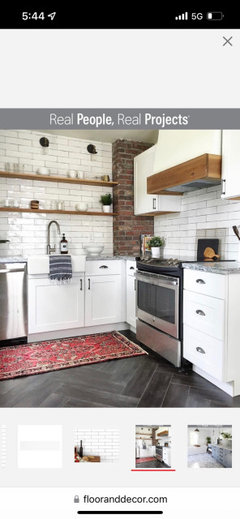
    As I was checking the store’s tile inventory online, I came across a picture of a kitchen with the artisan white tile (pic #3 above). Coincidentally, the countertop is the same as mine: silver cloud! I also have dark flooring, same style faucet, and white shaker cabinets! What are the odds? Ha!

  • 4 years ago

    Looks nice!

  • 4 years ago

    Meant to be

  • 4 years ago

    Debbi Washburn: when you mentioned the second picture, where you referring to the second counter or tile picture?

  • 4 years ago

    I think they are beautiful

  • 4 years ago

    I like the white if you are going to do wood accents like they did in in the Real People picture. Without the wood accents, I like your 2nd, more gray tile, best.

  • 4 years ago

    Shasta: yes, I plan on doing wood accents in the way of two shelves above the sink, just like in the picture.

  • 4 years ago

    Your kitchen will be amazing!

  • 4 years ago

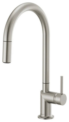
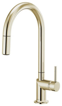
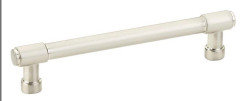
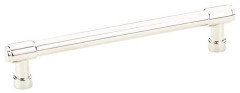
    Ok…I think I’m in the home stretch. It looks like I’m going with the artisan white tile; my husband loved it. Now I just need to decide on the finish of my pulls and faucet. I’ve narrowed it down to either polished or satin nickel. My kitchen is very small, about 10’ by 12.’ I have a total of 28 cabinets and drawers. 20 of those pulls will be 7” long (doors 24” and 42” tall), and 8 will be 6” long (drawers 18,” 21,” and 24” wide). All appliances and sink are stainless steel. For the faucet, I’ve narrowed it down to stainless steel or polished nickel. Is it weird to have a polished nickel faucet with satin nickel pulls? Which faucet and pull finish would you vote for?

  • 4 years ago

    The polished nickel faucet looks very warm toned in picture but it’s not in fact that yellow.

  • 4 years ago

    I love the polished nickel.

  • 4 years ago

    If you have brushed nickel pulls, then you should have the same in the faucet. I prefer the brushed because it doesn't show water spots as much as the polished. Plus, the stainless steel sink has a brushed finished.

  • 4 years ago

    Chinacatpeekin, Nancy Walton: I do love and prefer the look of polished nickel…but concerned that, when everything is taken into account, would it look too “blingy” in my small transitional kitchen? Also, that particular faucet is not available in satin nickel.

  • 4 years ago

    I should add that the satin (nickel) finish is not matte(ish) like brushed metals. I does have a subtle shine/sheen to it similar to satin fabrics.

  • 4 years ago
    last modified: 4 years ago

    I'm a total sucker for polished nickel and have used it many times. It's so beautiful and warm! I don't care for satin nickel at all. Our beach house kitchen isn't blingy and we have polished nickel faucets and pulls there.

  • 4 years ago

    I like the counters. As someone else said, they're a little intense but overall not too bad.

  • 4 years ago

    A stainless steel faucet would have the same look as the brushed nickel.

  • 4 years ago

    While polished nickel is heautiful, it is higher maintenance. It spots and can tarnish. I recommend the kitchen faucet be a stainless steel finish. Goes with everything, likely you have stainless steel appliances, can’t remember if you are getting a stainless steel sink. In any case it’s a neutral.

  • 4 years ago

    I like brushed nickel faucets too

  • 4 years ago

    I think it is beautiful, look how pretty it is with that pop of pink flowers! My countertop is leathered blue dunes and dark like that. We have lots of lighting and are waiting on under the cabinet lights to come in. It will all be beautiful when you get used to it and finished.

  • 4 years ago

    Rachel: thank you so much for taking the time to share those beautiful pulls!

  • 4 years ago

    Nancy Jackson: Thank you for the reassurance. It sounds like we have very similar counters! The counters are growing on me more and more each day. Once the lighting is in, it will soften and calm the granite a bit. I was (don’t laugh 😆) shining a powerful flashlight on the counters the other day. The granite looked more like it did in the slab yard. Lighting is everything!