Software
Houzz Logo Print
cecnolan

Backsplash against Taj Mahal - how busy?

4 years ago
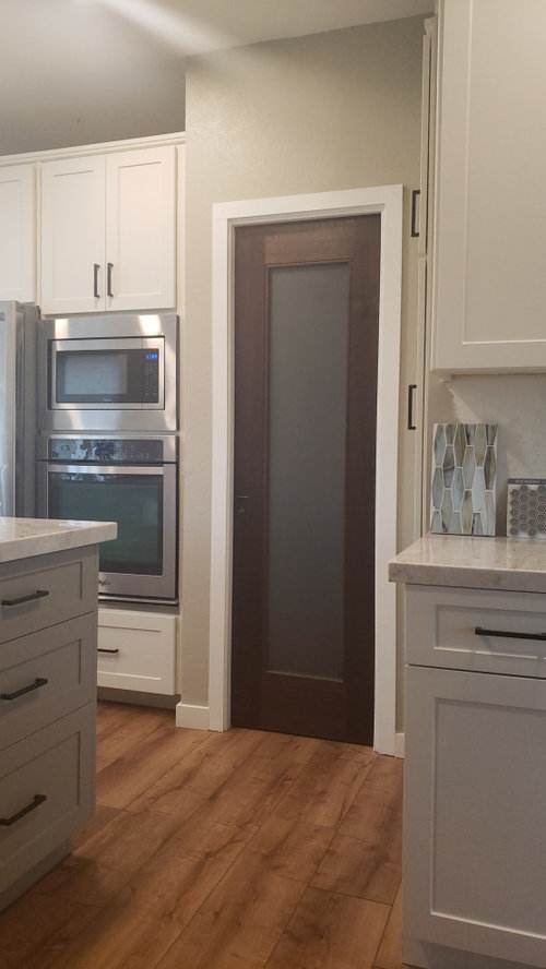
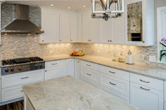
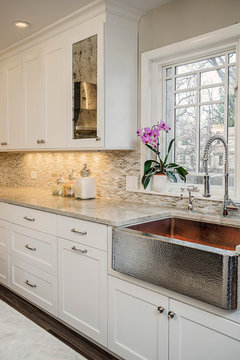
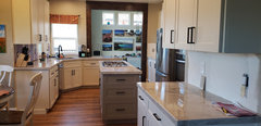
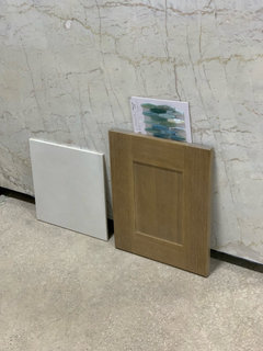
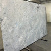
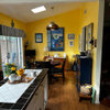
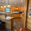
We have TM counters, antique white cabinets, some dark walnut wood, taupe island and wall color, and warm floors.
We want some warmth on the backsplash and as much interest as we can get away with before being officially BUSY.
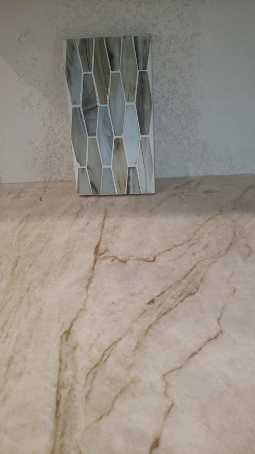
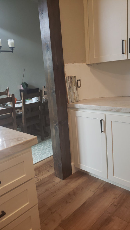
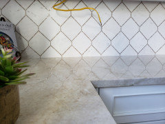
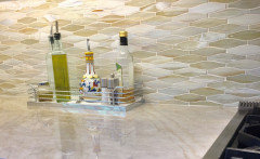
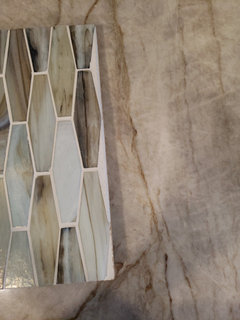
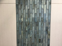
I love this Vihara Karuna (silk not iridescent) for its variety and warm tones. Hubby thinks it is too busy and will compete with veins in the counter.

Comments (34)

  • 4 years ago

    Pretty. But I agree with hubby.

  • 4 years ago

    I would keep the backsplash simple and neutral and let your counters be the focal point!


  • 4 years ago

    It’s a beautiful tile, but hubby’s right, too busy for that counter. If a plain tile doesn’t feel right, consider just paint, clear glass over paint,, back painted glass.

  • 4 years ago

    I agree with the others, how about a simple glass subway in a creamy white/beige or taupe?

  • 4 years ago

    I am trying to hit that sweet spot between too neutral and too busy.  We have been trying to avoid a totally monochromatic backsplash.  Interesting geometry, like the Sonoma Stellar Boka style shared by clt3 could strike that balance for us.

    Thanks so much for all of your feedback!

  • 4 years ago

    I would do that in a heart beat! I like contrast, pattern etc eye catching design. It's very taste specific...from a distance your counter reads beige, for me this wouldn't be too much.

  • 4 years ago

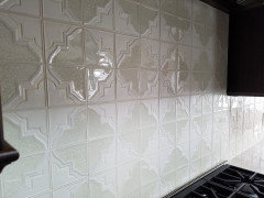
    @cecnolan, I think like you. I'm not sure why every single person wants white or gray subway tile when there are so many other beautiful tiles! I do like your original tile, just not with the TM. In fact, we plan on using something similar in an upcoming bathroom redo. Since you like interesting geometry , this is the backsplash tile we used in our other kitchen completed last year.


  • 4 years ago

    Yes, things can go wrong with mixing patterns, but most on this forum are paranoid about using anything beyond basic plain subway tile!


    I used this Jeffrey Court marble mosaic with TM in my new build. I have very large windows that caused too much glare on any glossy tile I sampled, so I went with a honed white marble. The small brown marble pieces are polished so you get a bit of shine being highlighted. The brown marble picks up the brown veins in the TM and my brown stained ceiling beams.


    In my previous house I used this deco field tile from Encore with the TM counters.


  • 4 years ago

    Just went looking through my Ideabooks for some saved TM photos.

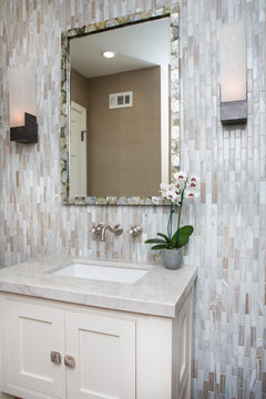
    Here is Lunada Bay Agate with TM counters (in a bathroom but it gives an idea with this type of tile)

    Traditional Colonial in San Marino · More Info


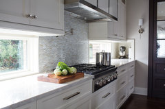
    Another. This is either Sonoma or Lunada Bay.


    Lincolnwood living · More Info


    This one is Lunada Bay Agate Martini color in Cortona Pearl finish

    Northbrook Split Level Renovation · More Info


    Another angle.

    Northbrook Split Level Renovation · More Info


    Between the 2 kitchens I did with TM, one white and the other stained wood, I tested every tile that might go with TM! 😁

  • 4 years ago

    Taj as a slab backsplash is an option.

  • 4 years ago

    Another vote against it.


    I like Chispa's first pic of the Lunada Bay Agate bathroom. It's similar in color variation to the one you show, but the colors seem to work better (hard to tell; your tile reads bluer in some pics and beiger in others; in the 2nd pic of the OP it really seems to fight with the counter but less so in the 3rd pic). I also think that the rectangular shape in the bathroom pic helps the tile from being too "extra" and that may be part of why I think it works better there.


    I've seen interesting backsplashes done mixing glossy and matte tiles. Heath Ceramics makes dual-glazed tile, but only in a very limited palette.

  • 4 years ago

    In the second photo I posted of my kitchens, the Encore deco tile was a combination of matte and crackle in each tile, with 4 tiles completing part of the pattern.

  • 3 years ago
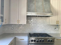
    These are beautiful options and they match the TM very well.


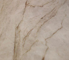
    With our dark wood accents, I prefer having an accent in our backsplash that ties in   The TM is mostly cream with some golden to dark brown veins and some areas that ten more gray or taupe.  

    The Sonoma Vihara sample in my original photos does include some blue tones.  The bad thing about the sample is that it includes 2 finishes offered by Sonoma tile.  Iridescent makes the blues much deeper than we want, while the blues are very subtle in the silk finish that we like.


    Thanks so much for all of the thoughtful, helpful feedback!

  • 3 years ago

    Also, one of you had a good point that the shape of our Vihara sample (elongated hexagon) makes it busier than rectangles.  That is true.

    We have an arched wall that the tile must fit into, and this limits what tile geometry can work.  The e-hex shape is larger than the subway tiles, and we thought that helped balance the busy-ness.

  • 3 years ago
    last modified: 3 years ago

    The tile is gorgeous! I love the elongated hex shape too.

    I can understand where your husband is coming from thinking it might be busy. But, if the majority of the Taj Mahal is pretty subtle and when you look at the room from a normal distance it reads more like one color overall, I would definitely not rule it out.

    I could attempt to do a mock up of it on your backsplash to see if it would be too busy for your husband with the few areas with veining. You would have to post a photo of your kitchen taken from further back. A straight on view ( like looking directly towards the range wall or sink) is easiest for me.

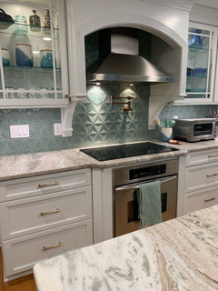
    I found this picture with a similar tile. It looks like a Taj Mahal counter to me.


  • 3 years ago

    I don’t really know About the busyness, it’s a bit hard to say because there’s not much sqft in the picture. However, you said you wanted warmth, that sample I would certainly say is not adding warmth. Definitely in the cool family. Try using texture rather than patterns-a natural texture in a color closer/ related to some of the wood tones you already have maybe?

  • 3 years ago

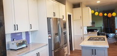
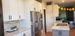
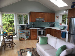
    It is a narrow kitchen so it is hard to get a photo showing the full width.   We only have backsplash under cabinets.  Each of 3 main counter segments that have backsplash has about 50% with brown veins / movement and 50% pretty tame.

  • 3 years ago

    rebunky, I just sent that same photo to my husband yesterday!  I agree with you.

  • 3 years ago

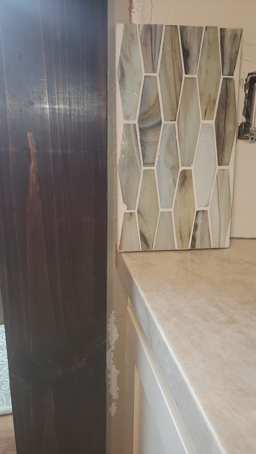
    I think that this photo shows the compatibility of the TM colors with the tile.  Some have said the tile is too cool.  I hodthe left half of the tile sample here so that the bluest (due to iridescent finish) tones aren't visible.

  • 3 years ago

    The hex tiles definitely go with what is in the room. It will draw the eye, and emphasize the tones of the stainless appliances and the green in the other room along with the landscape images in the other room. Maybe the warmth you’re looking for is more personal touches that give you those happy “feels” like art and accessories that are faves. Is the orange valence part of the redo? Maybe the orange and yellow balloons are throwing you off? Or are you trying to bring those colors in? It’s a lot easier to change curtains, art and plants than tiles.

  • 3 years ago

    Be brave and trust your instincts/eyes :)

  • 3 years ago
    last modified: 3 years ago

    In that last photo you posted, I think the tile colors looks great with the countertops! I really like how overall it is warm, yet there are some subtle colors within the glass that also pick up on the cooler grey/green/blues that are in the adjoining rooms. I love your rustic wood beams!

    Sorry these are not the best mockups. The tile next to the countertop on the left counter doesn’t really match well because I didn’t use your exact tile with your kitchen‘s lighting. The taj looks kind of pinkish on that side. Island not so much.

    Well, hope you get the idea anyways. Oh and I don’t know if the scale is correct either! 😬


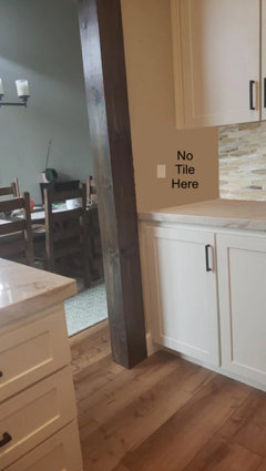
    You might have already thought of this, but whatever tile you pick, I would not tile the side walls.


    I must add that I am a little partial because I put some Lunada Bay accents in my bathroom. 🥰


  • 3 years ago

    I think the real issue with your tile choice is that theres too much movement in the glass, and a few too many colors. You can go for color, or movement, probably not both.

    There is sage advice on an older thread here at houzz, that advises you limit the number of clowns in your kitchen to one. What was meant by this is that the eye wants to fall on one complex element, not more than that. If you want the focus to be on your backsplash, you have to work within the limitations that the counter striations bring. For your bs, consider a beautiful shape in a beautiful color, no movement.

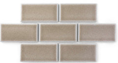
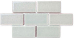
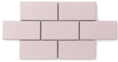
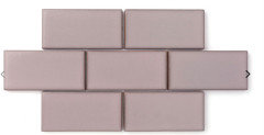
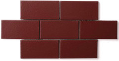
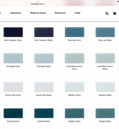
    Here are some colors that might work in your space. As for shapes, there are many to choose from. These are all Fireclay Tile.


  • 3 years ago

    P.S. You can get a similar feeling of movement with less visual complexity, by choosing a tile with variation in the glaze, like the top 2 choices above.

  • 3 years ago

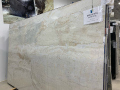
    @rebunky, I'm not trying to hijack this thread, but I'd love to see more pictures of your bathroom. It looks like very similar tile to what we've picked out. Also thinking about using TM until we saw this gorgeous slab.


  • 3 years ago

    You could do something simple in design (like subway) and find a pretty accent tile to put in to break it up. That is what we did. We used ivory travertine tile with an olive branch accent tile. If you want to incorporate a blue find a blue accent tile you like. That way, it isn't too busy nor to plain. Just a thought.

  • 3 years ago

    Truth is, it is only backsplash! Worst case you live with it for a few years and change it out to a boring one down the road!

    In the last 12 years I did major remodeling, additions and then a new build. For all those projects I had only 2 "mistakes" and ripped out a backsplash and a shower ceiling. Considering the size/cost of the projects I consider that a pretty good success rate!

  • 3 years ago

    clt3, I wanted dolce vita, too!  We went with TM bc it is quartzite.  If I remember correctly some places call DV quartzite and others call it marble.  


    Feel free to hi jack!

  • 3 years ago
    last modified: 3 years ago

    Dolce Vita was labeled as MARBLE by my local slab yards in SW Florida. Buyer beware!

    Have you read all the Geology threads by karin-mt for help in identifying stone types?

  • 3 years ago
    last modified: 3 years ago

    That slab is gorgeous! Your choices looks beautiful! I like that the stone has some very light turquoise swirls to bring in the colors of the glass tiles. Maybe even if it is a marble, it won’t be so bad in a bathroom?

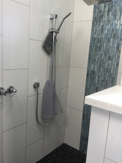
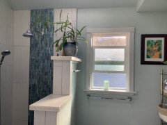
    Shoots I thought I had a better photo of the bathroom to show you. I did glass tile for the waterfall and then the backs of the two niches. My thought for the shower floor was to look kind of like lava rock. This is our little hawaii cottage.


    Yes the window is spun upside down. 😆


    Vanity and sparkle white quartz is the same as kitchen.


    And also I have admired your kitchen for a while! I love the fantasy brown and backsplash!

    Thanks for let us hi jack! Please keep us updated on what you decide!

  • 3 years ago

    Thanks! I'm not really too worried that the Dolce Vita could be a marble. The same stone yard treated our Fantasy Brown and it is still perfect a year later - I believe they used More anti etch. The work won't be done until this winter as we are snow birds who spend the winters in AZ. Contractor is my husband's best friend so work will happen while we are gone. We're removing the jacuzzi that hasn't been used once in 20 years and doing a curbless shower.

  • 3 years ago

    Taj is luminous, and glass tile would be a good choice to pair with it. Specifically the combination of matte and gloss tiles in the same color. Do any of these appeal to you? Are you still looking for tile? Or are you done?


  • 3 years ago

    This is what the combination of matte and gloss glass tile can look like against quartzite.

    This was Fireclay Tile, although their glass tiles are a little different now.