Software
Houzz Logo Print
jenni_sharma

Wall color advice

4 years ago
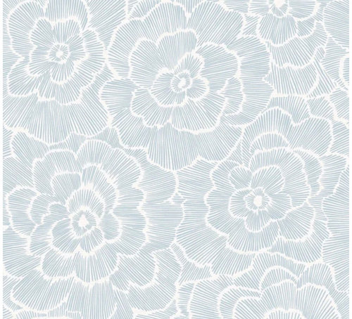
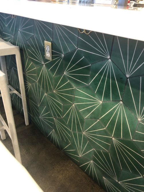
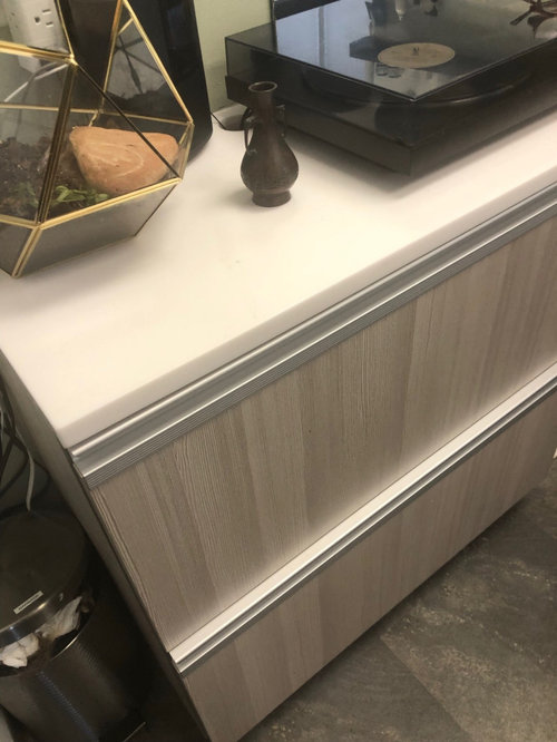
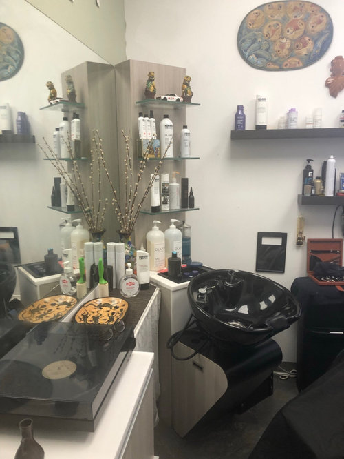
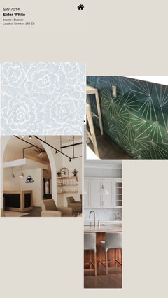
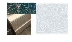
Hi there! I am opening a salon suite, which is a 12x12 single chair salon. I am posting a picture of all of the salon furniture finishes. I have picked a back splash tile that will be on one wall and a wall paper which will be on a wall that shares floor to ceiling windows. There will be one blank wall and the back splash wall that needs to be painted. I am TOTALLY stumped on what color to paint. I am thinking light and neutral. Would love your thoughts on wall colors. Will be using Sherwin Williams paint.

Comments (24)

  • 4 years ago
    last modified: 4 years ago

    I'm missing something here...you have chosen the wallpaper...the green look is the backsplash wall? I don't see a connection in color or style. Could explain again what it is you need?

  • 4 years ago

    The tile is for a back splash, the wall paper for an accent wall. I need a wall color for the rest. I like the both wall paper and back splash and not looking for advice on those selections. Just ideas for a wall color.

  • 4 years ago

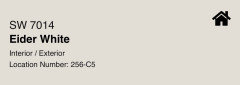
    Thoughts on this color?

  • 4 years ago
    last modified: 4 years ago

    I am not a pro, but I'm having a little trouble connecting the pale blue wallpaper with the medium green tile. The tile appears rustic: the wallpaper not rustic.

    To my eye and on my screen, the pale blue floral does not "juxtapose" with the rustic, somewhat geometric-pattern tile.

    In fact, they appear almost "opposite" in degree of rustic-ness, color hue, and too similar in "scale" to make sense in the same space, not to mention that floral gives a different feel than geometric.

    I hope I explained, but either one of those two items would be a statement piece to decorate around, without adding the other one.


    Edited to add: I just re-read that you're not looking for advice on your already-determined choices. So be it. I would paint the walls white, as that is the only color that your two choices share.

  • 4 years ago

    Thanks- but I really just looking for feedback about wall color. If you can’t in-vision the two elements I have chosen together, maybe just pick one and what color would coordinate?

  • 4 years ago

    Jenni, I would match the color that is the countertop in the space, or if the whites in the tile/wallpaper are close enough to each other, match a white to that. Are you thinking to introduce another color to the space?


    I am asking because in addition to the wallpaper and tile, you have what looks like a "creamy" white countertop (which may look dirty next to a bright white); an ash-gray toned cabinet, charcoal or slate-appearing floor tile, and black fixtures/leather elements. This is a lot of different colors to unify.


    I can also recommend that perhaps you choose some artwork that has the green and the light blue in it, and perhaps some black, to unify the colors.

  • 4 years ago

    Thank you Mrs S! I think I am going to go with a white, and will just have to find a shade amongst the other whites in the mix. The countertop is cool quartz. The floors are a charcoal stained concrete. These elements are things I can’t change. I really love the green tile, and have been really going back on forth on the wallpaper. This a creative space and I can take risks, but I also didn’t want something too dominating so I thought this blue paper was a happy medium. I just don’t want the green tile to be the only statement. The space currently is very cluttered, that will be cleaned up. I want to bring in plants and open to one possible art piece. Because it’s so small I don’t want the space to fill cluttered with decor and so wanted the architectural finishes to be the decor. Aside from plants, most of other elements will be black but done in a delicate way (besides the shampoo bowl and chair) and perhaps I can bring in a light wood to warm it up? I am not a fan of the ash and would prefer a birch so I will have to see how it looks with the two together.

    It is more eclectic idea and I want modern and clean.

    I am curious what type of wallpaper would you choose?

  • 4 years ago

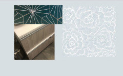
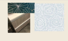
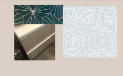
    I created this kind of inspiration collage.

  • 4 years ago

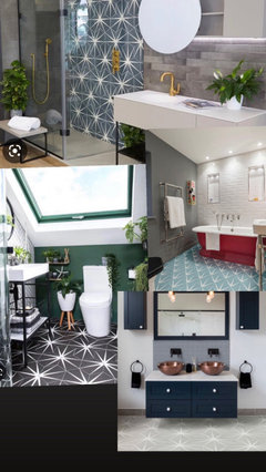
    Another collage. Bathrooms, but it’s got a lot of mixed elements which I think is the direction I am going towards.

  • 4 years ago

    Collage

  • 4 years ago

    Jenni, I'm not a pro. I hope others chime in here to give you more inspiration.

    Are you saying that the gray-ish cabinet will actually be changed to birch-tone?

    Your inspiration collage above shows a creamy, warm toned room with pale oak-looking wood accents, while the right-hand, bottom photo shows reddish-orange oak tones. I would only choose one wood tone for this small room.


    To me, (and again, not a pro!), you need a stronger wood tone to complement the strong, geometric, rustic green tiles. I love the tiles, actually. The reddish wood would complement the green, but the pale beige tones aren't going to fit that aesthetic.


    I think when you start with cool countertop, cool concrete floors, and black, that a nice statement color would be the green tiles, and that green will be repeated with the living plants you add. To me, that's enough really.


    Generally people either love the cool gray tones that dominated the decorating world but really the "grays" have quite passed their time. But since you have the grays in the space already, it would seem to me you need to work with what's there (Is that correct?). What I like about the green is it is a strong enough color that the black elements won't jump out at you. Less is more; let the tiles be the star.


  • 4 years ago

    So asking for paint color opens me up to being critiqued of my choices of other elements. So trolley!!! You obviously don’t get the esthetic, just move one and don’t comment. Like I’ve already bought the stuff this is what I am working with. Not helpful, and upsetting.

  • 4 years ago

    It’s as if you are cheering for her taking me down or something. So rude

  • 4 years ago

    As matter of fact, my space is about to look fire. And asking this question on Houzz only confirmed that to me. It’s a progressive forward esthetic that you may just not have been exposed to. I just came from a 5 star hotel in Napa that was totally my vibe. Maybe you should just level up!

  • 4 years ago

    Wow, Jenni, I'm sorry you feel like I took you down. That is certainly not my intention.

    No one knew you "already bought the stuff" because that is new information you just now stated. In fact, for all I knew/know, the salon or Landlord provides certain choices. You never said you had already bought anything, and in fact, appeared to perhaps have different wood-tone choices still to be made, or I didn't understand.


    I also edited my first comment to respond more directly to your question about wall color.


    And the only reason I posted any other responses was that (a) no one else had responded to you and any response from me bumps up your thread; and (b) you posted a couple collages attempting to show your inspiration, so I commented about that.


    I don't believe anyone is trolling you. I believe I was polite, and Denise stated nothing about you personally, but only stated her general opinion of certain style of decorating. You cannot control how people respond on a public forum. Perhaps she was responding to my patient responses, and I do not read anything mean or judgmental in her response either. I certainly never wish you anything but the best of luck in your new salon space!


    Wish a pro would chime in. Sometimes they do, sometimes they don't.

  • 3 years ago

    My comments were not really directed at you, it was Denise. You were polite enough, but clearly were not into my look. Just found the whole experience disappointing. I asked for paint advice that was in my title, not advice about anything else (though later I did ask you what wallpaper you would do). I am not internet person, I think this is probably a reminder to myself why. I had used Houzz years ago to ask for advice and was really stumped so I thought it would help. Now I am remembering someone saying to me that a piece I was using was collegiate and really I needed to replace everything.

    Ugh- thought it’d be a simple white- or grey- red would look wonderful. BUT I guess when you post online this is what you get.

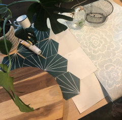
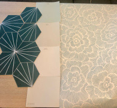
    And Denise was just bluntly saying what you were patiently saying. I’ll keep this open and update you on the finished product, I think you might find it interesting. And thank you for your well wishes. I appreciate your time really, and maybe other people would like advice like this. I am in a place where I want to go bold and really create a unique experience and look, I can always edit if needed. This morning I put a lot of the elements together on the table with the paint swatches I am most interested down the center. I am leaning towards #3.

  • 3 years ago

    Here they are

  • 3 years ago

    Interior design and cosmetology have a lot in common.


    Cosmetology, you have to match hair color and makeup and nail polish to the person's skin tone and eye color.


    Here you have cabinets, countertops and flooring that you need to work with.

    So you can't just look at the two elements you purchased, but have to look at the space as a whole.


    You don't want to do ash hair color on someone with pink undertoned skin do you? It will look green and they will look sick.


    So here are some choices. I can't tell you what looks good in your space without being able to see all the elements together, but you have been trained to look at colors and know color science. Think of it like picking hair color, makeup and nail polish.


    White makes the counters look yellow and dingy


    Blue also brings out the yellow on the counter


    Creamier is better, but doesn't do much for the backsplash or wall paper


    A taupe that is closer to the wood tones seems to work with everything.


    You will need bigger samples to see what they will look like with everything together (buy through sampleze.com or get sample pots and paint your own)


    I just did this quickly and wasn't precise with the background colors. Just did enough to get you started.


  • 3 years ago

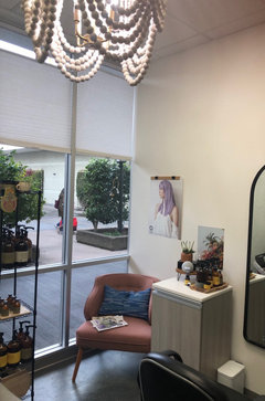
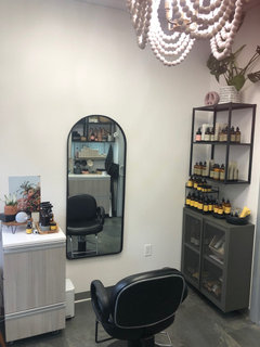
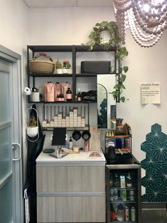
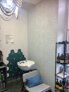
    Thought I’d update on the progress of the salon. Hope you like it, I’m pretty happy with it!

  • 3 years ago

    😊

  • 3 years ago
    last modified: 3 years ago

    You know what?

    It looks great. I really like the bit of chandelier I see, and the walls look soft, and the green tile picks up on the plants. Great job, and you really pulled it together yourself!

    Congrats, and I hope you get lots of compliments and lots of business!

  • 3 years ago

    Thank you! The advice regarding the white paint color was really helpful! I was tempted to do more of a grey or beige, but white really is perfect! I went with Sherwin Williams Snowbound. It looks even better in person!

  • 3 years ago

    I knew you could do this! Great job.

Sponsored
Wannemacher Interiors
Average rating: 5 out of 5 stars26 Reviews
Customized Award-Winning Interior Design Solutions in Franklin Cnty OH