Software
Houzz Logo Print
webuser_459495820

Interior paint specialist needed!

3 years ago
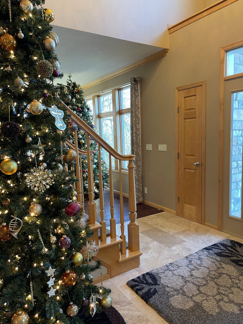
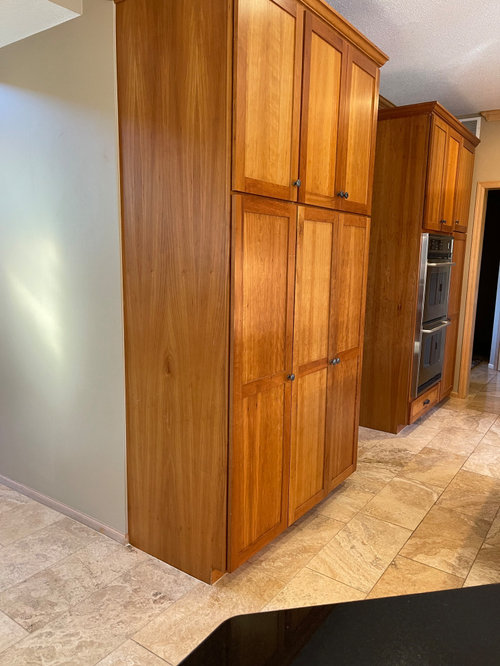
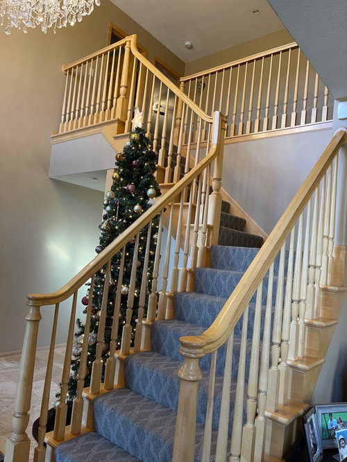
I have a house filled with maple trim and a large maple stairwell. Kitchen is cherry. Floors are dark and light, see pics.

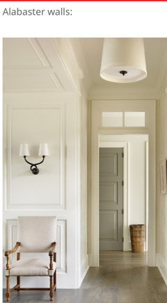
I want to lighten the paint color throughout. One solid soft, warm, whiteish. I like Sherwin Williams Natural Tan 7567 or Alabaster 7008.

Thoughts? Ideas?


Comments (13)

  • 3 years ago

    This paint color is Latte. It is dark and blah. I don't think it comes across in pictures as dark and gloomy as it really is. The lighting here is ideal, the entire house is windows and loads of natural light....

  • 3 years ago

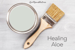
    I don't think Natural Tan is going to be enough of a change. It would be lighter than what you have currently, but still too beige as Verbo says. Alabaster is a very popular warm white, so if you really want white, this is a good choice. Also look at Natural Choice, Creamy, Greek Villa and Shoji White if you want something with a little more color than Alabaster. If you're interested in trying some color, a green leaning neutral looks good with warm wood.

    K C thanked kandrewspa
  • 3 years ago

    SW Latte has an LRV of 39. You are right that this can come across as pretty dark and blah.


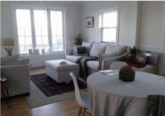
    Verbo is correct that paint color doesn't fix lighting. White does need good lighting to look good. It can fall flat when you don't have enough light. I think the darkness in your pictures is more about the dark paint, and you are looking at some lighter colors vs a white white. Natural Tan has enough color that it won't go gray and lifeless like the picture below.


    I do recommend that people check their home to make sure the lighting that they have is consistent and what they want before picking paint colors.


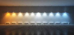
    Some people will tell you that 4000 k is the correct interior light temperature (color).


    I like 4000 in some homes. I prefer 5000 k in my own home, but also love the look of my sister's home with 2500k.


    I have a MCM home with a lot of purple tones in my neutrals and colors. 5000 is whiter light. Light gets more and more yellow as you drop in temperature. Yellow and purple make mud brown - not the look I am going for.


    My sister has a Tudor home with all fall colors and rich woods. Deep greens and coppers and golds and orange reds. Yellow lighting enhances the warmth. Her lighting is perfect for her home.


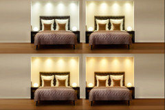
    See how differnt lighting impacts the wall colors below.


    I think lighting and color preferences are very personal. Buy a couple different light bulbs and test them in a couple of lamps and see what you like.


    Once you have the lighting the way you want it pick your wall color.


    Right now white is the trend. Everyone wants white on white on white on white.

    I had a museum white home 35 years ago. It looked great. It wasn't the best choice for my lifestyle. (owned 4 dogs, 10 cats, 2 horses and had a home based business with 8 employees coming and going). A bit more color was easier to maintain and more color really fits my personality better than white on white. I am just not all that sophisticated and the white on white house felt like a lie.


    Pick a white if it feels right for you. Pick a light neutral if you want a bit more color on the walls. There is no rule saying you have to follow the pack and do whatever is trending at the moment.


    I just picked Natural Linen for someone's home a few months ago. Very similar to Natural Tan. We tested both and Natural Tan had a bit of green that didn't feel as good with her finishes and wood work. Another woman posted on Houzz that she painted over Natural Linen with natural Tan as Natural linen was a bit too pink with her finishes and wood work.

    Alabaster is quite a bit whiter than whiter than the Natural Linen or Natural Tan. The LVR for Alabaster is 82, Natural Linen and Natural Tan are 65 and 66). Again, compared to 39 (Latte) they are all quite a bit lighter.


    Again, you have to consider where you live and what works best in your home and with your personality to determine how white you want to go. I lived in Southern California and moved to Central PA. San Diego had no cloud cover - it only rained a few days out the year. Where I live now we average 197 sunny days a year, so almost half the year is cloud cover and often just dreary. I need brighter colors here than I did in San Diego. The colors I used there look really gray and dingy here.


    Always test your colors in each room, on different walls, at different times of the day. Look at the colors next to the flooring and furnishings. You may want to paint a larger swatch or get a larger piece of poster board to put behind your samples so you aren't comparing your new color to the current color of the wall.


    I like painting my own samples and paint them on watercolor paper.

    https://www.amazon.com/Canson-Watercolor-Textured-Charcoal-Acrylic/dp/B01GTR6GHS/ref=dp_fod_2?pd_rd_w=24zx8&content-id=amzn1.sym.d4cdfb0a-d4b4-4f0b-8c51-55838af3328a&pf_rd_p=d4cdfb0a-d4b4-4f0b-8c51-55838af3328a&pf_rd_r=0HSSB2WKYT92PQPGAKF5&pd_rd_wg=psjqd&pd_rd_r=b93c8ed0-d3c6-43a6-b816-f9cd5608f4f9&pd_rd_i=B01GTR6GHS&psc=1


    I like it better than poster board - less expensive per sheet and doesn't have as much warping and more wall like texture.

    K C thanked Jennifer Hogan
  • 3 years ago

    Be sure to test your choice(s) in different rooms. I really like Alabaster, as it‘s light and seems to have the right undertone.

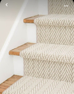
    The downside is you may feel that the staircase carpeting and area rug feel too heavy and when budget permitted, your entrance would feel lighter if changed.


    K C thanked Maureen
  • 3 years ago

    So true. Thank you.

  • 3 years ago
    last modified: 3 years ago

    Found what I was looking for...yeah! I can't copy the photo, but scroll to Silver Satin. It will work with the floors, the different wood tones and it is an off white.

    https://www.veronicasolomon.com/post/9-best-benjamin-moore-warm-gray-paint-colors-that-will-never-be-outdated


    BTW, photo #1, you chose to paint the wall of the drop ceiling the same. Walls are walls...paint those the same.


    K C thanked elcieg
  • 3 years ago

    The paint you have now has a fairly low LRV number of 38, pretty dark. LRV is Light Reflectance Value. On a scale Zero is near black and 100 is white.

    Alabaster is 82, Natural tan is 65

    Greek Villa 84, Creamy 81, Shoji White 74, Natural Choice 73

    K C thanked Bette P
  • 3 years ago

    I would paint all the maple trim white - it does not go with the dark wood floors. Also, you must be really skinny to fit through that half width front door!!!!

    K C thanked ShadyWillowFarm
  • 3 years ago

    Husband won’t agree to paint the trim and that’s not the front door. It’s a closet to the front door. I wish it was all white trim. I’ll make the best of it. Thank you.

  • 3 years ago

    You have beautiful trim, and cabinets. Not all wood needs to be painted boring white.

    K C thanked cat_ky
  • 3 years ago

    Thank you. All the doors, trim, crown molding, stairs… are maple. A lot of maple. Cabinets all cherry. Dark floor. We have all colored wood here. It’s a gorgeous house, i just want it soft and light. With younger kids I think we went darker and now I am ready for light and fresh. Thank you.

  • PRO
    3 years ago
    last modified: 3 years ago

    IMO choose a neutral from the tile and change that runner on the stairs . You havea lot going on with all the different finishes so try to minmize how many there are at least in color tone. I do not think you need to paint the trim. I very often use this as a neutral for walls I cut it 25% and my reasoning is that nature used green as a backdrop not beige or white but you need to test it too.


    K C thanked Patricia Colwell Consulting