Software
Houzz Logo Print
mcarroll16

An off-white to coordinate with teal

3 years ago
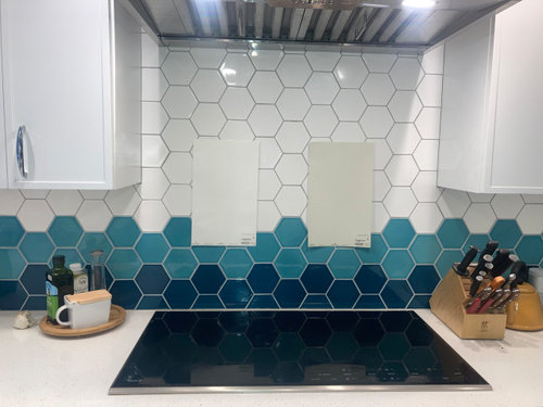
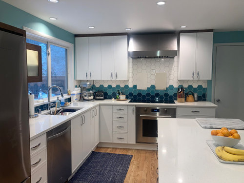
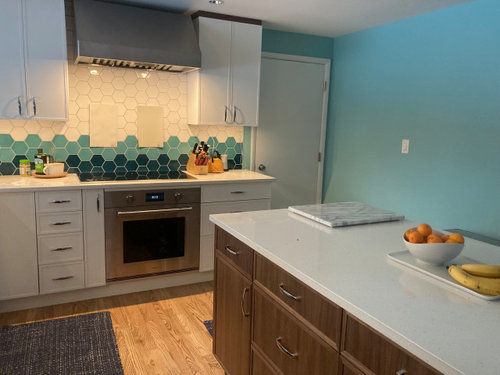
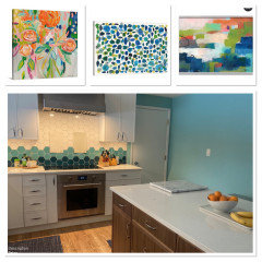
I would really appreciate some Houzz guidance on choosing an off-white paint color. Our big decision is color family (using Lori Sawaya's sytem). Would you do something that leans towards the green-yellow side, or the red-yellow side? We're looking in the range of Swiss Coffee and Moonlight White on the greener side, Ballet White and Seapearl on the redder side.


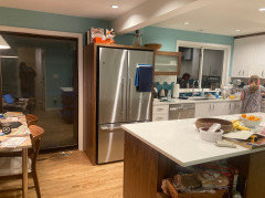
We're in the Seattle area, so lots of gray dim days. It's a north-facing room with large windows that are shadowed by a deep patio roof. We're looking for a color that has enough distance from the white cabinets to look intentional, not a poor mismatch, and has some warmth that stands up to the gray winter light. Cabinets are a close match to BM White OC-151.


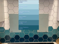
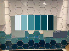
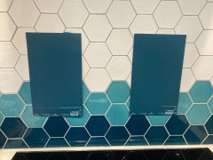
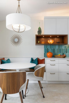
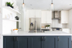
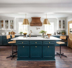
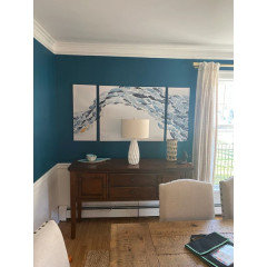
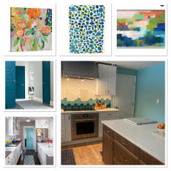
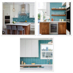
Our inspiration for wall color is this kitchen. Pictures attached: a closeup of Moonlight White and Ballet White against the tile, and a few other shots showing the larger

context.


Comments (109)

  • PRO
    3 years ago

    last modified: 3 years ago

    Left.......

    It's not that paint isn't important. It is. But . It is ONE element in a total space. Much agony goes into it, without the consideration of a whole. The adjacent room, whatever it is. The art on the walls! Out of context? It looms larger than is usually deserved. Can it make or a break a room? Yes, certainly. But it isn't an UN doable thing, ever.

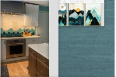
    The other thing? Some paint "colors" are actually not best in paint! They are on the other hand? Great if solid in a grass cloth! Why? Variation......texture..... D.E.P.T.H.

    You'll say...it's the same thing!!! Nope. Not close and just have to trust me on that.

    That's what made the mural so great.........and ps I do see your island and fridge cabinet : )


    Not to start WW111, but who does most of the cooking? Just asking. I'm all for negotiation . I am also for DEFER. .....

    I believe you already "gave" on the tile. Right?


  • 3 years ago

    I was thinking a dark aqua/teal grasscloth, and see Jan commented that already!
    I think off white will look like you just haven’t gotten around to picking a paint color. Also I think that large blank wall needs art to soften it.

    I feel like the whole aesthetic of the backsplash is what is punching you, but if you try to fight it, you actually make it more jarring. I think your current wall color is close, but just too bright, needs to be more muted.

    I also am forming in the camp of if going white, needs to be a pure white, but if you are in pacific nw and white will get grayed out and leaning into the color of the teals in the backsplash, even the dark, will warm up the room

  • PRO
    3 years ago
    last modified: 3 years ago

    "The back splash is punching you......."

    Well............that's a good way to put it!

    So? Rather than fight it? EMBRACE it. And you don't do that by wimping out lol.

    Lean in and surprise yourself .

  • 3 years ago

    Thanks Jan! Agree completely about texture and variation. Apologies for not responding directly on the mural earlier. Too many details swirling in my head. We will have some items on the wall. Not as pretty as your mural. Probably some custom-framed whiteboards for now. Better art in a few years when we've had time to shop thoughtfully (and I'm doing less hands-on managing of teenagers). Grasscloth would be gorgeous but it's not feasible for our family.


  • 3 years ago

    Ha! Yes, @User has summed it up well. Right now I like the blue on the left--it was the color I lobbied for before the teal went on the walls. But I'll look at some darker versions in the same color family too. Leaning in.

  • PRO
    3 years ago
    last modified: 3 years ago

    Having a hysterectomy is a permanent decision....... paint is roll a few in BIG areas on the walls, in several places, pick,,,,,,,,and paint decision.

    And WHITEBOARDS? ........RE THINK THAT. : )

    I'm begging on that one lol. Buy them each a huge calendar to put on a bedroom wall. Make yourself a digital version. At some point? They will not have you to tell them where they need to be. Or when.

    Art can be inexpensive and very impermanent. At some point you decide not to torture yourself.

  • 3 years ago

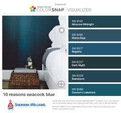
    Look at Quietude, Halcyon green, teal stencil, peacock plume all by SW if you want to stay lighter.

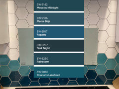
    Dark—Moscow midnight, westhaven, Blue Hill (slightly more green than rainstorm above)

  • 3 years ago

    If it were my kitchen I would match one of the tile colors or the cabinets. I would not add another color. To me that would sidtract from the tile, which seems to be the accent of the room.

  • 3 years ago
    last modified: 3 years ago

    I love the hale navy idea.

    No way would I do 2500K in a kitchen! it's not the 1800's where one needs to cook by candlelight! (plus w/your north facing PNW weather?? just no)

    If you have to alter your lighting to circa 1910 in order for the paint color to look right, you've chosen the wrong paint color!

    Do a 4000K light in the kitchen and try the darker color (Valspar Ocean Radiance is another beautiful color w/a bit more teal. I paired it on the drawers w/the Robins Egg blue


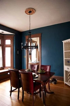
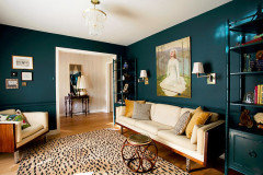
    With all of your wood in the kitchen, this beautiful color would look something like this:


    Maybe you just want to try it on one wall to see how it looks.

    As jan says, it's only paint. get a few sample jars and just try it. (but if you do choose a darker color, for sure go up in the light temp)

    I like your lighter choice on the right, but I think it has a bit too much green to it.


    when you paint this on the wall, it's going to have a more saturated look than what you see on the chip card.

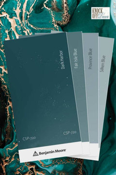
    two other BM colors

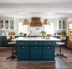
    Dark Harbor. This is stunning w/the walnut. Use a bright white trim.


    and shown here on the cabs.


    you can see how beautiful it looks w/the crisp white and wood tones. That's why I said to try on one wall first, the others a crisp white,to see how you like it.

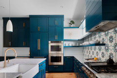
    either of these are more of a true teal


    but Hale Navy would also fit the bill.

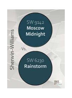
    If you prefer SW, Moscow Midnight is almost the same, but I think it has a tad more blue.


    This is the teal tonal range that matches your tile. you can see your other choices have too much green/gray


    here are some other lighter tones in the same range as Dark Harbor.


    side-note, since this room faces north in a grayish/overcast part of the country, the natural light you do get is going to have a bit more blue to it.

    just try some samples and actually paint the walls. That's the only way you'll know.

  • 3 years ago

    I love Dark Harbor!

  • PRO
    3 years ago
    last modified: 3 years ago

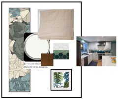
    I suggest you paint the walls the same colour as your cabinets (BM OC-151) and accessorize the room with a colourful runner (Ruggable washable), a linen roman shade on the window, and art on the wall.


  • 3 years ago

    Ok Jan and Beth, I'm listening! Here is Galapagos Turquoise and Bermuda Turquoise. The Galapagos looks best in the picture, but the Bermuda looks best in person. . I'll order samples of Dark Harbor, Hale Navy, and a few more dark blues.


    lisedv, I love OC-151, and it's what we have on all the trim through the house. With our weird north light, I think it would be very cold and harsh as a wall color. The previous owners painted several rooms in a pure white color. Only the south-facing room looked ok for most of the day. The other rooms looked cold and dingy except for the 2 hours the sun shone just right.


  • PRO
    3 years ago
    last modified: 3 years ago

    Mcarroll,

    Just had a look at your inspiration kitchen where I see the cabinets and wall colour are the same, just as I suggested above.


    Perhaps with the linen roman shade on the window and adding some wall art with the turquoise you like on the wall would contrast with the white so that it doesn't look dingy.

    IMO the 2 dark turquoise colours your're considering shown above with make the room look quite dark. I would only use it as an accent.

  • 3 years ago

    It must be a monitor difference. To me, the cabinets and walls in that picture do not look like the same color. The walls look darker and creamier.

  • PRO
    3 years ago
    last modified: 3 years ago

    May look slightly different only because of the different finishes between the cabinets and thepaint. You cannot trust photos to make your paint colour choices.

  • 3 years ago

    I'm not a pro and you have several helping you here. My two cents: Do the wall in the right dark blue, update your lighting and add artwork. You will hate it for 3-7 days and then wonder why you agonized over it. @Jan Moyer always pushes people to just LEAP - it's only paint! She's right.


    The white walls in the posted kitchen look terribly boring. You don't have boring tiles. Don't do white, please. @Beth H. :is giving you a ton of blue options and suggestions for improving your lighting.

  • 3 years ago
    last modified: 3 years ago

    The walls in the inspo photos are creamier. The cabs def look brighter against it. It's a very nice look. Make the cabs pop and warms the room. Pure white walls can look cold and gray in low daylight.

  • 3 years ago
    last modified: 3 years ago

    Oops I keep forgetting it's only paint, try going bold as suggested. It doesn't look like a such huge paint job that you can't redo it later. Are you hiring someone or just hate DIY? Can't help you there.

  • 3 years ago

    Well the beauty of "just going for it" is that for dark, I would do it myself. For a light color, it will be so much work covering the current teal, we would try to get the pros back. For dark, I'll do it myself, and then call pros if we hate it.

  • 3 years ago
    last modified: 3 years ago

    for how to pick the right white (it can turn gloomy and gray w/your type of lighting) please read this article. She nails it.

    https://www.kylieminteriors.ca/ask-kylie-can-i-paint-my-north-facing-room-white-or-off-white/


    https://www.kylieminteriors.ca/north-east-south-west-which-paint-colour-is-the-best/

  • 3 years ago

    That's the spirit! To cover a dark paint, the first coat should be a primer. You're gonna need two coats anyway. We had to paint three coats once, ugh. We said never again, and then we bought a house and hated the wall color. "Here we go again" lol. Two coats. Got a pro only for the high area over the stairs. Been two years and love the color. Kelly Moore Swiss Coffee 23.

  • 3 years ago
    last modified: 3 years ago

    First thing to do, IMO, is paint the island navy blue. That brown has got to go and eye level will show the navy tiles and the navy island. Then paint the walls the white of the cabinets in an eggshell finish. NO MORE TEAL!


    BTW, most factory painted cabs in white are OC-151...the best "universal" white.

  • 3 years ago
    last modified: 3 years ago

    judianna, you want them to paint over all that walnut? seriously? and the fridge surround? I'm sure they paid a healthy amount for this type of wood veneer.


    no. the wood isn't the issue. (I actually like it since it lends some depth and warmth to the cool tones)

    But if it was, and it was blah wood, they could paint it this color.


    but notice even here, they have a wood vent hood and wood door

    (also, it's not navy. the tile is teal)


    Mccarroll, look at some of these too


  • 3 years ago

    Thanks Beth H! That article is one of several that I looked at before trying to hone in on a white. But I'm being told that no white will be correct here. :)


    @tracefloyd if we repaint a light color, definitely primer first. If we go dark, I'm hoping 2 coats of the dark color will be enough. I'll talk to the pros at the paint store.


    @elcieg it's a brand-new walnut island. It's not getting painted anytime soon.

  • 3 years ago

    Thanks for the extra colors, Beth! I'll pick up some Sherwin Williams swatches tomorrow, and evaluate what to add to the Samplize order.

  • 3 years ago
    last modified: 3 years ago

    I actually chose the SW Moscow Midnight along with the Rainstorm last night to try.

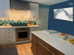
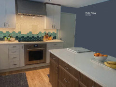
    As I was mocking them up, I thought they looked so close that I chose to show you just the one to give you the idea of a dark teal.


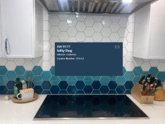
    Actually the first color I picked to try last night was SW Salty Dog. I thought it matched pretty well with the bottom tile.

    But then thought, is it too matchy-matchy?


    I did not know if the reason I didn’t like it on the wall in the photo was due to the yellowish lighting in the photo. Sorry had to add the fishies!


    BM Hale Navy

    I would give it a shot since a couple Pros recommended it. I do trust Jan and Beth. Hey, it does match your throw rug.


    Isn’t picking paint the craziest thing! I see colors on line or in the store on a swatch I like. Then once in my house’s lighting, the ones I thought would be perfect are just the opposite. The ones I thougt were to bright look drab, and vice versa. I feel your pain!

    My thoughts on the two lighter blue-green colors is that you will need to try a whole bunch of those colors to find the perfect one in your lighting. I find them almost as tough as choising the perfect white! Some look too baby blue, some too dingy drab grey-green.

    I had to test out so many blue-green-grey colors before I finally found SW Sea Salt was the sweet spot for our home.

    If you want me too, I am happy to do mock ups for you in whatever color you want to see. The photos taken under the range are great to see against the tile, but they don’t work when I try and bring it over on the other walls. So you would need to take a photo of the sample color taped on the wall behind the island.

    Be patient and you will know when you find ”the one”!

  • 3 years ago

    Thanks rebunky! Agree, picking paint is maddening. Nothing ever looks the same from room to room. And the spot above the range is the worst lighting/shadow combo in the room, but also the only open wall that shows the tile or that isn't covered in bright teal. I'm going to do one or two more rounds of Samplize orders, and then I'm just going to go for it with a color on the large wall. If it looks horrible there, it will be easy to repaint that wall.


    That fish art is pretty cool. Do you have a link?

  • 3 years ago

    No, I just saw this picture and thought it looked good with the dark teal wall. Plus since you are from Seattle I thought the fish theme kinda fit.

    Google ”norman wyatt jr goldfish art”

  • 3 years ago

    Thanks! Both my girls love sea life.

  • 3 years ago

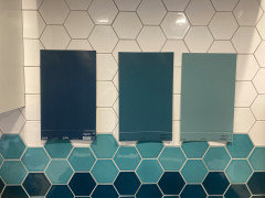
    Thanks again to everyone for the color suggestions, especially Beth H. Here are the current front runners. It's still a committee decision, so instead of asking which one is best, I'm asking if any of these three is definitely wrong (and if so, why). Left to right, It's Rainstorm, Deep Sea Dive, and Peacock Plume. Still grateful for all input!


  • 3 years ago
    last modified: 3 years ago

    See if you can get a Coronado color deck from your Benny Moore dealer. Coronado has the best white/off white selection of any paint company. Since they are owned by BM and they can mix any Coranado color in BM paint base. (hint use Aura in a kitchen)

  • 3 years ago

    I like the left or the right.

  • 3 years ago

    Well I think you can guess which one I like! 😉

  • 3 years ago

    Thanks Beth and rebunky! Sherry, appreciate the rec, and if circumstances push us back to off-white, I'll look at that. Right now the advice I'm getting is to stay clear of whites.

  • PRO
    3 years ago

    Take one of your dark blue tiles to the paint store they will match it! Than no guessing game.

  • PRO
    3 years ago

    But I would paint walls to match cabinets..love the crisp fresh bright room you have…why make it dark? Something to think about. Than add some fun bright colorful art on that side wall.

  • 3 years ago

    Cabinets are roughly BM OC-151. In a north room with no direct light, isn't that going to be pretty cold and gray as a whole-room color?

  • PRO
    3 years ago

    🤗

  • PRO
    3 years ago

    For fun you could paint your door a color…blue is a cold color it will be very cool if doing blue it is basically what you have now…add orange it really helps add warmth..and natural wood tones for frames for shelving.

  • 3 years ago

    Thanks. It didn't occur to me to get the dark-blue tile color matched. That's a great idea if we go for dark blue walls. DH has been rejecting all colors (except the one on the wall) for not matching the tile, so he would probably go for that plan.

  • 3 years ago
    last modified: 3 years ago

    I think the SW Rainstorm is such a pretty color and why I chose it to mock up earlier. It certainly looks to be a good match to the bottom tile on my screen. Does it look that way in real life?

    Remind hubby the paint will not be right up against the darkest tile, so it just needs to be close enough to fool him when on the walls.

    It does not have to be an exact color match to the tile by the paint store. I was wondering if that might actually end up looking too bright, too royal blue, too light, too dark, or too whatever once it goes on the walls if as they try and match it somehow picks up the shininess of the glass tile? I have no clue if that is how it work though. Of course you can always give it a try in a quart size if you want.

    If you want to tape the samples up on the right hand wall behind the island and post the photo, I can mock them up for you and your husband to see each on the walls.

    I am not loving the idea of painting the walls the same cabinet white and doing the darker blue or teal color on that one door. But that print HIWE posted with the orange flower looks nice next to your bowl of oranges!

    I don’t know how you feel, but the reason I don’t love the idea might be because the door is just a plain ole flat door style with nothing special I would want to draw attention to.

    Plus, if you have all your other interior doors white and especially if any are within sight, I would want them all to be the same white color so it is a nice cohesive look.

  • 3 years ago

    Rainstorm is pretty great. It is a little more blue than the tile, but definitely the closest thing I've found. I wish for a slightly grayer, more subdued color, which is why I like the Deep Sea Dive. But I can see how the Rainstorm is a better fit.


    I agree, I would not paint the door teal, even if we do paint the walls white. There are 3 doors in the room. Painting only one teal would be strange, painting all three teal would look Dr. Seuss. Agree too that HIWE's print is great! But getting the wall color is the first step. Art is something to decide on once the larger elements are in place. Super appreciate the kind offer for mockups! We've got Photoshop though, and DH has already offered to do some mockups.

  • PRO
    3 years ago

    Oh my the kitchen has three doors! Thought it was open and it only had the one door…bright painted flat doors are very mid century modern that is why I suggested it….I still would suggest white walls bright art and warm wood accents..that backsplash is the focal point.

  • 3 years ago

    @Home Interiors with Ease I like the idea of white walls. In your experience, how well does OC-151 work in a room with low natural light? All the advice I can find online warns against white in dark rooms.

  • PRO
    3 years ago

    With a LRV of almost 84 it is a nice classic reflective white that works in all exposures..no worries with this white…most kitchen have the strongest light as in light bulb wattage or Lumens…Make sure to have all daylight bulbs in your kitchen for true brightness..between 3000-4000 Lumens…I think it will look smashing!

  • PRO
    3 years ago

    🤗

  • PRO
    3 years ago

    Painting the walls OC-151 same colour as the cabinets was my original suggestions a few days ago...


  • 3 years ago

    Yes, lisedv, it is, and apologies. This thread has grown longer than my ability to keep track of it all. Maybe you have experience with this question then--would OC-151 really work in a north room in a gray climate? My inspiration picture is a Florida kitchen. As much as I love it, I have reservations about copying it directly for a totally different space. I've definitely seen a lot of sad dingy white spaces in other homes in the area.

  • PRO
    3 years ago

    I would do a woven wood Roman shade on the window that is similar to floors or island..

  • 3 years ago

    Oh, just seeing HIWE answer to the same question. Thank you! I'll sit down with the spouse this weekend to decide between the cabinet white, a dark blue, or the grayed-out teal.

Sponsored
Kuhns Contracting, Inc.
Average rating: 5 out of 5 stars26 Reviews
Central Ohio's Trusted Home Remodeler Specializing in Kitchens & Baths