

Alabaster trim regret?
3 years ago
Sort by:Oldest
Comments (5)

Related Stories
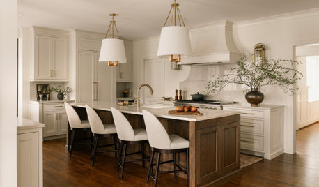
REMODELING GUIDES10 Biggest Remodeling Regrets and How to Avoid Them
We’ve asked a panel of experts to reveal the most common renovating mistakes — and how to steer clear of them
Full Story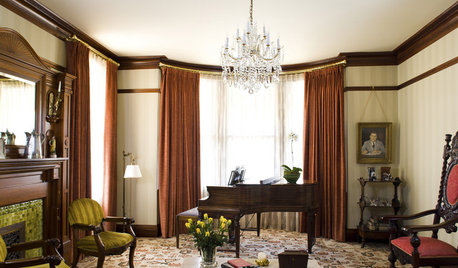
GREAT HOME PROJECTSHow to Bring Out Your Home’s Character With Trim
New project for a new year: Add moldings and baseboards to enhance architectural style and create visual interest
Full Story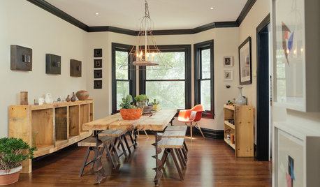
TRIMWhat Color Should You Paint Your Trim?
Learn the benefits of painting your trim white, black, neutral, a bold color and more
Full Story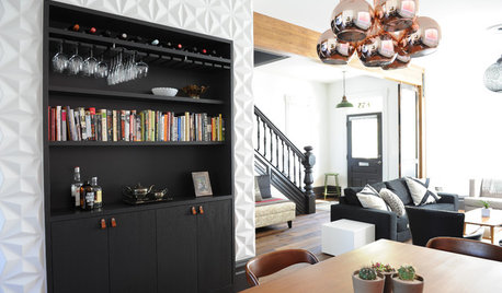
HOUZZ TOURSHouzz Tour: Black Cabinets, Trim and Doors Wow in This Victorian
A century-old home in Canada gets new life with a black-and-white color scheme and midcentury furnishings
Full Story
DECORATING GUIDES7 Ways to Paint Your Trim Fantastic, From Classic to Fearless
Give your rooms an edge with a trim treatment that shows attention to detail
Full Story
DECORATING GUIDES8 Reasons to Blur the Trim Lines
See what happens when you let your wall color cover doors and moldings too
Full Story
REMODELING GUIDESOriginal Home Details: What to Keep, What to Cast Off
Renovate an older home without regrets with this insight on the details worth preserving
Full Story
HOLIDAYSChristmas Tree Decorating the Painless Way
Holidays are for carols, not cussing. Make tree trimming less work and more fun with this guide at your side
Full Story
DECORATING GUIDESThe Case for the Anti-Accent Wall
Go ahead, paint everything the same color (even the trim)
Full Story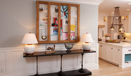
DECORATING GUIDESEdit Keepsakes With Confidence — What to Let Go and What to Keep
If mementos are weighing you down more than bringing you joy, here's how to lighten your load with no regrets
Full Story
chispa
Mary Elizabeth
Related Professionals
Wheeling Interior Designers & Decorators · Greenville Bathroom Remodelers · Clarksville Bathroom Remodelers · Bakersfield Bathroom Remodelers · Savannah Kitchen & Bathroom Designers · Mankato Kitchen & Bathroom Designers · Bismarck Kitchen & Bathroom Designers · Anniston Design-Build Firms · Napa Home Builders · Grand Junction Home Builders · Florence Interior Designers & Decorators · Meridian Architects & Building Designers · Altoona Architects & Building Designers · Orange County Architects & Building Designers · Sanford Kitchen & Bathroom DesignersAngela Zuill
Jennifer Hogan
Melissa LogueOriginal Author