Software
Houzz Logo Print
hali_gloeggler

BM Paint experts- please help!

3 years ago

I’m remodeling my den. My house has a very open floor plan and I have edgecomb gray throughout. I was hoping to go with a deeper color that coordinates with edgecomb. All signs point to revere pewter, but with the lower celiling and lighting it looks muddy in my den. Any suggestions??? I’m considering Collingwood, nimbus, balboa mist and rodeo too but they seem so close to edgecomb that I don’t think I’ll notice any difference. I’d appreciate any input! Tia!
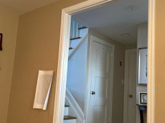
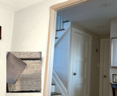
Photo is taken from den looking into hallway.

Comments (38)

  • 3 years ago
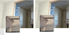
    Heres the pic. Hallway is edgecomb. Current den color is awful (Fairway oaks).

  • 3 years ago

    Will you be painting your ceilings white or the same color as your ceilings in the hallway?


    Are you looking for a warmer undertone? What furniture and other elements are or will be in your den? Do you have much natural light? Which direction does the room face? Do you use lamps? I love lots of lamp light btw. All of these things help in deciding on a color for your space.


    It is never easy to find the right color straight away. I love your Edgecomb Gray in the hallway!

  • 3 years ago

    Jennifer, that is interesting that you said that. I see and have read that Edgemcomb has a subtle soft green undertone. I am not seeing any pink or taupe in it.

  • 3 years ago

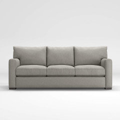
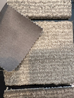
    Great advice, Jennifer Hogan! Thank you. Do you think those colors would be dark with carpet and couch (swatch) below? Don’t mind the odd shading - colors look weird on screen but you can get an idea of the depth of the color.

  • 3 years ago
    last modified: 3 years ago

    @amykath, Agree, assuming the natural light and Edgecomb Gray do have a green undertone.

    @Hbg28, suggesting trying a coordinate to Edgecomb instead. Take a look a gray, which shows blue. In the CSP fan: B.M. Subway Tile. My open plan is Revere Pewter, but my kitchen, is Subway Tile. Lovely...and the natural light is coming from the south.


  • 3 years ago

    This is goin log to be carpet and couch (swatch). It’s Douglas nickel from crate and barrel.

  • 3 years ago

    Jennifers picks with your carpet and upholstery would look great! they all have a taupe look to them. I‘ve never seen green in our edgecomb gray walls but in Revere Pewter yes.

  • 3 years ago

    Maybe I am going in a different direction here, but I would also considet cecking out samples of Gray Owl and Sea Haze. I say to just check bc obviously they can look different in various spaces. Just thought I would throw that out there... as it might be a nice bit of contrast between all of the beige.


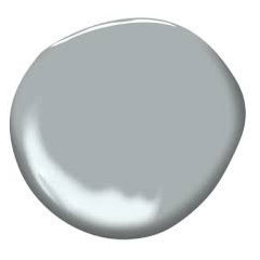
    This is Gray owl


    Sea Haze


  • 3 years ago

    Well my original thought was something with blueish undertones like stonington or silver chain (which I really love) but I’m not sure it works with carpet and sofa colors?

  • 3 years ago

    Hgb, I would lean towards a gray green rather than a gray blue. I think the greener tone would work more nicely with your fabric choices and the adjacent room.


    I think your best bet is to go and grab samples and put then on large white poster boards or something of that nature and put them on each wall. Add some lamps and whatever lighting you would use and watch how they change throughout the day. Aslo, the direction your room is facing and the natural light of that direction will make a color look very different than what you might see in another space or home.


    I had SW Sea Salt in a former home and I loved it. It was light and airy but did not feel cold like a gray or gray blue.

  • 3 years ago
    last modified: 3 years ago

    I think the other elements in the room will help you decide on the wall color. You are right in that the colors you have for the carpet and sofa are needing somethint like a lighter warm color.

    What other colors will be in the room? Do you like reds, blues, or are you a more neutral lover?

    Do you have any inspitation pics? That always helps me in designing a space. It just helps me see what it is I like about the space.


    I bought a total fixer upper and I added color in my rug and pillows/art etc. I mixed the paint on the walls myself but I wish I could find it again. I loved it and went with so many things! I really wish I had a before photo!


  • 3 years ago

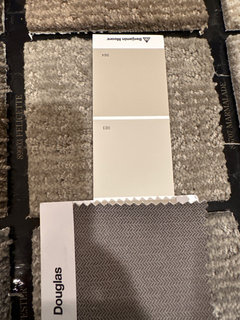
    I actually went and got swatches of Smokey taupe and stone hearth and kind of liking them! They’re def warmer than some of the others. I need to grab some sample cans though. I just need to make sure they’re not too dark for carpet and couch and don’t have too much pink undertone.

  • 3 years ago

    Those look great! I am not sure how they will look on your walls but they go so nicely with your choices for carpet and upholstery. I love the lighter one in this photo.


    Looking forward to seeing the samples on your walls!

  • 3 years ago

    Sorry - I work full time and have been too busy to come back to Houzz to reply.


    First of all I would like to build your confidence in your ability to pick colors and give you some pointers that I have gained over my 61 years of life.


    You have been picking clothes and makeup for years. You have become an expert on what looks good on you and you know when you go shopping with friends that what they pick out for you is usually what looks good on them and not necessarily what looks good on you.


    I went to cosmetology school way back in the 1970s, I only worked in a beauty shop for about a year before deciding to go to college and taking a different career path, but the knowledge I gained on skin tones and makeup and hair color stuck.


    By the time we own our first home most of us have figured out "our colors". Your closet is filled with the colors that make you feel like a 10 and that one sweater or dress that you picked up that makes you look washed out or dead sits in the back of the closet with the tag still attached.


    Decorating our homes is a lifetime journey. We will move from one home to another and get new furnishings, buy new bedding and towels, shower curtains and area rugs.


    We hone our choices over the years, first picking out the trend colors and slowly learning which of those (they change every 10 years or so) we really loved.


    If you start with the colors that make you feel like a 10 you can avoid a lot of mistakes and avoid changing colors every 10 years.


    Think about your closet and the colors that you wear all the time. Look through your house, what décor items have you picked that just make your heart sing? (Vases, art, statues, bedspreads?) I can usually walk through someone's home and pick out what their favorite colors are in a couple of minutes.


    Can you guess my favorite colors based on the things I own


    My current purse


    My last load of laundry

    Some of my favorite décor items


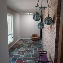
    Is it suprising that I fell in love with a home that was a pink brick home with deep red accents or that I loved the foyer with the purple, red and green slate flooring?


  • PRO
    3 years ago

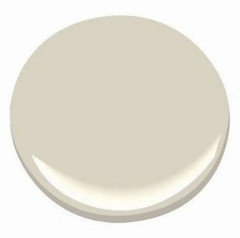
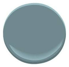
    I agree that Edgecomb Gray and Balboa Mist are a little too close. I'd go with a complementary color instead. A gray/blue might be nice. Benjamin Moore suggests Bootbay Gray as a complementary color:


    Or possible Benjamin Moore Blue Echo:


  • 3 years ago

    I happen to have 2 sisters and 2 sister in laws that each have very different coloring.


    I have ivory skin with a bit of pink and dark hair with a fair amount of red highlights. I look good in wine reds, purples and teal greens. I can wear black or gray or taupe, but no tans or yellow beige or green beige. Taupe is the best neutral for me.


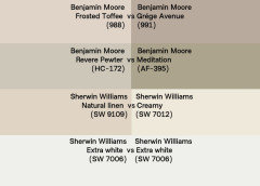
    My neutral wall colors are BM Frosted Toffee and Grege Avenue.


    My one sister is a fall - she has medium golden brown hair and brown eyes and olive toned skin. She looks amazing in anything green from emerald greens to the khaki greens, but can only wear more orange reds. Susie's best neutrals are the muted greige colors, olive greens, khaki, gray greens and can wear some tans. My clothing makes her look green.


    Her neutral wall colors are BM Revere Pewter and Meditation


    My other sister is a bit fairer than Susie, dirty blond hair, hazel eyes and fair skin. She looks good in beige and blues and greens, but nothing too strong. Her colors need to be softer, more muted. She can't wear black or gray. Her best neutral is a beige. My colors wash her out.


    Her neutral wall color is SW Natural Linen


    Neither of their palettes work well with my coloring, I look pink next to all the softer blues and greens. I can wear strong, clear blues and greens.


    Both of my sister in laws are blonds. One has golden blond hair ang bright blue eyes and that skin that turns golden brown as soon as she steps outside in the spring. She looks wonderful in cornflower blues and peach. Her best neutral is cream.


    Her Neutral Wall Color is SW Creamy


    The other has almost white blond hair and the lightest of gray blue eyes. She wears mostly whites and light blue grays. The smallest amount of color washes her out.


    Her home is white - specifically, SW Extra White.


  • 3 years ago

    Each of us has a wall color that works well with the things we own and wear and although we are all too old now to really feel like a 10, we are surrounded by colors that at one time made us feel like a 10 and our rooms don't clash with our skin tone or clothing.


    If we start with the colors we love and build a color palette based on those colors we end up feeling happy in our homes.

  • 3 years ago

    Wall colors and flooring are the two largest colors in our home and should become the backdrop for all the colors we love and have in our accessories.


    If we start our journey through the decades of home decorating keeping this in mind and pick neutrals that work beautifully as the backdrop for all the other things we own we start on a focused journey much faster and don't re-do near as many times and end up with a much more cohesive look than when we decorate one room at a time without an end goal in mind.


    You will have challenges along the way. When you buy a home that has things you can't afford to change (Flooring, countertops, cabinets) you have to start with those colors and work with the things you cannot change. But there is usually a way to make it all work together. Your colors may work best with Taupe, but also work well with a gray or work best with a cream but work well with either a beige or a gray.


  • 3 years ago

    We also have to keep in mind that the colors we pick are influenced by the lighting in our homes and the colors that are in the room. Edgecomb gray can appear green or pink if it is surrounded by the opposite color - lots of pink makes it look greener, lots of greens make it look pinker.

    You have to look at the colors together to know for sure what they will look like together.


    How many times have you gone shopping and picked out the perfect shirt to go with a pair of shorts that you have at home only to get it home and look at the two together and find that they are off just enough to make you feel a bit sick to the stomach. That perfect peach now looks more like salmon than peach, that white looks really gray or yellow next to the other white.

  • 3 years ago

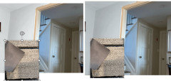
    These dollups are all edgecomb gray, buy looking at the same color with different backgrounds make us think we are seeing different colors.


  • PRO
    3 years ago
    last modified: 3 years ago

    And yes! Please do not go for 50 shades of beige. I like Sabrina's suggestion to go with compliment colors instead.

    https://www.benjaminmoore.com/en-us/paint-colors/color/hc-173/edgecomb-gray

  • 3 years ago

    Here are a couple of gray greens and gray blues to see with your rug and upholstery.


    My personal fave is this creamy color. You could go in any direction with it.


  • 3 years ago

    I think you are fine to do two neutral wall colors, one lighter and one darker but same family or to do a color. I wouldn't do a blue gray or green gray or with edgecomb. Two neutrals can be mixed but it is much harder to pull off well than keeping to one neutral family..


  • 3 years ago

    Thank you for all the great advice and pics. It looks like the ones that work the best with the carpet we’ll be getting as well as
    The lighting in the room are rodeo and nimbus. Both are light-medium warmish greiges. I probably won’t notice much of a difference against the edgecomb but when I tried darker- like revere pewter it just looked muddy in my lighting. I liked Smokey taupe but my husband hated it.

  • 3 years ago

    Nimbus has the slightest leaning toward taupe and will work much better with your sofa than rodeo, which has slight green undertones.


  • 3 years ago

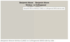
    Collingwood may be another one to test, more beige than nimbus, but less beige than edgecomb.


  • 3 years ago

    Yes Collingwood has always been in the running too. I think rodeo is in the lead right now. I do like Collingwood and nimbus too.

  • 3 years ago

    Rodeo looks nice. Does it read gray in your space?

  • 3 years ago

    Sometimes a see a warm gray undertone. It’s very greige in the room. I can see more gray when I look at next to the edgecomb which is right out in the hallway. That has more of a beige/yellowish base to it. This is one of my concerns. They are both warm greiges but with different undertones. I am concerned that they won’t look good!

  • 3 years ago
    last modified: 3 years ago

    I wonder if you should just use the Edgecomb in that room as well. Have you considered it? It may look a bit different if your room vs. the hallway, enough so that you might really like it. At the same time, it seems like a safe bet.


    I also think maybe you could use a soft creamy color. I think if you try to paint it any color that is close to edgecomb gray, you might find you do not like how they work together. Just a idea.

  • PRO
    3 years ago

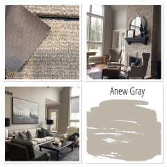
    for your space I would suggest SW Anew Grey…I have it throughout my entire home…it blends well with beige, taupe and grey. Here is a sample and photos of it in my home.

  • 3 years ago

    Why not just paint the den Edgecomb Gray. Your original ask was for something darker, but the colors you are looking at now are not darker than Edgecomb Gray. LRV of Edgecomb is 63, Rodeo is 60 and Collingwood is 61.


    When mixing neutrals, using a light and a dark color is going to be viewed as an intentional color change. If you pick two contrasting neutrals like cream and blue gray it looks intentional.

    When you have two that are very similar and doesn't clearly look like an intentional color change it may just look like you tried to get something to match and missed.


  • 3 years ago

    Well put Jennifer.

  • 3 years ago

    Jennifer, you’re right I originally wanted something with more depth. I tried revere pewter and Smokey taupe but they looked too drab and muddy in this room. Then I thought I’d do something lighter with a different undertone like balboa mist or nimbus. They have a blue/green undertone in the room when I look at the samples I painted. I do like it but not sure if the colors would work with my couch and carpet. I think I’m going to have to wait till everything is delivered and then decide.
    Nimbus is the top sample. Balboa is on th

  • 3 years ago

    My painter only uses Benjamin Moore.

  • 3 years ago

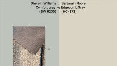
    From the sofa swatch I would either stick with the Edgecomb or go to a true blue/green neutral, not another taupe or greige, but something like SW Comfort Gray. The blue greens with taupe are gorgeous.


  • 3 years ago