Software
Houzz Logo Print
john_donodeo

Kitchen backsplash - leave alone or...?

3 years ago
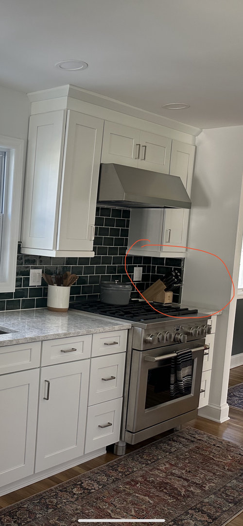
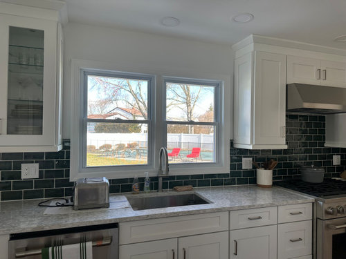
We did our kitchen last year, and absolutely love it and all of the choices we made. We are particularly fond of the dark emerald green crackled tile we chose as the backsplash (white cabinets and medium brown hardwood floors).


However, we were pondering two "mini dilemmas":


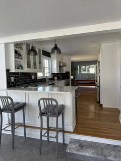
1. Take backsplash all the way up that wall over window - this was the original plan (we still have extra tiles), but we felt the tiles were pretty dark, and even in broad daylight (as in the pics), we felt it would make the area over the window feel heavy. Most of our family and friends agreed, and we will likely leave this alone.


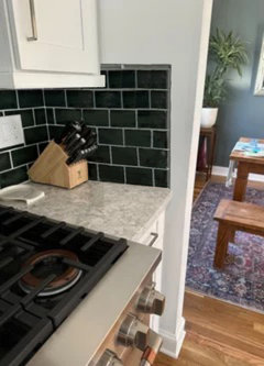
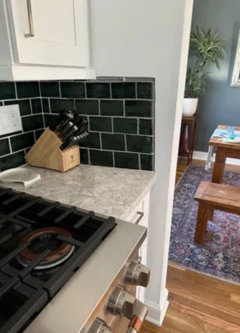
2. At the edge past the range where the corner turns (circled in red), we originally wrapped it to the cabinet, as we felt that it has a "cleaner" look. But, now we're thinking we should have wrapped it to the counter top, or not wrap it at all. We are considering taking it all the way to edge of countertop there, as it would be a pretty easy thing to do (just need to cover the countertops and stove top over there).


Again, we absolutely love how the kitchen came out and might possibly not touch a thing, but curious to get some thoughts.


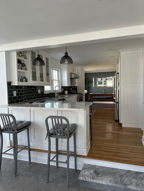
Off topic: Since others will likely comment (even though we're not asking about this), the sunken sunroom has different flooring than kitchen/rest of the house (it has porcelain tiles) because we have a pool, and there's a powder room there that gets a lot of heavy traffic from the pool when we entertain. Makes a lot more sense/looks great in person.


Thanks!


Comments (34)

  • 3 years ago

    I would just leave it.

    John thanked RL Relocation LLC
  • 3 years ago

    Leave it as is, looks great.

    John thanked millworkman
  • 3 years ago

    John, Beautiful space & finishes. My votes on your ”mini dilemmas” -

    #1 Agree, don’t tile around window. Though it would likely look nice, agree that it would be a bit heavy. Looking into the kitchen from your 3rd picture view, the eye flows through the entire space with the upper view all the same light color. With tile around window, the eye would stop at window.

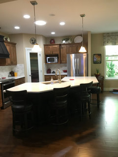
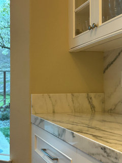
    #2 I’d continue the BS to line up with edge of base cabinet. BS is meant to protect wall & with that counter space next to cooktop relatively narrow, the side wall could use protecting. I had same decsion so continued BS to line up with base cab under the counter, not counter edge. A cleaner line. See my pic. I did same thing for the other counter with a wall edge.

    Clever of you to anticipate off topic input on the sunroom flooring. My off topic comment is that it looks gorgeous! The step & floor finish melds very well with the kitchen finishes. Love it!


    John thanked KW PNW Z8
  • 3 years ago

    It seems unfinished because there are no drapery/blinds on the window. Maybe pull out a warm colour from your rug then it will all feel more DONE. Leave the tile it looks great and adding to it will do nothing for the room but adding some colour to bring the warm tones of the flooring into the top of the kitchen-re:a drapery/roman blind pattern-will certainly finish it off nicely.

    John thanked Lorraine Leroux
  • 3 years ago
    last modified: 3 years ago

    Thanks for the comments! Definitely won't be tiling around the windows, and I'm glad we trust our gut on that one.

    For that other corner, we copied what our neighbor did, but then sorta regretted it. As KW said, backsplash is meant to protect the wall, and the countertop there is pretty narrow.

    The only slightly annoying thing is that we'd have to do a small cut of the light rail there so the tile that hits the bottom of that cab would fit properly. But I'm sure it can be done. And only the bullnose tiles and a few of the ones that were half tiles would have to come off (like 2 or 3).

    My GC is finishing my basement for me in spring, he did the kitchcen. I'll ask him his thoughts of how hard it would be, but I'm sure it won't be a big deal if we decide to do it.

    KW - your kitchen looks incredible! Jealous of your larger island. We could really only do a peninsula, but we did seating on both sides (even though everyone said not to, we love it) to sorta make up for it.

  • 3 years ago

    Thanks Lorraine - we agree, we're either gonna do a custom sign over the window (nothing cheezy lol) or more likely, drapery. Love the idea of a medium brown drapery to tie in with the floors. I think that's our answer :)

  • 3 years ago

    Nice job! I would continue the backsplash to the right of the range, it looks a little unfinished there.

    Perhaps a different color, but I would add a roman shade to the window.


    John thanked Kelly Jones
  • 3 years ago

    The backsplash is fine.

    The window needs some love. An interesting Roman shade in a pattern might help.

    John thanked RedRyder
  • 3 years ago

    John, Thanks for comment on our island. We love it too! Took us awhile to decide to create it because our house was still relatively new so didn’t need updating. It was a 2 level that we had cut to all counter height with no change to footprint of base cabs. It’s a bit over 10’ from outside end to end. Really opened up space of smaller kitchen & massively improved amount of working counter space with the flat counter. Best of all, we were able to have a seamless island top using a single slab of Cambria’s jumbo size for it. A tight fit due to the angled shape. We do love it though. Jealous of my island? You have a basement!! I’m jealous! 😁

    John thanked KW PNW Z8
  • 3 years ago

    The purpose of a backsplash is to protect the surface of the wall. Unless you experience a lot of grease and spaghetti sauce splatter on the wall adjacent to the stove, I’d leave it alone.

    John thanked flopsycat1
  • 3 years ago

    Came here to say add an outside mount Roman shade over window, and I think you are done. I would not modify the backsplash at all.

    John thanked User
  • 3 years ago
    last modified: 3 years ago

    Definitely doing a roman shade, likely in medium brown, over the window.

    Consensus seems to be split as far as the backsplash in that corner. I'll ask my guy how hard it would be to do, since I already have the materials needed. But could also be fine to leave it alone.

    Thanks all!

  • 3 years ago

    #1 Don’t tile around window. However, patterned Roman Shades would look nice!

    #2 I’d continue the tiles to line up with edge of countertop, to protect the wall from stovetop messes.

    John thanked Sammie J
  • 3 years ago

    John,

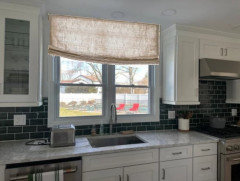
    I edited to add a mockup of the woven shade to match the floor idea and it looks nice too!

  • 3 years ago
    last modified: 3 years ago

    Thank you rebunky for the mockups! Really appreciate them!

    It might be something that you only really "get" in person, but these tiles are pretty dark and can almost look black at times lol. Don't get me wrong, we LOVE them, they are incredible, but...we felt that using a dark color above the kitchen window would make it feel heavy. We had originally planned to take them all the way up there, but once we saw them going up in person, our gut was to right away only go up to meet the cabs/range hood. Pretty much everyone we asked agreed. Also, if I go all the way up the window wall, wouldn't I then need to also do the same in the small strip by the sunroom (near island) and also on the wall where they wrap by the stove?

    For the shades, I'm only thinking a medium/light-ish brown. I get what you mean about them also making that area look heavy, but I dont think it would be nearly as heavy as the tiles.

    I think the issue is, we have a good amount of upper cabinets on the window/sink wall, and if we maybe made that window larger/fewer upper cabs, then maybe the tiles all the up would have worked. That's part of why we did lit-up glass front cabs on the left of the window to add some dimension (the fridge wall opposite this wall isn't pictured, and its solid cabs pretty much and wall oven).

    I definitely do like the way it looks to wrap them at the edge near the stove, that we'll fairly likely do. And in these pics, it actually doesn't look bad all the way up the wall. But even though it looks good in the pics, I worry it may "feel" different in person, if that makes sense.

    Again, thanks for the mockups, they are super helpful!

  • 3 years ago
    last modified: 3 years ago

    Yes, continue the back splash to the end of the counter by the stove.

    I vote yes to the tile going up and around windows. Right now it looks unfinished. The dark green doesn't both me. It think it will continue to highlight the cabinets and the window trim.

    Great job on the house. It looks like a professional decorating job.

    John thanked elcieg
  • 3 years ago
    last modified: 3 years ago

    Thanks again rebunky. Can you please do a mockup to edge of counter with this pic too? lol this is likely the only change we're going to make. I'd imagine the backsplash would end about 2 inches above the light rail that hits the wall there (if that makes sense). Bullnose tiles of course to "define" the edges.

    I can see how in theory the tiles all the way up by windows look nice, but in person, even in broad daylight (we rarely use the overhead lights, just the undercab lights at night mainly), those tiles are dark and just feel heavier in person than maybe they do in pictures.

    elcieg - thank you! We did work with someone who really should be a professional designer hehe


  • 3 years ago

    I personally don’t wrap tile to a perpendicular wall that is not above the back of the counter . I don’t like how the tile ends no matter which way it’s done . If the wall get dirty I clean it or touch up . Is that a marble counter ? Looks great …

  • 3 years ago

    I think your gut is telling you to tile around the edge and above the window! It will look great. Go for it.

  • 3 years ago

    Those 3x6 tiles are not that heavy and the area is small. If you really want to decide, purchase some thick clear tape and carefully tape them to the wall. The tape would be on the outside to connect the tiles together, but it will help give you a visual.

  • 3 years ago

    Oh man this looks pretty wonky!

    I wasn’t sure what you meant by 2” above the light rail. Did you mean adding one more full tile and then the rounded edge piece, sort of like this?

    Here is just with the edge piece for comparison.


  • 3 years ago

    That rebunkey! I actually meant the first version, that's what I will do. I like the way this looks a lot!


    I'm still not entirely sure about tiles all the way up by the window. It looks great in the pics with the mockups that you did, but that's during the day when I'm getting full sunlight in there. On a cloudy day or when the sun isn't directly overhead, I feel it will be heavier in person than the pics show. But I'm willing to consider it.


    Question though - let's say I do decide to go all the way up that wall. I have two concerns:

    1. We will likely have to pry off the left and right trim pieces at the window, because the other tiles were done before the trim and go under them. It just looks better. I just hope they can take off the trim as gently as possible without any damange to the decorative panels at the edge of the upper cabinets there.


    2. If I go all the way up at windows, that means the small strip at the sunroom (near open shelves) will get it too. But, how about the wall where you just mid the mockup so it goes to edge of countertops (near stove)? I'm guess no, since that's a "separate" wall. I feel it would look odd to go all the way up on that side wall (but definitely will bring the backsplash to the edge there as in the pics).


    Decisioins decisions. My gf now seems to want them all the up...d'oh lol

  • 3 years ago
    last modified: 3 years ago

    Nice job @rebunky! @John I think that additional BS will be great. My small adjustment is to line the front end edge up with the lower cabinet edge just under the counter. It leaves a cleaner & nicer finish to the front counter edge with absolutely no muddying up the counter edge. And, visually the result is only two ’ends’ which does make a difference when seeing that end of counter at any distance. The BS tile & lower cabinet line up as one & the counter is the second. BTW, I only knew to specify this BS edge end deal bc of my extremely detail oriented engineer B-i-l who made the observation while sitting at my island & looking at the newly installed counters & soon to be installed BS.


    ETA: Just saw your latest. I’ll vote again on tile - if you go all up around window, IMO you don’t need to duplicate all up at both ends too. The window is a stand alone highlighted piece. But, if you do window AND by sunroom, then you should do the wrapped end by stove too. So, do 1 space or all 3 but not 2.

  • 3 years ago

    If you did tile above the window, you don’t need to tile the part under the beam just because it technically is the same wall.

    I actually feel like leaving the strip of wall above the existing tile by the peninsula would balance out the back wall. It would be perfectly matched in that the tile on each end goes up passed the light rail 2” or so. It would look intentional in my opinion.

    But I understand what you are saying and if you think it would be too dark in real life then trust your gut as they say. Sorry, I am of no help on the trim issue you described.


    John thanked rebunky
  • 3 years ago

    I would do two INSIDE MOUNT window coverings. I think it would look less heavy than one outside mount.

  • 3 years ago

    Thank you all for the opinions and options! We have some thinking to do.


    I just hope the grout of any new backsplash we do doesnt look too different, since this is already 7 months old! lol we sealed it 2 coats and keep it clean, should be fine.

  • 3 years ago

    Handsome kitchen. Well done. I'd like to see the wall above the window tiled. It feels more striking and elevated than adding a brown tone blind. The blind idea is perfectly fine but it does have a kind of matchy-match feel that seems a bit more common. The rest of your kitchen feels Architectural Digest, swoon worthy. Don't bring it down to a mere mortal level.


    If you do a blind, I would get one that is a hard woven surface. Your window is close to the range and I can imagine being able to wipe the blind would be better than dealing with fabric that close to cooking grease.

  • 3 years ago

    I’m not a pro but something in brown on the window doesn’t seem to work with your sleek kitchen. Although woven can be more readily wiped off, I think you need to stick with the color scheme you have. The blackish-green tiles are the main event and a brown anything works against that.

  • 3 years ago

    Tile should not extend past the cab in the corner. Honestly, it should not have been extended to the side wall at all and just been done on the back wall, but it's not so odd that I would remove it. However, extending it past the cab to the end of the counter will look odd.

  • 3 years ago

    We did ours.


  • 3 years ago

    Tile is great just as it is. I think adding more would demote it from being a pretty feature to a mere background.

  • 3 years ago

    We have decided to take the tiles all the way up. We got more tiles and grout. Hope to do it soon. Will send pics of final product!

  • PRO
    3 years ago

    IMHO leave the backsplash as is. I like the transition from tile to gyp. board. Also if you surround your windows over the sink with tile they are going to stand out more. As it is, the windows are nice but the view outside takes center stage.