Software
Houzz Logo Print
rhonda_hurwitz

HELP: Open floor plan paint color?

3 years ago
last modified: 3 years ago
Hi Houzz color mavens,

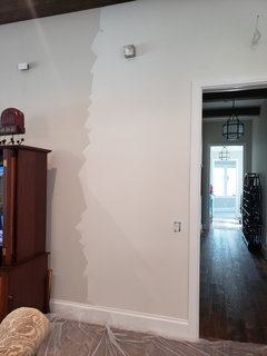
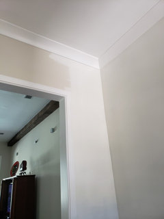
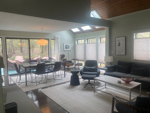
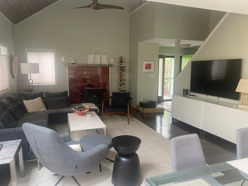
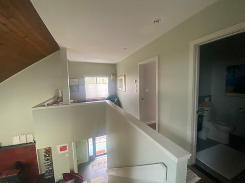
I need your help narrowing down to a color that will work across living room/dining area, kitchen, and connected hallways (pictured below).

Living/dining area has bright natural light/southwest exposure; kitchen is dark due to screened porch overhang/northeast exposure, interior hallways are darker too.

Interior elements to work around: dark wood floors and ceiling, medium taupe floor tile, cream window treatments and area rugs, white cabinets, almond countertops.

I've tried a few colors I don't like: bm sailcloth seems too yellow, bm calm seems a bit blue/violet, bm white dove may be too light. I'm looking to brighten the dark spaces and add warmth and depth to the brighter ones.

Here's what I'm considering: bm wind's breath, dove wing, cloud cover, ballet white, seapearl ... and maybe classic gray.

I find that some colors (for instance ballet white or wind's breath) look good in brighter areas or during the brightest part of the day, but they look dingy on overcast days or in shadowed areas like my kitchen/hallways -- other colors (like white dove) work with my kitchen's white cabinets/almond countertop, but look washed out in the brighter living/dining area! Suggestions/thoughts? TIA


Comments (24)

  • 3 years ago

    Do you know what the current color is? It actually looks pretty good in the pictures. What don't you like about it? Have you sampled any of the colors you're considering? Paint a board or spare piece of drywall with primer, then two color coats so you correctly represent the end result. You can move a board from room to room to see the color under the different lighting conditions you're dealing with. I always paint a larger swatch on a wall when I think I've found the right color before buying a gallon (buy a quart in the same sheen you're planning on using), and I have changed my mind at this point. Seeing the color on a large area is informative. Sometimes I hit the right color on the first try, other times it takes more attempts. When you're trying to find a color for a large area with light coming from different directions it is difficult. The easiest thing would be to paint everything in White Dove (including the trim) and then add some colorful art and accents. Just make sure it doesn't clash with the white cabinets you have. Also look at Swiss Coffee, another popular BM white.

  • 3 years ago
    last modified: 3 years ago
    Thanks for the feedback, @kandrewspa ...

    I have sampled many of these colors! Every time I move to a different corner or the daylight changes, it looks different! ...

    Re: current color, it's been this color since I moved in. Kind of a hospital green ... just not a color I would have ever chosen. I'm curious what you see to like about it ... maybe I am missing something?!

  • 3 years ago

    I would choose SW Alabaster, it will be a nice warm white in good light and a creamy white in less light.

    I think your green tone looks like a medical office.

  • 3 years ago

    In the pictures it looks gray-green to me - sometimes pictures don't do a color justice. It must look more green in person - probably in better light. What do you think about using a warm white?

  • 3 years ago
    last modified: 3 years ago
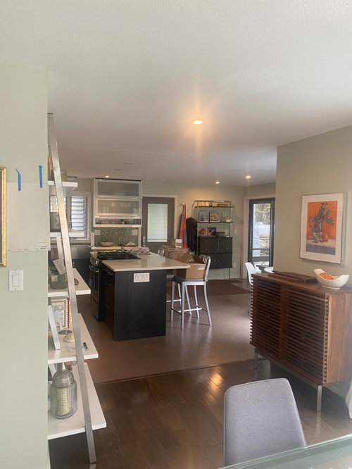
    Thanks @Lyn ... agree, green is like a hospital /medical office. I was also thinking about a warm white, do you happen to know the Benjamin Moore equivalent to SW Alabaster?

    @kandrewspa ... agree a warm white is the way to go. I've tried many and having difficulty choosing one. What to look for, how to know which one? looking at Wind's Breath, Dove Wing, Cloud Cover, but perhaps I should consider something with more depth?

    PS also wondering if it's better to do trim the same color or contrasting in a lighter shade of white?

  • 3 years ago

    I used Winds Breath on walls, similar concept with an open family room , entrance hall and up the stairs and Cloud White for the Wood trim. I really love it- a little darker than off white but very subtle and warm. Mine is a space with a lot of windows/light.

    Rhonda Hurwitz thanked akcohen65
  • 3 years ago
    last modified: 3 years ago
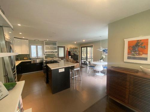
    @akcohen65 ...Thanks for your feedback on Winds Breath .... sounds lovely!

    Wondering how you decided to pair Winds Breath with that trim color? are they related colors? were you going for a smaller difference than a lighter white trim color would give? Trying to understand the thinking of picking a trim color once the wall color is determined.

    Also, what color did you paint your ceiling? If white, does it ever make the walls + trim look dingy/yellow? THANKS AGAIN!

  • 3 years ago

    I used Winds Breath in my house with an open floorplan and loved it. Such a nice color. We are currently renting and this place is painted in Light Pewter. I love this color also and it goes well with all our furniture. I would narrow it down to two colors, buy quarts of those paints, and paints and paint wall samples at different areas so you can see it in the different lights. It usually gets pretty clear which one you want once you do that.

  • 3 years ago
    last modified: 3 years ago
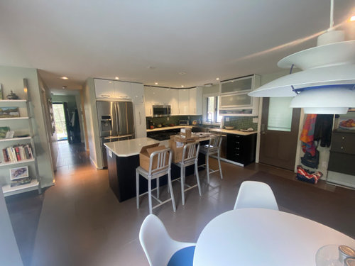
    Thanks @tresmamma ... I bought the 'samplize' color sheet of all these colors, but will do as suggested and paint several larger samples to see it in real life

    PS thinking back to your house with wind's breath, if you can remember, what did you use for trim/doors/ceiling?

  • 3 years ago

    I had a decorator that I hired for limited assistance, mostly to help with colors as I know how hard it is to select. She was the one who suggested Winds Breath with Cloud White for the trim. We actually have regular ceiling white but in hindsight, I would consider the cloud white for the ceiling as well. But I don't think the ceilings make the trim look dingy nor yellow. It looks creamy. When there is a lot of light/sunlight, you almost can't tell that it is off white. It just gives an impression that the space is not sterile (I am not a "clean white" house person- i.e. I prefer lots of wood and warmth). Agree with the other posting about painting larger samples and look at it at different times of the day. The thing about paint that amazes me is how it looks very different in the light and how much you need to match the undertones of a color, even a neutral one. Hence, the few hours of a decorator's time was money well spent!

  • 3 years ago
    last modified: 3 years ago
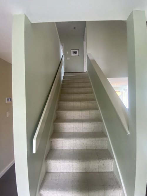
    @akcohen65, thank you again for sharing your experience ... it's amazing how the same color looks so different in different corners of the room and different times of day.

    My husband thinks I am overthinking this:-) ... but I really don't want to spend the $ and then regret decision after the fact.

    Maybe there is no 'perfect' neutral color, but it's a challenge figuring out the depth of color and coolness vs warmth that works best in your space!

  • 3 years ago
    last modified: 3 years ago
    With some of the cool colored elements you have, I would look at SW Snowbound, for both wall and trim.

    I used BM Winds Breath in my new house and repainted with BM White Dove after a couple of months. I found the Winds Breath too dark for the original look I had in mind.

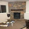
    Here is a photo showing both colors while repainting. All the trim and ceilings are BM Chantilly Lace.


    Rhonda Hurwitz thanked chispa
  • 3 years ago

    I have winds breath on walls with simply white trim. They look great together.

    Rhonda Hurwitz thanked Susan L
  • 3 years ago
    last modified: 3 years ago

    thank you both for sharing these pictures and your experiences.

    Where I've tried it, wind's breath looks beautiful and rich in the brighter areas, but looks a little too brown in the areas that get less light.

    Appreciate your comments!

  • 3 years ago

    Another warm off white is BM Dove Wing (a bit lighter than Winds Breath). I agree the challenge in your space is the various light neutrals (almond, taupe etc) that need to be balanced. Given the large amount of walls, you want to get it right for you. Would you consider hiring a decorator for 1-2 hours to come to your house and consult?

  • 3 years ago
    last modified: 3 years ago

    Actually, @akcohen65, I did that ... She suggested Sailcloth (which I feel is too yellow) ... and upon hearing that feedback, she suggested Wind's Breath (lovely at some times during the day, to brown others) or Calm(undertones too violet/blue IMO). On my own I have gone down the rabbit hole and by looking at Dove Wing, SeaPearl, cloud cover and various other warm off whites. it's been a bizarre few days trying to decide.

  • 3 years ago

    It took me a year to find a whole home neutral. I started out with a myriad of chips, whittled them down through the seasons. Then I painted my favorites on canvases and left them in each room so every day I could contemplate their potential.

    It's because every room has different lighting throughout the day if not throughout the season. It was going to cost me $5,500 for the walls, trim, ceilings and doors. I couldn't realize a color on a decision made in a couple weeks, it required a thorough, yet non-stressful, process. I made it an everyday exercise. It was very rewarding when the paint went up and I absolutely loved my choice.

    I had a Sherwin-Williams color consultant in but they weren't helpful. My choice came from a lengthy, yet thoughtful process.

  • 3 years ago
    last modified: 3 years ago

    Followup question to those who found 1 neutral paint color that works across several open living spaces/connected rooms: Did you find 1 great color that truly worked well everywhere, or did you make tradeoffs in particular spaces to make it work everywhere?

    I know that any color I pick is just a background and not the focal point of my space once it's on the wall, but in the color selection process it's hard not to try to optimize the decision everywhere, which seems impossible.

    Please share how you dealt with these tradeoffs if possible!

  • 3 years ago

    It isn't you, pink undertones can be really difficult. It looks to me as though you have subtle pink undertones in the carpets and window treatments, which is why the Winds Breath is working and why the Sail Cloth looked too yellow.

    But your kitchen floors are much more pink than your other more neutral neutrals.


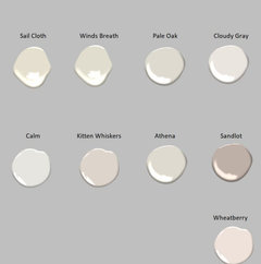
    Here are some colors I selected to compare to your kitchen along with several colors you have already looked at.


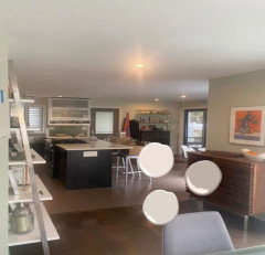
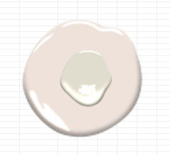
    The dollops below are wheatberry, Sandlot and Kitten Whiskers.


    This is winds breath over wheatberry.


    These muddier neutrals will look like mud on your walls next to the very pink taupe flooring.


    I know this because I lived this. I had pink undertones in my home 25 years ago when builders beige and white was all the rage and every beige I tried turned to mud. I had pink tile throughout the house, so I was able to pick a violet taupe and it worked. It was much darker than the colors you are looking for (at that time most people used darker colors - now everyone is going white or off white). I had poor experiences with color consults from interior designers. It seems they pick the same top 10 colors for everyone - whatever is trending is the perfect color for your home, regardless of the other colors that are already there.


    You may want to consider using two different color. I wouldn't try to mix two light neutrals. You could do a simple clean white everywhere or do a light neutral everywhere except the kitchen area and choose a blue gray or green gray or possibly a violet gray. Rule is the cool color has to be darker than the warm flooring color. I have tested it and found it to be true in my tests. (There are always exceptions to every rule). I would test something like SW Evergreen Fog. Sorry - don't have BM color that is close enough, but your BM store can usually color match greens pretty well.


    I would test SW Arcadia White - sorry no BM match (No BM cannot color match a white for you - whites are always off if you mix brands) and I would test a color that BM can mix for you as a custom mix called Devine Color Icing. It is in their computer system and is my absolute hands down favorite white. (SW can't get Icing right). I have never been a fan of White Dove - never feels really clean to me, too much green - but many others love it.


    Hope this helped.


    Rhonda Hurwitz thanked Jennifer Hogan
  • 3 years ago
    last modified: 3 years ago

    @Jennifer Hogan, thanks for your in depth explanation of why some colors can work and others look muddy, due to the color/undertones of my tile flooring (which came with the house!) ... lots to think about, and a few new directions to explore.

    I really ike your idea of going with two different colors instead of forcing one to work in the area with the tile and the remaining areas!

    PS I have not found sw arcadia white ... could you mean arcade white? Also, re: Devine Color™ V0101W Icing , I think I have to go with a broadly available brand but thx for that suggestion:-)

  • 3 years ago

    Yes, I meant Arcade White.

    As for the Devine Color - you can get that color at any BM store or ACE Hardware.

    Sounded like you were looking specifically at BM colors, so I assumed you had BM available locally.


  • 3 years ago

    @Jennifer Hogan i misunderstood! Yes, I have BM locally, didn't realize that devine was available there.


  • 3 years ago

    Fun fact: pale oak and Athena are actually the same color formula! We just repainted a north facing bedroom with Benjamin Moore aura strand of pearls, with white dove trim. SOP is a beautiful soft creamy off white, feels warm but not yellow. I love it and would use it in the rest of our open plan when it’s time to repaint. It brightens the dark room, has enough depth not to go grey and muddy in low light, and doesn’t go green despite tons of trees outside the windows.

Sponsored
High Point Cabinets
Average rating: 5 out of 5 stars21 Reviews
Columbus' Experienced Custom Cabinet Builder | 4x Best of Houzz Winner