Software
Houzz Logo Print
dbr463

Design ideas for window above kitchen sink

3 years ago
last modified: 3 years ago
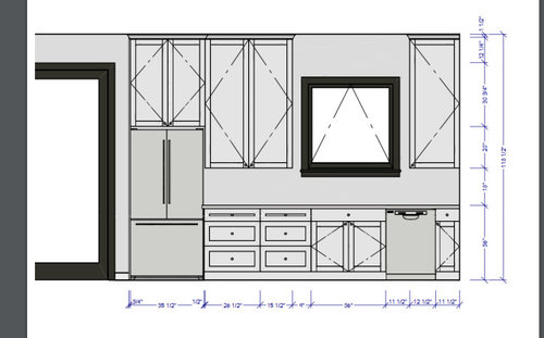
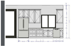
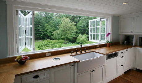
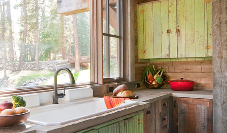
The attached sink elevation is a layout that I am not loving. First, I want the window to function but it does look out to a covered patio. Second, the ceilings are 10' but I want to save money on cabinets so I do not want them to go to the ceiling.

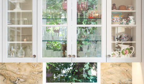
I don't mind making the window bigger and flanked with casements that let in fresh air. I do not want open shelving. I do want a place to store glasses.

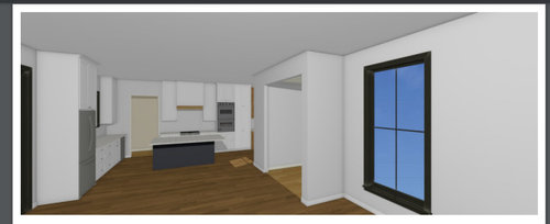
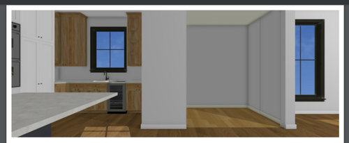
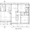
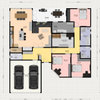
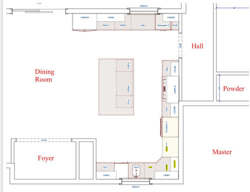
I attached the whole floor plan so you can see there will be plenty of storage. There is another problem area in the second picture. I want to maximize the pantry size next to the wall oven. It is currently 30". I don't need the upper cabinet that is next to the pantry and I don't have to have the lazy susan, if that helps any.

Suggestions for revised layout(s) please.


Comments (10)

  • 3 years ago

    Yes, the wall oven. Thanks for pointing that out. I will correct the post.

  • PRO
    3 years ago

    First, double hung or gliding windows do not encroach out into a covered patio. Second, save more money and have an eight or nine foot high ceiling. Third, I think there may be problems greater than the kitchen.

    dbr463 thanked Mark Bischak, Architect
  • 3 years ago

    For what it's worth, we put in a super-Susan in a corner cabinet. It has a massive amount of storage space that's easily accessible, even for rarely used items. Don't give up on it. :)

    dbr463 thanked LH On the Move
  • 3 years ago

    What greater problems do you see Mark Bischak?

  • 3 years ago

    Lower the window sill 4 to 6 inches; widen it as much as possible and raise the head to 9 ft.

    Consider a tilt & turn window to prevent accidents on the deck.

    What's the story with the sink? It would be helpful to draw the plan at counter level without the cabinet information.

    dbr463 thanked res2architect
  • 3 years ago

    The attached sink elevation is a layout that I am not loving.

    - First thing I don't love about this wall is its placement. You have two sinks in this large kitchen, and both are placed inconveniently. The sink is the most-used item in the kitchen ... it's the #1 thing you must "get right". This main sink is placed in a main traffic aisle; note that opening the dishwasher will block your access to/from the hallway.

    - I'd consider moving the sink and the dishwasher to the island. This would mean they're centrally located /easy to use. Then move the refrigerator to the right /more central on the side aisle, bringing it closer to the action. This would then allow that side wall cabinet run to function as a secondary area, which would work very well.

    - You want the window to function ... I'd suggest going with a slider. You can reach the slider window and move it without reaching up high. Maybe it's because I'm very short, but a typical double-hung window is just about impossible for me to open ... I can't lean over the sink and reach high enough to make it work.

    I do want a place to store glasses.

    Yes, that's something you have right in this layout ... a big cabinet for glasses next to the refrigerator.

    I want to maximize the pantry size next to the wall oven.

    Your plan shows a hallway behind the kitchen /behind the range ... could you open the pantry into that area /making it a small walk-in? That would be so much more storage than a small pantry cabinet.

    Second, save more money and have an eight or nine foot high ceiling.

    Totally agree. Super high ceilings paired with cabinets that don't go to the ceiling will look like you ran out of money. 10' ceilings honestly serve no purpose.

    I see several issues starting with the island being a barrier between sink and fridge.

    I was going to say that. Rule of thumb: Your sink /range /refrigerator form the main work triangle. Each of those major players should be placed no less than 4' apart /no more than 9' apart. And nothing should be placed between these three items.

    For what it's worth, we put in a super-Susan in a corner cabinet.

    I know they're largely disliked, but this might be a good spot for a corner pantry. The main work area will be between the island and the range ... meaning a corner pantry would be out of the main work area.

    Other thoughts:

    - You have more empty space at the bottom of the plan than is needed. If you were to shorten or angle what I think is a closet opening towards the foyer (?), you could reduce this empty space.

    - The dishwasher is oddly placed kinda in a corner ... this means extra steps to clear the table every evening.

    - Where will silverware go? the fire extinguisher? the trash can?

    - Overall, this kitchen has loads of space but little solid planning. It looks like space without purpose.

    dbr463 thanked Mrs Pete
  • PRO
    3 years ago
    last modified: 3 years ago
    What greater problems do you see?


    The spacial relationship of the garage, mud room, powder room, laundry room, and master bedroom suite connected to the rest of the house through the work area of the kitchen. The main entry of the house into the dining room.

    Many of the space seem to be size to minimums or less. Little, if any, rhyme or reason is given to the relationship of one space to another.

    dbr463 thanked Mark Bischak, Architect
  • 3 years ago

    Thanks for the ideas and critiques. I think I will start a new discussion and post the plan with a list of my wants and don't wants because I appear to have many issues and no firm idea of the best way to fix them.

  • PRO
    3 years ago


    dbr463 thanked BeverlyFLADeziner
Sponsored
Bella Casa LLC
Average rating: 5 out of 5 stars17 Reviews
The Leading Interior Design Studio in Franklin County