

Renovating the main floor of this 1979 split level builder grade home
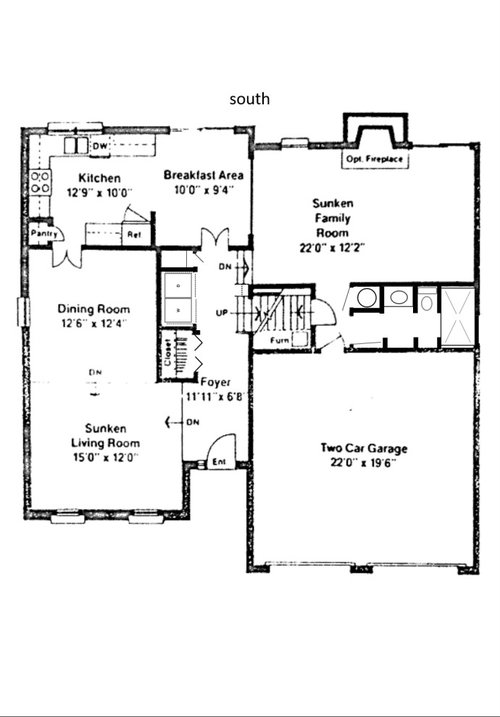
We are in the midst of renovating our upper level (https://www.houzz.com/discussions/6363270/upstairs-renovation-3-bedrooms-3-bathrooms-hall-closet ) and just started to plan the renovation of the lower level. Well that's not entirely true. We moved the laundry to where the powder room used to be (https://www.houzz.com/discussions/6168392/laundry-closet-wall-color ) then installed a bathroom where the laundry room used to be (https://www.houzz.com/discussions/6196804/new-bathroom-on-main-floor ). After considering a lot of options, the only floor plan change at the moment is to remove the short wall on the north side of the kitchen; it is not loadbearing.
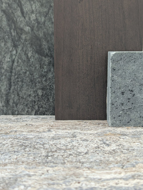
The biggest change is to replace carpet and laminate flooring with radiant-heated titanium travertine in a cool chocolate brown for the entire lower level except the bathroom, laundry closet, and utility closets. The revised plan is to start with the kitchen (including the flooring of the foyer and hallway), then family room, then living room, and finish with the foyer and hallway. The family room work includes refaceing the fireplace from painted brick to soapstone (Santa Rita or a Virginia blue-grey with several names), book-matched if possible. Then add the flooring, change the electric a little, add baseboard and crown molding, and paint. The work for the living room and dining room area includes adding electrical outlets, travertine flooring, base and crown molding, and paint. Finally we will finish the main entry, as they are on the same level.
The family room and breakfast room walls plus the kitchen north wall will be Sherwin Williams Rock Bottom like we have upstairs. The kitchen walls will be tiled in matte green tile ( Vert | Porcelain Tile - Architessa ), including the entire south wall, the entire east wall. The Holiday Kitchens cabinetry is cherry with a matte "granite" stain in a full overlay slab with eased edge for the base cabinets and any floor to ceiling cabinets. The upper cabinets, baseboard, ceiling, crown molding, and wall adjacent to the family room will be SW Rock Bottom. The countertop will be Santa Rita like we are using upstairs - it's such a lovely green grey.
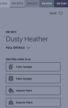
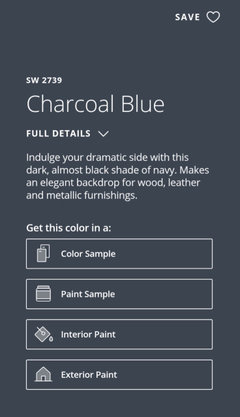
The living room and dining room will be SW Charcoal Blue from basebord to crown molding. The entry wall and closets will be SW Charcoal Blue to the east and SW Rock Bottom to the west to deal with all the exterior/obtuse corners in the space. Color changes will occur in accute/internal corners. The ceilings in the entry, living room, dining room, and family room will be SW Dusty Heather.
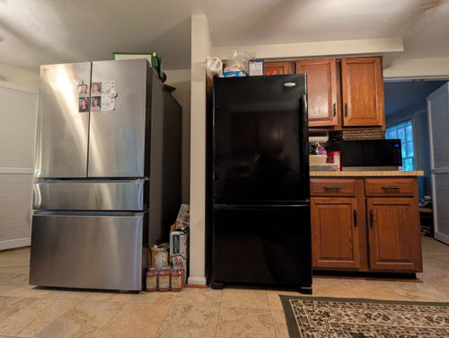
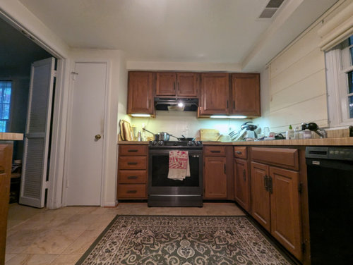
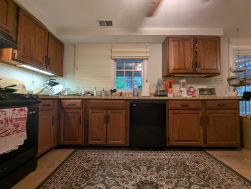
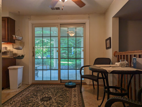
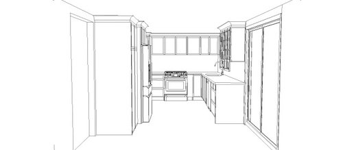
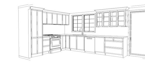
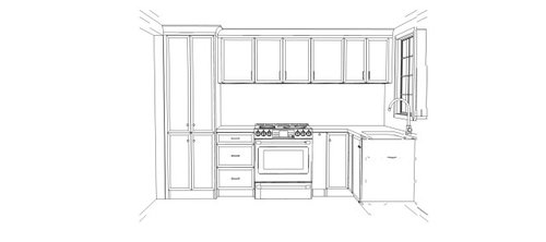
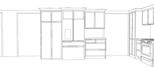
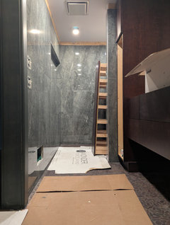
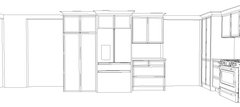
Attached are photos of the floorplan as it is now, pictures of the kitchen, and some materials. (Updated with renderings).
Comments (272)
 3 months ago
I think an eased edge is always best. Less likely to chip.
What color are the cabinets? The photo looks close to a walnut brown. Is that accurate? I love green soapstone…..:)
kl23
Original Author3 months ago@RedRyder Does it look harmonious to you? The cabinet color is "granite" on cherry. I like a little red in my chocolate. And I did decide to get an eased edge for the kitchen cabinets. I wanted a monolith look.
Related Professionals
Ocala Home Remodeling · Miami Kitchen Remodelers · Kissimmee Bathroom Remodelers · El Paso Bathroom Remodelers · Ontario Bathroom Remodelers · Spokane Bathroom Remodelers · New Orleans Kitchen & Bathroom Designers · Zanesville Kitchen & Bathroom Designers · Lexington Kitchen Remodelers · Lafayette Interior Designers & Decorators · Meridian Interior Designers & Decorators · Florence Furniture & Accessories · Bakersfield Furniture & Accessories · Santa Rosa Furniture & Accessories · Casper Furniture & Accessories- 3 months ago
My monitor doesn’t show the red. It looks like a regular brown ”walnut” finish.
It all looks very consistent with your taste. :) - 3 months ago
Have you researched appliances in the darker stainless? They would look great with this design plan.
kl23
Original Author3 months ago@RedRyder, you are so right. The black stainless range we have looks great with the sample cabinet doors we got. But so does the regular stainless.
kl23
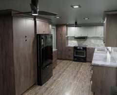
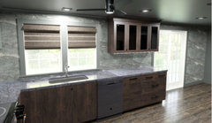
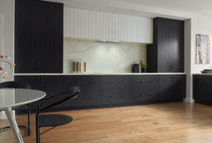
Original Author3 months agolast modified: 3 months agoA couple of CAD renderings came in today's email. Right away my designer felt the wall cabinet right of the sink should be SW Rock Bottom like the ceiling and trim. A reference from upstairs is included because CAD is limited in color rendering ability
kl23
Original Author3 months agoI bought the "invisible" range hood today and I hope Hubby LOVES it. Thoughts?
https://bestrangehoods.com/product/built-in/hbn1306ss
 https://bestrangehoods.com/product/built-in/hbn1246ss · More Info
kl23
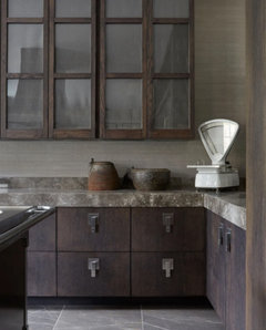
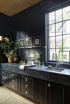
Original Author3 months agoI could use some help shopping for options for cabinet pulls. For upper cabinets I selected nearly invisible black ledge pulls. For the lower cabinets I selected generic bar pulls in black but am feeling wistful for something in squares like in my inspiration photos.
 stone floor and counter, dark wood cabinets, look at the hardware though. I am r · More Info
 kitchen · More Info
- 3 months ago
Knobs4less has recessed pulls like the ones on your black cabinet photo. I find that website to be the best for hardware.
kl23
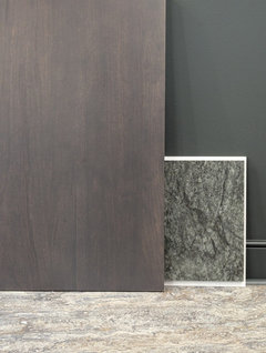
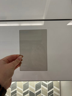
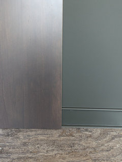
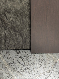
Original Author2 months agoHere's the flooring and cabinet and wall materials in north light that the kitchen has. I'm just worried about the cabinet stain. It's Holiday Kitchens cherry full-overlay slab stained Granite. So there's a little grey wash in the stain. I could say it helps it blend with the grey in the flooring or the stainless steel appliances. Or I could be convinced it makes the cabinets look dirty. I need to commit or start over.
kl23
Original Author2 months agoI gotta say I'm seeing more grain in the southern light. I made a bad typo. The kitchen gets southern light. The most recent picture is in southern light not northern.
- 2 months ago
I like the combination. But color is so hard to judge when not on site in person. What does your designer think?
kl23
Original Author2 months agoThank you so much for the near instant feedback. My designer and the contractor's kitchen designer both agreed it looked best in the contractor 's showroom. So did I. It's just such a huge expense that I'm nervous. The grain is so subtle that it's barely noticable with the grey wash. But I am averse to heavy grain contrast like in walnut or oak. I love cherry. And the greyed brown is what I want...like pine trees from a distance on an overcast day. I take it you feel like I should go ahead, right? My daughter likes it too... for a deep woods feel. Her kitchen is light and bright in gentle creams and blues.
kl23
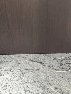
Original Author2 months agoAnd here is the sample door on the Santa Rita soapstone for the kitchen. I used Santa Rita soapstone upstairs too.
kl23
Original Author2 months agoHubby likes the cabinet sample too, so I should just get a grip I guess.
kl23
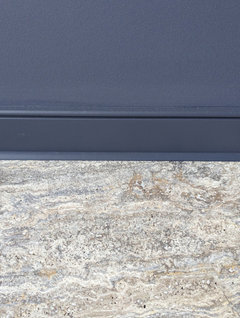
Original Author2 months agoHere is the titanium travertine floor tile with the wall color intended for the living room and dining room, SW Charcoal Blue. They compliment each other well. The plan is to have the travertine all over the lower level.
kl23
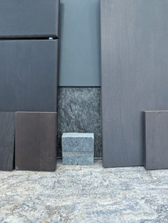
Original Author2 months agoStruggling all weekend with the graywash on Holiday Kitchens cherry cabinets stained Granite. The hue was right but I just can't do graywash. Went back to the contractor's show room this morning intent on looking at every single option and decided that Truffle was best. I realized the door sample I received was much darker than the square sample I first saw and learned the square sample was a year old. So Truffle it is, whether it's dark or lighter. Truffle on left in a large door sample and the smaller piece far left. See how different it is? Granite on right, large and small sample. Caraway also to the left in a small sample.
- 2 months ago
I wish we could see it in person. I know how much photos on my iPad and phone alter colors. If people who are seeing it with you say it’s good, you should go with it. (Then again, sometimes a spouse says “I like it” to get you to stop asking….).
The stone colors all look gorgeous.
kl23
Original Author2 months ago@RedRyder the contractor's kitchen designer said she was glad I chose the darker Truffle stain. She said it was more in line with the total feel of the house that was developing and said she thought it brought out the beauty of the stone flooring, countertop, and backsplash while also being a good boundary between them. She reminded me of one of my inspiration pictures. Except for my floor being a cocoa-powder and titanium grey blend, this really might be similar to my kitchen with Truffle-stained cabinets. I always thought it looked like a giant Hershey bar.
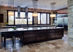 Country contemporary Kitchen · More Info
kl23
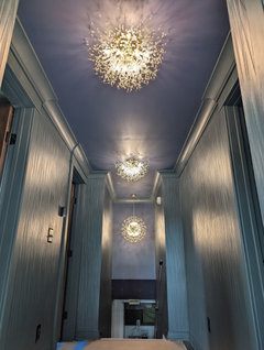
Original Author2 months agoI'm not ordering any more wired light fixtures from Amazon after getting stuck with one that wasn't wired for the U.S. so the light fixture I chose for the dining room is OUT. I've been looking for one to replace it and found this one that comes in three colors:
https://www.wayfair.com/lighting/pdp/everly-quinn-paree-luxury-real-crystal-chandeliers-dimmable-kitchen-island-square-rectangle-chandelier-w111483457.html?piid=1358489145,1355057046
I'm leaning towards the gold vs the silver. The walls will be SW Charcoal Blue, and the ceiling SW Dusty Heather. I thought my light fixtures should all be the silver tones, but the dandelion fixtures upstairs have a gold center and look perfect to me.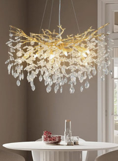 https://www.wayfair.com/lighting/pdp/everly-quinn-paree-luxury-real-crystal-chan · More Info
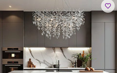 https://www.wayfair.com/lighting/pdp/everly-quinn-paree-luxury-real-crystal-chan · More Info
 Entries and hallways · More Info
 for the walls and ceiling of the hallway to the garage and bathroom. Leave doors · More Info
 Upstairs renovation - hallway and shallow storage · More Info
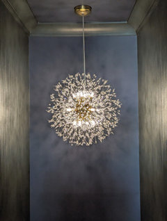 Upstairs renovation - hallway and shallow storage · More Info
kl23
Original Author2 months agoI think I've decided against refacing the brick fireplace with Santa Rita soapstone. It could have been stunning, but I'm not sure the two stones would look right with nothing between them. In the kitchen the floor will be the cocoa and titanium grey travertine, and the counter will be Santa Rita soapstone, but the Truffle-stained cherry cabinets will be between them. In the family room, the two stones would meet. I just am not sure these two stones wouldn't detract from each other that close.
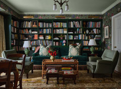
Instead of the soapstone, I will simply paint the existing painted brick fireplace to match the walls in SW Rock Bottom. Here is an inspiration picture of a living room or family room with dark green walls and a dark green fireplace.
There's nothing wrong with the fireplace except the mantle. The mantle is tilting forward a little and I don't trust it. The concept of replacing the mantle is new to me, and I don't know what style to use for an organic glam look. A simple shelf? A simple horizontal block? A live-edge shelf? Here is a vendor my designer directed me to: https://www.google.com/search?client=ms-android-samsung-gn-rev1&hs=BPt&sca_esv=1fae055577f6ba0b&hl=en-US&cs=0&sxsrf=APpeQntsiHU1RVJ9ynJF3HzyDx_nGG9VNg:1783594085796&kgmid=/g/11bc713kkk&q=Fallen+Lumber+Co&shem=epsd1,ltae,rimspwouoe&shndl=30&source=sh/x/loc/act/m1/4&kgs=5ce8a5082d6225ef&utm_source=epsd1,ltae,rimspwouoe,sh/x/loc/act/m1/4#ebo=0
I would appreciate photos of mantles you think are "organic glam" for a brick fireplace floor to ceiling with a threshold. It's well proportioned at 60" wide.
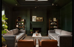 look what they did to the ceiling in this 1980s builder home · More Info
kl23
Original Author2 months ago@RedRyder thanks for the persistent encouragement. 😊 In my living room I want more than a place to sit and talk. I want the living room and dining room together to be a place for activities like puzzling. I have a beautiful 40" square coffee table to serve that function. My two local granddaughters and I could enjoy that together like we do at their house.
I love my two leather loveseats. They are 60" x 40" and comfortable to live with and they fit the 40" square puzzling table perfectly. The best arrangement for the three of them is an L only because of the size of the living room and the passage openings. But the living room has these two windows that one loveseat fits in perfectly. But I've been doing some measuring and am thinking that I should consider NOT entering the loveseat in the room. I like the feel of stepping down from the foyer into the living room unimpeded. We've tried having a loveseat back to the foyer and it isn't welcoming. Having a loveseat on the east wall has felt inviting. I'd like to try that as well as having book cases on the east wall. CoPilot tells me I should have 18" to 24" in front of the bookcases. I prefer 24" to allow me to get between the bookcases and loveseat to access books and raise/lower blinds. It's hard to measure now, because of the upstairs renovation, but I think that places the loveseat sort of in line with and slightly to the west of the east window. I have a square antique table that would fit between the window and the loveseat.
The other loveseat lines up in an "L" on the north wall facing the dining room. Instead of being between the two windows, it would be partly in front of the west window. There's room for another table or floor lamp at the end, and I'm wondering if a table would call too much attention to the dissymmetry. If a floor lamp, perhaps a downlight that could be pulled over at times for puzzling. I like this one: https://vakkerlight.com/products/helmet-floor-lamp?currency=USD&country=US&variant=43877040324849&stkn=eeec5618bad1&gad_source=1&gad_campaignid=17266395537&gbraid=0AAAAACcQR_erSDnQQQKGtvEPFWFDxMeyQ&gclid=CjwKCAjw08fSBhA7EiwAfbQTsLt20NlIMa-cXewsHQjb2BAlyYm5LAHLrCAIUV7Nd1pcGBJBCYpUwhoC5IQQAvD_BwE
The puzzling/coffee table would fit into the harbor created by the L-shaped seating. It leaves a very broad path from the foyer to the living room and into the dining room. Chairs from the dining room could easily be moved to the other two sides of the puzzling/coffee table for serious puzzling. From the foyer, I think it would look welcoming and not congested. But how would that look from the dining room? Would the end of a loveseat there be jarring? Would the other loveseat straddling the window and wall be jarring? I was going to pull it off the wall about 6" and wondered if that would help.
And I wondered if creating more symmetry on the east wall with bookshelves also would assist with a sense of order. If I center the 9' of matching bookcases on the 12' wall, there's 18" on each end that could house matching floor lamps, perhaps torchiers to light up the ceiling.What do you think?
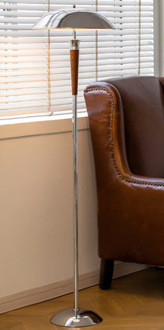 https://vakkerlight.com/products/helmet-floor-lamp?currency=USD&country=US&varia · More Info
- 2 months ago
You have to place the furniture (on athletic socks) IN THE ROOM to assess the plus and minuses of an “L” shape. Seeing the back of a sofa is inevitable from somewhere, but it’s not awful. We have a Great Room and the back of the sofa faces the kitchen. It’s the only way the room can work with one.
Symmetry under windows falls into the same boat. If something has to be under a window, as long as you can get to it to open and close, it’s fine. The width of walkways is important, as is the overall feel of the seating arrangement. Have you done graph paper layouts? I usually do that before I move into a new space so I know where the furniture goes before the movers arrive. I’m not great with guessing the size of a space, so a fully measured picture on graph paper - with cutouts for my furniture - has been my lifesaver for every move. I imagine it would be helpful for a space that isn’t even there.
kl23
Original Author2 months agoThank you. That's a great idea. I use PowerPoint but the scale can suddenly change. Your idea is better.
kl23
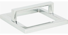
Original Author2 months agoSome changes to the kitchen cabinet plan include a narrower sink cabinet and wider prep base cabinets plus a towel pullout next to the sink on the south window wall run. The north run is still in 36" thirds but moved 6" east towards the range run to make just a little more room for the breakfast table. Thoughts? For handles, I'm find of the one below where I want handles to show. I like the square base for show with the "U" handle. Wall cabinets will have a inconspicuous tab pull in matte black. For the 3" towel rack should I use a tab pull?
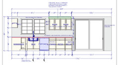 kitchen · More Info
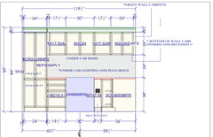 kitchen · More Info
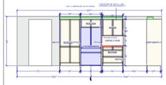 kitchen · More Info
 https://www.wayfair.com/home-improvement/pdp/atlas-homewares-wide-square-bar-pul · More Info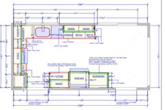
- last month
I don’t think the pantry needs to have the doors be the same as the cabinet on the right. It needs to be practical for your use. A taller main section gives you a better storage unit - i.e. more pull out shelves of varying heights for your stuff. Will you put food in there? Serving dishes? Baking dishes? Everyday dishes? Think about its usage, first. I don’t think anyone will notice if the doors don’t match the unit on the right.
kl23
Original Authorlast monthThanks @RedRyder
In the bottom of the pantry I want a roll out cart counter height. Above it I want heavy appliances like a stand mixer and food processor on a pull-out shelf. I want to pull them to the cart, wheel the cart to my prep center on the window wall, and wheel them back again when finished. I also want to use the cart to haul delivered groceries from the front door to the refrigerator and pantry by the stove. So you are right that the pantry doors could be higher.
- last month
Now that sounds like a good plan! Those heavy appliances being stored away, but easier to handle is a great idea. I think a lot of us never use our heavy mixers for this reason - moving them around makes us decide to just not do it.
- last month
The pantry configuration/usage sounds good.
I can’t tell from the rendering. Is the pantry being built as a cabinet that attaches to the wall or as a pantry closet with stud and wall construction?
You are going to need heavy duty pull out shelves to hold the weight of those appliances and maybe some anchoring to the wall studs and blocking. The pantry floor will need to be flush with the kitchen flooring for easy roll-out.
kl23
Original Authorlast monthAgreed @Design Fan (NE z7a) that's what there been talking about, a heavy duty roll-out shelf. I wanted a stable shelf at first. The pantry is built as a cabinet, not a stud and wall. Thoughts?
- last monthlast modified: last month
My stand mixer with bowl and food processor are heavy without taking into account the accessories’ weight. I would give the combined weight to the cabinetmaker and kitchen contractor to be sure that the cabinet rollout shelf and hardware will easily support the weight.
kl23
Original Authorlast monthI've been visualizing the living room focal point to be a square coffee table we will use for puzzling with the grandkids. In preparation for my son's visit, I bought jigsaw puzzles for his two kids. On the first day I learned they had never put together puzzles before and was told they probably wouldn't be interested. Well, turns out they are puzzle fiends! I had all four of my grandkids putting together multiple puzzles and racing to the finish together. My grandson was putting pieces in place based on shape while the rest of us were going by color. Eventually he will find that skill very useful. I was so happy for the look of joy on his face when he fit a piece and looked at me as we shared the accomplishment.
Then I had to laugh as my husband marveled at how innovative it was to entertain the grandkids by having puzzles on the cork floors upstairs being renovated... no furniture. He previously was concerned, thinking the floor would be too hard. But my 7-year-old grandson first sat down on it and spread his hands on it and said, "Oooooo" at how comfortable it was. After a couple days, my 10-year-old local granddaughter declared that bedroom should always be for puzzling on the floor.So I am pleased to continue to envision the living room and dining room together as a puzzles/games/reading room/library.
kl23
Original Authorlast monthI don't know if it's all the stress right now or coming to my senses and doing what @Jan Moyer often said, "Edit". But I decided to switch from the glass inserts to slab doors on my wall cabinets on the south sink wall in the kitchen. I just imagined them between the window and sliding glass doors and thought, "That's too much glass." Also, those are prep area cupboards, not contents I want seen. The glass was going to have to be so dark, it wouldn't have had the light effect I was after. And they will be wood, the cherry with "truffle" stain. I went back and forth between stained and painted for those cabinets.
kl23
Original Authorlast monthI also decided that immediately after the renovation, I'll use one of my leather loveseats in the living room and one in the family room. My chair and ottoman go in the family room too. That will give me the chance to carefully add in the non-seating pieces, the bookshelves and tables. Then I can add in new lights, consoles, and make sure of the living room arrangement before adding in a daybed in the family room and sleeper sofa upstairs in our workout room. I don't want things to get too crowded.
kl23
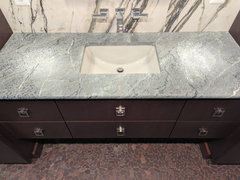
Original Author10 days agoBack to kitchen questions... I am second guessing my choice of quiet hardware. My original choice for the base and pantry cabinets was the simple ones shown in black. But now I am wondering if I will wish I had something flashier. On the other hand, maybe I should keep the hardware quiet to better enjoy the beauty of all the stone: titanium travertine floors, Santa Rita soapstone counters, large-format honed Irish Green rectified porcelain tiles for two of the walls with backsplash. Should I keep the hardware quiet or find something more showy? If quiet hardware, should I stick with matte black or go for bronze? Or stainless steel like all my appliances? Or chrome for bling?
Country contemporary Kitchen · More Info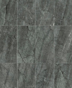 kitchen · More Info
 https://mmgmarble.com/product/natural-stone/travertine/titanium-travertine-tiles · More Info
 Primary bathroom · More Info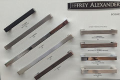
- 9 days ago
I like the quiet hardware. Let the stone and wood be the stars of the room.
kl23
Original Author9 days agoAnother aspect to ask about... Are some hardware types more comfortable to stand up against for a long time while washing dishes or preparing food? I like my bathroom bail pulls because they never dig into me.
- 8 days ago
Quiet hardware. You have chosen some very high end and gorgeous items (soapstone? Wow.) Why make the hardware shiny? I would find the quietest, darkest hardware you can live with for this room. There are so many other beautiful features, you don’t want hardware glimmering all over the place. Black, dark brown - no shiny nothing.
- 8 days ago
Can the kitchen towel be hung inside a cabinet? Where is this hook going?
I keep my kitchen towels on the oven handle and my oven mitts inside the cabinet door of my cooktop island. It’s tacky, but easier to find.
kl23
Original Author8 days ago@RedRyder we also hand dishtowels on the oven door handle. However, in order to center the sink and have a large lazy Susan in the corner cabinet, there was a 3" gap between the two, so the designer suggested a pullout for a towel. Why not...
Well, if I choose the quiet hardware, that's the last piece of the kitchen puzzle I think.
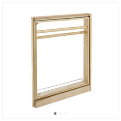 Rev-a-Shelf 432TB-BFBBSC-3C https://wurthbaersupply.com/product/710564/432-FILL · More Infokitchen · More Info
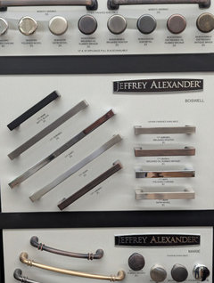 kitchen · More Info

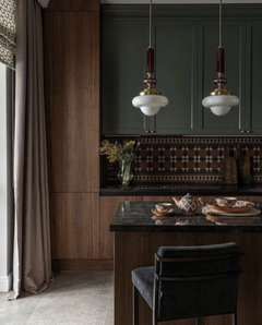



rebunky