

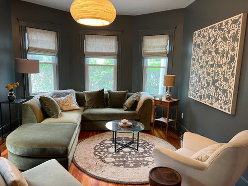
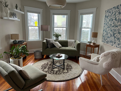
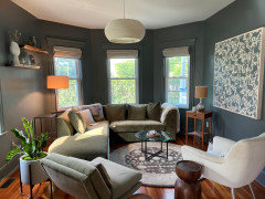
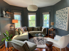
Neutral to deep, high contrast living room
3 years ago
Featured Answer
Sort by:Oldest
Comments (27)
- 3 years agolast modified: 3 years ago
Related Professionals
Lubbock Interior Designers & Decorators · Peoria Bathroom Remodelers · Buffalo Bathroom Remodelers · Fort Collins Bathroom Remodelers · Clarksdale Kitchen & Bathroom Designers · Burlington Kitchen & Bathroom Designers · Lansing Kitchen & Bathroom Designers · Springfield Interior Designers & Decorators · McAllen Interior Designers & Decorators · Lawrenceburg Furniture & Accessories · Rochester Furniture & Accessories · Winona Furniture & Accessories · Brooklyn Furniture & Accessories · Kissimmee Flooring Contractors · Parkersburg Flooring Contractors- 3 years ago
 3 years ago
- 3 years agolast modified: 3 years ago
- 3 years ago
 3 years ago
 3 years ago
- 3 years ago
 3 years ago
 3 years ago
 PRO3 years ago
 PRO3 years ago
- 3 years ago
 3 years ago
 3 years ago
 3 years ago
- 3 years agolast modified: 3 years ago
- 3 years ago
- PRO3 years ago
 3 years ago
- PRO3 years ago
- 3 years ago
- 3 years ago
- 3 years ago
- 3 years ago
- 3 years ago

Related Stories
KIDS’ SPACESRoom of the Day: High Contrast for a Toddler’s Room
Charcoal walls, smart white furniture and red accents rule in this adaptable and versatile nursery
Full Story
LIVING ROOMS10 Design Ideas for a Neutral Living Room
Strike a balance between character and calm with these classy design ideas. How many are you already using?
Full Story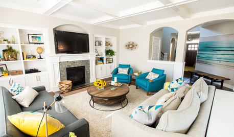
ROOM OF THE DAYRoom of the Day: Contrasts Catch the Eye in a Beachy Family Room
Rough jute and soft shag, eye-popping turquoise amid neutrals ... this room’s pairings make each element stand out
Full Story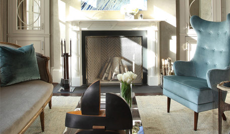
LIVING ROOMSRoom of the Day: High Eclectic Style in a Luxe Sitting Room
Rich textures and contemporary art make this swank sitting room both restful and invigorating
Full Story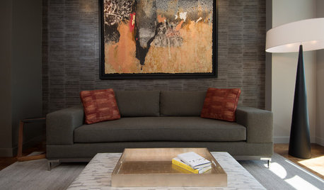
DECORATING GUIDESRoom of the Day: Playing All the Angles in an Art Lover’s Living Room
Odd angles are no match for a Portland designer with an appreciation of art display and an eye for good flow
Full Story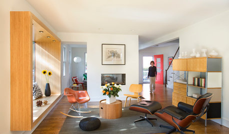
LIVING ROOMSRoom of the Day: Living Room Update for an 1800s New England House
Major renovation gives owners the open, contemporary feel they love
Full Story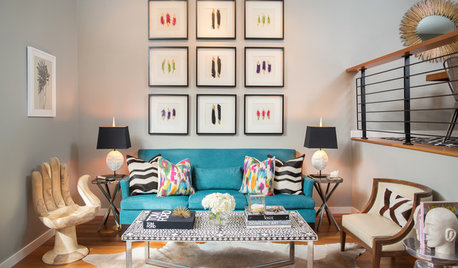
LIVING ROOMSRoom of the Day: Jewel Tones Wake Up a Narrow Living Room
Bright colors and playful patterns turn up the volume in a Seattle townhouse
Full Story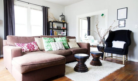
ROOM OF THE DAYRoom of the Day: Living Room Does a Vintage-Meets-Modern Balancing Act
Old is new again in this Austin, Texas, living room full of easy decorating tricks
Full Story
ARTRoom of the Day: Art an Inviting Presence in a Formal Living Room
A redesign brings new energy into the room with a mix of contemporary furniture, forgotten treasures and appealing artworks
Full Story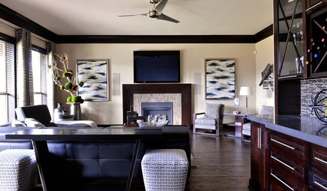
CONTEMPORARY HOMESRoom of the Day: Traditional Living Room Gets a Contemporary Spin
Strategic changes transform a dated living room into a sleek space made for relaxing and entertaining
Full Story

Jilly