Software
Houzz Logo Print
leanne_nieters92

Multicolor kitchen backsplash

3 years ago
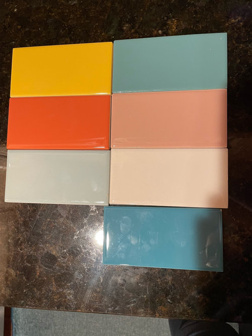
Hello!

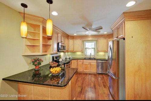
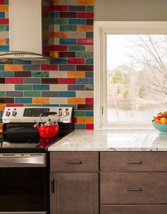
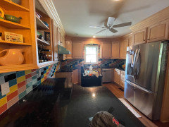
We are adding a multi color subway backsplash in brick pattern to our kitchen. The cabinets will stay light maple and the dark granite will also remain. Appliances will be replaced, but I’m also not concerned about how the tiles looks with appliances as I want it to stand alone.

My question is: which looks less “busy”: having more color options and using fewer of each color tile OR having fewer color options and using more of each color tile in the pattern?

We’re planning on using these seven tiles pictured plus a black that hasn’t been delivered (total of eight). I have one more I like and can add if needed, but this already seems like a lot. Lol

Absolutely not interested in a solid backsplash or different colors than shown. Also will not be painting the cabinets.

Thanks!

Fewer colors: no more than seven
More colors the better
Fewer colors: no more than five

Comments (45)

  • 3 years ago

    are you creating a pattern or just putting them in random?

    I like the colors, just not the gray one.

  • 3 years ago
    last modified: 3 years ago

    Having more colors and using fewer tiles of each color will look busier. I love the color combo with the black countertop.

  • 3 years ago
    last modified: 3 years ago

    Love the colorful idea!

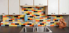
    Not sure about mixing in any black tiles; if you do, I'd use them sparingly like the example below:


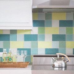
    This one has many colors, but none as dark as black:


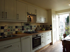
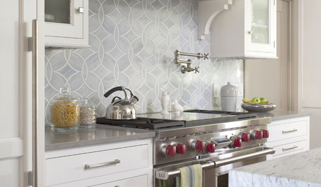
    Here's another example, where the colors flow nicely and the sizes vary b/w square and rectangle:


  • 3 years ago

    I'd go with more color options... are those Daltiles? Since natural maple finish can appear pinkish under certain lighting, I would think twice about the pink tiles. I speak as one who loves pink and noticed this in my own kitchen. Also, the gray doesn't seem to be as vibrant as the other tiles... like the printer ran out of ink. Look at Fiesta stoneware colors. So bold and brilliant. What about a purple tile? So again, yes, more colors.

  • 3 years ago
    last modified: 3 years ago

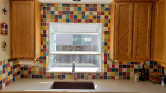
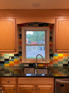
    What size tile are you looking at? I think it matters what the distance is between tiles of the same color, so I think you can do more colors with smaller tiles while the same number of colors could look chaotic with larger tiles. I'm looking at the first two pics that Chicagoans posted. I count 6 colors in both, but the 3x6 looks busier to me than the 2x2 (I think those are 2x2s). Between those two pics, I much prefer the smaller tiles.

  • 3 years ago

    I love this one, especially with the occasion textured tile. It could be glass tile, I'm not sure.


  • 3 years ago

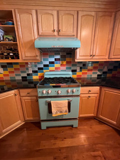
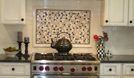
    I like the ones with the multi-color behind the hood….

  • 3 years ago

    Also, I second no black. Distracting.

  • 3 years ago

    Love the colors. i might do them stacked rather than subway. i would skip the black as well as there aren’t any other dark colors. i’d want a green too! Show us the end result please! i’m bored of white and gret and quartz backsplashes! :)

  • 3 years ago
    last modified: 3 years ago

    @Lyn Nielson I am still debating that as well. Random seems to be the most commonly done from the examples I have found, and I don't mind it. I do worry about having sections that are "too blue", etc. but I guess that's what random means! That tile isn't gray it's actually a lighter blue. Iphones do weird things to colors.

    @Sabrina Alfin Interiors sounds like you're on "Team Husband" here. lol

    @chicagoans the amount of black will be determined by whether we go with random or with a pattern. We wanted to make sure it was there to bring in the countertop, and it's brown and black (wanting to limit the brown). It's not what I would have picked myself, but it's in great shape so we're keeping it.

    @cupofkindnessgw these are American Olean ColorStory 3x6 subway - so yes, Daltile. That "gray" is actually a light blue tile that we're using up from a prior project. Definitely on the chopping block for potential omission though, so thanks for the input. We special ordered the blush per my hub's request, so it will stay. We actually use multicolor Fiesta as our everyday dinnerware, so that was sort of the inspiration!

    @theresa21 I also love that example. Definitely the vibe I like.

    I'll be sure to post the final product when it's done (hopefully) next month. We will be using black tiles at least in part, but based on this feedback we'll consider how much for sure. Thanks for the input everyone!

    I'm not sure if this is any clearer, but this linke below is the tile that is coming across as gray above.

    https://digitalassets.daltile.com/content/dam/AmericanOlean/AO_ImageFiles/colorstorywall/web/AO_0058_Restore.jpg/jcr:content/renditions/cq5dam.web.570.570.jpeg

  • 3 years ago

    I would keep all tiles having the same saturation. Some right now look too gray compared to the others. I'd choose either all with more muted tones or all with more saturated tones.

    I would choose the colors you have for Fiestaware. (We use Fiestaware daily too)

    How about using the black as a border against the counter with the other tiles multicolored above.

  • 3 years ago
    last modified: 3 years ago

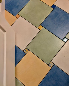
    Have you thought about grout color. I did a multi-colored floor in my bathroom. I chose black grout for that application. Maybe if you used black grout, you wouldn't need to add a black tile into your mix. I arranged the tiles on the floor in another room, prior to install, to get the randomness just right. The four larger color tiles dominate the color scheme while the accent tiles add interest. This floor is about 20-years-old and I still love it.


  • PRO
    3 years ago
    last modified: 3 years ago

    IMO a backsplash needs to be chosen to have some connection to something in the space or be neutral. I think a mix of color needs serious thought and BTW there is no such thing as random. To me those choices just have no real idea behind them. I love the mix of the pic above it has real purpose in design. Just throwing abunch of tiles in colors on a wall is IMO just going to look a mess .I think if you collected pottery in colors and then used those colors it has a plan the kitchen really does not lend itself to this idea.

  • 3 years ago

    @cpartist these colors are actually somewhat based on my Fiestware. We literally use all colors, even some retired. I'll look at the black as a border on the bottom and see what I think. Thanks for the suggestion!


    @theresa21 yes, I have. I had charcoal grout in my last kitchen and loved it. But, this kitchen is already pretty dark with the granite, flooring, and two small windows so I hesitate. I'll put it back on the table though for consideration since nothing is final yet. Thanks!


    @Patricia Colwell Consulting yes, that is an opinion. It is also an assumption that I haven't put serious thought into these colors - this post is not step one of my process. Also, as I posted previously, I do collect Fiestaware and it is driving these choices in part. I also have not posted any photos of the connecting dining room and the colors that are in it, so....thanks?

  • 3 years ago

    I'm a neutrals gal but think this is going to look fantastic. Your pinks are great. I don't love the bottom blue and would nix that and use the top six. I really like it in a stacked pattern like what you have show in your pic. What color will the walls be?

  • 3 years ago
    last modified: 3 years ago

    I think it will be fun! I was going to comment that they look like Fiestaware, and was pleased to so that is your inspiration! When you add a few cups, bowls and candle holders to the curve shelves at the end, it will look fabulous!

  • 3 years ago

    IMO a backsplash needs to be chosen to have some connection to something in the space or be neutral. I think a mix of color needs serious thought and BTW there is no such thing as random. To me those choices just have no real idea behind them. I love the mix of the pic above it has real purpose in design. Just throwing abunch of tiles in colors on a wall is IMO just going to look a mess .I think if you collected pottery in colors and then used those colors it has a plan the kitchen really does not lend itself to this idea.

    Once again it's YOUR opinion. Doesn't make it right. Maybe she needs to add 4000k lighting too? (that was sarcasm btw)

  • 3 years ago

    I for one am excited to see how it winds up. I'm so thrilled to see something other than white or gray.

  • 3 years ago

    use a color wheel and use a triadic combo

  • 3 years ago

    Tile is being installed today. I can't wait to post the result.

  • 3 years ago

    Cute idea! i would say with all the oranges and yellows you already have in the kitchen, stick to more cool tones - maybe with pops of the warmer ones if you really like them- to add some contrast. otherwise i think it might be more orange than you want

  • 3 years ago

    I cannot wait to see this! I chose a "funfetti" solid surface counter in my prior kitchen with teal laminate perimeter counters and I just loved it. I'll make you smile every day!

  • 3 years ago

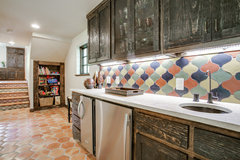
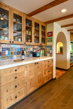
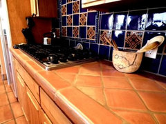
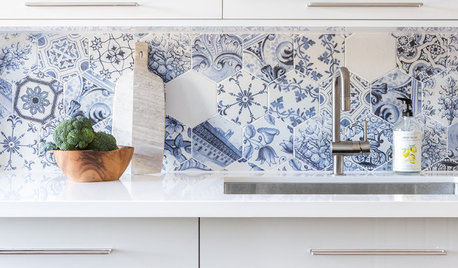
    I am a fan of the multicolored Mexican tiles. Your idea will have a similar look, but with only the solid tiles. Most of the Mexican tiles are used with solid paired with the patterned tiles, but I've seen it done all patterned ones done randomly too. I think it gives the room tons of personality.

    Broken Arrow · More Info


    Tile projects · More Info


    Sand Point Seattle Kitchen Remodel · More Info


    Kitchen Tile Designs · More Info


  • 3 years ago

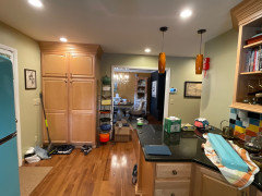
    I was hoping to have a direct comparison photo to post, but the kitchen is still a work in process.

    I’m accepting suggestions for wall paint to go with my white trim. But, only positive responses to the final product will be received at this time. I couldn’t be happier with the end result.

  • 3 years ago

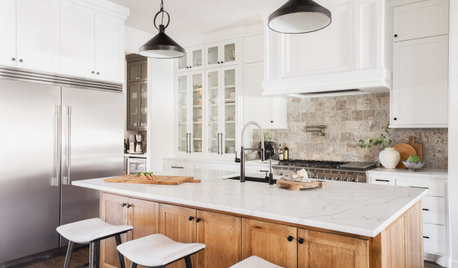
    Wow, @LeAnne Nieters it turned out great! I like the pattern you chose and the range and hood looks great with the tile. Even the black tile looks perfect. I'm not sure what wall color will coordinate, but maybe a cream color would look good. Something like the Sand Point Seattle Kitchen Remodel that @Tara shared.

  • 3 years ago
    last modified: 3 years ago

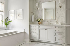
    How much wall area are you talking about? i like the grounding effect of your dark counters. id go w a cooler undertone / satin finish/ and stay light w wall paint. i like something like this on walls shown in pic but not sure where the walls are in your space. And id likely get stainless or polished nickel hardware…anyway its a fun kitchen… it worked out well.

    Yarrow Point Shingle Style--Remodel & Decor · More Info


  • 3 years ago

    Fiesta!

  • 3 years ago

    Even though this isn't my style at all, I have to say the end result is stunning!

  • 3 years ago

    LOVE it!

  • 3 years ago

    @BeverlyFLADeziner I'm not sure how this is helpful seeing as this project is done and I obviously used a planned pattern.


    As a pro, do you have any recommendations for wall color? That is the kind of comment/advice I'm needing. My trim is all Benjamin Moore Mayonnaise which has a yellow tint. Between it and the light maple color tone, I don't want to choose a neutral that is too yellow but I do want it to stay warm. Thanks.

  • 3 years ago

    It looks fantastic! Great job :)

  • 3 years ago

    Where is the paint going? I don't see any wall space left to paint.

  • 3 years ago

    Wow the tile looks amazing, especially with the blue range! The whole kitchen is vibrant and fun.

  • 3 years ago

    Apology for the mess: as I said it’s a work in process. Paint is going to the right of the fridge, left of the cabinet by the peninsula, and along the wall of the doorway into the other room

  • 3 years ago

    I vote teal.

  • 3 years ago

    I love the statement you are making here. It is such a happy and interesting look. I think the tile and appliances provide enough color, so a warm neutral would be my choice for the wall, maybe a gray to contrast with the cabinets.

  • 3 years ago

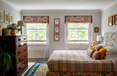
    I agree with juliab51. This colorful and warm bedroom is perfectly complemented by the pale gray walls.


  • 3 years ago

    Absolutely no gray. Your kitchen is fabulous. I would consider a very light peach with a touch of brown in itt

  • 3 years ago

    It is so refreshing to see something outside the box! The stove ties it all together beautifully.


    Agree with no gray on the walls. Maybe a soft WARM white/off-white?

  • 3 years ago

    Your tile looks great!

  • 3 years ago

    easy does it …. colors represented enough. nice clean soothing wall color.

    Modern Kitchen · More Info


  • 3 years ago

    Love it! How refreshing to see someone unafraid to use color.

  • 3 years ago

    I love to see a very personal kitchen! Your range and hood are beautiful. I agree with a warm white for the walls, enjoy!

  • PRO
    3 years ago

    That looks so great!! I love something outside the "norm"

    Enjoy!