Software
Houzz Logo Print
tammi_cotter

Paint Color for Kitchen

3 years ago
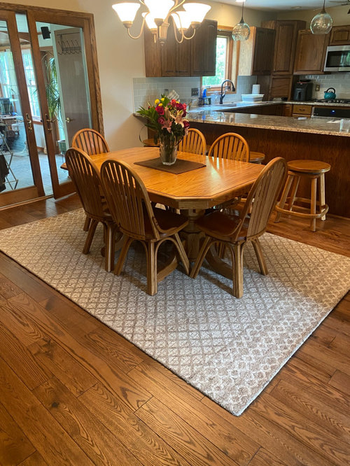
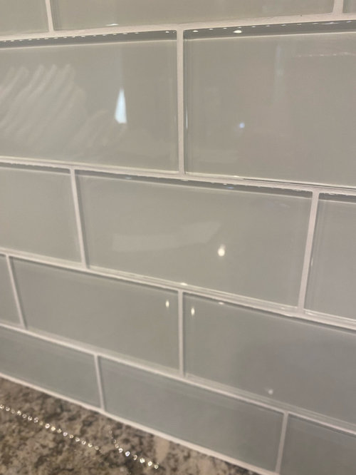
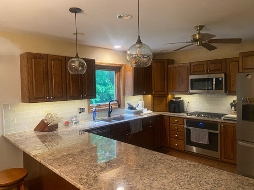
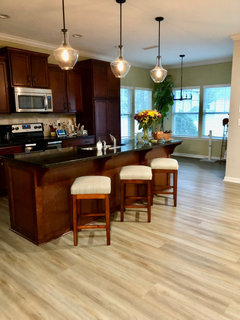
We recently updated our kitchen and I’m looking for the last piece of the puzzle…the wall paint color. We did our counters in Ganache and the backsplash in Alabaster (off white) glass subway tile. Unfortunately, the creamy color I was looking for in the backsplash is showing as a grey tone (not warm like I had hoped). I’m hoping that I can achieve the look I want by the paint I select. SW Accessible Beige is one I’m looking at but I’m open for more suggestions.

** Bought a new light fixture for above the dining table that is not installed yet but the lights above the peninsula are new **

Comments (30)

  • 3 years ago

    Also, the kitchen knobs have been replaced with ORB knobs. The ceiling fan will be replaced and the recessed lighting will be updated.

  • PRO
    3 years ago

    Firsy update the lighting then choose wall color .Use all lED 4000K if you want true colors at night like bright sunlight during the day. Those tile right now do not work with the counter at all so for sure I would not do beige next to them. I wish oyu would have come here to get some help before you did this "upgrade" but now what are the walls in the spaces next to this or are planning on painting the whole living space ?IMO you have a sea of beige in that space with almost everything being some form of beige so no more beige . Maybe after the lighting is fixed you could try this cut 25% it is a BM color usually my go to for a true neutral much more so that beige


  • 3 years ago
    last modified: 3 years ago

    The best way to make your greige tile look more creamy is to paint the walls a shade of gray, so the contrast is between a true gray and a gray-and-beige, playing up the beige.

    Your floors are gorgeous! Do you have any plans to paint the kitchen cabinets? I know that's not what you came here to ask, but taking some of the brown out of the kitchen would be another way to make the backsplash seem less gray in comparison, and you have a lot of wood tone going on. Painting the cabinets would allow your beautiful floors to become the star.

  • 3 years ago

    Alyssa, unfortunately my husband will not agree to painting the cabinets. That is a HARD NO at our home. I will post a picture next of the other half of this open space.

  • 3 years ago

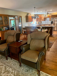
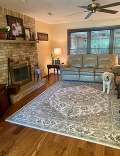
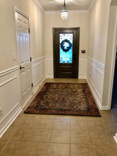
    Here are two more pictures of the space. The family room, dining area and kitchen are one open space. You will see that the family room fireplace causes me some grief trying to coordinate colors with it. I realize that my home isn’t a showplace and that perhaps I’ve made some mistakes in my tile selection (despite lots of research and pre-planning) but I’m hoping to make this work with the right paint.

  • PRO
    3 years ago
    last modified: 3 years ago

    Why not try a color form the rug . This is the time to change all the lighting so try the LED bulbs in the lamps in the FR and see what happens to color. IMO if the FP makes you crazt paint it. I always hate exterior brick painted but sometimes the interior brick is just too much to deal with.

  • 3 years ago

    Patricia…I might be able to pull off painting the fireplace. 😊

  • 3 years ago

    We just painted our bathroom a color similar to Accessible Beige but lighter. SW Drift of mist. It’s a beautiful color that can look warm or slightly gray. Bathroom isn’t finished yet, but here’s how it looks in our space.

    TeeCee84 thanked clt3
  • 3 years ago

    Patricia -- the BM Healing Aloe seemed interesting to me...what do you mean cut 25%? There is sage in the rug so I have thought about a shade of green.

  • 3 years ago
    last modified: 3 years ago

    There are plenty of design mavens on this site who've made "mistakes," and some of the biggest pitfalls seem to be paint, backsplashes, and countertops. Pulling it all together, especially in an open concept room, is not easy! You have lots of beiges and wood tones, and some gray in your fireplace and in your rugs, so one way to unify the space would be to introduce a non-neutral pop of color and spread it in choice spots throughout the space.

    Not to jump into a marital issue, but do you know why painting your cabinets is a non-starter? Is it that your husband likes the current wood tone--in which case, what is it he likes about it that you might be able to replicate some other way, like the earthiness, or the coziness of a dark color, or that they don't show much wear and tear...? Is it that he considers painting cabinets an unnecessary expense, that he has misgivings about how paint would hold up to everyday use, that he installed them himself and has a sentimental attachment, that he has unpleasant associations with previous spaces that had painted cabinets, or some other consideration? Sometimes putting your finger on why someone feels strongly about a particular design choice can lead to a compromise everyone ends up loving better than their original preference.

  • 3 years ago

    Alyssa, he is old-fashioned and thinks that would should never be painted. I like the look of white trim but since we had oak trim put in through the entire house when we built it, he says that he doesn’t want to cover up the beautiful oak. Same with the cabinets. I agree that they should be painted, tbh.

  • 3 years ago

    *wood

  • 3 years ago

    @clt3 I love that color!

  • 3 years ago

    Okay, so he doesn't believe wood should be painted, presumably because he likes the naturalness of woodgrain etc. Are your cabinets solid wood rather than laminate? If so, would he consider a lighter wood stain or wash--something that changes the color while still retaining the natural character of the wood? https://www.home-dzine.co.za/kitchen/how-to-make-dark-or-yellow-kitchen-cabinets-lighter.html#:~:text=The%20easiest%20and%20least%20labour,with%20the%20level%20of%20whiteness.

  • 3 years ago

    Solid oak

  • 3 years ago

    If the problem is the backsplash color and you like everything else, why not consider changing the backsplash to something that works better? It looks to me like the bs is a cool tone and everything else is warm. If you chase after a solution with the current splash, you may end up on the slippery slope to replacing everything.

  • 3 years ago
    last modified: 3 years ago

    To answer your question..You can ask the paint store to reduce the color added to the base by 25%, thus making it the same color but slightly paler once it goes up on the walls. Or increase by 25% for a richer deeper tone.

    I love that Healing Aloe or Drift of Mist in here.

    TeeCee84 thanked tracefloyd
  • 3 years ago

    Unfortunately that is a common occurrence with many glass tiles. Once installed and grouted, you block the light transmission through them and the color now appears different. On the lighter colored glass tiles you usually get a green tone coming through. It really helps if you can see a larger grouted sample board before buying any glass tiles, so any color changes can be spotted before buying the tile.

  • 3 years ago
    last modified: 3 years ago

    Because the cabinetry stops before it reaches the end of the counter and backsplash, I would match the same color as the glass tiles show. Otherwise, another color is going to highlight the tile, in not a good way.

    When choosing glass tiles it is best if you bring the sample home, prop it up on the counter, and lean it on the wall on which it will be installed. Put a bright white piece of paper behind it. Look at it in natural light and overhead lighting. Betcha the tile looks very different from the sample in the store.

    Keep in mind the natural state of glass shows a green tint.

  • PRO
    3 years ago

    Can you post picture of new dining table light please. Please don’t hang it too low. I think the best avenue is to replace the backsplash. That’s what doesn’t work. Plus, when redoing stop at end of cabinet. Going beyond doesn’t work in your space. Then consider square tiles with a less smooth surface. Then consider a new paint color. But do that first. Watch lighting too. Get that set before testing new backsplash material. You don’t appear to have that much backsplash too.

  • 3 years ago
    last modified: 3 years ago

    Your living room is pretty! It’s always a battle feeling like we need to change things. Fireplace is perfect as is but when budget allows maybe paint or change just the front cover to orb or black to tie with kitchen. I’m with your hubby on preserving quality wood cabinets so if changing the backsplash will bring you peace and joy, do it! A lot of charm already seen with what’s been done.

  • 3 years ago

    Taking inspiration from your cute tea kettle, you might consider replacing the counter stools. Less wood look will calm down all the variations going on already with floor, dining table and living room tables. Floor and cabinets are the stars.

  • 3 years ago

    Love those bar stools!!

  • PRO
    3 years ago
    last modified: 3 years ago

    To make the space appear updated, I'd

    eliminate the rug under the dining table

    and replace the table and barstools with items in a painted or stained finish.

    That room is overrun with oak.

    Olive green or black might bring some relief to colors that all blend into one another.


    TeeCee84 thanked BeverlyFLADeziner
  • 3 years ago
    last modified: 3 years ago

    Try B.M. Gray Owl next to the tiles. It will look good with the color of the cabinets.


  • 3 years ago

    See how nice a green might look with warm cabinets. The hall photo is Accessible Beige. It needs good lighting or can look dingy. I’m still a work in progress lol.

  • 3 years ago

    Both look great!!!

  • 3 years ago

    Your husband needs to learn the adage “Happy wife means happy life”.

  • 3 years ago

    1. Get all of your new lighting installed first with good bulbs. (4000k will make your home look like a hospital! Try 3000K instead.)


    2. I think your tiles are beautiful and look good with everything else in the space so I'd try to find a color that is a close match to the tiles. Get a slew of Benjamin Moore color chips to narrow it down.


    3. Then invest in swatches from Samplize. Use tape to hang them up around your room - by the fireplace, by the tile, in the dining area. Look at them at different times of day too. That is the only way to pick a color that will look right.


    Sea Pearl could be a contender. But, it does look so different in different lights and different spaces, there is no way to tell until you have a large swatch in your space .


    PS - “Happy wife means happy life” My god, are we living in the 1950's? I like that your husband has opinions and that you are going through a process of compromise.