Software
Houzz Logo Print
harpua728

Help needed with center of built in wall unit

3 years ago
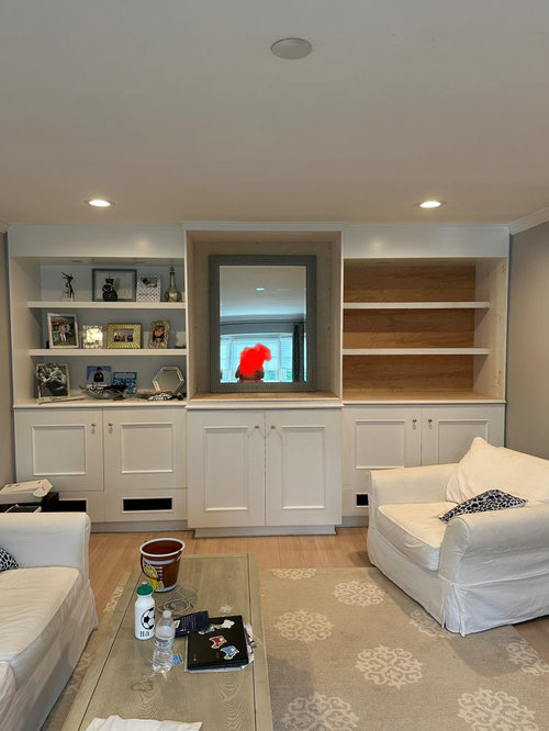
Hi there,


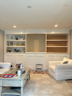
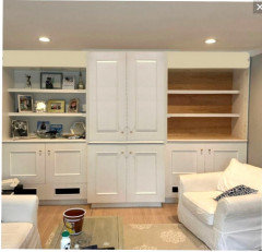
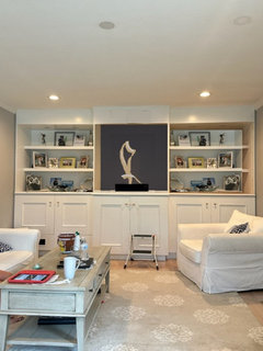
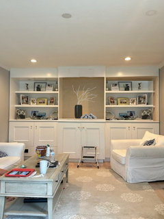
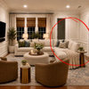
We are in the process of finishing up this wall unit built in and I am looking for help with the large middle section. We kept it open for the moment and threw a large mirror in there to get an idea, but we don’t love it. The other option would be to have the middle section match the side (two shelves and match the top soffit as well).


Thoughts?


Thanks


Comments (30)

  • 3 years ago

    Why does it stick out so far in the middle?

  • 3 years ago

    Middle section sticks out about 6 inches. I think it was originally built this was to accommodate thee old box TVs which were deep

  • 3 years ago

    What do you mean by “finishing up”? This implies you built it. But you say that it was constructed this way for a big tube tv. If this is a renovation of the space, I would think you would have reconfigured the space above the cabinets to omit the space for the old tv. You are asking how to use the big recessed space where the mirror is placed..which you have retained?

  • PRO
    3 years ago

    I assumed you built it so now all you are asking is how to fill it IMO it is already too much stuff on it and so I guess I need more info from you.

  • 3 years ago

    I think one of the issues is the upper center cabinet jutts out too far past the side shelves and that may be throwing it off balance. i agree with adding the soffit to the middle

  • 3 years ago

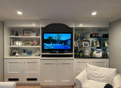
    I‘m sorry for not being more clear with my description. We are finishing up a remodel of the unit. Here is what it used to look like. The right hand side had mirrors and a granite counter. We opened up the middle section and I am now asking if we should leave it open or add shelves.

  • 3 years ago
    last modified: 3 years ago


    Here’s a pic of what it was like

  • 3 years ago

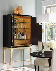
    OK! Thanks for the clarification. I think that the different size of the middle section points to a different use for that middle space. You have established the right and left sides for display. Have t you considered turning the middle space into a place for a dry bar? Perhaps papering the space with grass cloth, installing a large piece of art on top, and placing a tray with bottles, etc. on it? Giving that middle spot the focal point of the wall.

  • 3 years ago
    last modified: 3 years ago

    Put a door or pair of doors on it, hang a large painting on the door and use the space behind for storage. If doors/hinges won't work structurally, then close it off and hang a large painting there.

  • 3 years ago

    Thabks for the suggestions we are likely going to line the back wall of the built ins with grasscloth wallpaper (in either a neutral tan or possibly either a light or navy blue). we considered doors as well, but im worried that it may close off the room by doing that.

  • 3 years ago

    Since you are already modifying, id suggest cutting the middle section top to be the same depth as the sides. I think the base cabinet could be left as is. i’d Probably try to put doors on the middle since its too narrow i think for art to look proportionate with the wider sides.


  • 3 years ago

    The discontinuity of the soffit is what’s bugging me. The middle looks like a big empty box.

  • 3 years ago

    @Susan L I agree i think at the very keast we shoukd continue that soffit and molding across the top.

  • 3 years ago
    last modified: 3 years ago

    Another thought if you want art in the middle. maybe wall the middle section off flush with the shelves and hang art on that. that way the art is not stuck in a hole.

  • 3 years ago

    Its going to be too much work to get the middle section to be flush with the sides.

  • 3 years ago

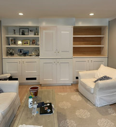
    Here it is with the soffit extended over the middle section (which is part of our original plan)


  • 3 years ago
    last modified: 3 years ago

    I think what @wsea means is to make this recessed portion less deep. Frame in a new rear wall with a piece of plywood or sheetrock. Measure the depth of the side bookshelves and use that so the new bump-out is flush the their edges. Try it with cardboard and see what you think. It's a good idea. Keep the cardboard cutout for your grasscloth or paint samples.

  • 3 years ago
    last modified: 3 years ago

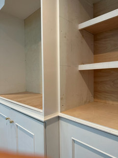
    @wsea @tracefloyd thanks for the feedback. It’s difficult to see in my pics, but there is a new rear wall in the middle section. So, even thought the front and sides of that section stick out further than the side section section, the depth of that cavity is roughly equivalent to the depth of the sides.


    This angle may give a better perspective. the back wall of the middle secion is almost flish with the front of the shelves of the side sections.


  • 3 years ago

    The continued soffit looks much better. If you have a piece of art that you like, I would use it or put doors on the top.


  • 3 years ago

    @houssaon

    there were originally doors on that too section which I still have. They go all the way up to the ceiling trim.

  • 3 years ago
    last modified: 3 years ago

    Thanks for the photo. I don't think your new wall is out far enough. To hang art there I would leave 4-6" +- deep recessed area. No shelves just a big painting over your grasscloth and coordinating sculpture. It's gonna be nice. If you have power there get a picture light.

    With this treatment you won't have to redo the soffit/header.

  • 3 years ago

    Thanks for the clarification. The middle section is too narrow for today’s televisions. What is the use of the room? The built is are a focal point, unless you put the doors back up and close them. I would remove all the upper shelves and cabinets and make it a better space for a big tv, or put the doors back up and maybe do a dry bar? Or reading/game room? It’s a very nice space - just needs a purpose and tweak.🙂

  • PRO
    3 years ago

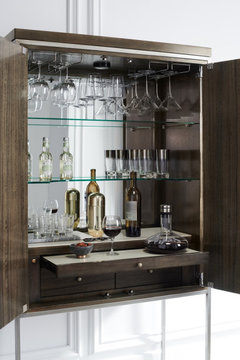
    Looks like a perfect place for a refreshment station or liquor cabinet.

    Outfit it with a mirror on the back wall and glass shelves


  • 3 years ago

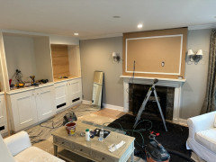
    @ShadyWillowFarm this is our living room/family room and we are putting the tv above the fireplace. Although it’s a mess, here is another angle of the room showing the fireplace. We are getting a sectional sofa with the shorter side with a bumper along the builts ins (not right up against them, but a few feet off that wall).

  • 3 years ago

    Your pics did not post, but consider taking it all out so the focal point can be the tv and you have great seating.

  • 3 years ago
  • 3 years ago

    I would get that middle section redone to be flush with the sides, and have all the shelving the same. The tv will look great above the fireplace.

  • 3 years ago
    last modified: 3 years ago

    Or light the center section and display 3D objects that need its depth (a sculpture, grasses or branches in a vase, etc.)?


  • 3 years ago

    I think the best solution is to add shelves. The old TV space seems awkwardly sized for much else, and shelving will provide a visually pleasing continuity to the cabinetry.

    I’m assuming there is power on the wall behind the center section, so if you wanted to emphasize it as more of a display area for special objects, you could use 2 glass shelves and then tuck some lighting up behind the top molding to provide some illumination. I once used a flexible tube type lighting hidden behind molding to get some light on some pretty china in an old breakfront.

    Looks like a wonderful room to spend time in!

Sponsored
J.Holderby - Renovations
Average rating: 5 out of 5 stars4 Reviews
Franklin County's Leading General Contractors - 2X Best of Houzz!