Software
Houzz Logo Print
ginnycraigj

did I paint the right color?

2 years ago
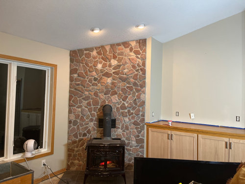
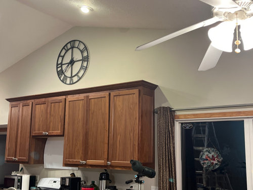
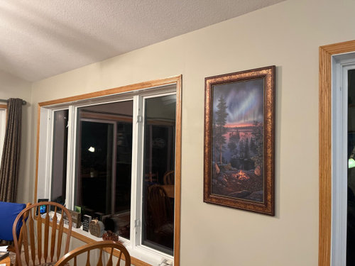
I am painting a large area in Sherwin Williams Accessible beige as recommended by the Interior Designer.
She picked it out to go with Walnut Cabinets, Honey oak trim (doors of cabinets next to fireplace will be restained) Whitby Cambria countertops and white oak floors.
I am 2/3 done painting and I am not sure if this works?
On my own, I probably would have picked a greige (or some kind of warm gray)and tried to get some of the warm tones from the rock wall behind the fireplace, but maybe this color is meant to be light and neutral so as to show off the kitchen cabinets?
If this works, great. I really don’t want to repaint…. But if it doesn’t… I would rather fix it now.
Any thoughts or comm
Never mind the furniture… everything is going.
The room does get lots of light!

Comments (24)

  • 2 years ago

    Ps…
    That is the same paint color in all the pictures, accessible beige can look quite different from one wall to the next due to lighting.
    The rooms that I am doing are kitchen, dining, living room and entry.
    Yea, I realize painting is last… and as far as I am concerned…. I want the best paint color for features of the room and I will have help picking furniture that works.

  • PRO
    2 years ago

    The light bulbs in your fixtures need to be replaced. with LED PAR bulbs. Find the size that is right for your fixtures and start changing them out. Your paint color is not consistent because of the lighting.

    Also, replace the ceiling fan or take down the light kit. They are not doing anything good for your kitchen.


    DO NOT PURCHASE ANY R BULBS!!!!! These are not the right color bulbs.


  • 2 years ago

    Whatever you do, I would paint the ceiling the same color as the walls. It is hard to tell because of the shadows from your lights and the orange undertones of the trim. Can you post some daytime pics too? This color doesn't feel perfect to me, but again, really hard to tell.

  • PRO
    2 years ago

    It looks good, just don’t forget to paint the outlet covers too

  • 2 years ago

    I think it looks nice. I would paint the dining room chairs a nice shade of blue to make them look even nicer.

  • 2 years ago

    From what I can see, it looks nice with the fireplace stone and the cabinets in the kitchen and living room. But the trim around windows and the baseboards are a more different yellow tone - if these could be painted same white as ceiling (but in satin or semi-gloss) it would tone down the yellow that is fighting with the accessible beige. I had AB throughout our main open living areas and lighting played a big part in the color appearance, sometimes it can look dingy when there's minimal light in the space.

    P.S. I would not paint all the ceiling the same AB as mentioned above, it would come out much darker because of the horizontal plane/lighting difference.

  • 2 years ago

    Yes Beverly,
    All the lighting fixtures will be replaced as I will pay attention to the bulbs.
    Not planning to paint the ceiling,
    Everyone seems to say it looks nice and they “like “ it, no one says that they “love” it.
    I feel the same…. I went with what the designer suggested…. but maybe I am not supposed to love it because it is meant to be neutral???
    The fireplace rock wall is a focal point. Will send a few more pictures in about an hour after the sun is up.
    Thanks everyone!!!

  • 2 years ago

    Ps…I really want to make sure I get the color correct now, I am 65… this is a huge job and I will probably sell the house in 10 years before I ever paint this again.
    Not rich enough to ever hire someone… plus I am a perfectionist.

  • PRO
    2 years ago

    I think first fix the lighting the wall color looks different in every pic. I like LED 4000K I have it everywhere but at lest in the spaces you are painting do 4000K or 3500k but anyhing lower k will cast yellow so be aware. I do not think beighe in all its permutations is neutral I love gray but I think an ice grayed green very light toned is perfect for a neutral. I use this often wnen clinets have a need to choose a wall color before funrniture . I cut it 25-50% depending on the space it looks awesome with wood


  • 2 years ago

    That’s a beautiful color

  • 2 years ago

    I cant say, I love it, but, I dont like anything that even looks slightly beige, so take that with a grain of salt. I do think, it looks ok. I would much prefer to see the Healing Aloe that Patricia just posted above, rather than accessible beige though. No, please do not paint the ceiling to match walls. That works in some rooms, but, not so much in a kitchen. I do think, the color you are painting does go well with the stone, but, it still seems a bit boring to me.

  • 2 years ago

    I agree withthe Healing Aloe or similar suggestion. The honey oak trim really dictates paint color. In my mom’s last house one of her friends who is an artist steered her toward paint tones with pale sage undertones to better address honey oak trim instead of beige and certainly not gray.

  • 2 years ago

    Will get a sample of healing aloe😃😃😃!!!

  • 2 years ago

    While you are at it, take a look at Balanced Beige, one color down the strip from Accessible. We have that with our similar colored wood work and they compliment each other well. I think a little more saturation may look better with all of your neutrals.

  • 2 years ago

    I'm surprised by the suggestion to go more green. I guess if you like the look in your second photo best, then that's the way to go. I like the left wall in the first photo and the entirety of the third, so I'd stick with the paint and adjust the lighting for consistency.

  • 2 years ago

    Is anyone even talking about the soft furnishings, rugs, etc.? If so I missed it. I’m assuming the paint recommendation from the designer took those into consideration? This is a must! Never pick a paint color without testing with those elements as ‘wood’ goes with everything but not every paint goes with YOUR furnishings!

  • PRO
    2 years ago

    The OP stated that all the furniture is being removed, so unless there are samples of the new furnishings, that's going to be a problem.

    My question is how much do you trust your designer? She/he is the only person who has seen the room in real life. The color that we see on our monitors doesn't accurately reflect what the color looks like in your room with your light. If one of my clients started second guessing my choice by crowd-sourcing, I would not be too pleased.

    Regarding Healing Aloe, it's a very nice color, but I think it looks best in a pale environment, like an all-white bathroom or a bedroom with light furniture and soft furnishings. I wouldn't use it with honey oak or walnut cabinets.

    With that caveat, from looking at your photos, if you want a neutral background, Accessible Beige looks very nice. If you want something more dramatic and with more contrast, and you are considering green, then a darker more saturated green would be better than Healing Aloe.

  • 2 years ago

    Excellent comment Dianne .
    And let me add- there is no second guessing once you start painting . THAT always ends in disaster one way or the other .
    Go with your first choice . And trust the professional THAT YOU HIRED 👍🏽

  • 2 years ago

    Oopsie I meant excellent comment Diana Bier …

  • 2 years ago

    I think it’s too yellow? I think Greige would look better

  • 2 years ago

    It looks okay, but the beige isn't going to look the same from one room to another, due to natural light. The one thing I noticed right away was the white windows and wood trim and I'm not lovin' the beige with the windows. Were it my decision to solve the different light in each room and the stark white windows with wood trim, I'd go white on the walls in eggshell finish and the same white on the ceiling in flat finish. A white which has almost no undertone, making it almost pure, is B.M. Chantilly Lace.


  • 2 years ago

    I like this

  • PRO
    2 years ago

    I agree with elcieg, the white on the windows is too much of a contrast with the wood and the beige. Can you paint it the same as the beige? Or stain it to look like the wood trim? Or paint the white and the wood trim the same color as the walls?