Software
Houzz Logo Print
webuser_552982494

trying to avoid paint color chaos (living-dining-kitchen)

2 years ago
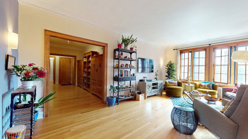
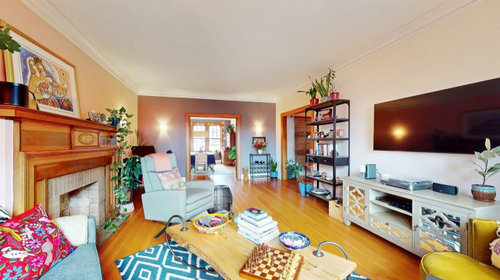
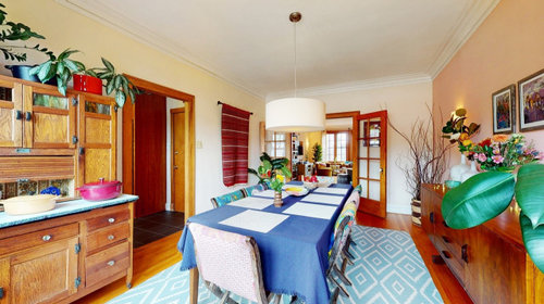
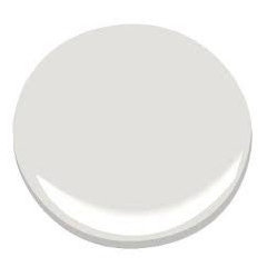
We have settled on SW Pearly White for our entrance/halls and living room, and we are learning towards SW Niebla Azul for our dining room-- we like having a bit of color, but aren't sure if that will be too disconnected or intense?


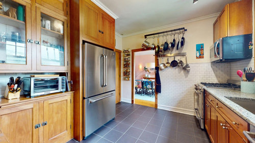
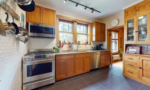
We also didn't know what to do for the kitchen-- a pop of color like SW Poinsettia? We also like muted greens like SW Restful. Or something more clearly connected to living/dining colors? There is a small guest room/office off the other side of the kitchen, and we were thinking SW Sea Salt, but again not sure how to make it all feel connected. We have gone back and forth on all of this for way too long and need to make final decisions in the next couple days--tempted to just give up and paint everything Pearly White...


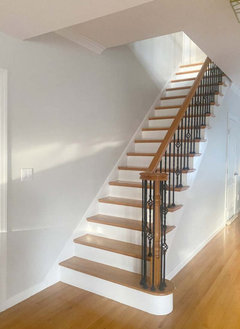
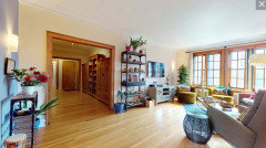
Photos are from the previous owner, so disregard the furnishings. Thanks!


Comments (15)

  • 2 years ago

    This would be the perfect time for you to consider a color plan for the whole house - rather than individual colors for individual spaces. It will get you the cohesive feel you are wanting. Something that will work well with your great woods, and the floor in the kitchen. SW Pearly White could look great with your woods, having a peachy and a green undertone (no I couldn't see that either, but the color experts say so). It is referred to frequently as a chameleon color so I would get large sample pages and test in multiple rooms in varying lights for several days. Sea Salt will definitely work with it, it has that grey-green not too saturated color. You might want to reach out to a color consultant for help with a whole house palette.

    https://rugh.design/color-wheel/pearly-white

    https://knockoffdecor.com/sherwin-williams-pearly-white/

    https://www.hgtvhomebysherwinwilliams.com/en/colors

    https://www.etsy.com/listing/1409925627/pearly-white-coordinating-colors-modern

    Leigh thanked Jenny
  • 2 years ago
    last modified: 2 years ago

    I love B.M. Classic Gray (it is an off white and shows white) with maple stain wood. I would run it all throw the downstairs. Use B.M. White Dove on all the ceilings.

    Add color with art and fabrics.


    Leigh thanked elcieg
  • PRO
    2 years ago

    If it's feasible, I'd highly recommend a consultation with a designer whose work you like. Paint is so easy to get wrong--even with the best qualifications and hard work! Colors change from one end of a wall to the other, at the very same moment, to say nothing of variations throughout the day and evening. The other colors around them affect them too--making small swatches painted on an already-colored wall hard to perceive clearly. This is not to say it's hopeless, just tricky! You have a lot of space here, and you want to feel really happy in it... maybe a bit of professional help would be worthwhile. If not, give yourself very large sample areas to look at with each color you explore. Best of luck! It looks like a great house.

    Leigh thanked Full Fathom Five Interior Design
  • 2 years ago
    last modified: 2 years ago

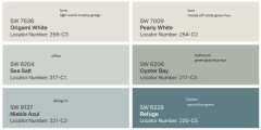
    Thanks, everyone! I had picked Pearly White since we wanted some contrast with the white trim and to cool down the warm wood-- it looked like the warmest of the cooler off whites (I have been using the large Samplize peel and sticks on different walls & times of day). I met with a color consultant today who said it could work but cautioned against the greenish potential. She suggested maybe Origami White for halls and living, keeping Niebla Azul for dining, Refuge for kitchen, keeping Sea Salt for office (plus Oyster Bay for office bath). Still nervous about so much color...Anyway, thanks for the advice and would appreciate if you have any other thoughts, especially about sheen-- I have old plaster walls, so my painter recommended matte to hide imperfections, but I have a toddler, so maybe satin?


  • 2 years ago

    I think that's a beautiful group of colors. Your kitchen has so little wall space, I think the Refuge would be beautiful against all the white tile. Some people love lots of white and only pillows with color. I am not one of those people, and think color brings so much joy to a house. I personally would jump in the deep end with the kitchen, if you love it keep going on color.

    Leigh thanked Jenny
  • PRO
    2 years ago
    last modified: 2 years ago

    I do not like the 2 whites together at all. I do agree too many colors feels disjointed and not sure about the kitchen color with the cabinets. I use this color from BM a lot for clients who want some color but have many items that do not work well with certain colors I cut it 25-50% depending on the space but it is truly neutral and works really well with wood tones and allows lots of colors for accents too I aslo suggest you think about your lighting I like all LED 4000K but 3500K works well too but IMO all the lighting should be the same then choose colors. Waht I like about 4000K is it mimic bright daylight so colors stay true at night


    Leigh thanked Patricia Colwell Consulting
  • 2 years ago

    Thanks, Patricia! But to clarify, it wouldn't be those two whites together-- it would be one or the other. The Origami was suggested as a replacement for the Pearly.

  • 2 years ago

    Great that you are going with subtle color changes from room to room that will all look good together.


    I too have plaster walls and matte is the way to go, however, it is not a forgiving sheen and would be challenging with kids. I recently used Farrow and Ball Dead Flat. If is a fantastic new formulation that came out this year. It is complete matte and more cleanable than any glossy paint I have ever used. Not sure what they did to achieve this but it really, really works. I just take a damp sponge and everything comes off. It is more expensive and you'd have to pay your consultant again to translate the SW colors into FB and test them out. Don't know if you have the budget or energy for this, but FB paints are stunning and very worth it.


    The palette she created is beautiful. I presume in these rooms you will paint all four walls those colors. What did she spec for the ceilings? Is all of the trim staying the same as now?


    The only one that seems off to me is the kitchen color. (Swoon worthy space, oy those tile walls, I love them!) It could also be how it looks on my screen vs in person in the light of your room. It seems almost there but not quite. I don't love it with the floors. There is so little wall space to paint that I feel like the wall color and floor color are going to create a heavy top and bottom and sandwich, in an odd way, everything else in the middle. What will the ceiling be in this room?


    I'm not opposed to a saturated color in here, nearly the same as this, but for some reason this particular shade is not hitting the mark for me. (That said, there is so little of it, if you paint it, live with it, and don't love it, you can always repaint that small amount.) SW Star Gazer is just a tad bit darker and I think would relate to your floors more. SW Blustery Sky is a tad bit lighter and also feels like it would relate to your floors more.


    I hope you'll post the after pics! I think this is going to look great.


    Leigh thanked Kendrah
  • 2 years ago

    The color of the crown on the ceiling and the trim around the doors need to be the same - IMO. It just looks busy otherwise. I assume they will be the same color.

  • PRO
    2 years ago
    last modified: 2 years ago

    I am not fun of different colors in rooms. I prefer to go with the same color for entire house.

    October Mist SW for dining room visual here


    Leigh thanked Celery. Visualization, Rendering images
  • 2 years ago

    I love color and use a lot of color in my own home, but i think you may have selected too many different colors for the main living areas of your home.


    I have a method I use to pick colors for my own home or when I help someone pick colors for their homes.


    My first task is to make a list of the rooms and adjoining rooms that are visible from each room.

    Once I have the rooms I add the list of major color contributors for the space.


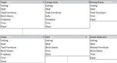
    Inventory of my current home


    Close up of just some of the inventory


    Once I have my list completed I decide what colors must stay (I either don't want to change or can't afford to change at this time or in the near future).


    The next thing I find out are what colors the homeowner loves. That color that keeps repeating in the art, throws, décor items that they have bought. We all have colors that make are hearts sing and we should surround ourselves with those colors, but not every color needs to be on the walls.


    Once I have the colors that must stay and the color the homeowner loves, it is a matter of figuring out how to make those colors work together and what neutral backdrop looks best with the colors that must stay and the colors that are loved. After defining the neutral I pick a white that will harmonize with the neutral. I usually use the same neutral as my neutral, but sometimes use two shades of the same neutral.


    For potential wall colors I will pick less brilliant shades of most colors. Walls are big surfaces, so a little bit of color can go a long way and look way brighter, more saturated than expected or desired. Again, keep in mind that walls are generally the backdrop for your art and décor, not the main attraction.


    I almost always use the neutral that I selected in the living room or great room and in hallways. In those rooms I will have the colors that are loved displayed in the area rugs, furnishings, art and décor. The rooms that shoot off from those rooms are where I may use a different shade of the same neutral or use a muted/softer shade of the colors that are loved. I will repeat the same colors in different amounts in each room.


    Example - If I want to move from a neutral living room with some blues and greens, but want to use yellow in the kitchen, I would use the dining room that sits between to two to marry the colors, using the neutral for the upper half the walls in the dining room or for the whole wall adding in some blues and greens on the lower 1/2 the walls or in the seat cushions and area rug. The centerpiece, art and place settings would bring in some yellow along with the blues and greens. Now when I walk through from one room to the next I get introduced to the yellow in the dining room and the yellow can now be the main color of the kitchen. I would most likely try to get countertops/backsplash that repeats the same neutral from the living room and have just a touch of blues and greens in the art/décor.


    When you are selecting a different color for each room I am wondering how you will marry all the colors. Will you be able to have enough of the colors represented in each room to make them flow from one color to the next?


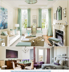
    I love these two examples. First one moves from fresh blues and greens to violet and violet gray through an intermediary room where the colors are blended.


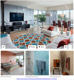
    The second one uses different color walls, but you find all of these colors in the main living area.


    Leigh thanked Jennifer Hogan
  • 2 years ago

    Thank you!! Going off of the very helpful advice here (and my own deep fear of color), we will do the dining room the same Origami White as the living and entrance halls. I am still stumped about the kitchen-- I made a new post, since the options have shifted a bit, but I would welcome any advice you all might have: https://www.houzz.com/discussions/6416718/kitchen-and-guest-bath-color-help

  • 2 years ago

    @ Leigh - I am going to challenge the designer's thoughts and yours on the white you are choosing.


    I understand the logic, if I have warm floors and want things to look less warm, I should add cool tones. That would work if you were adding a translucent layer over the wood, but since we are not cooling the color of the wood, but putting something next to the wood using a cool color will have the opposite effect.


    Your highlighting the warmth instead of making it less impactful. Purple and yellow are opposites or complementary colors putting them together makes the purple more purple and the yellow more yellow.


    To make the floors and trim feel less warm you need a light creamy warm paint color.


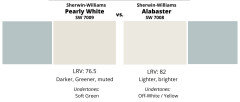
    A bit less yellow but still warm enough to not contrast with the wood is SW Alabaster


  • PRO
    2 years ago

    Here is an option for your consideration Notice how Pearly White changes the tone of the Azul