

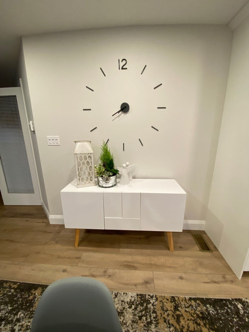
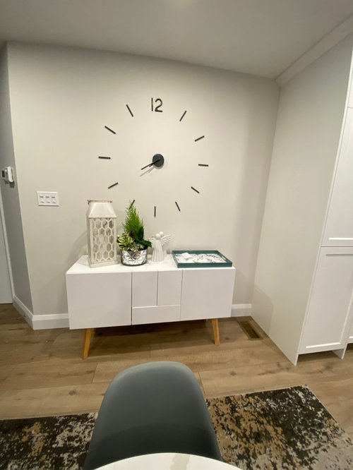
Console design help
2 years ago
Sort by:Oldest
Comments (19)
Related Stories
DECORATING 101Interior Design Basics to Help You Create a Better Space
Let these pro tips guide you as you plan a room layout, size furniture, hang art and more
Full Story
MOST POPULAR7 Ways to Design Your Kitchen to Help You Lose Weight
In his new book, Slim by Design, eating-behavior expert Brian Wansink shows us how to get our kitchens working better
Full Story
LOFTSDesigner Helps a Couple Adjust to Loft Living
A careful balancing of refined and industrial touches creates an inviting home in downtown Milwaukee
Full Story
DECORATING GUIDESGot a Problem? 5 Design Trends That Could Help
These popular looks can help you hide your TV, find a fresh tile style and more
Full Story
UNIVERSAL DESIGNMy Houzz: Universal Design Helps an 8-Year-Old Feel at Home
An innovative sensory room, wide doors and hallways, and other thoughtful design moves make this Canadian home work for the whole family
Full Story
GARDENING GUIDESGreat Design Plant: Common Boneset Helps Good Bugs Thrive
Support bees, moths and butterflies with the nectar of this low-maintenance, versatile and tactile prairie-style plant
Full Story

DECORATING GUIDESHelp Out: Art and Design for Japan
Home Design That Benefits Relief Efforts
Full Story
8 Ways Dogs Help You Design
Need to shake up a room, find a couch or go paperless? Here are some ideas to chew on
Full Story
WORKING WITH PROS3 Reasons You Might Want a Designer's Help
See how a designer can turn your decorating and remodeling visions into reality, and how to collaborate best for a positive experience
Full Story
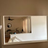
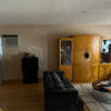
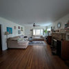
Norwood Architects
Patricia Colwell Consulting
Related Professionals
Parkersburg Interior Designers & Decorators · Houston Architects & Building Designers · Hilton Head Island Kitchen & Bathroom Designers · New London Kitchen & Bathroom Designers · Spring Home Remodeling · Waterbury Home Remodeling · Scranton Home Remodeling · Ocala Kitchen Remodelers · Akron Kitchen Remodelers · Middlesboro Interior Designers & Decorators · Kingman Interior Designers & Decorators · North Platte Interior Designers & Decorators · Wheeling Kitchen & Bathroom Designers · Toledo Furniture & Accessories · Bridgeport Furniture & AccessoriesNagyMama
blfenton
Ariana Designs & Interiors
blfenton
Celery. Visualization, Rendering images
Nad TOriginal Author
Nad TOriginal Author
BeverlyFLADeziner
blfenton
RedRyder
Paul F.
RedRyder
Molly D. Zone4B
Paul F.
Yvonne Martin
btydrvn
btydrvn