Software
Houzz Logo Print
webuser_375033222

kitchen design advice

2 years ago
HI,

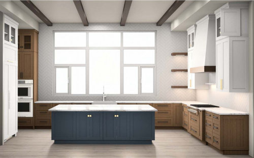
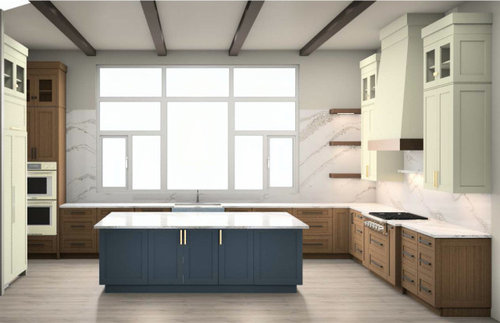
I have attached the 3d drawings of our new build kitchen, and would love design feedback?


Picture 1 & 2: Bulkhead or NO bulkhead above the cabinets? (ignore color and cupboard/drawers.. this is just a visual for the bulkhead)


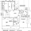
Picture 3: This is our layout. Any suggestions ??


Keep in mind our kitchen ceiling is 12ft - which in retrospect creates some difficulty with cabinet height.


Thanks for your input!


Comments (18)

  • PRO
    2 years ago
    last modified: 2 years ago

    I love the fact the windows are there I do not like how thay are styled . The fact tis kitchens are a very personal space IMO. Why are asking abiut a bulkhead just take the cabinet to the ceiling , BTW I never like 12' ceilings and never in kitchens The base cabinets need to be all drawers but much larger there is no way those beside the range can even hold one pot . The walkways in this volume of space need to be larger . Do you have an actul independant kitchen designer or some cabinet salesperson ? Kitchens first and foremost have to function for you, bigger is very often not better in fact just the opposite. I agree a whole house floor plan is a must to really advise. Posted here in a comment DO not start another post. I also think 3 finishes for cabinets is too many . I think you need to pick a style I do not think a farmhouse sink belongs in a space with that wall of windows one very contemporary and the other not.

  • PRO
    2 years ago

    No bulk head

  • 2 years ago

    Do you have to have 12’ ceilings?

  • PRO
    2 years ago

    No bulk head

  • PRO
    2 years ago
    last modified: 2 years ago

    No bulkhead.


    and just from what we can see?

    I'd re think my appliances/.locale.

    We'd get a better understanding if we could see the entire living floor.


  • 2 years ago

    No bulkhead.

  • 2 years ago

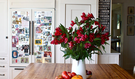
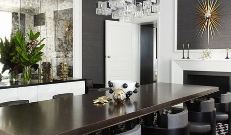
    in real daily life I think it will be odd. the window takes center stage......yet the glare and UV would bug me....motorized shades would be down most the time...anyway maybe you crave sunlight [I'd cut the window down by 25% at least---just take off that top layer]..... these rooms shown w high ceilings showcase details and the scale height etc serves a purpose w layering in materials, colors, texture, architecture. Your tiny beams /tiny shelves yet huge glass panaroma doesnt make sense. Bring in other details. The first two shown here have the cabinetry set within some framed alcoves which gives a sense of a zone embedded within the larger scale of the spaces.....Are you getting designer help for your kitchen ?


    The Dominion · More Info

    Cliff Lane at The Dominion · More Info


    Pacifica · More Info


    Burr Ridge, IL Traditional Kitchen · More Info


    Modern Kitchen · More Info


  • 2 years ago

    And to add to what Jan Moyer said, I'd also make all your lower cabinets wider. Depending on your cabinet line, you could easily go up to 42". It's easier to get more into fewer cabinets versus trying go get the same stuff into narrower cabinets

  • 2 years ago

    It sacrifices a lot of utility for the style. If you're not a cook or you are flipping it, its a show stopper.

  • 2 years ago

    I'd like info of the view and directional orientation of the window side of the house.

  • 2 years ago

    What style are you going for? The window makes me think modern--kind of a monochrome Mondrian--and the heavy-veined quartz wall adds to that feeling. But the cabinetry is pretty traditional, and the beams (plus the dark green island) gesture at English cottage, although your ceilings are much too high for a cottage feel. You need to figure out what style you are really shooting for, and then adjust several elements accordingly.

  • 2 years ago
    last modified: 2 years ago

    I don't think your walkways are wide enough. They should 48" from thing-that sticks-out-the farthest to thing-that-sticks-out-the-farthest (i.e., countertop edge to countertop edge) and yours is clearly marked, in at least one place, as box-to-box. A few inches difference may not look/seem like much on paper, but it makes a world of difference in real life.

    Your island dimensions appear to be ENORMOUS (but I don't see measurements). Seems like it would be very hard to reach across and clean the countertop without throwing your body across it. :-)

    Also, for sure no bulkhead, but DO go all the way up to the ceiling like @Jan Moyer proposes.

  • PRO
    2 years ago
    last modified: 2 years ago

    "And to add to what Jan Moyer said, I'd also make all your lower cabinets wider."

    Cpartist took the words from my left it out comment : )

    I'll reiterate: Show the entire floor. Nothing lives in isolation, let alone a kitchen.

    I also fully agree the beams ( @ herbflavor) need a lot more heft, and THREE is far more attractive than the even number four.

    The wow of a 12 foot ceiling is up to you, as is a wowie view and placing appliances and finishes for effect.! As long as you remember you have to live in it, work in it, and pay for it : )

  • 2 years ago

    IMO the window as drawn is not very attractive at all. And probably too tall.

  • 2 years ago

    Additionally I wouldn't make the uppers any higher than 10'.

  • PRO
    2 years ago

    I found a couple pictures going each way.

    Soffit

    Note the size of the beams


    No soffit


    Personally , I would not have a soffit - just nice thick beams.

    If you do want to soffit - be thoughtful about it. This room transitions to another space - look hard at what it looks like from outside of the kitchen space. It might be nice designed as a tray ceiling with beams


    Just some thoughts

  • 2 years ago

    Hurray for fantastically high ceilings. I love them. No soffit. Jan's drawing is the prefect solution. Here is a kitchen with former 12 foot ceiling that was brought down to 10 feet with the use of soffits. But it works here because they ran it all the way around the room, and it is two feet, so hit has some hefty and seems proportional to the design. Your drawing just stuck on skimpy sofits above the cabinets, which doesn't do much. Notice the beefy three beams here as well.


    I'd add cabinets in the corner to the right of the window. Those shelves are ridiculously high and impractical. I'm envious of your counter space. You will certainly get your steps in each day walking from the fridge to the stove and back. Is that the goal though?


    The idea of a huge window is glorious, but it becomes the focal point and you really need to up the ante on the aesthetics. What is the view of outside the window? Are you working with a designer on this?


  • 2 years ago

    oh just go to the ceiling, will look great.

    suggest just bid wide drawers in the cook top, ditch the narrow oull outs (spice and utinsel) totally useless and mininmal storage

    on the other drawers go wider and less of them, example to the right of the range, do three drawers not six