Software
Houzz Logo Print
nancyartist

using blue throughout is it too much ?

2 years ago
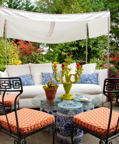
My first floor is various shades of blues , cream and white. The exception is the sunroom which is teal ,it’s in need of a changeover of cushions. I’m leaning once again to various shades of blue . Is it too much to have variations of blues in every room ?

Comments (38)

  • 2 years ago
    Your house, your choice!

    If you want answers that apply to your actual space, you might want to post photos of what some of the rooms look like.

  • 2 years ago
    Agree need pics.

    Just a general consideration, I think it could be very cohesive to do that IF there are some key differences in each room that add interest . So a concept is, let’s say you have blue & beige/ cream. One room might have more blue, maybe paint, or maybe a lot of upholstery, with cream accents or rug, and another room might have semi- reverse of that. Intensity of blues should vary ( in similar undertones), so, not all a sea of matchy blue. Maybe a sunnier room and a moody blue room. Some pattern & degree of pattern mixing helps. Different textures.

    Also, whatever 3rd or 4th accent colors could vary. One room might have touches greens, healthy houseplants ; another might have some lemon yellow.

    Artwork can be great, avoiding hotel- room bland blues matching blue room, but introducing contrast and additional colors.

    I think if you search, you can find designer houses featuring just such a “ love of a color “. It wouldn’t need to be blue, but you would get ideas about variations in a color that provide interest.

  • 2 years ago

    Pics?

  • 2 years ago

    Oh, and using woods and other natural materials to warm up the blues. Not going mass amounts of golden oak or orangey( though orange and blue look good together in textiles & art), but “ warming up” what could be a lot of smooth paint and fabrics.

  • 2 years ago
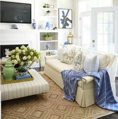
    I have blue in every room. My designer friend says it serves as a neutral in my home.

  • PRO
    2 years ago

    If you want help we need pics for sure posted here in acomments DO NOT start another post. I do not like blues in main living spaces except for maybe navy. So I need pics . There are literally 1000s of colors to work with blue get out of the blue box and give some of those a try . Maybe a print with a bit of blue and some colors .

  • PRO
    2 years ago
    last modified: 2 years ago

    "I do not like blues in main living spaces except for maybe navy. So I need pics ."

    Please stop that " I do not like" thing.

    Not what the op asked. She likes blue. There are no pictures. For all we know, it is gorgeous, just not your gray style and preference.

    Bottom line and with all due respect PLEASE?

    The seemingly continual insistence on beginning virtually every contribution with what you like or dislike is not at all relevant.

  • PRO
    2 years ago
    last modified: 2 years ago

    I love blue and white and use it in almost all of my rooms. Pictures would help, since context is everything.

    Saying you like or don't like anything is not helpful. As a design professional you should be able to give a client what they like, as long as it's designed well and fits their needs. Whether you would put it in your own home is of no consequence.

  • 2 years ago
    last modified: 2 years ago

    The seemingly continual insistence on beginning virtually every contribution with what you like or dislike is not at all relevant

    And its unhelpful because it makes an OP second guess their color choice likes.

    It would be like me saying to someone asking for advice how much i dislike red contemporary kitchen cabinets with gray, especially in a historic house. Honestly, I've never known a professional to do that because it's not very professional.

  • 2 years ago

    Go with the blue cushions in the sunroom.

  • PRO
    2 years ago

    One of the challenges of using blue throughout the house is that it can be cold. You can overcome this by adding accents of warmer colors, like red,
    Orange or yellow. You can also add organic materials like wood, rattan, bamboo, or brick.

  • 2 years ago

    I like blue throughout! My local interior designer did this scheme in her home and it’s stunning! It’s similar to what @chispa said. It’s used throughout in a cohesive way and different shades but the undertone runs throughout.

    So her kitchen is all white, except navy island. Adjacent family room has a touch of blue in the curtain panel end that brings elegance to a simple white panel. The rug there is a muted light blue. And her upholstery is blue but not like all over in your face. And she created custom cabinetry to flank the fireplace where the lower cabinets match the island. Then her living room also uses blue but in a grand buffet that is almost a blueish tone wood with other colors.

    All this to say, she used blue throughout and it’s so so so stunning! She’s a designer so she paired things I wouldn’t even know where to begin but the main point is…it’s a yes to blue. Just make sure the tones work!

  • 2 years ago

    I don’t think what you’re describing sounds like too much blue at all, OP.

    It’s normal to carry preferred colors throughout a home. I love warm, earthy colors, so that’s what I have in every room.

    Would like to see your sunroom! I so wish I had one.

  • 2 years ago

    Many people utilize a whole house color scheme. I think it is fine to carry various doses of blue throughout your home. It is much easier to give specific recommendations if you attach a photo.


  • 2 years ago
    last modified: 2 years ago

    It’s your home, so you might as well use colors in your rooms that you like. Otherwise, what’s the point.

    And no, having blue in all the rooms would not be too much - as long as you balance it out with other colors and/or natural elements and/or metals, such as gold. I get the sense that you are probably already doing that, instinctively. I don’t think you are planning to have just shades of blue from top to bottom in every room.


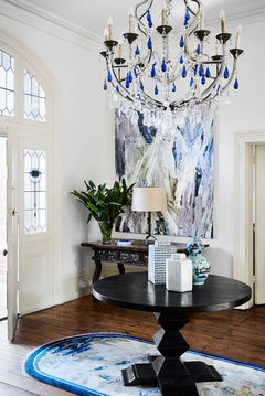
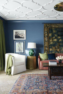
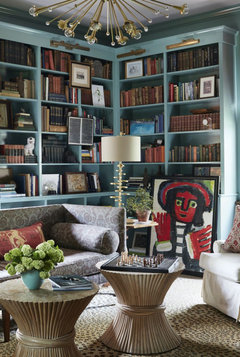
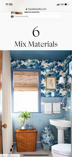
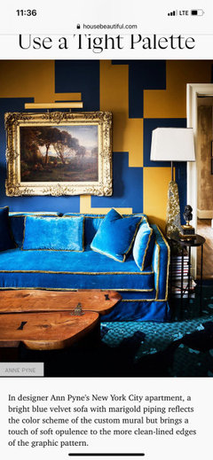
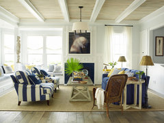
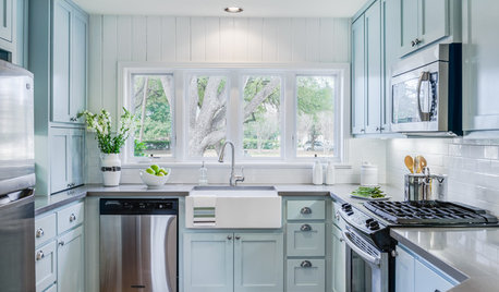
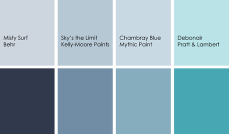
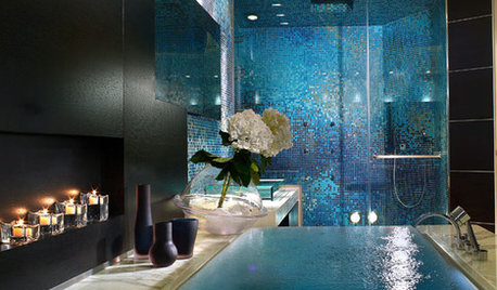
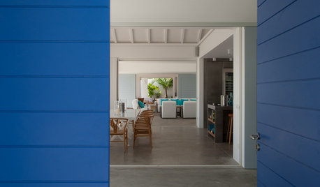
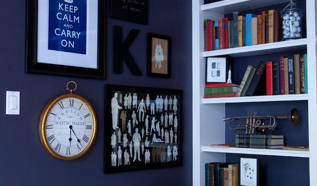
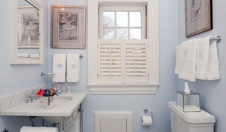
    Some blue inspiration:


  • PRO
    2 years ago

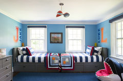
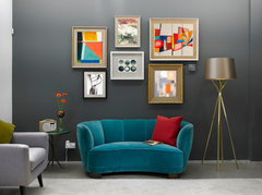
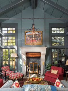
    More examples:

    Rye Colonial · More Info


    Autumn Winter 2016 Hive Gallery Wall · More Info


    Contemporary Living Room · More Info


    Salt Lake City · More Info


    East Beach · More Info

    I could go on and on, but I think you get the picture!

  • 2 years ago

    I never did it intentionally but every room in my house has some degree of blue. I can’t help it — it’s what I like! But I mix things up enough that I think it looks cohesive rather than one-note and boring.

  • 2 years ago

    The only time I ever saw a room with too much blue was the house my Mom bought back in the 80's. The owner had baby blue carpeting, all upholstery was baby blue, the walls were painted baby blue and it was basically the only color in the room.

    That is not what you're doing and honestly it's good to have a repeating color throughout the house where in each room it's used in different amounts. Blue is a great neutral.

  • 2 years ago

    Shades of blue play well together and also coordinate beautifully with many other colors. You can always go with blue and teal for the room in question.

  • 2 years ago

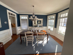
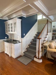
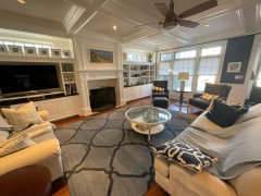
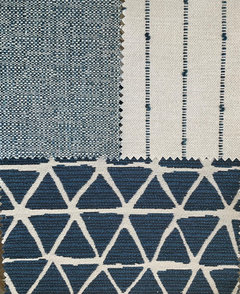
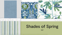
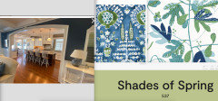
    Thank you all , here are so the photos , its our full time home near the ocean .Semi open floor plan however the dining room and sun rooms are seperated by the foyer. The sun room cushions i want to change possible fabrics are pictured . were having white plantation shutters installed on lower half windows . Fabric

    swatches what I'm considering for the cushions , more solid blue for base , white stripe for latge pillows and tge print for small accent pillow . Appreciate input


  • PRO
    2 years ago

    I absolutely love your home!! So many gorgeous architectural details.

    I love your fabric choices too, but I'd want to introduce an accent color probably in all the rooms. Nothing big, but as I posted earlier, you'd get some oomph and drama if you added a bright yellow, orange, red or green to the palette. Perhaps in a pillow, throw, lamp, artwork, etc.

  • 2 years ago

    Lovely seaside styled home!

  • 2 years ago

    Beautiful home!

  • 2 years ago

    Gorgeous home!

  • 2 years ago

    I believe our homes should reflect our personalities.


    Sometimes I find that people are much more conservative in their home décor than in real life. Other times, it is truly a reflection of their personality.


    Your home is lovely, but a bit too monochromatic for my taste. I love the teal and bit of coral in the sun room. It lightens the conservative feeling that the rest of the home portrays. But I am not a conservative person. My closet is filled with a rainbow of colors. When the kids in the family were guessing everyone's favorite colors and they came to me they decided my favorite color was "Flowers".


    If your closet is filled with navy, white and camel and these are truly the colors that represent who you are then it is the right choice for your home.

  • 2 years ago

    Your home is beautiful and I love all the colors.

  • 2 years ago
    last modified: 2 years ago

    What a beautiful home! Not too much blue at all - its all tasteful. Come to think of it, I have blue in every room in my house too :) I personally would add pops of other colors, like people have suggested. My office space is navy blue, tan, hunter green and its one of my favorite rooms. Blue works so well with almost every other color!

  • 2 years ago

    I love it the way it is. I'd consider coral or lime green as a great accent color. Just personal preference, but I'd take down the small photos that are obstructing the LR window.

  • 2 years ago

    My gosh.....I look at your photos and proposed choices - and I wonder why on earth you are here asking for advice! What a gorgeous home with beautiful colours and furnishings. I do like the teal cushions you've got.

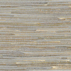
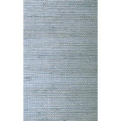
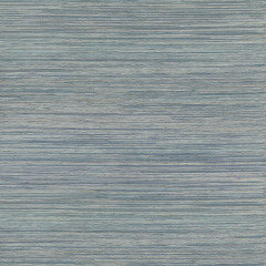
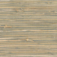
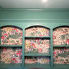
    What if for that sunroom, you chose a grasscloth or some other type of wallpaper for the walls (there isn't much wall since it appears to be mostly window).

    Here are some I saw - and to echo some advice above - some other colours and textures to work with your blue could look really lovely.


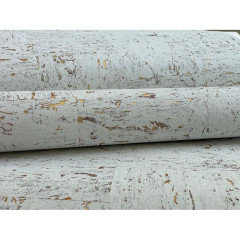
    This one is cork and gold. So gorgeous, bringing in colour and texture and then you use some gold coloured accessories in the room.


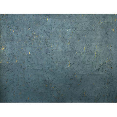
    Same idea with a mid blue colour and gold.

    These others are grasscloth ideas. The colours may not be right for your room but I like the idea of the texture for the walls to work with the blue fabric choices you've got.


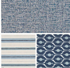
    This one with multiple hues of blue would be very nice.


    Too much maybe, but looks like a blue/grey background here. Echo this natural colour in cushions.


  • 2 years ago
    last modified: 2 years ago

    I think the fabrics for the cushions will work fine ... they are a safe choice to go with your overall house design. In a sun room, I would probably go a bit bolder.

    Tropical Hollywood Regency Sitting Room · More Info


    Summer 2016 · More Info


    Leslie Hayes Interiors · More Info


  • 2 years ago

    I like blue; I think most people do.

    If you're afraid of going overboard, remember the 60-30-10 rule (I personally am not very good with color, but I can follow rules). Any give room should be primarily made up of three colors ... use 60% of one color, 30% of another and 10% an accent color. If you use blue in all your rooms, vary the amount you use, and it should work. That is, let it be the 60% in one room, but the 10% accent in the next room. It'll keep things tied together without being "too much".

    Nancy thanked Mrs Pete
  • PRO
    2 years ago
    last modified: 2 years ago

    I am all for blue. But comes a point when it is used the same tones, the same way everywhere? Not quite so much

    The sun room?

    First up for change? The wall color!! . I'd change up to green! It will pop the shutters, and it's a NATURAL with your rattan furnishings. Great with the rug too.

    Then? Broaden your palette, certainly carry the blue ( pardon my lazy, no big dig here )

    And BAM.

    Personally? I'd let the seats go a great washable white, and all the rest of the interest? The back pillows!

    You're forgetting the layers, the textures, the BREAKING/stretching of a palette that makes a home come to life!: )


    It sings FRESH


  • 2 years ago

    Some very good ideas here Thankyou .

  • 2 years ago
    last modified: 2 years ago

    You have a beautiful home. I also love the current wall color in the sunroom. It looks like a yellow/gold color, so rich. My kind of wall color. :) Definitely keep it, if you like it! The rattan adds a lot of warmth, as well - plus, the beautiful red on your poinsettia. And it looks like you have some coral on your existing pillows. Are the cushions on the chairs teal? They look grey on my phone, as do the window shades. (might just be the way light is hitting the room in the pic, plus my device; window shades might be white and cushions teal - but either way it works.) And if your cushions are teal, the gold wall color is even more sublime, since gold and teal are both jewel tones.

    I really do not see one issue with the existing sunroom... nor with the new pillow fabric you have chosen. If you wanted to add another accent, as one option, you could pick up on the beautiful wall color; maybe add a solid gold pillow or two to your mix. Or a fun pattern.

    You have very elegant taste and style.


    Nancy thanked freedomplace1
  • 2 years ago

    Thank you , can you tell me the source of the shades of spring books. Thibaut?

  • 2 years ago

    Thibaut, maybe Kismet collection.

    Nancy thanked chispa
  • PRO
    2 years ago
    last modified: 2 years ago

    Yes, Thibault fabrics all ;just a sampling

    Shades of Spring is a Ben Moore paint swatch.

    https://www.thibautdesign.com/

    Nancy thanked JAN MOYER