Software
Houzz Logo Print
charlotte_landry96

How can I make this look bette without reinstalling new tile?

2 years ago
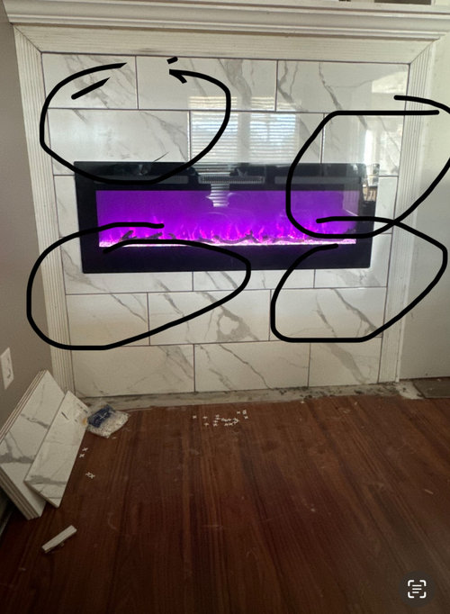
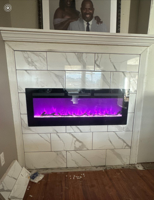
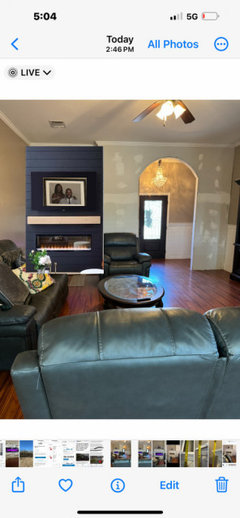
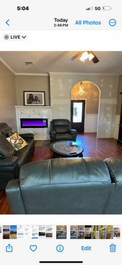
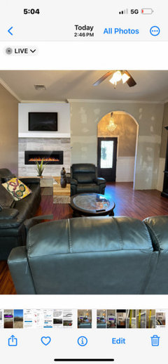
Contractor recently installed tile on fireplace. while he was installing, i noticed the off balance of the tiles. i pointed it out to my husband and he told me that the Contractor was following the pattern. (Husband is easily aggravated with me not agreeing with him.) I thoughy once the fireplace was inserted it would look better. well. im super depressed. What should i do?


Comments (21)

  • 2 years ago

    Yeah, not a good job. I agree with you.

  • 2 years ago

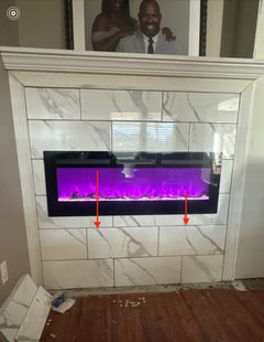
    So the symmetry of the tiles is off. Yes contractor should of did a better job on that. There is not a lot of tile, can you ask him to replace it? Honestly I only noticed it because it was pointed out, not saying that I would of never noticed it.

  • 2 years ago

    I think it is kind of the pattern you or the contractor chose. I'm not sure there is a way to make it symmetrical with that pattern. I don't think it looks bad. If it were me I would keep it since the grout lines are even and the tile looks very nicely installed. I don't think you can blame the tile setter.


    But it if really bugs you then think about having it redone with a different tile that is more uniform and a different pattern that will center nicely. To my eye the tile is too big for that pattern in that small of a space. There is also too much variation in the tile.


    We did our electric fireplace in a similar tile (white with lighter grey diagonal veins since I didn't want a high contrast pattern). Due to experience with tile setters, we laid the pattern out on the floor first so we could balance the diagonal lines and have them run together. We were also explicit that the center tiles were centered on the fireplace. If he had started with a full length tile at the end then the other side would have been a shorter tile and we didn't want that to happen.


    We bought several extra boxes of tile so we could eliminate the nearly all white ones and pick the ones with lines that joined up to lines on other tiles. It was a royal pain to lay them all out and keep moving them around until we liked the composition but we are happy with the results.


    I'll send you some pics via direct msg if I can.

    Charlotte Landry thanked mmmm12COzone5
  • 2 years ago

    Yes ouchy, once pointed out. It would drive me nuts. Could you not redefine extra lines on the tiles to represent smaller tiles. You could use glass paint which they use for decorating bottles and small window decorations.

    Charlotte Landry thanked HU-267503144
  • 2 years ago

    Technically he used a standard 1/3 overlap running bond so it is not incorrect from that standpoint. There should have been some discussion on his part about what your expectations were regarding centering and where, and regarding what happens when there is a big gap in a pattern like a window or firebox because that can make even well laid out patterns look wrong. He just laid the pattern starting with the most full tiles at the top.

    As a designer I would have tried to talk you out of tile this big because there are so few tiles it's hard to get a layout that looks right everywhere.

  • 2 years ago

    To me, the tile, while nice, does not suit this application. I would have chosen a solid slab to eliminate grout lines and busy pattern.

    Charlotte Landry thanked susan49417
  • 2 years ago

    You could place a decorative fireplace screen in front, which will help to hide any imperfections that might bother you - I think once everything is finished in the surrounding area, I don't think you will notice it :)

    Charlotte Landry thanked la_la Girl
  • 2 years ago

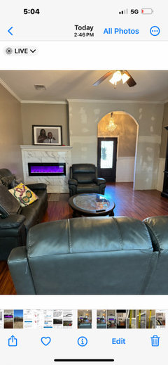
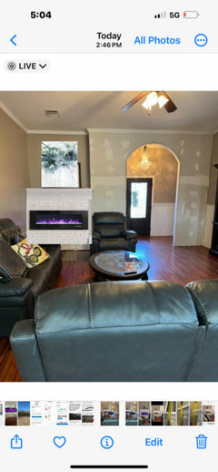
    A photo of that wall from further back might help with suggestions. Love those smiles in your photo above the mantle - they are sure to compete as the focal point! I wonder if painting that inset area above the mantle a different color would draw your eye up. Perhaps hang the picture instead of propping it. It might be worth trying for MORE asymmetry with your fireplace decor. A nice size floor plant on the right that would blur the edge without coming too close to the fire might help.

  • 2 years ago


  • 2 years ago

    They did a pretty impressive job with the veining. What about using a lighter grout that matches the tile so you don't see as much of the non Centering?

  • 2 years ago
    last modified: 2 years ago

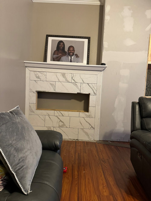
    is the contractor the one who built the box and installed the insert? if so, he should have gotten the tile layout done BEFORE doing this to avoid the god awful tile pattern.

    He could have lowered it so that there were no sliver cut tiles at the bottom, made adjustments at the top to compensate..

    A dry layout would have shown you this before hand and you could have decided what to do. perhaps a diff tile? diff tile layout?(vertical?) or diff placement.

    I'm not particularly fond of your marble-look tile for a fireplace. it belongs in a bathroom. sorry.

    Nor do I like the trim chosen for around the exterior. It's too frilly, competes w/the pattern, and doesn't really go w/the more modern flair of that particular tile.


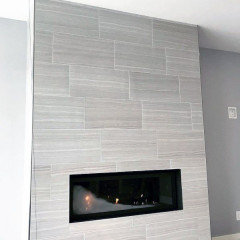
    I found another 12x24 tile w/the same issue. don't like this either

    It's a bad layout and poor planning by the person who build this


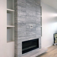
    Here's another 12x24 tile in a stacked pattern (much better) while the placement in between full tiles isn't ideal, at least it's symmetrical and looks pretty good. the wrap around hearth is a nice addition


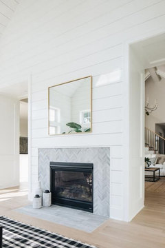
    if you wanted that marble, a design like this would have fit much better. (a mosaic chevron marble tile around the insert w/some nickel gap planks going all the way up) Even a stack-stone would be better


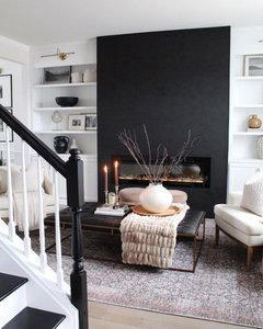
    or, this w/the black shiplap is nice


    I really like this one too. even though it's modern w/the solid black piece, paired w/the white and creamy traditional furnishings, it really works.


    I don't mean to be harsh, but your home style and furniture does not go w/that marble-look tile.

    I'm sorry. It's just too contemporary for the style of your home. (unless you plan on getting all new furniture and flooring?)


    here's one w/more traditional bric and mantle surround (which you don't have to do) with some art that has a bit of color. the portrait would be fine, but it needs to be in a bigger frame if you want to hang it in that spot.


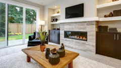
    similar insert and size as yours. compare tile jobs w/the same size tile. see what I mean about centering the insert between full tiles? he didn't have to do an offset pattern.


    If it was mine, I'd redo it w/a completely new tile and make sure you get an actual tile setter who knows how to do a tile layout prior to install.

    I really like this green vertical slats all the way up. now that would be cool in the corner spot like that


    Charlotte Landry thanked Beth H. :
  • 2 years ago

    Wow, I really misconstrued the earlier pictures! I thought the fireplace was on a wider wall.
    Now I see that is not a niche above the mantle so “no” to painting the wall differently.
    If you plan to leave the furniture as placed, the chair already masks the tile issue on the lower right.
    I’m still in favor of hanging the photo instead of propping.

    Charlotte Landry thanked L.D. Johnson
  • 2 years ago

    It’s like there’s no way to win with this tile. Either the veining is off or the tiles are off symmetry. I agree, if you’re going to keep it, lighten the grout to reduce contrast, matching the tile. Or remove it all and replace with something more solid color and no veining.

    Charlotte Landry thanked rainyseason
  • 2 years ago

    It is such a small amount of tile. It is not the end of the world to redo it. You are never going to be happy with it. Let us help you pick a better tile.

    Charlotte Landry thanked Paul F.
  • PRO
    2 years ago

    You chose a tile that is busy then a layout forcing this off center who decided the layout? IMO these are not the right choice for what you have for a FP I would have done a nice simple large format plain tile or marble slab.

  • 2 years ago

    I think it looks fine, given the materials, and once it's no longer the Newest Thing in the Room, you'll stop being bothered by it.

    Charlotte Landry thanked acm
  • 2 years ago

    I agree that it would have been best to center the tiles at the top and bottom of the firebox to create symmetry around the opening, which it would have done. But that would have created a top row of two cut tiles of different sizes and an off-center middle tile. That would be a different sort of trade off. The only way to create symmetry here would be to do it with the right sized square tile in a stacked bond, or a fairly small rectangular tile with a 50% offset running bond rather than the 33% offset.

  • 2 years ago

    I think when you finish painting the wall to match the fireplace tile it'll be fine everything's thrown off the eye and I pretty much agree with ACM

    Charlotte Landry thanked happyleg
  • 2 years ago


  • 2 years ago

    thank you all for the advice. i only had to lighten the grout. it looks great. thank you again for the grout advice.