Software
Houzz Logo Print
webuser_480986942

Pulling wall paint color from wallpaper

2 years ago
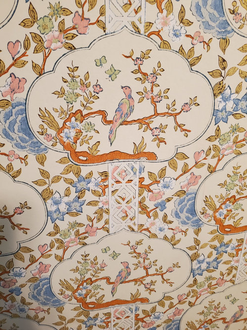
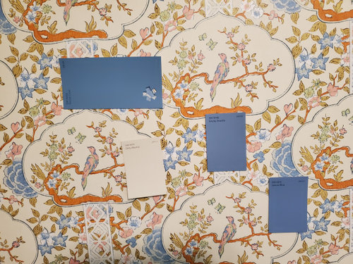
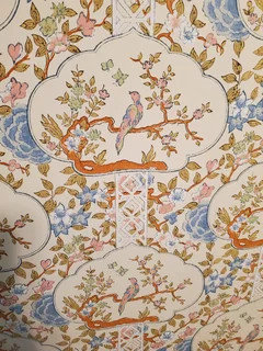
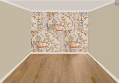
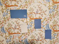
We have this wallpaper on an accent wall in a spare bedroom. What would you pull as the main wall color for the rest of the room?


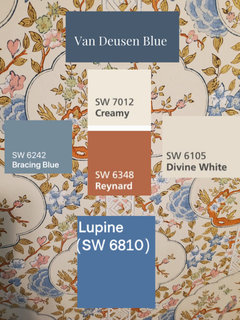
The second photo shows a few chips we pulled at SW just as a starting point.


Thanks for your input!


Comments (28)

  • 2 years ago

    SW Dirty Martini

    use the blues in bedding and accesories... a beautiful Rich blue lamp would be stunning.

  • 2 years ago

    Totally agree with Lyn. I think the blue would be too much as a wall color. If you are doing drapes, maybe match the Dirty Martini color. This is stunning.

  • 2 years ago

    Yes, @tfitz1006 a Linen or slub drapery panel (blinds inside mount, if you need light control or privacy)

  • 2 years ago

    I would color match the cream color in the wallpaper background.

  • 2 years ago

    Those dark blue chips look cute, but will look weird as a whole room colour. You['ll be multiplying that amount of colour by 50,00 or more so it will overwhelm.

    Stephanie B thanked partim
  • 2 years ago

    My vote for Dirty Martini as well and have one while you're painting!

  • 2 years ago

    Yes, Dirty Martini if testing proves to look as good as the chip in your photo.

  • 2 years ago

    I like the blues. It would give the room much more drama. Even if you go with a lighter blue, it would also work; and a lighter blue is a relaxed color. The Dirty Martini is going to look like Little House on the Prairie with that wall paper. (jmho)


    I like the red/coral in the paper, too. You could wrap a headboard in a piece of coral fabric.


    Stephanie B thanked freedomplace1
  • 2 years ago

    I would use the light color for the rest of the walls, and one of the blues for accents in the room for bedding, draperies, etc etc.

  • PRO
    2 years ago
    last modified: 2 years ago

    Guest room? I'd choose one of those dramatic blues and do the 3 walls plus the ceiling. Because. Fun. And that accent wall will REALLY be an accent wall. :)

  • PRO
    2 years ago

    What's on the floor? Rug? Bare wood? What type of furniture do you have? Painted/stained/light/dark? How about lighting--how many windows?

    It would be a good idea to post photos of the other items in the room--hard to pick a color in a vacuum.

  • PRO
    2 years ago

    Show the whole room please, all four walls ?

  • PRO
    2 years ago

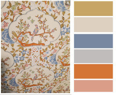
    Here are all the colors from the wallpaper.


    Stephanie B thanked BeverlyFLADeziner
  • 2 years ago
    last modified: 2 years ago

    Consider the furniture, flooring, bedding and importantly how you want the room to feel. Keep in mind that the shade doesn’t have to be as intense (say as the blues you show); for example variations with same undertone.


    Decide on light/medium/dark and bring home sample chips of your favourites. Narrow down to a few and then buy test posts, so you can get a sense of their effect with the changing light especially. For a guest room, I’d skip pinky/peach, as the (lovely) wallpaper may be enough in setting the tone vs going too feminine.

  • 2 years ago

    Thank you all so much for your input!

    I am out of my element with wallpaper...my daughters absolutely love the birds, so we're trying to work with them. (the birds, not the daughters :))


    We're just about to have oak floors installed, so I'd like to paint before that.

    Looks like I have quite a few sample pots in my near future.

  • PRO
    2 years ago

    You'd get better advice if you posted more photos.

  • 2 years ago
    last modified: 2 years ago

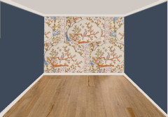
    And my favorite, which is not in the paper; it's a darker and less intense version of the paper's darkest blue. As others have said, it really makes the paper stand out.

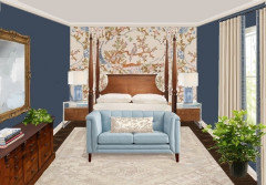
    And with furnishings and a dark-stained floor:

    Notice how the furnishings reduce the impact of the wall color, since they cover some of it and also give the eye so much more to see.

  • 2 years ago


    Stephanie B thanked Beth H. :
  • 2 years ago

    Now that I see Beth's swatches, maybe the deep blue IS in the wallpaper, in the outlines of the cloud-shaped bird areas.

  • 2 years ago

    If I wanted to match the background of the wallpaper I would have it color matched or use a color muse to get a really close match. Just a bit off and you may run into trouble. Just a little more muted and the walls may feel dingy, just a bit cleaner and the paper may feel dingy.


    Oranges and pinks may not work with the flooring.


    Blues and greens are your easier colors.


    Someone already mentioned that you want to pick a color that is less intense than you think it should be (grayer/more muted) because you are painting a large surface area and the color looks more colorful by the time you have a whole wall painted.


    I use Samplize dot com to order samples. Much easier than painting your own and they are high quality, nicely sized samples.


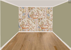
    I would consider a green. I think it is less competitive with the wallpaper than the blue.


    Stephanie B thanked Jennifer Hogan
  • PRO
    2 years ago

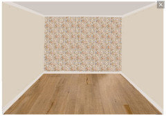
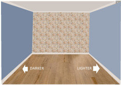
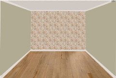
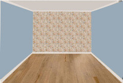
    You can't consider colors for the wallpaper without posting the wallpaper in the correct scale.

    The important colors look completely different when the scale is correct.


  • 2 years ago

    Thank you for pointing out the difference with the appropriate scale vs large scale visualization. This is an excellent point. I generally take samples to someone's home when I am helping someone pick colors, so I didn't think about the visualization.


    I wasn't sure what it was about the blue that I wasn't loving, but I think with your scale representation I really prefer the green to the blue.


  • 2 years ago

    You all are amazing!

    I hadn't even considered the green as an option, but it really does look nice. We have a similar shade in other parts of our home.


    I have also worried about the walls and/or the paper coming across dingy...


    I will definitely check out Samplize.

    Thank you so much!

  • 2 years ago
    last modified: 2 years ago

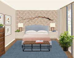
    Beverly is absolutely right that the wallpaper scale changes everything. The eye no longer sees bold colors and shapes, but rather an overall textured composite color (tan/brown-ish here) with geometric patterns emerging (verticals, diagonals) that are not evident in the sample. Softness replaces drama. The papered wall is different from the painted ones, but not in a bold focal point way.

    I spent quite a while experimenting with options that wouldn't look like Little House on the Prairie (as @freedomplace1 said). This is the version I liked best: softer, lighter, keeping the birds-on-branches theme to relate to the wallpaper. For whatever that's worth--and thanks for the educational design exercise!


  • 2 years ago
    last modified: 2 years ago

    I also like what @simplynatural did directly above. ^^

    I suspect that, in person, the blues in the wallpaper are a bit more pronounced, even with the scale shown here. Also, the scale shown in these more recent renderings may or may not reflect the true scale of the paper... and even if it does, again, there is the distinct possibility that this limited virtual view does not accurately reflect the actual coloration - as well as the overall effect of the paper, as it appears in person.

    In any case, I do believe that you still have a myriad of color options that can be used with this paper - even if the small scale and coloration shown here is an accurate depiction of how the paper shows in person. And I think you can still use shades of blue, or green, etc., if you would like to.


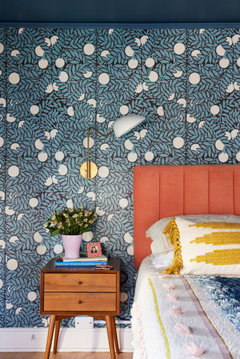
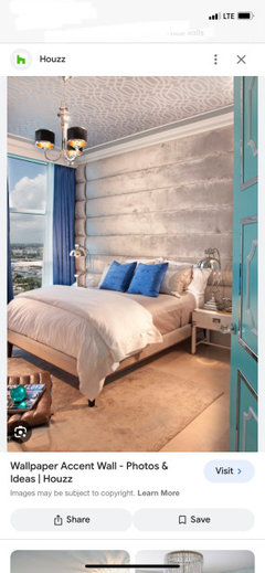
    Here is one general example/view. This room would work with this accent wall if the other 3 walls were painted blue - and this accent wallpaper/treatment has zero blue in it (compared to your paper, which does have some blues in it).


  • 9 months ago

    Can I ask where you got this wallpaper? My grandmother has had this in her house in a different color way since the 70s and I always loved it. I've wanted to put it in my own home but haven't found it. Thanks!

  • PRO
    9 months ago

    It might be a discontinued Schumacher wallpaper.