Software
Houzz Logo Print
collectorguru

Please Help me with Master Bathroom Refresh

2 years ago
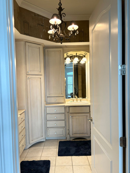
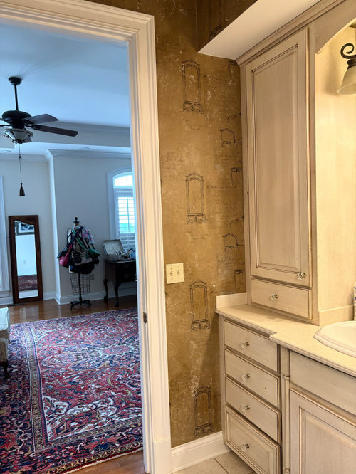
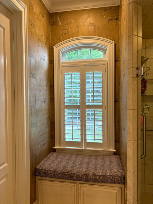
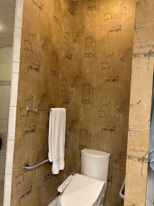
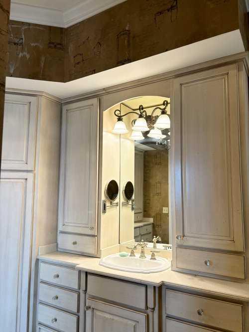
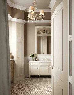
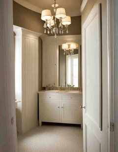
I have loved the wallpaper in this master bathroom for 22 yrs and its time to GO! The cabinets are glazed/antiqued slightly cream, tile is white, door/trim is BM Decorator White. There is no tub, this is an L shaped bathroom with 10" ceilings, and a large fully tiled corner shower. The window is north facing. Fixtures are staying.


1. I need a wall color choice that works with cream-y cabinets.

2. Open to updating the lighting


Master bathroom · More Info


Master bathroom · More Info

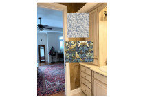
My bedroom view, the walls are SW Steamed Milk and it does not look good with these cabinets.


Master bathroom · More Info

This cushion will be recovered, fabric recommendations welcome!


Master bathroom · More Info


Master bathroom · More Info


I am considering SW Natural Linen, but wonder if that is not enough contrast on the wall. Also, looking at SW Balanced Beige. I don't want anything with gray tones. Help! TIA

Comments (79)

  • 2 years ago

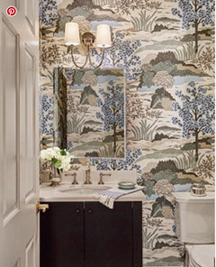
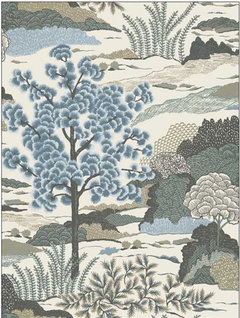
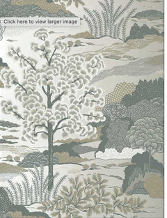
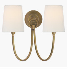
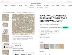
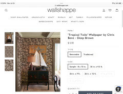
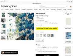
    The scale of this print may be too large and busy for your space, but I love that it would go well with your current glazed cabinetry, is a nice bridge to your rug, and could work with the brass and leather vibe too - it can lean masculine. Maybe something like this but smaller scale. I also like the sconce.


    I totally understand why you want new wallcovering, but gotta say I love your wallpaper. I hope you post pics of your new kitchen. I really like your style and furniture.


  • 2 years ago

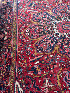
    Yes, I think the blue Chinoiserie wallpaper you found could look nice in your bathroom and with the rug. You don't have to have the exact colors in your rug for it to complement and look appropriate together.

  • 2 years ago

    Wow! I LOVE love that fabulous paper! I have 10’ ceilings and I can see using a full scene on my long full walls, but would it be odd where I have the window seat and the design will start further up? I love multi colored toile also. I am still looking, so thank you for the input.

    I did however order the paint samples of the SW designer edition that I’ve never seen after doing this AI image. Pretty consistent that creamy glazed cabinets require a contrast on the wall color to make an impact.

  • 2 years ago

    Once again, I love your AI paint colors. I concur that a darker contrast is needed. I thought you had ruled it out as too close to your current wallpaper. I think it looks grand. Can you post a close up of your floor tile. I can't quite make it out but it looks beautiful. Rarely do I have bathroom envy, but yours is great.

  • 2 years ago

    Finding wallpaper is a challenging activity, but often it elevates a room. I just did a powder room and have a huge folder of samples, but eventually the right one will show up.

    I think a darker tone -from deep taupes to browns - will work. It will complement the glaze.

    A couple of ideas

  • 2 years ago

    Love that first wallpaper RedRyder. I think I should just collect samples to swoon over! This is one of my favorite toiles - Harlem Toile.


  • 2 years ago
    last modified: 2 years ago

    What about navy for the walls? It would go with your rug and pull the rooms together. You rug goes well with your traditional furniture.


    I know you only asked about wall colors, but have you considered turning your rug the other direction to go under the sofa and end of the bed. It seems like you could then move your bed closer to the windows and open up the space some.

    Design2 girl thanked HU-402831377
  • 2 years ago

    You are getting great ideas here. BUT I think you should change your LED lighting FIRST! Get LED lighting at 2700k or higher. It will change your perception on everything.

    Maybe also do a deep cleaning on the cabinets. (Are there smokers in the house? That could also make the finish more yellow.)

  • 2 years ago

    Nope, no smokers at all in 22 years in this house. The glaze is more taupe than yellow.

  • 2 years ago

    @Kendrah - I can send you 4” of wallpaper samples! It’s only fun when it’s not your bathroom…. 😂

  • 2 years ago

    Sure, I'll swap you for 8" of upholstery fabric sample fails!

  • 2 years ago

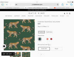
    I think if you wanted to introduce green this wallpaper would do it.

  • 2 years ago

    But a wallpaper with different colors in it might be better.

  • 2 years ago

    So, it's decision time, and I would appreciate any opinions on this idea.

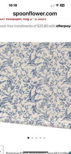
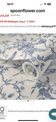
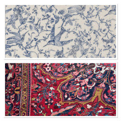
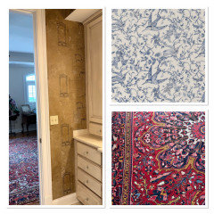
    This wallpaper is french bluebirds, on a cream background. We love bluebirds, and have many bluebird boxes on our property, our grands enjoy watching the boxes, count the eggs, and watch the babies fly each year. So, there is that. This collection by bridgettstahlman has coordinating fabric and a duvet with pillow options, so my question is....would this wallpaper in the master bath, work with my oriental rug in the bedroom if I added a few of these bedding accessories as an update?


    https://www.spoonflower.com/en/wallpaper/15235563-french-country-vintage-birds-roses-blue-large-by-bridgettstahlman


    Master bathroom · More Info


    Master bathroom · More Info


    And, can you tell me about Spoonflower? Is that a reputable company to order wallpaper from? I'm not familiar with them.

    Would you get peel and stick????? I've never seen such...I have always had wallpaper that had to be pasted and was a huge pain to hang, but please enlighten me.


  • 2 years ago

    Hi D2g, lots going on in your house! I’ve been silently following. 🙂. I think the wall paper goes well with your rug. I would use peel and stick in the bathroom, but fortunately there are other options. I believe Spoonflower recommends overlapping the paper and then double cutting to get the pattern to match so there is some waste width wise.

  • 2 years ago

    Hi @Molly! Thank you so much, yes, my kitchen is totally down, no plumbing, and we are agonizing over paint colors in there so you're right, it is crazy, but I decided to get rid of this wallpaper because my husband is going fishing for a week with the guys, and I thought....time to get it done! LOL.


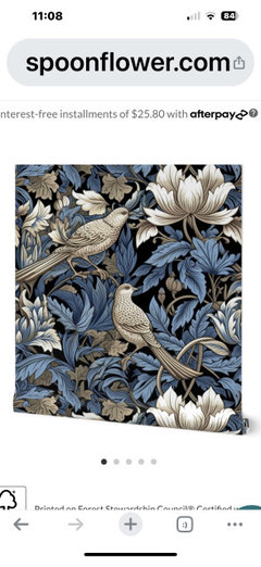
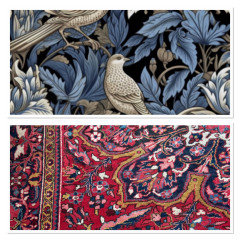
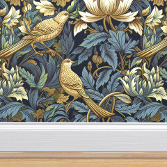
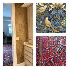
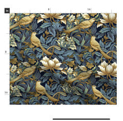
    What do you think of this with my rug? This is Winged Bouquet by Cheryl Graham Designs, and dramatic with the taupes. I'm kinda digging it.


    Winged Bouquet cream/blue spoonflower · More Info


  • 2 years ago

    Both are beautiful. The first would make the room feel bright and airy and the second would feel cosy, but might fight the rug if they are too close together. How much light does the bathroom get?


    Design2 girl thanked Molly
  • 2 years ago

    I do not know that I would do peel and stick. My DD and I tried to wallpaper the back of a china cabinet years ago and it was a nightmare. I'm sure things have changed since then with the paper but I don't perceive it to be a quality product for what apperars to be a very nice house.

    ANyone else want to chime in?


  • 2 years ago

    If you want to try peel and stick wallpaper, see if you can find some that's not as thin as cheap white printer paper. You can order a roll, then line a few drawers with it. By the time you finish, you'll know if this is a process that will result in wrinkles and tears or smooth, professional looking installation. IME, wrinkles and tears are much more likely with peel and stick than old fashioned wallpaper.

  • 2 years ago

    The bathroom has a single window on the north side of our house, the bedroom has lots of eastern exposure that helps the bathroom some.


    I have a pro coming to remove the wallpaper, so he will be hanging it. I just wasn't sure about peel and stick in a bathroom that does get changes in humidity with showering, etc. Would you choose pre-pasted or non pasted? And I guess I will also him. I am assuming he will be pasting it up there, but I haven't used wallpaper in 23 years, lol.


    It also comes in a gold colorway that I think is a bit better with the rug? What do you say with this Molly? Do you think the curly leaves are too grandma'ish?


    less taupe, but the bathroom cabinets are neutral and I think would work with this too.


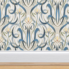
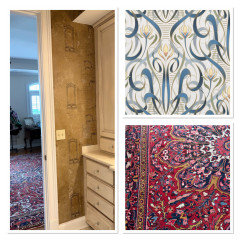
    And here is another fun option, what about this? Art Nouveu French Waltz? I kinda like that it is definitely different from anything in my house. What say you on this? Might be too white of a ground for my cabinets?


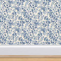
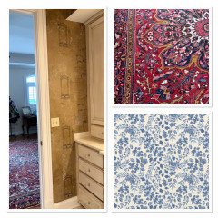
    And another calm blue/cream option, leaves and acorns. More in the same flavor as the bluebirds, which helps with bedding accessories.


  • 2 years ago
    last modified: 2 years ago

    Some pi of the darker paper for comparison. I think the golden works better with the rug and it looks similar to the existing paper color which you love. I dont find the leaves too curly.


  • 2 years ago

    Here are the lighter options. I like the blue and cream with the birds better than the one with acorns. The French Waltz is pretty, but too curly agsinst the rug IMO.


  • 2 years ago

    Sooo helpful, Molly. I like the cream bluebirds more than the acorns too. The bolder gold birds look richer with the rug, and I like it in an adjacent fashion, just not sure I want that busy bedding in such a large print. Maybe a cream mattelesse with print shams and bolster would do it.

  • 2 years ago

    That would be a beautiful pairing!

  • 2 years ago
    last modified: 2 years ago

    I have used Spoonflower before and think it is a great option! I used peel & stick in a guest bath and it came out great (professionally applied, no way i would attempt). I’m not sure how the adhesive would hold up with daily steam. You can also order the fabric by the yard if you want to do the seat cushion in the same fabric. I matched a shower curtain to my wallpaper. I think i prefer your gold birds to the bluebirds, but both are lovely


  • 2 years ago

    Thank you so much, so helpful to have those visuals! The bolder birds are definitely more dramatic and lean into the rug. I’m ordering the samples

  • 2 years ago

    As long as it goes with your cabinets I vote golden toned as well. Really nice!

  • 2 years ago

    OMG, thank you so much @Kylie M Interiors! I have been reading and watching all your youtube videos relentlessly since I started all this. I appreciate it so much! You are the best!

  • 2 years ago

    Love the bolder birds with the gold leaves. I am going to bet your professional wallpaper person will ask for unpasted. That gives them the best control.

    It all works with your Persian rug because they are “neutral” IMO!

    I would do the bathroom first, and when it’s done, make bedding decisions. There are more options for nice bedding than wallpapers that work with your bathroom cabinets. You picked a good one. It’ll change that bathroom, big time.

  • 2 years ago

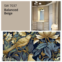
    I’m kinda thinking SW Balanced Beige as it was mentioned earlier, but do you think it works with that paper.i feel like the paper goes gold and the balanced beige is taupe-y. I also ordered a sample of navy grass cloth for texture. Although I don’t know about that in the bathroom either. Good grief, I put grasscloth in my husbands office in 1984! 🤣

  • 2 years ago

    It will be interesting to see what the wallpapers look like in person compared to Balanced Beige which seems to look nice with your cabinets. Always hard to tell from an image on a screen.

  • 2 years ago

    Monitors are notoriously bad for color decisions, but my first instinct is that the beige doesn’t highlight the gold. It looks blah next to the wallpaper.

    This will be a wait-and-see decision at the end.

  • 2 years ago
    last modified: 2 years ago

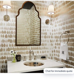
    So many pretty options! - the undertones likely won’t work but I keep thinking about Schumacher’s Queen of Spain


    Design2 girl thanked la_la Girl
  • 2 years ago

    hey @la_la girl I actually like that Queen of Spain, artsy piece. And I keep looking at this Perigold option


    Here is Beige & Taupe


    And it comes Greige & Gold.


    Should I get these samples too? I am thinking when the guy comes to take my paper off, I will have him just paint it Balanced Beige, then he can come back after I've decided on the right paper.


    Which of these 2 colorways do you like?

  • PRO
    2 years ago

    Hi again! looking at the previous samples, Natural Linen looks close bit maybe a wink orange and needs a wink more pink? Take a look at SW Rivers Edge and Bungalow Beige/Dhurrie Beige. Maaaaybe even BM Cedar Key?

    Design2 girl thanked Kylie M Interiors
  • 2 years ago

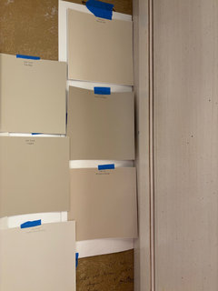
    I actually have Bungalow Beige and it definitely goes more pink. Here are the samples I have
    Top left Canvas Tan
    Top Middle Sandbar
    Top right Natural Linen

    Left long sample White Duck
    Middle Loggia
    Right middle Balanced Beige
    Right bottom Bungalow Beige

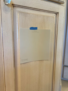
    I also have Taupe of the Morning and it’s beautiful and very light. I would love to use it

  • 2 years ago

    Taupe of the Morning

  • last year
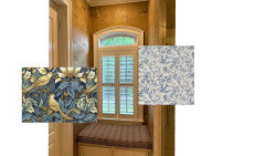
    To circle back for an update, I did have the wallpaper removed, which was a grueling 4 day process (AND the reason I won't be using more wallpaper!) and I painted the walls SW Taupe of the Morning and I love it. Calm, serene, and very refreshing.

  • last year
    Would love to see the results!

  • last year

    Photos, please!

  • last year
    Looks so fresh and inviting - enjoy!

    Design2 girl thanked la_la Girl
  • last year
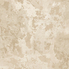
    The taupe is a lovely color choice. Thanks for the wallpaper removal photos, too.

  • last year
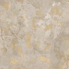
    Very nice! While I love wallpaper, I know the PIA it is to remove. Great job, your bath looks soothing and inviting!

  • last year

    Oooh, I was in the paint it a calm color and let it be serene camp, so this is great! You had a nice bird fabric, as I recall. Would that still work for the pillows with the new wall color?

  • last year
    Following.

  • last year
    The walls look great. Good paint color! Show us the fabric you have for the cushions. The room is so neutral almost any fabric can work in there.
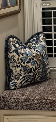
  • last year

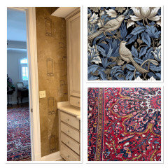
    This is the fabric that I have, it’s a linen and I’m just not sure if it’s heavy duty enough for this cushion, but I love the design and the colors.

  • last year

    You can ask the upholsterer if the pillow fabric is durable enough for the cushion. It should be.

  • last year

    If that fabric that you have doesn’t work, perhaps go back to the Spoonflower wallpaper patterns you liked (particularly the gold birds) and consider ordering a fabric that works. Each pattern is generally offered in a multitude of types of fabrics you buy by the yard. https://www.spoonflower.com/en/fabric/15112506-winged-bouquet-gold-blue-on-navy-william-morris-wallpaper-new-by-cherylgrahamdesigns