Software
Houzz Logo Print
ker9

peach paint for bathroom

2 years ago
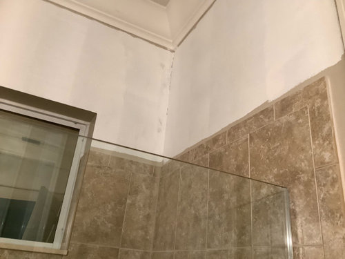
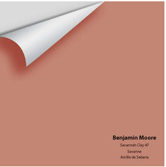
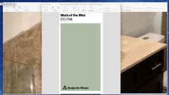
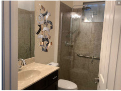
This white is too bright, can anyone recommend a peach or something not yellow in BM paint? Perhaps BM sun kissed or summer peach? Is this the right direction? Small guest bath.

Comments (28)

  • PRO
    2 years ago
    last modified: 2 years ago

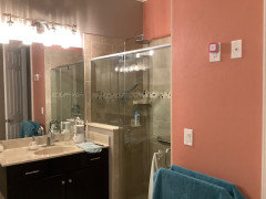
    What else is in the room, that would make you want peach or even a touch of peach in a white? Too bright as in too much contrast with the tile? You are painting over a beige of sorts ? Show the entire bath, please?

  • 2 years ago
    last modified: 2 years ago


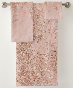
    Towels a bit lighter than walls with hints of brown.


    Zazzle

  • PRO
    2 years ago
    last modified: 2 years ago

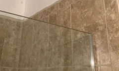
    Is that the ENTIRE bath from the doorway? No. It is the same snippet of tile. It is not a really great color for the tile unless you can show us why you want it.,,

  • 2 years ago

    The previous owners had SW Hazel and some other dark color. I can’t find a blue I like and don’t think green is appropriate. We are in FL if that matters. The master bath has similar tile but it’s a little lighter. I think peach because it’s complementary to tile and people.? I don’t want to go dark, keep it light and bright.

  • 2 years ago

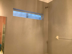
    Also want to add a plantation shutter inside the window, which currently has the hurricane shutter over it. It’s west and gets too much sun. (Easier to keep that shutter up once it’s closed since ladders are involved.) it will be opened again in mid October.

  • PRO
    2 years ago

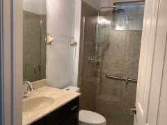
    No shutters inside a shower and honestly peach has to be one of my all time hated colors . The tile and the counter do not work together maybe try a simple counter and we need pics of all the things in the space like the floor, the vanity etc so a pic from further back showing all of that.

  • 2 years ago

    It looks like your vanity is on the yellow side and your tile more to the red but BM Shaker Beige might bridge the gap if its not too dark for you.

  • 2 years ago

    The perfect blue-green would be nice. I can’t change anything but the paint right now. Future updates may include gut job or pieces. The bathroom is ugly but I can paint. The shutter is designed for wet areas; no curtains. All you see out that window is an ugly roof.

  • PRO
    2 years ago

    A green would be far nicer with the tile, far more climate suggestive as well

    This is a second bath, a guest bath, in need of an update, and you are trying to do it inexpensively and only cosmetically.

    Give the vanity a new plain white top, its alongside a WHITE toilet.

    Paint the vanity a fresh green to MATCH new walls, use a satin finish on vanity..

    Peach? No. Fix the glaring things in there, if you can.

    Counter top, and dark vanity and.......jumble: )

    Lower the contrast with the tile you dislike - in a complimentary manner.


  • 2 years ago

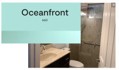
    I have a painter here now so would like to fix the too white while he is here painting whole interior . I can change the vanity top later. Perhaps BM oceanfront?

  • 2 years ago

    Might as well throw the ensuite. I must get these colors out of my house! Then I can regroup and plan major projects.

    The ridiculous window needs something creative that is not a curtain. You see an ugly roof out of it.

    I like my peacock milagro towels.

  • PRO
    2 years ago
    last modified: 2 years ago

    I think "Ocean Front " is quite gummy bear turquoise: ) and more suited to a children's bath or bed ? And a TON of bright white around it. That's just opinion.

    Too bright for the subdued "drab" tile you hate.

  • 2 years ago

    Ok I wasn’t really happy with it either

  • 2 years ago


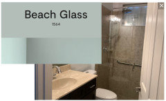
    Oceanfront is a lovely color but prepare yourself it can be very childlike. And the sink you have may look more yellow than light beige. If this is what you are going for go for it. But if you are looking for something more soothing with a hint of blue think about Beach Glass. It is similar to what you like but it has a slightly grayer tone that could help negate the brown in your space. Of course get samples of all the colors you are thinking about and test them out.


  • PRO
    2 years ago

    I can't really suggest a specific peach, I went through a lot of samples before choosing one for my powder room. I think a lighter peach or a white with some peach in it would be better than a mid or dark peach.

    You could easily put a window film in the clerestory window. Clear privacy film is common, and there are a lot of faux stained glass colors and patterns you could use. If you are crafty or know someone who is, you could create a liquid glass film, a resin pour insert, a real colored glass insert, or a beaded fretwork for it.

  • PRO
    2 years ago
    last modified: 2 years ago

    Removed the ceramic towel bar. It hasn't been in style for the last 30 years.

    Select a color that works with both your countertop and tile.

    NO PEACH.

    Select some art to improve the bathroom appearance. It can also add color and texture.

  • PRO
    2 years ago
    last modified: 2 years ago

    Basically? Reconcile the fact you want the bathroom blown up.

    Reconcile that towels and/or new towels are irrelevant in this scenario.

    You can whine, or take the advice. It needs more kaching$$$ than you are throwing at the project, to make you happy : )

    Select a more complementary paint, don't jam a round peg into the square hole you have.

    Guests have their own rooms they want to change at their own homes, and truly don't care, as long as you are welcoming, and the bath is spotlessly clean.

  • 2 years ago

    I’m trying to find a paint color that can be neutral until I can get to the kaching upgrade. Keep in mind I went through hurricane Ian 2 months after move in and it opened my roof and poured inside for 6 hours. It’s almost 2 years later when I could get to the painting. I’ve been through a big battle starting with insurance and every freaking contractor. I’m exhausted and just barely back to where we started.

  • 2 years ago

    How about some wallpaper that works with the tile, floor, etc.?

  • PRO
    2 years ago
    last modified: 2 years ago

    You have it, Green is neutral......look outside your window and find something that clashes.

    You won't find much. The white you slapped up there was "neutral....." it's the wait for the kaching that IS bugging you.: ) and the wait to be completed after a hurricane damage - design fatigue with no real joy, yet.

    If bound and determined to have a "kiss" of peach?

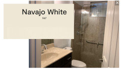
    Ben Moore Navajo White.........not as great as green: )

  • 2 years ago

    Every monitor is different and colors that might look terrible could look fantastic in person. Maybe a peach is what you really desire and would make you happy.

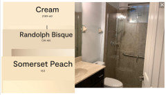
    What do you think of one of these? Can you get some samples from your painter and see how the color you love looks next to the sink and shower tile.


    Living in the coastal US I know all too well the hurricane season we are in. Wishing you well as we pray any storms move out to sea. Hopefully Debby Downer didn't come close to you. We dodged Beryl but Ernesto dumped a ton of rain on my niece in Bermuda. Stay safe.


  • 2 years ago

    Jan Moyer I look forward to your help with the kitchen and master bath when I’m ready to plan the kaching update :).

    Notice I said planning stage, not after demolition begins ;)

    I will try to calm down until then, the anxiety attacks are real.

  • PRO
    2 years ago

    I like the colors that BoxerPal and Home Interiors with Ease better than peach or green. They are beige-y and I think they work much better with the tile and counter top.

    Now keep in mind that they will not look exactly like they do on a computer monitor. I'd try them in the room before deciding on the exact color.

  • 2 years ago

    I would look for a color similar to the tile grout, a neutral that is soft. Then you can have pops of color with towels and accessories.

  • PRO
    2 years ago

    It isn't a hole in the wall, and whatever goes on can be changed, because it is just......paint.

    As a friend always says? "Pouring maple syrup on a turd, does not a pancake make"

    So...the tile is the turd in the room for this op.

    " I MUST get these colors out of my house!" The tone of the vanity top, at least on my monitor, is far WARMER than the tile. Perhaps bite a bullet, change it to white Corian. It will at least match the potty and eliminate that conflict.....which is making the selection difficult, at best.


  • 2 years ago

    I woke up at 3:30…so I decided to go look at the rooms in the dark, wondering if they were glowing/glaringly white. The guest room gets some street light (black outs are on the list) but it was fine. Checked again at 7 and I’m happy. Guest room looks good and bathroom looks good enough and not bad. I’m off the ledge and going to wait until I can replace the tile. Thank you!

  • PRO
    2 years ago

    There ya go! Good enough is good enough: )