Software
Houzz Logo Print
shoebaroff

What color paint would you choose?

last year
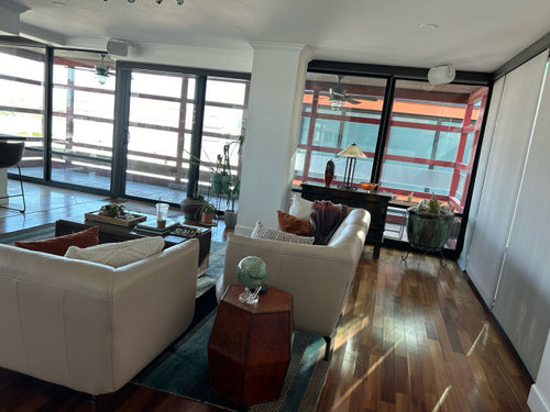
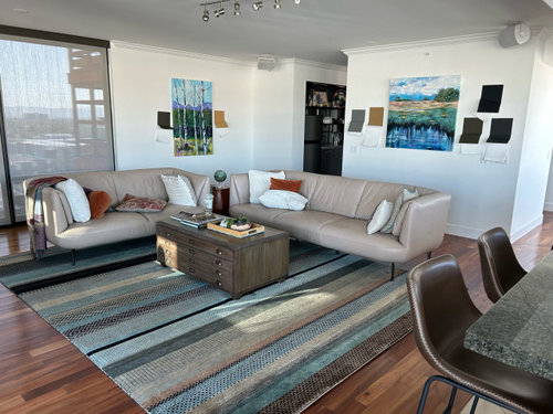
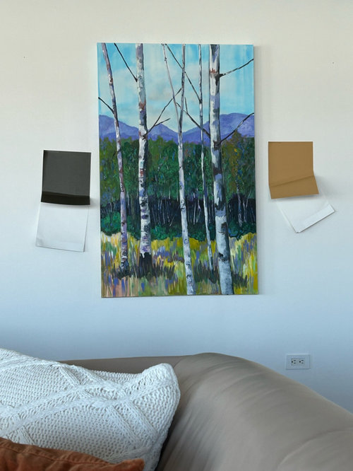
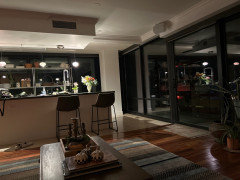
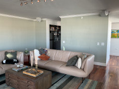
We just bought this condo with three walls of glass. The only walls look very plain to me. I’m trying to pick a color. I circled my ideas but my husband thinks they are all too dark. Thoughts? Help pls

Comments (84)

  • last year

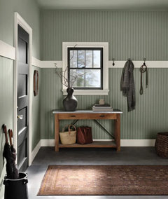
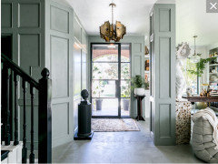
    Several walls will have to be painted the same dark color to attain the cohesiveness of the example photos. I am getting the feeling that a dark house, even with great lighting and those huge windows, will not be something your husband will agree to. Perhaps showing him those photos can help him visualize how a space like yours, with so many big windows, can look fabulous in a dark color.

  • last year

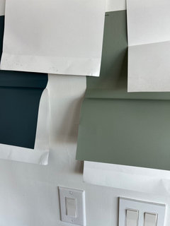
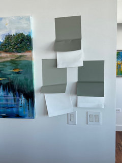
    New samples. I’m thinking the bottom right sw evergreen fog

  • PRO
    last year

    I LOVE Evergreen Fog!

  • last year

    ooohhh I think I want to try Evergreen fog.. I am liking this color.


  • last year

    My mother talked me out of dark paint colors years ago - it will be difficult to cover when you want a change.

    The other thing to consider is if a color clashes with the floor.

    youalso have cool natural light changing to warm throughout the day/evening

    i like the warm gray-blue

  • PRO
    last year

    It You can choose a shade of blue that is not too light but cheerful and not too dark and not for all walls as well.

  • last year

    We just painted our living room with BM Plaster of Paris (CSP-185) in satin. We used the same for the molding and baseboard in eggshell. The ceiling is approx. 3 shades lighter instead of white. It gives a moody look without being too dark.

  • last year

    I would look outdoors and copy one of those colors in a darker or lighter shade,as the space requires or skip paint and check out some accent wood design like they often do maybe even stain that wood close to nature or paint all of it if that seems better. You are watching the lighting frlm outside thru the day as itchanges, so get a feel for the emotion this sends. mimic that in color. even large art painted can start you out.

  • PRO
    last year
    last modified: last year

    I'd address the real issue: )

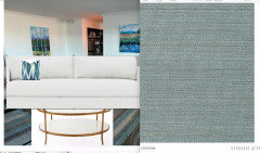
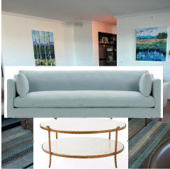
    The couches, the cocktail table.....and put a grasscloth on the walls.


    Or? white looks great.......


    It may be all glass, but it's dimmed by overhangs and buildings.

    Furnishings feel off to me, especially the not so neutral as you think.........seating.: ) Dining chairs too.

    Wrap it in a color and texture, maybe go for some updates....to even include float frames on some art for a more finished look

  • last year

    I love Jan’s idea of grasscloth and the color she selected. Adds color and texture.


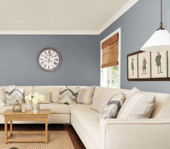
    If you want to try a darker shade, consider SW Software. I had it in an East facing room and it was a fun color; changed with the light and was very restful at night. It has blue tones that will work with your things. When i was ready to switch back to a light shade, it covered easily with just a coat of primer so dont be afraid to have fun with paint. You can easily paint over it!

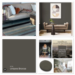
    pic from online just to show the color


  • last year

    Love the iron ore—makes the paintings pop, especially the blues in the paintings and rug. I used SW Ellie Gray for walls and all the artwork looked fantastic, as well as white door frames in one house and dark wood frames in another.


    Remember to hang your paintings lower for a better artistic effect. They are too high now. And play with hanging them off-center, too.


  • last year

    In my experience (homeowner/advisor - not a pro!), if you find a color you like, go up at least one block on the paint strip set and it will end up looking similar to the color you chose. In your case though, going to the top of the strip/2nd from top might be the compromise you could both live with: some color & contrast but not overly dark either.

  • PRO
    last year

    Going one block up on the paint strip is not a great way to choose a paint. Not all strips are tints and shades of the same color, so you could wind up with something way off from what you wanted.

  • last year

    Spend some time reading Maria Killam's blog. She also sells a neutral color wheel to help you define undertones in your furniture, counters, etc.

    https://mariakillam.com/blog/

  • last year

    I like the Asphalt but maybe do an accent color on the wall with the square painting using a dark muted blue green that goes with the art and the rug.

  • last year

    Thank you all for the help. I am using the furniture we have.I have dogs and family so I need a durable leather seating. I am going to use a lighter color. The art is a wrap around canvas. I love inspiration from Houzz,magazines etc but ultimately this is where we are living and enjoying. The pictures shared here are great and I thank you all. This is a great resource and community.

  • last year

    Read the whole thread. Originally, I liked the gray you circled. Then I saw the deep blue that was posted when talking about your hallway. Theennnn, I Loved the Evergreen Fog. I agree it's not an easy decision. I think pulling something to match the carpet is a good idea. Good luck! I'm sure whatever you decide will be amazing. Please post final pics.

  • last year

    Read through the thread. Originally, I liked the gray color you had circled. Then I saw the deep blue that was posted when talking about your hallway. Theennnn, I Loved the Evergreen Fog! I think it's a tough choice with so many great options, but something to match the rug is the best. Good luck! Whatever you decide, please post follow-up pics.

  • last year
    last modified: last year

    With the amount if windows/natural light that you have, it would be fine to do a “dark” color. Maybe do an accent wall or two of a dark color and leave the rest of the walls white.

  • last year

    I think you can def do a moody dark wall since your room is flooded with natural light all around. Additionally, your art will pop off the dark paint, as well as your light color sofas. Good luck!

  • last year

    Good for you, ShoeBaroff ...especially on standing up for your choice in keeping your own furnishings. Not everyone has hundreds of thousands to spend to do a complete reworking of their entire home. Anyway, your condo has lovely light, and I'm sure you'll wind up enjoying whatever you decide to do color-wise. Best wishes!

  • PRO
    last year

    I wouldn't waste time on Maria Killam's blog. Check out Lori Sawaya's Land of Color for the best advice on colors.

  • last year

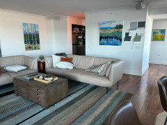
    Down to a few

  • last year

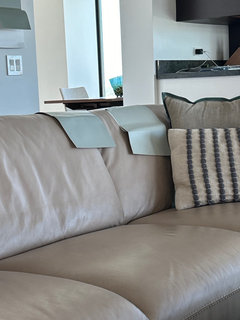
    Are the samples laying on the couch the same colors as the ones on the wall? The wall ones definitely look green-gray and the ones on the couch lean blue (my mo it or, of course.)

    The color on the wall that is lower left looks best to me.

  • last year

    They are the same samples and yes I agree that the lower left is best. Funny how the angles and refraction change the color.

  • PRO
    last year

    SW Urban Bronze would be stunning!


  • last year

    As my friend pointed wto me, when it is nighttime all the windows become large black squares. I am going lighter than my original plan

  • last year

    Glad to hear you decided to go lighter!


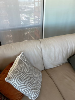
    What is the undertone of your 2 couches? They look like they have a pink beige undertone from the first two pictures.

  • PRO
    last year

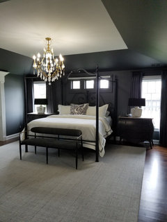
    All windows are black holes at night..just did my bedroom in slate it is gorgeous and cozy at night, during the day deep rich color mixed with neutrals.


  • PRO
    last year

    Windows are black holes at night unless they are covered with shades or curtains. That really shouldn't have anything to do with whether the walls are light or dark.

    Home Interiors with Ease, your bedroom is gorgeous!

  • PRO
    last year

    Diana..Thank you! we are so pleased with the end result.

  • last year

    The under tones depend on the time of day. There is some slight warmth in some light situations but other times they have a taupe/grey look. (Unless of course they need to be cleaned from the dog 🤪)

  • last year
    last modified: last year

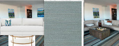
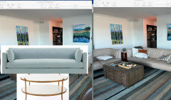
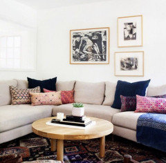
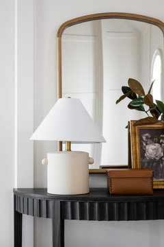
    Your rug looks great with your couches. A gallery wall adds a lot of color and interest. I prefer print pillows since solid color pillows tend to look flat. A console with a mirror and art work is another idea that might work to the right of the window. Wood console or coffee table that matches your floor could add warmth.

    Website gives some ideas of pillow combinations: https://www.oneaffirmation.com/


  • last year

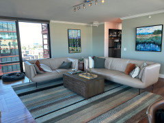
    Tada! Fred the dog on the sofa is happy and so am I

  • last year
    last modified: last year

    Wow, gorgeous!. It was a good idea to paint the walls because it really envelops the space and adds warmth with such little wall space to work with in that room.

    I love colors like this, chameleon colors and the way it looks different shades in the light. The green you chose is very soothing and is a nice foil to the city view. A very nice backdrop, the color of nature for your artwork yet neutral.

    Well done, thanks for posting the results.

  • last year

    Perfect! The walls look great.

  • PRO
    last year

    it apears cold to me..I thought you wanted to add warmth? well glad you are happy!

  • last year
    last modified: last year

    Not sure it looks cold. Sure goes with the sofas...nice foil for them. Same depth of gray tones. Brings out the pink in the leather which is cool.

    I Fred the pup loves it but photo shy lol. I just saw a bit of sunlight on the wall...very nice, cheerful green.

  • PRO
    last year

    Yes it sure does make the pink in the sofa come out..not sure that is a good thing🤷🏼‍♀️

  • last year

    I’m not seeing the same
    Colors in person as on my camera. My IPhone does not take very good pictures.

  • last year

    Looks more taupe in person but it translates blushier ( a new word) thru the magic of the iPhone

  • last year

    It is so hard to get good color representation on photos shared over the internet.

    Phones auto correct color, each platform translates color between different color spaces and then each monitor displays color differently - it is kind of like the whisper game - the message at the end has little to do with the original.


    I am seeing pink in the sofa, but I have a lot of taupe in my home and it usually works really well with blue greens and feels very neutral. If that is what you are seeing in your home without all the help from technology it should be gorgeous.


    Can I ask what color you ended up using on the walls?

  • last year

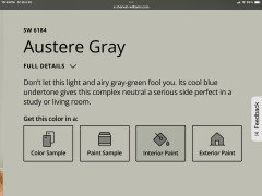
    I picked the color Sherwin Williams Austere Gray sw6184

  • PRO
    last year

    Cool Blue undertone


  • last year

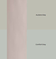
    Austere Gray is a great wall color. I tend to go a bit more blue green gray (Comfort Gray) for my own home, but often use colors like SW Austere Gray and BM October Mist when helping others choose colors for their homes.


    I find the bluer blue green grays work a bit better with the pink/violet undertones in my taupe flooring and décor, but it is also a bit more bossy than the more muted greens.


    With Austere Gray people will notice your art and décor while the walls simply support the art and décor and don't demand any attention.


  • last year

    Picture framed. New pillows. Be kind

  • last year
    last modified: last year

    It's coming together nicely, ShoeBaroff !

  • last year

    looks beautiful!


  • last year

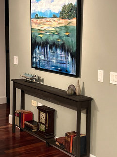
    Added a thin console.

  • last year

    It’s definitely coming together. Good artwork choices.