Software
Houzz Logo Print
heidi_sprang

Wall color choice

last year
last modified: last year
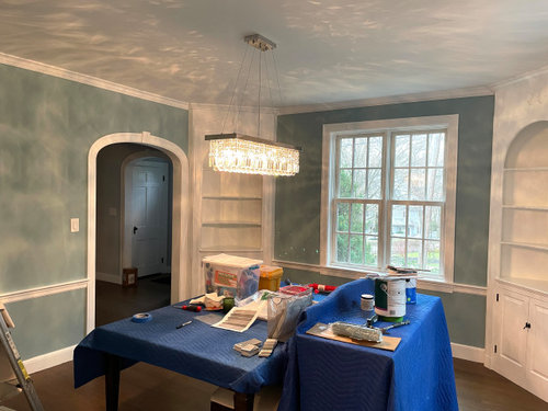
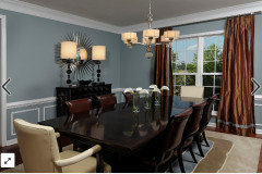
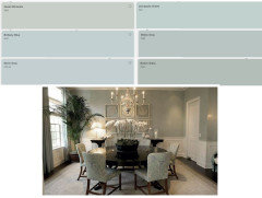
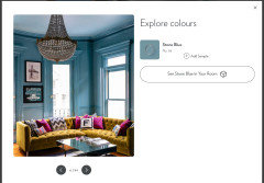
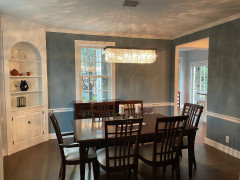
I am finishing the last bit of painting as part of a big house remodel and doing the dining room. After looking at photos on here, I decided to go with BM Buxton Blue (the trim is BM Chantilly Lace) but am not liking it. The home is traditional but this looks a little too colonial. And too much of a greenish-blue. Thinking of redoing it in a differnet blue and debating between Santorini Blue or Slate Blue (BM) or perhaps a somewhat darker hue like SW Poolhouse. (I wish there was a middle ground but not really finding it) Was trying to find photos of the latter but wasn't getting any. I'm nervous about going too dark (though I definitely don't feel like my first attempt with buxton blue is dark at all). Any advice - hoping to get this right the 2nd time?

(FYI the surrounding rooms are a light gray - BM sidewalk gray and BM gray cloud)


Comments (25)

  • PRO
    last year
    last modified: last year

    I do not understand the statemnt about too colonial versus traditional but I choose wall color to connet to my decor so can we see some of your spaces and for sure what is going into the DR. I usually choose wall color last seems to be thta is what you are doing so I need context to even begin to advise what shade of blue .

  • last year

    Maybe you need a blue with some gray to tone it down. When I was sampling blues for my dining room not too long ago I really liked Gentle Gray 1626. The next darker shade has a similar LRV to Buxton Blue. It's Manor Blue 1627. Colors look more intense on a wall than they do on a chip, so try some things that are more subtle than Buxton Blue on a chip.

  • PRO
    last year

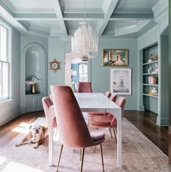
    Looks like a very beautiful room in a Colonial home. You might consider painting the entire room in the same blue color: trim, cabinets and all. Or dark trim and light walls. Light trim and dark walls have been done to death for the past 30 or so years.

    What is the look you're going for? What furniture/rugs are you using? Can you post some inspiration photos?

  • last year
    last modified: last year

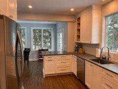
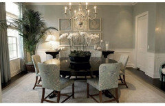
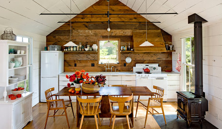
    The house was built in 1942, so it has some really nice character but not too old fashioned. And my style is definitely 'transitional' which is reflected through the renovation. For example, here is the kitchen. (All of my photos seem a little darker than in real life since I'm using my iphone) In terms of inspiration, I'm also attaching a photo of a DR I found on this website (ironically this says it's buxton blue but it is not looking the same in my room as I've noted).

    All of the trim was originally wood and it's been painted white throughout - appreciate some folks are flipping that around but that's not my personal style and I really like the white trim against the painted walls. As for the re-painting direction for this room, I'd definitely like to steer it more to the blue-gray (I'm just not liking the green tone in the buxton blue family), but am a little afraid of going too dark. Of note, the room gets ok light - there are two windows but of course one is often in the dining room when the sun has gone down. You can see the chandelier (which I love) in the original photo.


  • last year

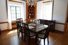
    PS here is the "before" photo of the dining room (the table will be the same - its just covered while I finish painting). And thank you for all the comments - It's so kind of folks to lend their opinions!!

  • PRO
    last year

    People often select a blue green color for dining rooms because it makes people look so good in these rooms and it's an easy color to live with. Still a bright hue, but has color.


  • last year

    In the photo, the camera is picking up a yellow tone in the chandelier, almost like an amber color. Are the crystals an amber color? Or it could be yellowish tint to the light bulbs. It would def. make the blue paint appear greener.

  • last year

    Before you pick a new color, put all of your transitional furniture in here, window treatments, and whatever rug you are using and see what you think. A painted room without belongings in it is always going to look different than when it is put together. I have been where you are many times - seen the walls and thought the color was wrong. But others have talked me off the ledge, I put all of the decor and furniture in the rooms, live with it for a week or two, and realize I'm in love.


    Your room is never going to look like your inspiration pics. The scale of that room is so different than your room, which is especially going to look colonial with your contrasting white trim. I'd even try painting out the chair rail and leaving the rest of the white trim and think it will look vastly more transitional instead of colonial.


    (Your before picture made me groan a little and mourn the loss of that fabulous wood work. Beautiful!)

  • last year

    @tracefloyd Interesting perspective about how the light impacts the color, but the bulbs and the chandalier are both clear / crystal. I think it's just the limited exposure flexibility with the iphone...

  • last year
    last modified: last year

    Thanks for the response. It's a beautiful room.

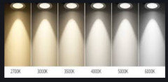
    Double check the light bulb temp. I see a yellow cast on the cabs. ..you want 4000K probably.


  • last year

    bulbs and the chandalier are both clear / crystal


    Yes, bulbs will look clear and the light will look clear. But it actually have a temperature of light that it casts. That temperature will impact how you see your wall color. Try plugging in a lamp in the room with different temp bulbs and you will see the impact. They will all appear clear until you start playing around with the temp. A different temp bulb might be what you need to enjoy what is on your walls now.

  • last year

    Color is super personal but have you looked at Farrow & Ball blues?


    - I live in an old house with lots of chunky white trim and feel that more saturated colors get chopped up with all the trim, it can make a room feel jumpy

  • last year

    I've always loved Buxton Blue so I'd keep it and tie in with curtains and rugs. I don't think it looks too colonial. Big fan of this room. Very very pretty.

  • last year
    last modified: last year

    TRY B.M Stratton Blue. Betting you love it. Consider Diana's recommendation to color drench.


  • last year
    last modified: last year

    Love that ^ having the trim the same color seems more transitional


  • PRO
    last year

    I've used Stratton Blue and it is definitely a greenish blue, so if you don't want green, it's probably not going to work. And forget changing out the bulbs to 4000K LEDs. You want soft lighting in the dining room, not lighting suitable for an operating room. 3500K would be the highest on the LED scale.

    Some Ben Moore gray-blues you might try are Manor Blue, Blue Heather, Slate Blue, Saratoga Springs, Dusty Cornflower, Lavender Blue, November Skies, Winter Lake, New Hope Gray, or Chiswell Blue.


    Heidi Sprang thanked Diana Bier Interiors, LLC
  • last year
    last modified: last year

    4000K not 4000W. Get bulbs that are dimmable and a dimmer switch if brightness is a problem. Better to try different bulbs first as suggested than keep repainting different paint colors.

  • PRO
    last year

    Who said 4000W?

  • last year

    Seems like color drenching is all the vibe for 2025… will also look dated in five years.

    Personally I think the white trims look gorgeous.

    And I see nothing wrong with the wall color. I would follow the advice to put all the furniture etc. in and see how it feels then.

  • last year

    No one said 4000W but my point was couldn't you use a dimmer even with a 4000K bulb?

  • last year

    Thanks for all the feedback. I decided to repaint with SW poolhouse and love it. There was something abut buxton blue that didn't fit right with the grays in the rooms next door and I don't find it with this at all. Silver lining is if I didn't do the Buxton blue first, I probalby would have gone with a ligher blue, but once I had something on the wall (vs the original cream) it didn't look that dark.


  • last year

    Looks beautiful now❣️

  • PRO
    last year

    Glad you're happy with it--looks nice!

  • last year
    last modified: last year

    Awesome, thanks for the update.

Sponsored
High Point Cabinets
Average rating: 5 out of 5 stars21 Reviews
Columbus' Experienced Custom Cabinet Builder | 4x Best of Houzz Winner