Software
Houzz Logo Print
lisa_moffitt48

Off-white/Cream color for cabinets

last year
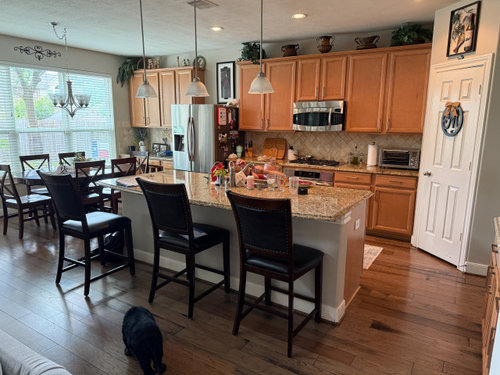
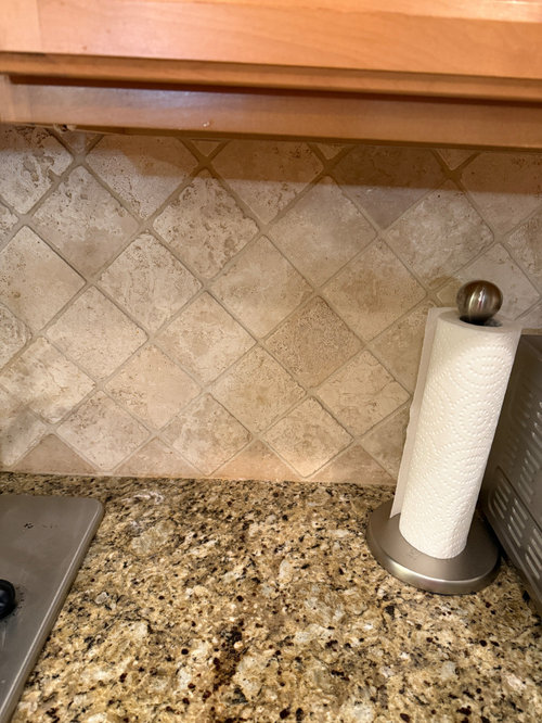
I think our counters are the New Venetian Gold granite (installed in 2010) and we're wanting to paint our cabinets a cream color that would complement our counters. We recently installed wood flooring and our walls are SW Accessible Beige. Our backsplash is tumbled travertine. I've tried samples of SW Aesthetic White and SW Creamy but both seemed too white. Looking for something that wouldn't be so stark against our counters and backsplash. Please help! What would be a good paint color for our cabinets??


Comments (19)

  • PRO
    last year

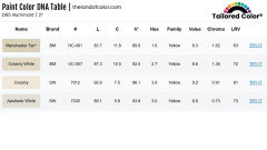
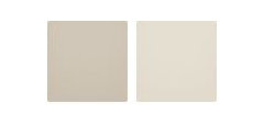
    Manchester Tan and Creamy White both from Ben Moore have potential. Here they are compared to the two colors you've tried.


  • last year

    The cabinets need to harmonize with more than your countertops. You need to consider your new floors, backsplash, as well as your Accessible Beige walls. Not so sure creamy white is the way to go with Accessible Beige and backsplash tiles. Consider hiring a color consultant to plan cabinet color and new wall color.


    Here's a Pinterest page for new venetian gold granite: Take note of wall colors in the photos.

    https://www.pinterest.com/barnes1748/new-venetian-gold-granite/

    Lisa Moffitt thanked housegal200
  • last year

    Find a color for the cabinets that goes with the counters and backsplash, then use that color to also paint your walls. You are going to have too many beiges to match otherwise. I'd try BM maritime white.


    Getting a good paint job from a cabinet painting specialist is quite pricey. Are you cabinets in excellent condition and worth the cost? Do you love your counters and backsplash and are they perhaps what should be changed instead? (I don't love them together.)

  • last year

    @housegal200 Thanks! So, I'm going for the look in your first photo. Do you know what cabinet color that is?

  • last year

    @Kendrah Thank you for your advice! I do agree with you and would love to change the counters and backspash as well, it's just not in our budget at this time. Since putting in new flooring, the cabinets need the most updating at this time since they clash with the wood floors. We painted the walls in SW Accessible Beige about a year ago, so we'll be keeping that. Our cabinets are in great condition and were an upgrade when we built our house. I will look at BM maritime white. I dont mind beige but of course want to make sure they all go together. Thanks again!

  • last year

    We've also been looking at Shoji White, White Duck, Divine White, and Moderate White lol. Trying to find something that is not as dark as Accessible Beige, but not as light as Creamy. These colors are tough! Any experience with these?

  • last year

    The photo doesn't look like your cabinets "clash" with the new floor? What aren't we seeing?

  • PRO
    last year
    last modified: last year

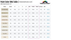
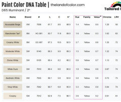
    Trying to find something that is not as dark as Accessible Beige, but not as light as Creamy.

    1. I put all of the colors listed in order by Value (how light/dark they look). They're all in between AB and Creamy.

    2. The hue angle/family is consistent. Which tells me these colors - and colors in the same hue range - do indeed go with your counter top / backsplash or else you wouldn't be pulling essentially the same color, just slightly different nuance.

    Same with Accessible Beige, you wouldn't have chosen it if it didn't go with your stuff.

    3. It's not a stretch to say that Manchester Tan and Creamy White are lighter, more colorful, not as neutral versions of Accessible Beige. We know you want lighter than AB but how much more or less color is the question.

    4. There are A LOT of near neutral/neutral paint colors in this hue family range. The good news is you're consistent and clear about what you want. Just need to find the right lightness and neutralness.


  • last year

    Not sure how you're checking the paint samples in your space but consider getting the Samplize size paint sheet for each of the colors listed by @Lori A. Sawaya to compare in your space. Remove all the countertop stuff when doing so to see choices better. @Lori A. Sawaya is a paint guru and many times will educate on how best to harmonize color. Normally, wall color is chosen last so I wouldn't let the Accessible Beige control your cabinet color selection. You may find once you get the cabinet decided that you might want the walls to be the same color or a different one. AB is more on the griege side which isn't quite the compliment with the pretty new floors. When budget allows consider changing the counter stools to compliment better, they look rather dark compared to the rest of the space.


  • last year

    You already have white trim and Accessible Beige Walls. To get a color that is somewhere between the two can be accomplished by using Accessible Beige at 50% or 25%.


    White Duck is also very similar in color, but lighter than Accessible Beige.


    Make sure that you know what it will look like in the sheen that you will be using. Even using accessible beige on the cabinets will look like a lighter version of the color.


  • PRO
    last year

    I'm thinking that the white you have on the door in the photo would look good for the cabinetry.

  • last year

    Patricia Colwell;s suggestions are good ones:


    --leaving the cabinets as is --huge savings--since they echo the floor very well


    --decluttering all those dark objects on the walls


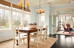
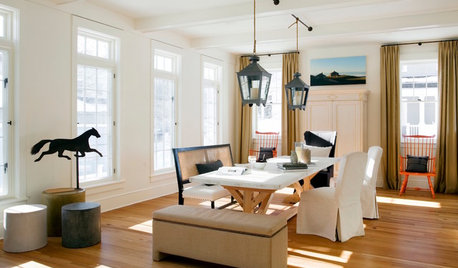
    --(me) getting dining table, paint the chairs and counter stools cream to harmonize with wood cabinets and floor. The current fuiniture is bringing the room down, something you're trying to solve with lighter cabinets. But there are alternative ways to lighten the heaviness of the space:


    Traditional Dining Room · More Info


    You seem to have a kitchen that opens to living room space? Is that so? Then you need to show us all four walls of the entire space. Designers don't just deal with element in a space--everything has to connect. That means we need to see your other furniture, art work, things you are keeping or possibly plan to change. There are other approaches to brigthening a space than expensively painting cabinets.

  • last year

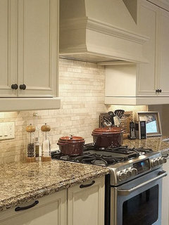
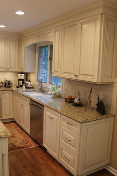
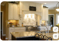
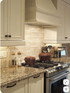
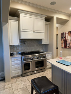
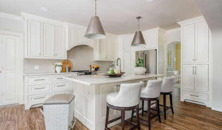
    Thank you all for your suggestions. I'm not looking to change the backsplash, the barstools, the chairs, or anything else at this time. I actually like the way everything else looks and the Tuscan look. I'm just looking to change the cabinets. They are an orange hue compared to the flooring we just put in, plus the entire room looks very woodsy with all of the wood. Right now, I'm just looking for suggestions on paint color for my cabinets that will match my older granite and backsplash. I've attached some pictures of the look I'm going for if this helps. I'm having trouble finding what creams/light beiges will work with this space. Thanks.


  • last year
    last modified: last year

    If you like the wall color and you feel like that works with the floors, counters etc then what about using that for the cabs?

    If you def want the cream then you're threading the needle on the wall color, floor color, backsplash and counter color and I think the best approach will be to bring in tons of samples to see what looks right in your space, monitors/screens can be bad at properly showing color


    https://jacobowensdesigns.com/blogs/news/the-best-cream-paint-colors-top-5-popular-cream-kitchen-cabinets


  • last year

    I like the idea of lightening Accessible Beige by 50% and trying that on the cabinets. I think I'll get a sample and try that next.

  • last year


    These are SW White Duck. In very sunny Arizona, they are very light if that’s what you’re looking for.

  • last year

    Get a color consultant.

  • last year

    @Lisa Moffitt - I love that you know what you like and what works in your home. My sister has very similar granite and backsplash and it works beautifully in her home. Her color palette is fall colors, golds, greens, some orange/orange red accents.

    I haven't ever managed to be on trend. I have been using taupe neutrals (beige/gray with pink/purple undertones) for decades. You would have thought I was the antichrist during the Tuscan era, but it worked in my house.

    Stick to what works for you!

    Let us know how the Accessible Beige at 50% works out.