

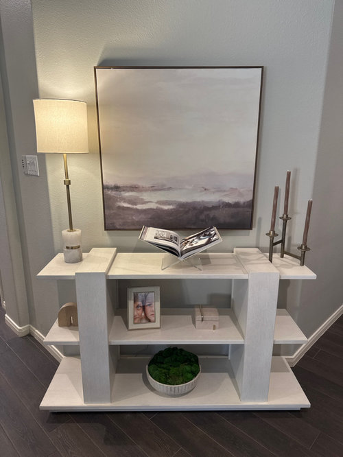
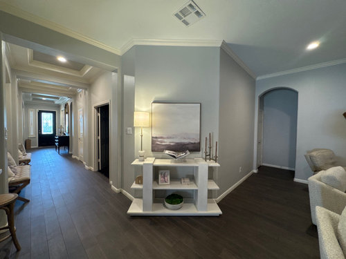
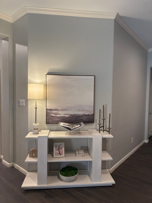
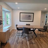
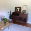
Need Help Decorating My Console + Artwork
11 months ago
Sort by:Oldest
Comments (10)

Related Stories
DECORATING GUIDESDecorate With Intention: Helping Your TV Blend In
Somewhere between hiding the tube in a cabinet and letting it rule the room are these 11 creative solutions
Full Story
FUN HOUZZDecorated Houses Help Save a Detroit Neighborhood
Art's a start for an inner-city community working to stave off urban blight and kindle a renaissance
Full Story
DECORATING GUIDESBudget Decorating: How to Decorate Smart and Slow
To make the most of your decorating dollar, forgo the disposable stuff, think vintage and free first and give yourself a splurge
Full Story
DECORATING GUIDESDecorating 101: How to Start a Decorating Project
Before you grab that first paint chip, figure out your needs, your decorating style and what to get rid of
Full Story
HOLIDAYSDecorating Diary: Holiday Decorating From Fall Through Winter
Blogger Lauren McBride shows how her holiday decor evolves through the seasons
Full Story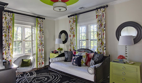
DECORATING GUIDESHow Repetition Helps Rooms Shape Up
To give your interior designs a satisfying sense of rhythm, just add circles, squares or rectangles and repeat
Full Story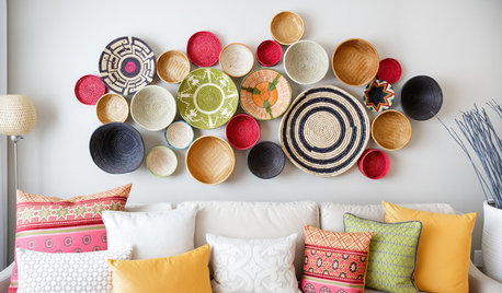
WALL TREATMENTSA Dozen Creative Ideas for Decorating Blank Walls
When you want to fill a lot of wall space in one fell swoop, these ideas will help you do it with aplomb
Full Story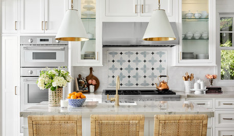
DECORATING GUIDES10 Common Decorating Mistakes and How to Fix Them
Turn your styling errors into successes with these solutions — and the help of a good designer
Full Story
COLORPick-a-Paint Help: How to Quit Procrastinating on Color Choice
If you're up to your ears in paint chips but no further to pinning down a hue, our new 3-part series is for you
Full Story
DECORATING GUIDESThe Right Mat for Your Artwork
Don't skimp on mat size and material to display and protect your framed artwork well
Full Story
ilikefriday
JenniferOriginal Author
Related Professionals
Flint Interior Designers & Decorators · Edison Interior Designers & Decorators · Brooklyn Interior Designers & Decorators · Auburn Kitchen & Bathroom Designers · Albany Kitchen & Bathroom Designers · Bend Kitchen & Bathroom Designers · Vancouver Kitchen & Bathroom Designers · Charlotte Furniture & Accessories · West Plains Interior Designers & Decorators · Longview Interior Designers & Decorators · Elmira Furniture & Accessories · Hot Springs Flooring Contractors · Meridian Flooring Contractors · Durango Flooring Contractors · Honolulu Flooring ContractorsUser
ilikefriday
User
Kendrah
K Laurence
fnmroberts
Jeanne Cardwell
Design Fan (NE z7a)