Software
Houzz Logo Print
pani_gosia

interior color consult

9 months ago

Looking for an interior paint color consultation for a bathroom to go with Bedrosian oda ice tiles, need to make a decision by Sunday, please help if you can, thanks

Comments (27)

  • PRO
    9 months ago

    It is always best to at least post a pic of the space and the tile.

  • 9 months ago

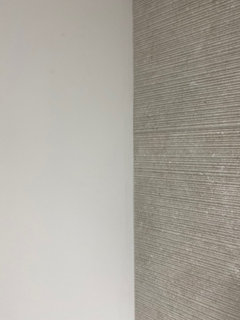
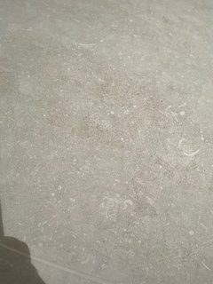
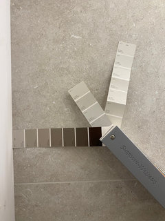
    Wall and floor tile

  • 9 months ago

    without a lot of thought, SW Alabaster is a soft warm white that compliments most colors.

  • 9 months ago

    Post a photo of what your vanity finishes are-cabinet and top…best to show them with the tile if you can

  • 9 months ago

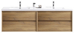
    Cabinet is white oak with white countertop and black faucet, please help!

  • PRO
    9 months ago

    Waht drove black as a choice for stuff, As for wall color probaly the best is to match the white counters IMO Alabaster can look murky not a nice look IMO

  • 9 months ago

    going for fresh, modern and masculine look (2 pendant lights on left and right side of the mirror also have black metal finish with 23” long ribbed glass)

  • 9 months ago
    last modified: 9 months ago

    try a dark Taupe color if your goal is a masculine look.

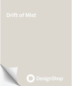
    SW Drift of Mist . or even darker. do you have a window in the space?


  • 9 months ago

    No windows, just WC and sink (ceiling fan with light, two pendants next to mirror and under cabinet strip are the source of light, all warm lights)

  • 9 months ago

    Tile pulls black (thus black touches throughout) and is on cooler side but then again with the warm light pulls a little wormer, will check out your suggestion, I am so confused..

  • 9 months ago

    If you have tile samples - you can bring them to a local Ben Moore and ask what Ben Moore colors are close to the tile - it can at least give you a starting place. But you'll have to decide in the room with samples (Sampelize is great) and the lighting installed - colors are not often great on monitors

  • PRO
    9 months ago

    Sorry I do not see the black but only you know what looks right to you mY advice make sure your lighting is good before choosing wall color I like all LED 4000K in bathrooms amd kitchens it mimics bright daylight and keeps colors true at night

  • 9 months ago

    Is this just a powder room no shower, correct? Which of the walls are tiled? How much surface is going to be painted? How large is the room?

  • 9 months ago

    Cedar Key always look very fleshy or band-aid colored to me!

  • 9 months ago

    You are so right with the specks of black/gray/taupe in tile, and taupe family color paint is what I was hoping to achieve (not yellow/cream)
    popular gray is a VERY strong contender right now, will test it tonight now!

  • 9 months ago

    Looking forward to hearing how popular gray works out for you!


  • 9 months ago

    @chispa - Color perception is really all about context. In my foyer I have a 10' pink brick wall and the same brick is on the outside of my home and visible through an 8' window.

    I tried some of the tried and true taupe colors and they were all muddy and too green. Ended up going with Frosted Toffee, which is far more pink than I had ever used or recommended in any home where I assisted in picking wall colors, but it worked in this room.


    Cedar Key looked like green mud in that room. . .


  • 9 months ago

    Goodness….is there a safe white with taupe undertones instead maybe? I know that all white paints have yellow undertone but which one has taupe/white not yellow/white?
    popular gray is a VERY strong contender right now, will test it tonight now!

  • 9 months ago

    *was asking for “white” paint colors, disregard sentence after question mark (got copies from a previous message =)

  • 9 months ago

    Heron Plume (LRV 75) and Snowbound (LRV =83) are lighter than Popular Gray (LRV 61)

    and still have taupe /. warm gray undertones similar to Popular Gray.

    Sea Pearl (LRV 76) and Classic Gray (LRV 74) is a Benjamin Moore off white with Taupe tones. Not sure how white you want to go.

  • 9 months ago

    Snowbound is too white and popular gray is too dark/purple, would like to go lighter to complement the tile, rather have lighter than dark color (considering leaving the current primer only on the wall as of right now), why is this so difficult for me?

  • 9 months ago

    Is there a light taupe without purple undertones?

  • 9 months ago

    Heron Plume, Egret White and City Loft are all between Popular Gray and Snowbound and look good with your tile. BM Classic Gray, Pale Oak and Sea Pearl are also between Popular Gray and Snowbound.


    You need to get larger samples to see how they will look in your home.

    Samplize.com is my favorite way to get larger samples.


    The neutral color families are

    Beiges:

    Pink beige

    Orange beige

    Yellow beige

    Green beige


    Grays:

    Green Gray

    Blue Gray

    Violet Gray


    Beige Gray hybrids

    Taupe - Beige Gray mix that falls into the orange and red hues - calmed down with gray giving us a warmer undertone - pink/violet undertones - can be more or less pronounced.


    Greige - Beige Gray mix that falls in the yellow to yellow green hues - calmed down with gray giving us cooler, earthier green undertones. Again can be more or less pronounced.


    Your tile is in the taupe range - warmer rather then earthier. Nothing wrong with the color, it just scares people when they hear the words pink/purple. Placing a greige next to your taupe floors will look muddy.


    Why is this so difficult

    Choice overload - too many options. Things were tough enough when we were kids and had 150 crayons - now you are being handed thousands of colors and told to pick one and live with your choice for the next 10 years. You don't get this many choices in any other arena - clothing, furniture, flooring, countertops. All are limited color selections. Paint colors are truly unlimited. What you can't find in the fan deck can be custom mixed.


    Good blog post for you to read.

    https://www.kylieminteriors.ca/the-top-11-warm-neutral-paint-colours-that-arent-beige/

  • 9 months ago

    Jennifer - THANK YOU! For all the info, support and not giving up on me =) will shop for bigger samples first thing tomorrow morning

  • 8 months ago

    I don't think Snowbound is "too white", but I don't know what you are comparing it to. Definitely get the Samplize samples.

  • 8 months ago

    Thank you all for helping! I really appreciate your input and assistance!