Software
Houzz Logo Print
cyprissa

Desperately need paint help

9 months ago
Hi all,


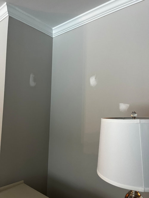
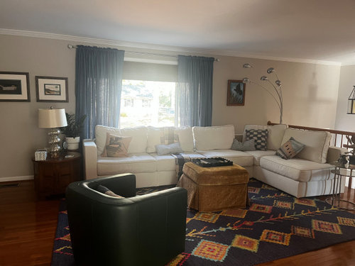
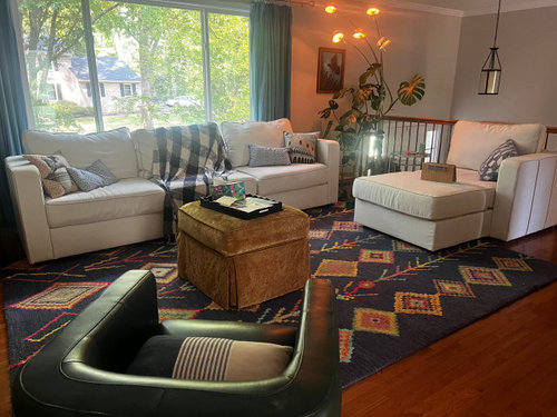
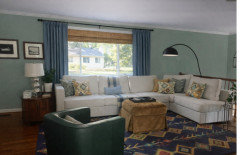
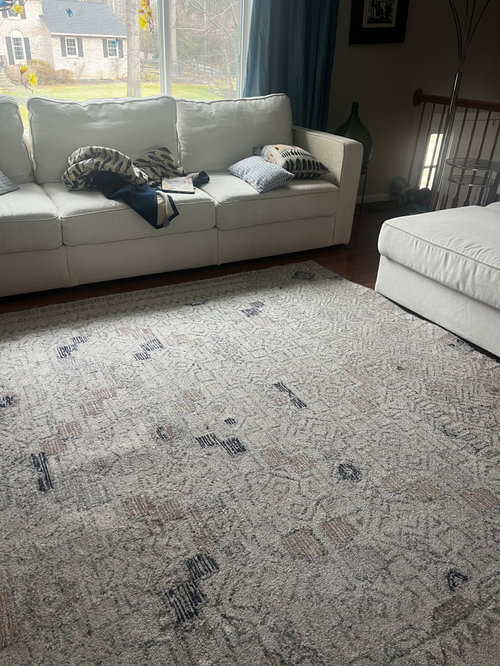
I am continuing my quest to make my north facing living room feel cozy. To that end I have removed the blinds, pushed the curtains past the windows, broken the sectional into a couch and a chaise, swapped the dark rug for the light one now in the pictures.


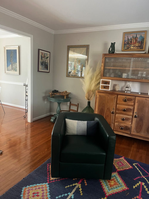
I am happy with the layout and have no where else to put my 60s walnut bar and the sofa is too new to replace. We are a mili family and can’t refurnish every time we move. I think we will be here longer but you never know.


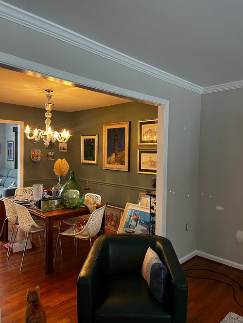
The current paint is SW Agreeable grey and I hate it. It goes dingy in most light. i have switched all bulbs to brighter white and it has helped but i just don’t like the color in here. itend to like more saturated, bolder colors and the adjacent dining room is BM Rushing River. I cannot seem to find something that works in this room though. i tried Palladian blue but its way too minty. I do’t need thus room to feel airy and bright as our family room has a huge two story wall of windows so i am happy with pleasant and pretty and not dirty looking walls.


Thank you for the assist.


Comments (16)

  • 9 months ago

    My first instinct is to suggest a lighter version of Rushing River (1574), which looks like a nice color, such as Gray Wisp (1570) or Night Mist (1569). Leaning green will be helpful for warming up a northern exposure. However, the curtains look blue. Are they, and do you plan on keeping them? If so, look at these colors next to the curtains to see how they work together. I agree with you that Agreeable Gray is not a good choice, but any neutral would be blah with your furniture and rug. If you want to lean blue to go with the curtains, look at Gentle Gray (1626). See how it looks next to the dining room. I'm not sure it will work, but Gentle Gray was one of the finalists for my north facing dining room when it was painted last year.

  • 9 months ago

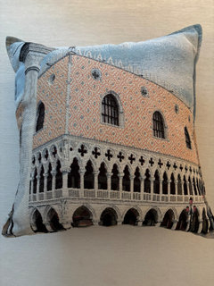
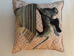
    Thank you! The curtains are blue but can be changed if needed. I was worried about too much green but maybe it will be fine. I have a couple of pillows I love that are from our time living in in Italy that are blue and peachy woven designs of Venice and the lion of St. Mark. it seems silly but I am kind of attached to them but I am trying to be open. Also, i should note, the swivel chair looks black but is green leather. My artwork has lots of blue and green but pretty varied.


  • PRO
    9 months ago

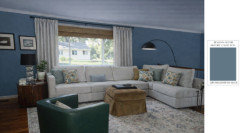
    Why not continue with BM's Rushing River you have in the adjacent dining room? Here's the look. I would move the curtains more to the sides and hang them on a black rod, and replace the shade with a bamboo or natural fibre roman shade. A black arch floor lamp would give more contrast in your decor.


  • 9 months ago
    last modified: 9 months ago

    @lisedv thanks, I did move the rod out and removed the shade in my last round our updates. I used an old photo because everything is moved in order to prep the walls for paint. I had thought about rushing river but for some reason DH really didn’t want that. He doesn’t ususually have much of an opinion so maybe i will work on him.

  • PRO
    9 months ago

    Most people cannot visualize, show him the mockup!

  • 9 months ago

    The blue curtains are a cool color, not cozy. Change them out to ivory curtains that match your sofa color. Add those golden bamboo shades as lisedv shows.


    Rushing River at full strength may be too dark. You could try it at different intensities at different times of day and night. Your dining room is so dark.


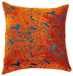
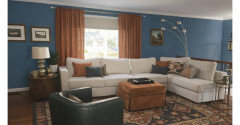
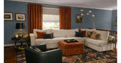
    Group your small art works and leave some walls empty. A couple arger works, with centers 57"-60" from the floor, will connect better with the room and the people sitting in it. Your very nice golden wood cabinet is too cluttered. Take away the art work above it and the vase with dried branches. Let the cabinet be the star. No need to clutter the corner with blue table. Less is more.. Your sofa pillows should echo some of the warmer colors and patterns from your rug.


    Ethnic pillow cover, Ikat pillow cover, Southwestern design, orange and brown · More Info


    Blanco Pillow, Orange Paisley Pillow · More Info


  • PRO
  • PRO
  • 9 months ago
    last modified: 9 months ago

    I love Celery's mockup with the warmer colors added to the room. It makes the room feel so well coordinated and much cozier and warmer, even with the cooler wall color.

  • 9 months ago
  • PRO
    9 months ago

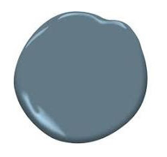
    The wall color in this mockup reads as a muted blue-gray with soft teal undertones. It’s deeper and more saturated than Agreeable Gray, but still calm and “clean,” which is why it doesn’t go dingy.

    The closest real-life paint matches would be:


    Closest Sherwin-Williams Matches


    SW Smoky Blue (7604) – Best overall match

    Muted blue-gray, elegant, no minty look


    SW Granite Peak (6250) – Slightly deeper, more dramatic


  • PRO
    9 months ago

    Closest Benjamin Moore Matches

    BM Philipsburg Blue (HC-159)

    Slightly richer, great in living rooms

  • 9 months ago

    The dark rug has been swapped for the lighter one. Celery - can you mock up with the lighter rug?

  • 9 months ago

    @Celery. Visualization, Rendering images my first inclination with this room was to go darker because it will never be light and bright but other people got in my head and freaked me out about it. On the other side of the dining room is a family room that has a two story wall of windows so I have light and bright in abundance there.


  • PRO
    9 months ago

    Your lighter rug, PM's Philipsburg Blue walls, curtains a light greige to pick-up form the rug.


    cyprissa thanked lisedv