Software
Houzz Logo Print
webuser_307712693

Bardiglio Marble Countertop Dilemma

last month
last modified: last month

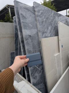
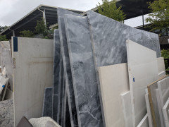
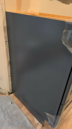
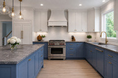
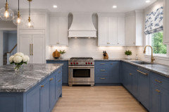
I would love outside opinions! I fell in love with Bardiglio marble slabs at the stone yard. Initially I was planning on a more basic white stone, but this stopped me in my tracks.Our base cabinets are going to be a navy though - specifically Harbor from KraftMaid. Uppers will be Dove White. I'll attach pictures for reference.I'm having trouble finding example pictures of bardiglio counters. Be honest - do you think these would pair nicely? Any thoughts are appreciated!
Edited to add: the cabinet colors aren't changeable at this point unfortunately. We already have the cabinets in hand and we're in the middle of the install.

Comments (26)

  • last month


  • PRO
    last month
    last modified: last month

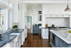
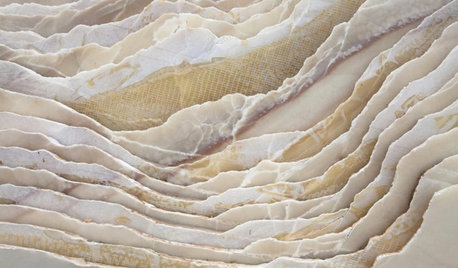
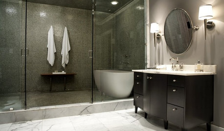
    This should give you an idea. The counters are beautiful. I am sure you have done your research as far as marble counters go and know the downfalls of them despite the beauty.


    .


  • last month

    "Be honest - do you think these would pair nicely?"


    No. Too drab against the specific cabinet color you're showing; the combo is saddening IMO.

  • last month

    Make sure they pull out every single slab individually so you can inspect them. Marble sitting outside might have developed some stains/etching/fading that will not come out with standard cleaning.

  • last month

    The combination is overwhelmingly grim. To let the marble be the star, use the Dove White cabinets on both top and bottom.


    If you have second thoughts about the gray marble, buy some similar gray marble peel and stick Contact paper to apply to your current countertop for a week or two to see how it looks.

  • last month

    I think a lighter countertop with those cabinets would look better.

  • last month
    last modified: last month

    There are many people on this forum who see any dark counter, as “drab.” I’m not in that camp. Those are beautiful slabs.

    I will say though, because the slabs have lots of movement (many here would use the word, busy), I would stick with one color for the cabinets. And, though I’m not a fan of white cabinets (or painted cabs, in general), of the two color choices shown, white would be better.

    If the Bardiglio marble makes your heart sing, then get them. You’re the one who will be walking into your kitchen several times a day, not the folks here critiquing your choices.

    You can solve the staining issues marble has, by having the counters sealed. Etching is another matter. Yes, there is a product called AntiEtch, that can prevent etching. However, it leaves a kind of plastic looking coating on top. Quite frankly, I’ve never minded etching in marble. For one thing, etching shows the history…the well loved use of the counter or table. Also, usually, etchings are only really visible from a certain angle.

    My suggestion is to have the slabs honed. Etching is far less visible in honed marble.

    Full disclosure: my own counters are soapstone, which make me smile still, after 10 years. If I hadn’t gotten soapstone, marble would be in my kitchen.

  • PRO
    last month

    Do it you will never regret that choice and marble has life it patinas beautifully

  • last month

    The problem isn't the color of either the marble or the cabinets on their own -- it's the particular combination of stone and cabinet color that is drab and, yes, grim.

  • last month

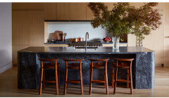
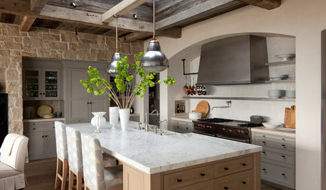
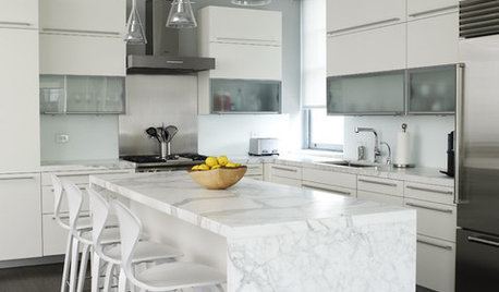
    Bardiglio marble is beautiful. You might consider wood instead of Harbor Blue.This bardiglio island contrasts nicely with wood tones and white tile.


  • last month

    Would you consider doing the dark cabinet color just for the island and the Dove White on the rest of the cabinetry with the marble choice on everything. I think that having more of the Dove White cabinetry might help the "lighten things up" a bit. Beautiful marble though and if it makes you happy, go for it.

  • last month

    Thanks all for the input so far! I'm weighing everything you're saying. The cabinets are already in progress unfortunately, so we're not able to change them. They will have to be harbor lowers and dove white uppers.

  • PRO
    last month

    I believe the cabinets are already installed based on your photo?


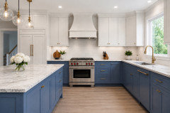
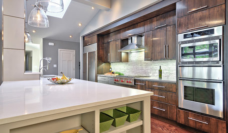
    Here is the options that directly speak to the critics who say use a white counter

    For reference White Mountain Danby


    and if you were to take it up the wall


    a fabric on the window that speaks to both the gray and blue together elevates the look


  • last month

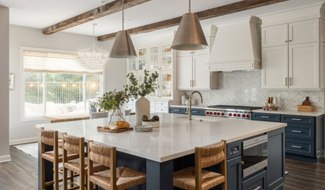
    A different blue but the bardiglio is present and some elements of this kitchen may work for you.


  • PRO
    last month

    Those counters are beautiful! IMO not drab at all. Get what you love to look at - that's more important than what we think. If you keep going back to it and can't stop thinking about it, then go for it!

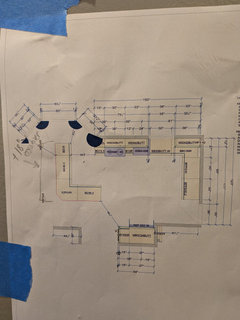
    I would definitely want to see the slabs so you can pick the one or 2 you will get AND you will want the template laid out onto it so you can see where the pattern goes and where the seams will be and what that does to the direction of the pattern. Ask tons of questions. Do not let them cut the stone without you being able to see and have a print out and photographs of the template on your specific slabs.

  • PRO
    last month

    I love the cabinets and the countertops, but I'm not wild about them together. But they don't clash and if you love them together, then do it. Personally I'd choose the Danby marble with the blue cabinets.

  • last month

    Admittedly, I'm never a big fan of marble, but I'd give a solid no to this combination:


    1. You're already committed to blue lowers /white uppers. I don't see these three big slabs of color playing together nicely. This marble is "bossy" /draws the eye. Having already committed to two colors, you need something to draw them together /help them coordinate. This marble just doesn't do that -- it's kinda a whole new thing that just doesn't blend in. You need something with a lot more white to connect the lowers to the uppers.


    2. I like /can follow rules -- do you know the 60-30-10 rule? It says if you have roughly 60% one color, 30% another color + 10% of another accent color, you'll come out with a nicely balanced room. What you're proposing is essentially 40-40-30. The colors will fight with one another for dominance /none of them winning; whereas, if you go with a white countertop, the white uppers + white countertop will dominate, the blue will be your 30%, and you'll have something else acting as an accent.


    3. You haven't mentioned the floor. In a perfect world, the countertop and the floor coordinate. They don't necessarily have to match, but they nod to one another -- especially in terms of color. If you go with this dark marble + include some dark flooring, you're going to have an awful lot of dark -- and it's all going to be lower, while the white uppers stand out in a negative way. In contrast, if you go with white countertops + some white on the floor, you'll have white at the top, in the middle and on the floor -- nicely distributed /a balanced room.


    4. You also haven't mentioned backsplash. You really have to consider ALL THESE THINGS together, as they won't exist in a vacuum once they're done. Backsplash can't be an afterthought. Already having chosen two colors for the cabinets, your backsplash needs to be the most simple, calm possible choice. White subway is played-out, but a white tile in another shape could work well. You could also bring a white countertop material "up the wall", minimizing the number of new materials you bring in.


  • last month

    @Mrs Pete the floors are hardwood - classic 90s orangey honey oak. We are going to re-finish/re-stain in a few years because they are continuous for the entire first level. So it's okay if they don't coordinate perfectly (for the time being).


    The backsplash is TBD, but we are not particularly picky about tiles. We will pick something simple (likely a plain white glazed subway tile) pending the countertop choice.

  • last month

    I love dramatic countertops and I love blue. However I think your base cabinet color may be too close to the countertop color (especially in the photo of you holding the color sample next to the slab). I used White Dove for all kitchen cabinets so I could use a dramatic quartzite countertop that has blues and greys and beige tones in it. I love blue cabinets but decided in my kitchen to let the countertop make the statement. I think especially if you are going for marble that you could find something similar in dramatic aspect but in a lighter color to go better with the blue base.

  • PRO
    last month

    This marble is "bossy"--I actually think that the marble has nice movement and will provide interest. It's the color combination with the cabinets that I personally don't love.

    Backsplash can't be an afterthought.--This is the one item that you do NOT need to plan, it should be an afterthought. Once everything is in place--flooring, appliances, counter tops--then you can select a backsplash. There are so many options that it's not worth stressing over until you're almost finished. Many of us here on Houzz have said that we have lived with our kitchens for a very long time before we decided on a backsplash. Mine wasn't selected and installed for at least 6 months after I started using my kitchen.


  • 29 days ago

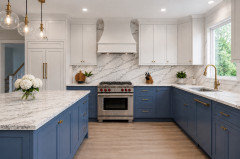
    Absolutely gorgeous! And, despite what others said, they coordinate perfectly with the blue cabinets.

    Make sure to get the counters sealed. And, enjoy!

  • 29 days ago

    Looks gorgeous! You went with your gut - and your gut was right!

  • 28 days ago

    Glad the marble and cabinets came together so well.

    The placement of the ceiling recessed lights in the work area looks a bit off.

  • PRO
    28 days ago

    Well I'll be damned!!! The marble is much lighter than it looked in your original photos, and works so well with the blue cabinets. Just shows that online photos are so unreliable!!

    Enjoy your new kitchen!!!

  • PRO
    28 days ago

    Congratualtions! The counters are stunners! Was your lighting plan intentionally done like this? I ask because I notice your recesssed lights are shining on the front of your cabinet vs you work space which equals they have been isntalled too close to the cabinet. Generally its a foot minimum but your sweer zone is 14-18" from your cabinet front. That U formation is not lighting your kitchen properly. Sorry but I know on a renovation you want to produce a better result and lighting is so important!