Software
Houzz Logo Print
bb_capecod

Does this fabric go with this wallpaper?

3 months ago
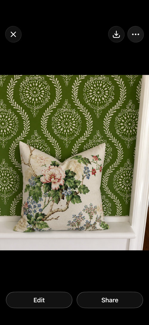
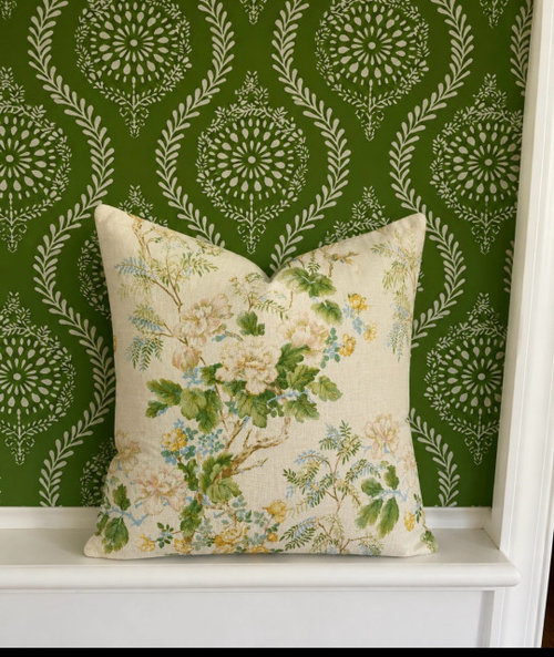
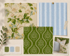
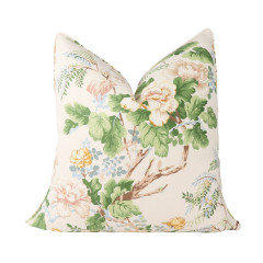
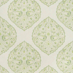
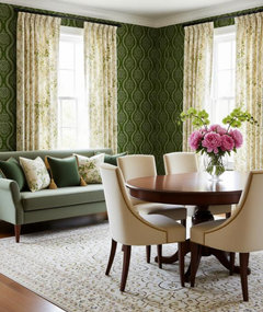
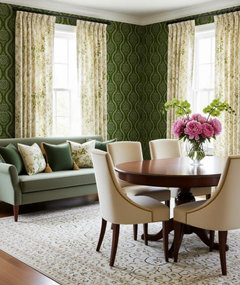
We are close to putting up this green wallpaper in our dining room. Do these fabric patterns go with the wallpaper? I need to find something for window treatments and maybe upholstering dining chairs. This room opens to the living room so I may have this same fabric on the window treatments and pillows in there as well.

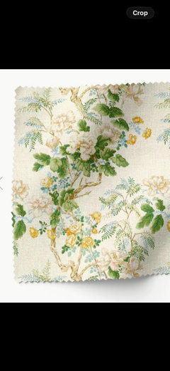
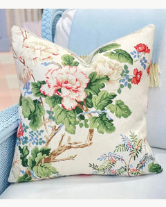
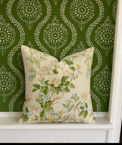
The pattern is Lee Jofa Chinese peony in Rose and the other is Gold.

Comments (23)

  • 3 months ago

    Love those together!!

  • 3 months ago

    The colors do! Mixing patterns is an art for sure. The wall paper and pillows won't ever be that close to each other, correct? Seems like a good pairing.

  • 3 months ago

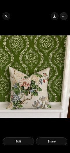
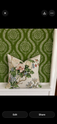
    The floral would be potentially either drapes or Roman shades in the dining room and maybe DR seat cushions so yes they would be right up against each other. Here are some more pics as the above images are from chat gpt and I think it alters the colors

  • PRO
    3 months ago

    The second colorway (gold) is better IMO. They do work well. i would consider a third pattern for the dining . chairs. A photo of the space would be great and we can help you with fabric distrubution to create a cohesive space in both rooms.

  • 3 months ago

    Is this a pick one? Have you seen an entire pattern repeat of both of them? I like the darker top one but I am drawn to those colors and my house is decorated in them. The bottom one reminds me of my mothers expensive couch from the 80"s that was limeish and yellow floral on a light background.

    I really like the wallpaper!

  • 3 months ago
    last modified: 3 months ago
    I like the Gold. The green is truer to the paper. But I'm not fond of red/pink for what it's worth.

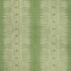
    I found these images of the blue pattern and is very subtle. The gold has a deeper green.


  • PRO
    3 months ago

    They are both very pretty fabrics and either would go with the wallpaper.

    You just need to decide if your preferred color palette is green/yellow with a small amount of blue, or green/blue with a small amount of red.

    A stripe would work great on dining room chairs.

    Also what is in the living room at present? Do you have a rug in the dining room?

  • PRO
    3 months ago

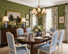
    Having no clue what your rooms look like.......... I played around with the idea of a formal dining room using the Gold option fabric the wallpaper and taking the blue and using it as an accent color by upholstering the chairs in a complimentary fabric


  • PRO
    3 months ago
    last modified: 3 months ago
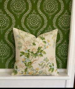
    Sorry no blue stripe IMO would complimentary. I think either works with the wallpaper but i would be nice to see the space .

  • PRO
    3 months ago
    last modified: 3 months ago
    I do think to upholster chairs in either fabric is too matchy but maybe with either you could do blue velvet seats .

  • PRO
    3 months ago
    last modified: 3 months ago
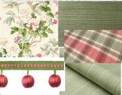
    I like the first combination...however, without seeing the living room, it is a guessing game for us.

    As an aside, you are on Cape? Green is a tough color to use with our cold, damp winters, unless natural light is coming into the room from the east....and that is a strong green.

    I have had good luck with B.M. Spring Meadow. Gives a warmer yellow undertone.

    Just suggesting.


    Lee Jofa


  • 3 months ago

    @RNmomof2 zone 5 "... from the 80"s ..." It's baaaaaack. Delicate florals, many embroidered, jacobean florals, cabbage roses. All with a slight twist, but they are BACK!

  • 3 months ago

    Whoa! That wallpaper is intense! I jumped a little when I opened the image on my phone. Had a similar reaction when I enlarged the rendering of the dining room. Strange-we have green curtains in our dining room and I just installed sage curtains in our bedroom.

    Maybe it's the dark green in the paper's background that seemed to leap out.


    I'm probably in the minority here. Fabric and paper seem to coordinate. Not sure about the overall effect.

  • 3 months ago

    I agree, @thinkof129.


    I basically thought the same thing as you, when I saw the combo and read the plan, etc. Then I thought, ”Maybe I’m not seeing this correctly.” And maybe I am not. So I kept it moving. But, now, I just tuned in and saw your comment. And I know you are in New Orleans; so if you feel it’s too “intense” and if you are ”not sure about the overall effect”- it made me start to think maybe I am not so off-base.


    Essentially I just think the idea of combining these florals in drapes and pillows with this particular wallpaper just “doesn’t go”. The paper is nice, and the floral fabrics are nice- but the overall effect just seems to clash and/or fall flat.


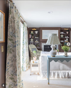
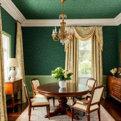
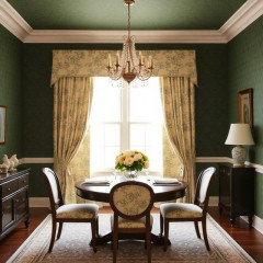
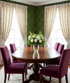
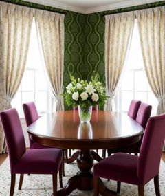
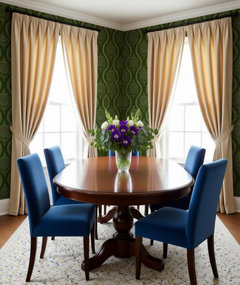
    So I did a quick visual with the paper in a dining room . I don’t know what the OP’s furniture and dining room looks like. But I created a room just to show the idea. I was inspired by the general colors in this pic of OP’s:


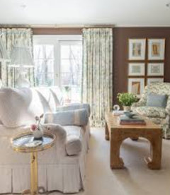
    I went a bit more plum than red/pink on velvet upholstered dining chairs. And I used a drape with a very subtle floral patterning. Simple. And you will notice how the wallpaper looks. Maybe the drapes could be a bit more of a subtle matte gold. I went with linen/flax type color on drapes.


    Then, maybe use a couple of the colored floral fabric pillows in the room. I don’t know if the room has a window seat, bench or sofa, or what.


    So anyway- just one view/one approach. The simplification may be too boring for OP.


  • 3 months ago

    Subtle light matte gold silk drapes?


    I could have changed the rug, too.


    I don’t know if you are actually on Cape Cod, OP. I spent quite a few summers there, when I was growing up. Neighbors/friends in NYC had a house there, not too far from the beach. I don’t know exactly how far- but by the time I was a teenager, I remember being adventurous and walking to the beach and back. But mostly went by car. Nice memories.


  • 3 months ago

    Something about the wallpaper or fabric or combo does not say ”aha, this is it!” to me. Maybe it’s because there is no context posted about your home and there are no photos of your dining room and adjacent rooms. The success imo of that wallpaper in part depends on the number and size of the DR’s windows/doorways, the trim and crown molding, if any, etc.

    I am also wondering how formal the DR and house decorating are. While I like the suggestions given by other posters, some seem more formal than what I picture for a home in Cape Cod (if that’s where you are) or how your family may live.

  • PRO
    3 months ago
    last modified: 3 months ago
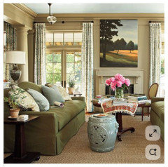
    It's a fun , cheerful palette, the paper would be a bit strong for me, I'd probably love a grass cloth for longevity but lord know I do love the first- it's been living as a screen shot for my sister for a few weeks: )

    Dying to use a trim again.....

    Much depends your chair style, if what a rug and more. I'm not for too much repetition in pattern between rooms... but we are not seeing what you have. i

    Not every color must be everywhere, and even small doses of a color will create flow between rooms


  • PRO
    3 months ago

    I think the 2nd photo of fabric coordinates well with your wallpaper.

  • 3 months ago
    last modified: 3 months ago
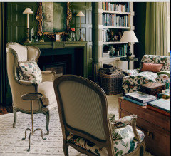
    Maybe the wallpaper can work with the floral fabric. The rendering that was done that shows a combination of the two (featuring the second pillow fabric) is not showing the actual wallpaper. Or at least I don’t think it is showing the actual paper- but I could be wrong. Plus, I am not sure if it is showing the actual floral fabric.

    In any case, if I have a chance, maybe I will create some images with the OP’s specified wallpaper and floral fabrics.

    Also, as far as the poster, @Design Fan, that commented that “some of“ the suggestions/images posted “seem more formal than what I picture for a home in Cape Cod.“ I am assuming the poster is referring to my renderings.

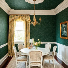
    I don’t know... I haven’t been to Cape Cod in a long time. Plus, I was not aware that everybody on Cape Cod has the same design aesthetic. I’m clearly out of touch. So, I did a few quick AI images - just loosely requesting dark green wallpaper, and the general floral pallette of the second floral fabric colors. Not the specific floral fabric or wallpaper. And for the rest of the elements- I basically left the selection of everything else in the dining room up to AI. Except, I just clearly specified: ”Upscale Cape Cod dining room”.

    And this is what I got:


    So - I think a bit more ”formal” than the images I created and posted.

    Maybe I could have specified ”casual Cape Cod dining room” and it would have been a different result.


  • PRO
    3 months ago

    The wallpaper the poster has chosen is Brunschwig and Fils Marindol. It has been discontinued by B&F. Fabric yes so perhaps she is going to upholster the walls. Or perhaps she has found a site that has inventory still. Which if so my advice is to make 100% sure you are buying all rolls from the same run. If not on a saturated color like this it can go very very wrong if the color is even slightly off from roll to roll.

  • 3 months ago

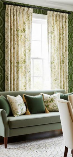
    It may work, @bb_capecod. I don’t know. I just did another rendering in which I again used your wallpaper choice, as I did in my previous renderings; but this time, I attempted to add the floral print in drapes, etc. I used your second floral print image- this one.


    As you can see, the floral colors and pattern is not coming across accurately on the drapes. It almost seems to me like AI is opting to go in the direction that I had actually chosen to go in, when I specified these drapes in earlier visual.


  • 3 months ago
    last modified: 3 months ago
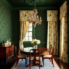
    But you can see the floral colors and pattern better on the pillows. I enlarged the area.