Software
Houzz Logo Print
oldhousebuffs

Help me find this paint color!

2 months ago
Hi All,


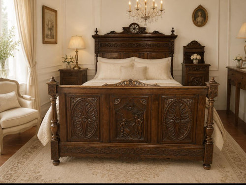
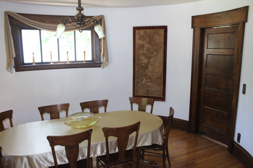
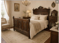
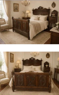
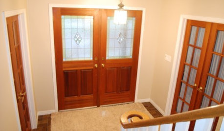
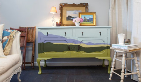
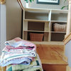
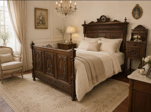
I've been dreaming of painting the interior of my home and know I want to use Benjamin Moore. Does anyone know of a Benjamin Moore color that would match the exquisite color in the top two photos? I'm more than willing to mix colors to achieve the this tonal. It's exactly what I've had in my mind's eye for months.


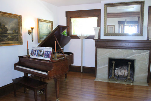
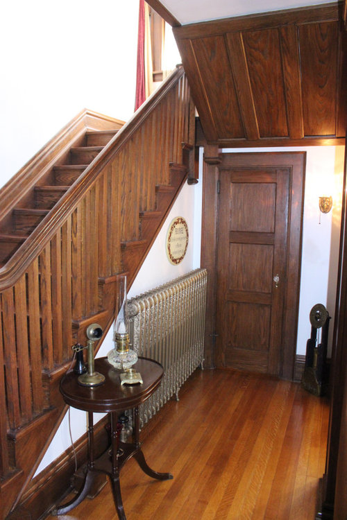
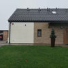
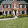
Our home...


Comments (24)

  • 2 months ago

    pint colors you see/feel in a room have everything to do with the natural lighting the room gets. Not to mention the textiles and window coverings... Do you already have an area rug? It will play a big role.

    Your inspo image is a beautiful soft white with a creamy undertone, not yellow, but samples in YOUR room will be the only way you can find what suits you.

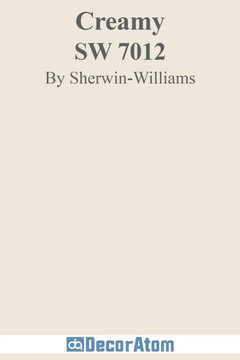
    Start with a few samples... although this is not BM, this SW Creamy is a good starting point.

    Good Luck.


    oldhousebuffs thanked Lyn Nielson
  • PRO
    2 months ago

    What I see in those photos is a yellow-ish off white. My favorite is Ben Moore Linen White, which goes very well with natural wood and in a home of your vintage. You could also try Ben Moore Mayonnaise or Ivory White.

    But as I just wrote on another post on color, you need to try the color in your own home with your own light.

    oldhousebuffs thanked Diana Bier Interiors, LLC
  • 2 months ago

    ^agree - another idea: we got a very nice cream in an east facing room with BM Navajo White

    oldhousebuffs thanked la_la Girl
  • PRO
    2 months ago

    As alwyas go get some smaples and see how close they are to the pic . No one can tell you what color that is they can only guess.

    oldhousebuffs thanked Patricia Colwell Consulting
  • PRO
    2 months ago

    That's a good idea, Design Fan.

  • 2 months ago

    Absolutely plan to sample--I realize that paint chips are a good starting place but nowhere near as accurate as getting a sample of the color on the wall. Thanks very much Diana Bier and la_la Girl for the ideas; I've tried two or three samples but wasn't finding the right tonal--Acadia was the nicest but in the end just too light/too white. In the end, just decided it wasn't warm enough.


    I think I'm seeing just the barest hint of buffy pink (not beige) in those pictures. e.g. a warm cream tone.

  • 2 months ago

    SW Aged White


    oldhousebuffs thanked Lyn Nielson
  • 2 months ago

    Our house has dark trim like yours and I wanted a creamy paint colour that wasn’t yellow, pink, or gray. BM Collingwood looks beautiful in our south, east and west facing rooms. But it went gray in a north facing room, so definitely sample in the room!

    oldhousebuffs thanked P D
  • 2 months ago

    A pretty very creamy light yellow that I have on my exterior, so it will be different on an interior, is from Benjamin Moore’s Historic Collection - it’s called Hepplewhite Ivory.

    oldhousebuffs thanked AC M
  • PRO
    2 months ago

    Acadia was the nicest but in the end just too light/too white. In the end, just decided it wasn't warm enough.


    oldhousebuffs thanked Lori A. Sawaya
  • 2 months ago
    last modified: 2 months ago


    Bar Harbor Beige?


    Your inspiration photo is gorgeous with the Eastlake furniture. My one concern is the floors in your home....I see yellow/orange tones. You might want to consider taking the floors into account, assuming the wood/stain runs through out the house.


    oldhousebuffs thanked HU-417221168
  • 2 months ago

    So much help given here...thank you all! I'm having a hard time knowing which samples to go with but will try a few out and most likely ask for more help. Right now...I'm really liking October Sky. Am wishing that it had an LRV value that was just a bit lower, as I suspect with my massive windows the tone might be too light. Hopefully not!!


    Good point on the wood floor tones...they are showing a bit too orange in the photos so hopefully will be OK in that regard.

  • PRO
    2 months ago

    Am wishing that it had an LRV value that was just a bit lower


    I know all the blogs make a big deal about LRV but it's not what they make it out to be. LRV is a physical measure and the only thing it does is tell you how much light a color reflects. Which is useful for certain visual ergonomic standards and calculations. Not so much for practical use.


    LRV contains ZERO information about what a color looks like. Munsell Value is the best data value to read for how light or dark a color looks.


    More Chroma in October Sky means it literally has more color, less whiteness and that can spill over to a color looking more "full" and "round" and not feel as light as it factually is.


    oldhousebuffs thanked Lori A. Sawaya
  • 2 months ago

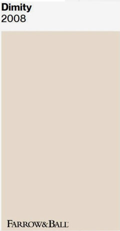
    I know you are looking for Benjamin Moore, but it really reminds me of Farrow and Ball dimnity, which I have in my bedroom with dark wood furniture and it throws the most glorious hint of blush. I've read Benjamin Moore's martime white is a good dupe for FB diminity. I have used Martitime white in many spaces and love it, though not because I wanted a blush undertone.

    oldhousebuffs thanked Kendrah
  • 2 months ago

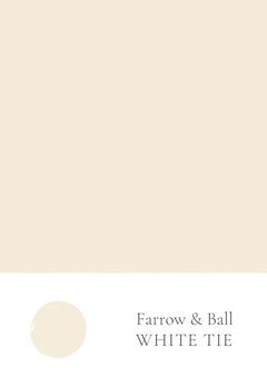
    The colors in your two pictures look different. If interested, BM can color match F&B.


    oldhousebuffs thanked Maureen
  • 2 months ago

    Your home is so lovely and will look even more spectacular when you paint it a more muted colour. I hope you will share the ”after” pictures here!

    oldhousebuffs thanked P D
  • 2 months ago

    P D...Thanks so much for your encouragement! So looking forward to later this week when I can get a few samples.

    Maureen and Kendrah...The Farrow and Ball paint is a new one for me; thank you for the suggestion!

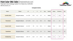
    Lori A. Sawaya...Thank you for taking time to educate me. I had no idea. I've bypassed several samples because I thought the LRV was an issue and now will need to take a 2nd look at those. How do I find out what the Chroma of the paint is? Is that information listed somewhere on the Benjamin Moore website?

  • 2 months ago

    “Is that information listed somewhere on the Benjamin Moore website?”

    I’ve found thelandofcolor.com to be very helpful.


    oldhousebuffs thanked chloebud
  • PRO
    2 months ago
    last modified: 2 months ago

    bypassed several samples because I thought the LRV was an issue

    I know, it's a major problem. I try to talk about it as much as possible but it's just me against misinformed blogs and YouTube videos. And now there's AI - it churns all of it together and amplifies all of the made up garbage in the slop answers is gives.

    The good news is once someone tells you the truth about how LRV (and really color in general) works, you can SEE it for yourself. Someone else's subjective opinion of what a color looks like becomes just that --- someone else's subjective opinion.

    Don't use websites like Plan Home, Encycolorpedia, etc.

    Those websites are free because they scrape RGB values from God knows where and then publishes a wall of numbers that aren't tethered to the reality of how humans see color.

    Any ad-heavy website is a big red flag.

    I'll get you chroma values, just post the list(s) of colors here.

    oldhousebuffs thanked Lori A. Sawaya
  • 2 months ago

    My house is SW Antique. It works for us. My kitchen cabinets are SW Creamy and it’s an open concept house, so the two ivories go together well.

    oldhousebuffs thanked RedRyder
  • 2 months ago

    Thank you, Lori A. Sawaya--that is very kind of you!

    I'm picking up samples tomorrow and will keep in touch.

  • 2 months ago

    I tested samples today...so fun!


    At the top of my current favorite list is Butterfield and October Sky. I have a question for you, Lori A. Sawaya, specifically on the Butterfield color, and I'm hoping you can help me out.


    I have had several not-so-fun experiences with yellow paint tonals in the past. For whatever reason the same paint can look entirely different from room to room, or even on an adjoining wall. I'm not talking about normal variations of shade due to light play/shadowing. Rather, it's as if a totally different yellow color was used.


    In fact, on the exterior of our home I chose a rich gold tone for our trim. I had to come up with 3-4 formulations in order to get the color to match on all four sides of our home. I've seen the same thing with other homes too--and when I spot it, the house is always yellow.


    Can you explain why this is happening? And do I run the same risk if I choose to go with the Butterfield option? Thanks so much for your time!