Software
Houzz Logo Print
webuser_435108487

I feel like something is missing

28 days ago

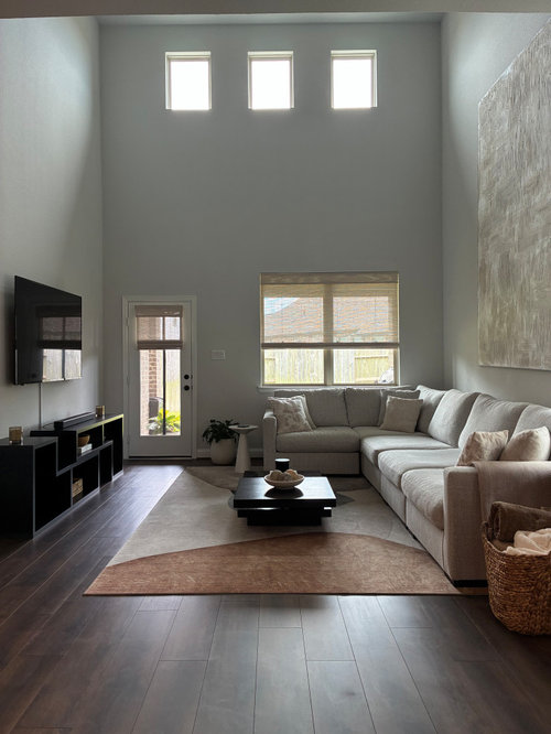
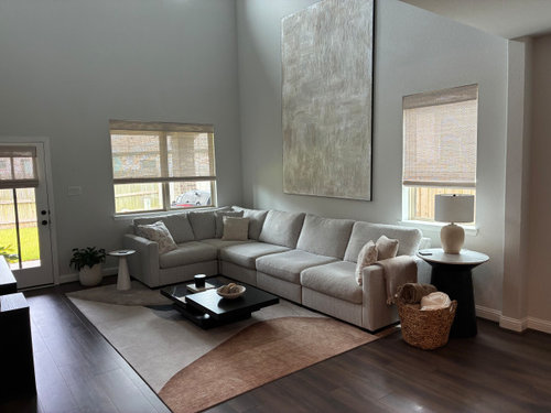
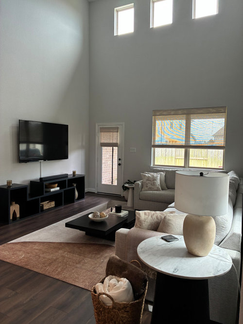
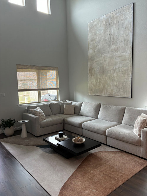
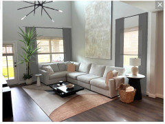
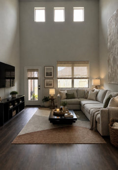
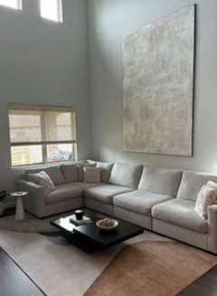
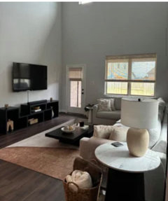
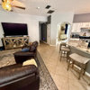
I added a few pics of my living room. I’ve been working at it for a couple of years now but it still feels incomplete. Maybe curtains on the window facing my patio? I’ve always worried that curtains would clash with the height of the large artwork. Is it my throw pillows? Or am I crazy and the space looks totally complete?


Comments (12)

  • 28 days ago

    Your room will look 100% better if you ditch the grey wall paint. It doesn't coordinate well with the warmth of the floor or rug, and the color evokes a feeling of emptiness, a sadness, in this space when I look at the photo.


    You need window trim, too.


  • PRO
    28 days ago
    last modified: 28 days ago

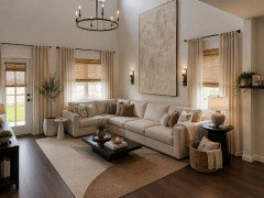
    The room is lacking in texture and contrast. Additionally, everything is happening within the first 7 feet and nothing above. It would be good add items to take advantage of the volume of the space.


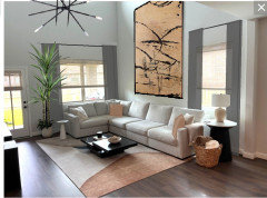
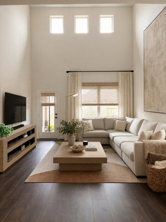
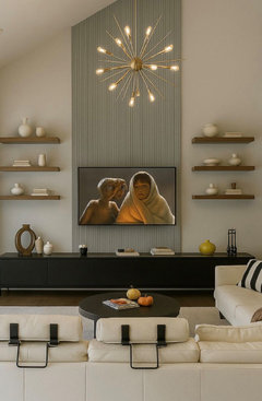
    I have added sheer drapes to the windows, a tall thin tree and adding some color accents to the space & a hanging light fixture in the space.


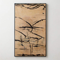
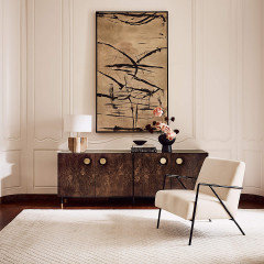
    Changing out the art would make a huge difference to the space IMO.


  • PRO
    28 days ago

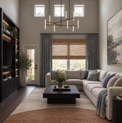
    Your space already has a great foundation; it just needs a few finishing touches to make it feel more layered and cohesive. I would replace the oversized gray artwork with a slightly smaller piece that introduces warm colors and soft blues.


    Add full-height, light sheer curtains on both windows, mounted at the same elevation to emphasize the room's height and create a more balanced composition.


    A statement pendant light will help fill the vertical volume and make the double-height ceiling feel intentional. Finally, introduce a few more throw pillows in blue tones pulled directly from the artwork to tie the palette together and add depth.


    These subtle changes will make the room feel warmer, more complete, and professionally designed without changing the furniture or layout.


  • PRO
    28 days ago

    Color is what you need for sure . Maybe just some darker tones of the colors in the art for pillows and maybe a bit more life in the rug. The art is quite uninspiring so if you love it use it to add some color.

  • 28 days ago

    I love your room and think it is really pretty, but it’s a little stark. Add a few more furnishings to warm it up such as additional lighting and wall decor, greenery, and pillows.

  • 28 days ago
    last modified: 28 days ago

    Is the dark impression just the photo's lighting? Maybe the room is really lighter and warmer than it appears? This image adds drapes and substitutes a lighter, heftier coffee table and TV console (with lowered TV), but the biggest change is the lighting.


  • 28 days ago
    last modified: 28 days ago

    Curtain panels. Windows deserve proper dressing. Shades are for temporary apartment dwellers. And don't hang them at the ceiling as some here will suggest.

  • 28 days ago

    The tv is too high. When you sit on the couch, can you view it at eye level?

  • 28 days ago

    Great advice already just a vote to change out the tv console for something longer/larger with more texture

  • 28 days ago

    Another suggestion. I think the wall with the tv needs to balance the visual weight opposite and together with a chandelier, they will help to draw the eye down.


  • 28 days ago

    I imagine that the very large piece of art on the wall wasn't inexpensive - while changing it to something with more contrast would help the room, it's not a very practical solution. If it was a smaller piece of art, it could simply be moved to another room - however, I doubt that you have another wall where it would work!


    It does "disappear" a bit on the wall. Maybe if you added a floating frame to it in a color that would contrast against the wall color, it would stand out more. You could add just a dark stained wood frame (there are many DIY tutorials for adding a floating frame - it would be $$ to have it professionally framed).


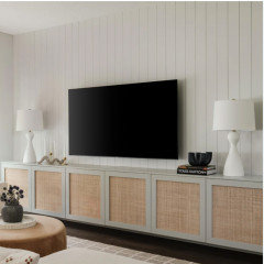
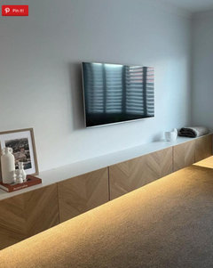
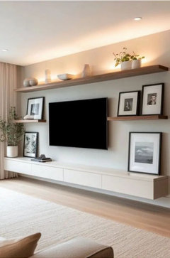
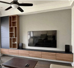
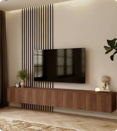
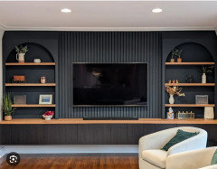
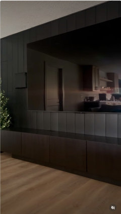
    I agree with la_la about adding a longer media console with some texture. There is a lot that you could do with your TV wall that would make a huge impact on your space. You could use IKEA Besta units in order to customize the console to the size of the wall. There are MANY options for doors/drawer fronts for Besta units - many third party options + a TON of diy ideas.

    The units no longer look like IKEA once the doors + a top is added.


    Frontiers (sells doors to fit Besta units - I've also seen DIY hacks that look the same as these doors):


    The above media console uses the taller Besta Units (I think that they are around 25" tall). This one below uses the shorter units (about 15") to make a floating media console. The person below used wood veneer doors that are sold at IKEA:


    These Besta units were wrapped with plywood in order to make an upscale looking media console:


    You could add floating shelves if you want to add .more to the wall:


    IKEA also sells other units that are part of the Besta system:


    Below is a DIY that somone did using IKEA Besta units + IKEA bookcases:


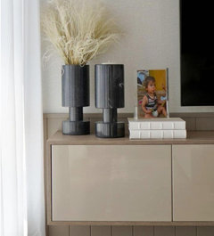
    I couldn't get a good shot of this unit - I just wanted to show you how they used Besta units to make a media console that looked like one that was over $2,000 - their cost was $400.


    Also, adding casing/trim to the windows would make the room feel more "finished" - I'm not a fan of windows that don't have trim (I've never lived in a home that had windows without trim - maybe that's why they look "unfinished" to me?)


    Plus, adding some panels to the lower windows + different throw pillows would also add more color/texture to the room.

  • PRO
    27 days ago

    It would not clash.