Software
Houzz Logo Print
elana_konig

Help me with this bathroom!

25 days ago

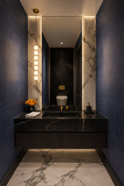
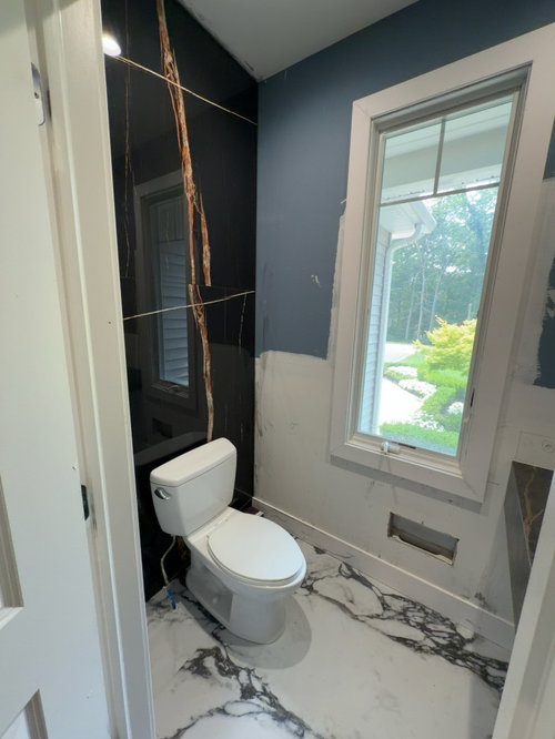
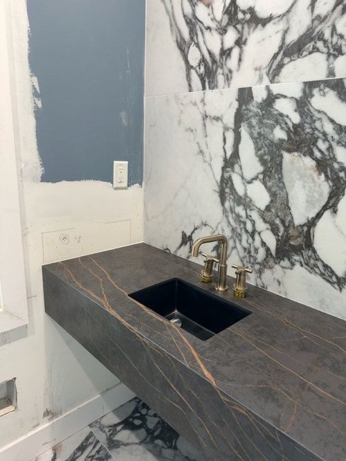
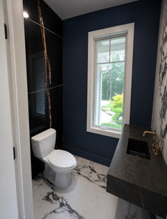
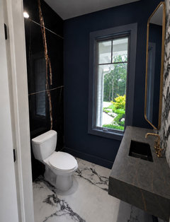
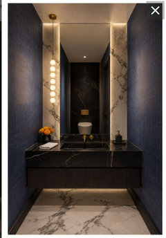
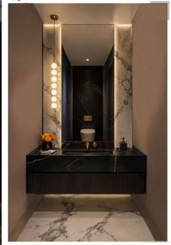
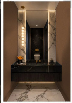
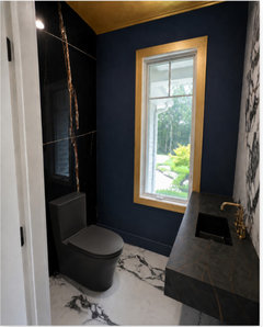
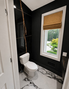
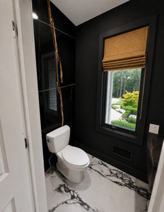
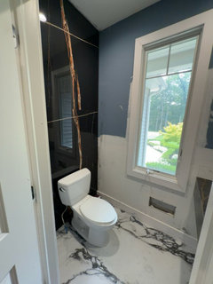
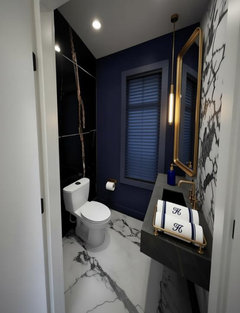
I am 3/4 way through a bathroom reno, and I hate it! Help me salvage it so I dont rip it out and start again. Inspo pic and two current pics attached


Comments (52)

  • 25 days ago

    Trim looks to be black in the first picture. What do you hate?

  • 25 days ago

    Are you planning on upgrading the toilet or no?

  • 25 days ago

    I can change the toilet but not to wall hanging.

    I hate the orange in the black wall and that the vanity isnt an exact match

  • 25 days ago

    I’d probably want to simplify at this point and paint everything (walls and trim) a matte black - i’d want a sleeker skirted toilet

  • 25 days ago

    Who picked out the finishes? e.g., the black wall with orange ? it’s very dramatic, not my thing, but it looks like you were going for dramatic based upon your inspir. pic.

  • 25 days ago

    I think the orange gives a nice shot of color. Maybe you can consider painting the trim/door a color that picks up the dark gray in the vanity. A room-darkening or blackout shade will help with privacy and add to the vibe. I believe it will look fine when you are done.

  • 25 days ago

    i was going to do the white tile with half wall of the same tile fluted, and then my friend sent me this and i changed the whole look and im totally regretting it.

  • 25 days ago

    Curious about the inspiration photo. The camera's viewpoint is between the toilet and the vanity. If you look at the mirror, no camera is visible. Am I missing something? Is this an AI rendering?

  • 25 days ago

    its AI

  • PRO
    25 days ago

    Instead of blue would you consider painting walls and trim black or as someone else posted a dark gray that matches the vanity. Simplfying really might be the best answer to your problem.

  • 25 days ago

    If you removed the orange and black wall and the vanity, would you be happy with the rest of it? Or do you want to remove everything and start over?

  • 25 days ago

    I would remove just the black wall and vanity if I knew what to put instead.

  • 25 days ago

    The black wall and vanity seem to be what makes the whole bathroom like your inspo.

    I think the blue on the walls is not dark enough and too grayish. It leans country while your inspo walls lean dramatic.

  • 25 days ago

    Its not painted yet, only tiles and vanity are in so far

  • 25 days ago

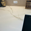
    They look like 2 different stones or maybe the finish is different. I think it would look better if the stone behind the toilet was more like the vanity.

  • 24 days ago
    last modified: 24 days ago

    AI renderings suck, but you will never get the same dark/modern/moody feel, during daylight, while you have a window in the bathroom!

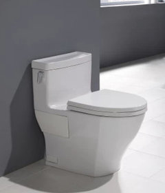
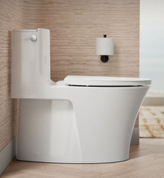
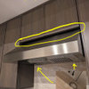
    For the toilet, get a Toto Legato or Kohler Veil (several models, standard one is fine).

    I've owned both and the Veil flushes better!


    Toto Legato


    Kohler Veil


  • 24 days ago

    Methinks you have a case of mid-project jitters. Your friend thought it was right and so did you. Keep calm and carry on.

    E Kay thanked thinkof129
  • 24 days ago

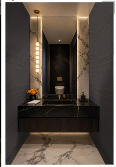
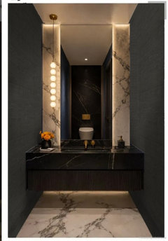
    I like the dark blue walls and think that if you keep on going with what you had in mind you’ll have a beautiful bathroom.
    I’ve shown it here with the window trim in the current white and then if that is painted out in the dark blue color I tried putting a mirror in but Ai had a hard time with that one.

    E Kay thanked Emily
  • 23 days ago

    It's pretty dramatic. I might pick a dark gray for the walls, one that goes with one of the grays in your stone.

  • 23 days ago

    I think Im going to replace the tile behind the toilet to be the same as the floor and vanity wall, as per the advice above. And then decide on a paint/wallpaper.

  • 23 days ago

    It would be a waste to rip out the vanity. I would definitely remove the tile behind the toilet.


    I'm not sure that I would run any tile up behind the toilet.


    I think using two different marbles with veining wasn't a great decision - especially when one of them has very dramatic veining (FYI - I love the marble on the floor and vanity wall - if you installed a fluted one that matched, it would have looked amazing).


    However, if you remove the tile behind your toilet + paint the walls dark + add low lighting (that has a warmer color to it) + maybe bring in some wood that looks similar to the color in the vanity (but will act as a neutral), it will bring it all together for you. Maybe the wood could be used behind the toilet?


    Is the floor tile/vanity wall tile real marble? I'm assuming that the vanity is quartz?


    The inspiration rendering has a faux marble for the floor/vanity wall - yours looks much nicer than the one used in the inspiration AI rendering (I'm not a fan of faux marble - except for the one Chispa used in her guest bathroom - it looks very realistic). However, the one you've installed has a much whiter background than the faux marble used in the AI rendering. The low soft lighting will help tone down the white background of your tile.


    I wouldn't add wallpaper - I think that there is more than enough going on in the room.

    E Kay thanked dani_m08
  • 23 days ago

    This is a dark moody bathroom with the lights on, the walls bare and the window without a covering. I think it will nice when its is finished and the lighting is right. Btw, Costco has some great looking low smart toilets. Hopefully you thought to put a plug in there.

    E Kay thanked Paul F.
  • PRO
    23 days ago

    I think you mean an outlet or receptacle, not a plug.

  • 23 days ago

    Personally I am not a fan of small dark rooms that give off "Black Hole of Calcutta" vibes. I would go for a much lighter colour on the walls.

    Apart from anything else, you have three different types of marble in there, none of which really go well with each other, and none of which goes well with the gray paint on the wall. Stylistically the very plain toilet clashes with the dramatic wall behind it.

    I get that you don't want to gut it and start over, but for a result you will be happy with for years to come, I think that's your only option.

    Similar to Diana Biers' suggestion, I'd keep the toilet and the black and white marble and rip out everything else and start again, with a better eye for colour matching.

  • 23 days ago

    can I paint or wallpaper behind the toilet without ripping out the tile first? just applying it on top?

  • PRO
    23 days ago

    I don't think either paint or wallpaper will adhere to stone, especially polished stone. If you really hate the stone, then have it removed. If you don't want to go through the expense and disruption of removing it, then just live with it. It isn't going to affect the function of the bathroom. Paint the drywall a complementary color (white/gray/black) and move on.

  • 23 days ago

    Taking light levels down (dimming lights, covering window) will probably minimize difference in sheens of the stones. For the fixture over the toilet you might try a bulb with lower light output and/or narrow beam angle. Such bulbs are readily available.

  • PRO
    22 days ago

    Don't panic-at 75% complete, this is actually when a lot of bathrooms look their worst. Focus on the finishing details before making any big decisions. The right vanity, mirror, lighting, hardware, paint color, and accessories can completely change how the space feels. I'd also wait until everything is installed and properly lit before judging the tile. We've had many clients who wanted to start over midway through a project, and once the final touches were in place, they ended up loving the result. Sometimes it's not the layout that needs changing-it's the layers that bring the design together.

    E Kay thanked Highland Construction & Remodeling, Inc.
  • PRO
    22 days ago
    last modified: 22 days ago

    I don't think the blue on the walls looks good in the inspo photo. Here is the inspo picture. The blue walls are apparent.


  • 22 days ago

    I am confused by all the comments about the blue walls. The blue in the construction pictures appears to be blueboard. Seems reasonable to use blueboard when doing a skim coat as prep for wallpaper. The OP stated beforehand that the walls had not been painted.

  • 22 days ago

    Just use a thin ceramic that’s made for going over the surface of existing tile like Kerlite. No need to demo. I’ve used their large format sheets many times on walls and flooring. As long as your installer knows to cut it like glass then it’s a great solution for you. I think it’s a little premature since it is a lighting issue in my opinion. https://www.tilesolutions.com.au/projects/kerlite/

    E Kay thanked Paul F.
  • PRO
    22 days ago

    The blue that's being questioned is not the blueboard in the construction photos. It's the blue walls in the original AI image.

  • 22 days ago

    Blue walls in the original image seem to occupy most of the surface area, so blue appears to dominate. Shouldn't the other colors be examined in relation to the dominant color?

    I'm starting to think the OP is freaking out over the white marble on the vanity wall. Right now it looks like a huge clash. The mirror will cover most of it and dark colors will take over.

    E Kay thanked thinkof129
  • 21 days ago
    last modified: 21 days ago

    I think it can be salvaged. Think about this band-aid.

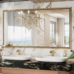
    Worst, IMO, is the wall at the sink and that is where I would start the fix. Install a large mirror with the same brushed brass tone frame as the faucet. Go as large and wide as possible to hide the "seam".


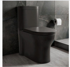
    Switch out the toilet...not black, but a charcoal to work with the sink. This one is Home Depot. Do a higher set toilet...(look how low your white one shows).


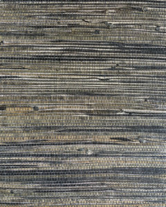
    This wall paper...touches of black, charcoal, brass and white. The grass cloth paper brings in a much needed tactile feel to counteract all the cold, shiny look.


    https://mitchellblack.com/products/black-and-brown-iridescent-loose-weave-grasscloth-wallpaper?variant=41829481316449&gad_source=1&gad_campaignid=20258797145&gclid=Cj0KCQjw94bTBhDQARIsAN3vv0wSvMYTdmWD1wvnH81_yp-sQ9TFVGziznghMo0h4TrVwKHi3XkhEzIaAhGvEALw_wcB

    Any other metal you add (ceiling light, sconces, even the flush handle on the toilet and the crank on the window)...stay with the brush brass tone.

    After all this is done, you may want to paint the window. Do a dark charcoal in a satin finish.

    You started with black, so stay with it. Use the brass tone only for accent.


  • 19 days ago

    Go all in!


  • 19 days ago


    paint walls black and add gold accents ie gold roman blind

    Paint walls and window surround black and add gold accents .. ie roman blind, gold rimmed mirror,


    change socket to black so not obvious

  • 18 days ago

    You need a LOT of white paint and get rid of the black counter top & sink. Thankfully, finally black & grey are no longer trendy and NEVER should have ever been trendy unless someone wants to see how ugly they can make a room or house.


    Get rid of ALL the black ASAP if you want your room to look like a sane person styled it.

  • 18 days ago

    Opinions are like *. Everybody's got one.

  • 18 days ago

    I like the counter. Try the mirror up there before taking anything out on that side. It could work. The black behind the toilet is what I would remove. I do like your inspo pic.

  • 18 days ago

    Just keep in mind that skirted toilets are more difficult to install and much more difficult to repair due to limited access to the fill and flush valves.

  • 18 days ago

    Hi there, I like Emily’s and HU417… ’s idea. If you don’t love the dramatic veining from the marble at the wall, try to cover it up as much as you can.

    Hang a very large (abstract?) picture over the toilet that picks up the colors of the room, a large mirror over the sink and choose some burnt orange or gold-toned accessories to pull it all together.

    It will look awesome once it is all finished! Don’tworry about the negative comments! 😄

  • 18 days ago
    last modified: 18 days ago

    @Anne O

    Appreciate the heads up.

    Looking at the construction picture, I see that the supply pipe comes out of the floor. I think supply pipes have to come up inside the toilet skirt. Implies a limited horizontal offset from the toilet centerline. Don't see that happening in this case.


    This ought to make folks think twice about using a skirted toilet in a remodel.

  • 18 days ago

    I for one, hope you don't stop/quit.

    I think it will be a gorgeous jewel box, half-bath,

    (minus the toilet & waterline).

  • PRO
    17 days ago

    "Don’t worry about the negative comments! 😄"

    The OP started the post with negative comments about the bathroom, i.e.,

    "I am 3/4 way through a bathroom reno, and I hate it! Help me salvage it so I dont rip it out and start again."

    Most of us are agreeing with him/her and are offering ideas about how to salvage it. So what is the problem???

    E Kay thanked Diana Bier Interiors, LLC
  • 17 days ago

    @E Kay - your friend gave you a beautiful design.


    You really cannot judge the finished product by this:


    It would be more like this:


  • 16 days ago

    @E Kay,


    For a little perspective, check out this link from a post by another commenter.


    https://www.theglampad.com/2026/07/inside-a-bold-and-beautiful-fifth-avenue-apartment-by-corey-damen-jenkins.html


    Your worries will disappear.

  • 15 days ago
    last modified: 15 days ago

    If the tile behind the toilet is real marble you can have the finish ground to match the vanity. I would change the faucet to a copper finish. You need a more modern toilet. I would not use any white trim paint. I don’t mind the blue walls in your inspo pic. The window treatment should be the same.

  • 14 days ago

    The blue paint color is way too light for the look you're going for. There is also a lot of warm tones in your chosen stone that isn't in the inspo, which may be part of the issue. I think more gold or copper metals might be able to tie it together. https://seremodeling.com/how-to-design-a-luxury-bathroom 

  • 13 days ago
    last modified: 13 days ago

    Very 1976 Caesar's Palace.


    Seriously, though, maybe it's just so far removed from my taste that I can't see -- but I completely understand your mid-project misgivings. Note, too, that your inspiration picture shows one image of a very symmetrical room /the vanity straight-on. And the room is laid out to give you a view of yourself in the mirror while you're on the toilet.


    Things I'd reconsider:

    60-30-10

    The inspiration picture "works" in large part because the colors are balanced. Do you know the 60-30-10 rule? It says (and you can google for examples) that you should let your #1 color take up 60% of the room -- in the inspiration picture this is black /dark blue that's almost black. 30% should be a secondary color -- in the inspiration picture, that's white. And 10% accent color -- in the inspiration picture, that's gold /brass /warm toned flowers. This rule is particularly important in small rooms.

    In contrast, your black and white are about 50-50, so they're competing with one another. When you walk in, the black wall-with-large gold veining draws in your eye. THAT wall is the beginning of your 60%. The blue on the walls is going, right? So the real question is, what's going in? Not stark black -- that'd be too much. Work on color balance. Not color equity.


    Other thoughts:

    - Walking in to the side of the vanity is odd /looks like you're going to bang into it frequently. It does "throw things off".

    - The toilet in your inspiration picture is fancy /sleek /modern /Japanese (?) and meshes with the upscale materials. In contrast, yours is a simple, basic American toilet.

    - The window is adding a lot of white /light, whereas your inspiration picture emphasizes dark and moody. Beyond that, it's hard to say why the window is throwing things off, but it's a problem.

    - Your veining is a step "more bold" than the inspiration picture's. This extreme veining makes the wall behind the toilet look like it's cracked. And the large-scale tile behind the sink exaggerates the tile-line that doesn't match up; this could be improved with a large mirror to hide that "doesn't match".

    - You really want your room to look like this inspiration picture? Note how much the small details create this vibe: The custom-cut mirror that touches both the ceiling and the countertop -- the inspiration vanity emphasizes vertical, whereas your tiles are cut horizontal. The sleek wall-mounted faucet. Cut out these details, and you lose the inspiration's vibe.

    - The inspiration picture "works" because of the multiple, small soft light sources. You don't (yet) have any of these -- just a window. This is a huge vibe-change between the picture and your reality. The only thing I really like in the inspiration picture is that unusual "hanging bead" light fixture -- do you have a stand-out light fixture in the works?

    - Think ahead to your practical needs: bath mat, trash can, towel bars. They will play into finishing the room well.