Software
Houzz Logo Print
amanda_cantieri

Exterior Design Advice

8 days ago

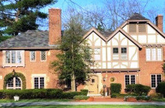
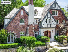
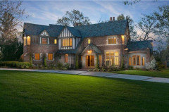
We’re considering building a home and want some opinions on what’s going to look best! I’ve always loved a traditional or Tudor style architecture but I’m not sure if these have too much going on/the right color palette to stand the test of time. Which (if any) would you pick and why?

Comments (17)

  • PRO
    8 days ago

    Define "best".

  • 8 days ago

    A Tudor style house, that is designed along the lines of a classic Tudor, will likely have ”staying power.“ These houses transcend trends. None of the houses that you are showing are in this category, imo.


    If you are really interested in a classic Tudor style house, enlist a competent architect. Or, buy a classic Tudor.

  • 8 days ago

    Interesting, what is it in your opinion that makes a classic Tudor “transcend trends”?

  • 8 days ago
    last modified: 8 days ago

    The following newer homes are what I think of as representing a timeless "Tudor inspired" home:


    I feel like the windows on the above houses are an important element for a Tudor style home. Also, my understanding is that traditionally, Tudor homes do not have shutters. Additionally, the homes you've posted look "busy" due to the materials used (for example, I don't like the mix of stone and brick).

    I have no special knowledge in this area - the above homes just remind me of the classic Tudor neighborhoods that are in my city.

  • 8 days ago

    Thank you for giving such a thoughtful response! I see what you mean about the windows for sure and I also worry about the others looking too busy.

  • 8 days ago

    That being said I tend to like a mix of stone and brick just personally 😅 and would find the other examples of Tudor inspired to be a much more contemporary take on it than I tend to lean towards so it’s a challenge finding that balance!

  • 8 days ago

    FYI - you will receive negative comments about mixing of stone/brick - just wanted you to be aware that it's a comment that is made often. However, it's your house - you should have what you want.


    There are much more modern Tudor inspired homes than the ones I posted - I tried to only pull ones that look more like classic Tudor style homes.


    This house near me was designed by Clarence E. Shepard (worked under Frank Lloyd Wright):


    Two more homes near me:


    So, I thought that the ones I posted were more modern Tudor style homes - without steering away from what makes a home look like a "Tudor style" home.


    I think probably the biggest issue with all of the houses that you've posted is the windows. The windows are one of the most distinctive features of a Tudor style house. I also think having the front door located right in the middle of the front exterior makes it look much less like a Tudor style house (asymmetrical entryways is a key architectural feature of a Tudor style house).


    The first house - the classic "half-timbering" is lost on the house due to (i) the paint color, and (ii) the brick. If you want brick, I wouldn't use such a busy brick or have it installed in a busy pattern (herringbone). The shutters shouldn't be on the home (also, the board and batten style adds another busy element). I think it's odd to have the one upper window on the left to be surrounded by stucco - it seems like an odd choice to highlight that window (that's the only place where stucco is used) + introduces a third material on the exterior of the home.


    The second house - I would limit the stone to around the front door area - I don't think you should add it on the right side also. I know that it's separated from the brick by a course of brick that's turned vertically - however, it doesn't seem like a good place to transition to a different material.


    The third house - it looks a lot better with the materials used on it vs. the ones selected in the first photo. I think if you changed the windows + removed the shutters, it would improve the look of the house. Also, it would be nice if there was a prominent exterior chimney on the house.

  • 8 days ago
    last modified: 8 days ago

    Numbers one and three seem to be the same with different color palettes. I like the lighter one a lot better. Number 2 is a poor design. One the first floor, none of the windows are aligned. The arched window's crossbar at the bottom of the arch is not aligned with the top of the window to the right of the door. The bigger window on the second floor is not centered in the wall it is in and the shutters emphasize that fact. Nor is it aligned in any way with the window below it. I'm not convinced the rightmost windows are centered in their mass, but can't tell from the angle. Further, it has the fewest and smallest windows on the second floor, meaning your rooms will probably not get a lot of natural light.

    With #1&3, you want to ensure that the leftmost windows on both the first and second floor are centered and aligned.

  • 8 days ago

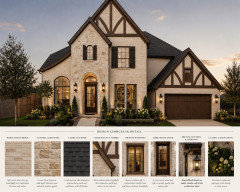
    Thank you both for the feedback, really helpful stuff! Y’all can probably tell these are Perry home exteriors, not fully custom builds because we’re just not in a place to do a fully custom build in our life right now. But your advice can definitely help us in customizing what we can! We like the floor plan of the 2nd option’s the best so will likely focus on it. Doing some tweaking within what I think they can accommodate would achieve something similar to this. Thoughts?

  • 8 days ago

    The windows still aren't centered or aligned. I would align the middle of the biggest window to the middle of the one below it. You've made the garage very prominent, and you have a tiny dead space to the left of the garage and right of the house.


    Also, I don't like the curved roof on the left. They can be cool Tudor details, but because the back is not curved and higher, you just get an odd shape.

  • 8 days ago

    The 2nd picture is of an actual model home (garage door not installed yet). So with this, and what Perry appears to be, is a tract home builder in planned unit developments. Which would mean that the elevation cannot be redesigned, you pick from set styles. Verify with the exact development location what you are able to customize with them so you are not spinning wheels.

  • 8 days ago

    Correct you cannot change the elevation, I’m more so trying to compare elevations options they have and you can change out exterior stone, brick, etc

  • 7 days ago

    Thank you for sharing!

  • 7 days ago

    I like your darkening the half timber trim in your tweaking of the second one. Mid tone or light tones are just wrong to me. 1&3 are too busy to me. More important is the floor plan fitting your needs.

  • PRO
    7 days ago
    last modified: 6 days ago

    Masonry (stone and brick) usually does not turn out well when it is treated like paint. They are structural materials that are heavy and should be treated that way. Fake stone and fake brick can be used in ways that real stone and brick can not. It is common for uneducated designers to misuse masonry in their house designs that it has become the norm. All the houses above are of the Pseudo-Tudor style and many were created using the Mr. Potato Head methodology of taking features from other styles and applying them to one house. Then AI can bastardize it even further.

  • 7 days ago
    last modified: 7 days ago

    I would go with the simplest style you can (tends to age well) and then add drama and interest with fabulous landscaping — the current trend is homes with lots of different materials, shapes and “details” tacked on the front and then really anemic landscaping (looking at you boxwoods) - flipping this script will yield something with staying power imo

  • 7 days ago

    Thank y’all for the added input!