Software
Houzz Logo Print
ausoutback

Need help with exterior paint color

13 years ago
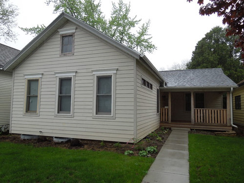
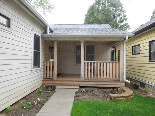
We have a two bedroom 'puddler's cottage' near the lake in Bayview, Milwaukee, Wisconsin. The interior has been gut renovated with cathedral ceilings, skylights, everything new, we love this house.

However, we're having a real problem choosing a color for the exterior. It seems that the majority of homes in the area are various shades of beige, or white. We want something that will look sharp and stand out.

We've narrowed it down to a shade of green - but we're having trouble finding the exact right shade, it seems to be very easy to make a mistake with green.

Another option would be a dark blue-gray.

A third option is a shade of brown-gray or deep taupe.

The main problem we're having at this point is that when we find and inspiration photo we like, when we paint the sample onto the wall, it comes out looking NOTHING like the photo - there is always a huge variation in depth, shade, undertone, etc.

Its hard to tell what the entire house will look like from a paint sample. And the stakes feel so high because this is not something we want to do again for a very long time.......

Any advice from a color-phile, or someone who's been through this recently? Do we just go for it even if we don't trust the color?

What is the right color scheme for a small 1860 cottage like this?

The walls are currently primed Hardy-plank, never been painted.

Thanks for any help and advice you can give.

Comments (16)

  • 13 years ago
    It sounds to me like you have confidence issues in what color will look good over the long term. You know what you don't want (what everyone else has), but aren't sure how to decide for yourselves. We won't know what is "right" for you, because it is going to depend on what YOU like.

    If it were me, I'd probably buy samples of the colors I like and paint an area that is as unobtrusive as possible, ie somewhere on the back of the house. While lighting may be different in the back than in the front, at least you can get an idea of what looks good to you. It doesn't have to be an outdoor paint sample, unless you can get that from somewhere. Whatever you try as samples, you will be painting over, so it doesn't matter in the end. Check the color out early in the morning, at high noon, and later in the day. Whatever looks good to you over time, use that. If you can't agree on one, then try another color. It's only paint, samples are usually less than $4, and you can change your mind with samples.

    Good luck.
  • 13 years ago
    motownmom, you were able to see right to the heart of the matter - you're right, its confidence about what will look good over the long term. You summed it up perfectly. We have been doing the back wall sample color bit but we're at the point of being sick of it - we get excited with an inspiration photo, lets say a light gray - but then when we put the sample up, it comes out looking dark brown!!!! Thanks so much for your insight and help, we'll let you know how it turns out. Much appreciated.
  • 13 years ago
    tabernacle, great idea, i will look for that software, should make things much easier. appreciate it
  • 13 years ago
    Well then, maybe think about things outside the colors you've been checking out. A light yellow might look nice, I see that often in cottages. Like a butter yellow with white trim. Or a lighter blue gray. I personally like both these colors. I have a cottage look indoors, not out, and both play into the cottage appearance.

    Also, while confidence is a difficult thing to manage, in the end, it's what YOU like. Not what we think. I'd keep going until you find what makes your heart sing.
  • 13 years ago
    Would you say a lighter color would work bettering a small house like this, rather than a dark color?
  • 13 years ago
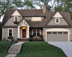
    Inspiration photo
  • 13 years ago
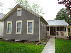
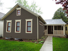
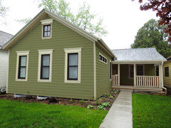
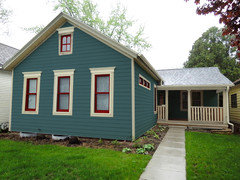
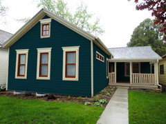
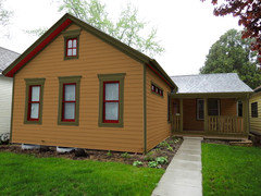
    So I worked up a few options for you.

    Most of them have painted sashes, as I think it helps to define the windows and add a little detail. The sashes could be a pop of color on an otherwise subdued house, or they could be a complementary color to the body of the house, or they could just go dark and define each opening to your palette.

    I think you could go bolder with this little cottage and it would look really nice. Here they are, mild to wild...
  • 13 years ago
    or...
  • 13 years ago
    Your house is adorable and will look even better once you decide on a paint color. Ourfarmhouse gave you great examples, love the 4th one. Keep us posted and once you've painted add flower boxes under front windows. It's so cute.
  • 13 years ago
    You're hired! Wow, ourfarmhouse, thank you so much. Seeing the mock ups really makes it so much better than trying to imagine what the house might look like. These all look great but we have a few favorites.

    We completely agree with your idea about painting the sash a different color that 'pops.' The couple of great paint jobs that have caught our attention all had that , actually in red.

    Thank you very much for the time and effort you put into this, you don't know how much you have helped us.

    We'll put the finished product up for you to see when we're done.

    Thanks again.
  • 13 years ago
    Thanks for the kind words.

    Remember that paint almost always seems brighter once you get it on the house, so make sure you continue to paint swatches on the siding...the larger the better...and paint it around a corner. Light hits it differently, and the color seems to change as it rounds the corner. Also look at it during different times of the day.

    We made the mistake of painting a small swatch once and had to have the whole house repainted after it was nearly complete. It looked pretty subdued on the small swatch, but turned neon when we saw the whole house. Costly mistake.
    ausoutback thanked ourfarmhouse
  • 13 years ago
    Well you really, truly understand our situation. Every time we buy a sample and paint a section, it looks so different than we imagined it. The corner idea is a very good one.

    May I ask, which program did you use to make these 6 mock ups? We'd like to try the couple of the colors we've narrowed it down to, to see how they look together and on the whole house. Any tips?
  • 13 years ago
    I can give my email if easier
  • 13 years ago
    I use Photoshop, but it's not something most people can just pick up and run with (I use it everyday). There may be other house/color programs out there that would be easier for the layman.

    Also, when you paint the corner - inside corners are different from outside corners. The inside corners will reflect the color back on itself and are usually more in the shadow. I would do both, if you could.

    I'd also paint it, and then live with it for a few days. We just recently made a final decision on color for our house. We painted large swatches, mocked it up on the computer, and lived with it for a week or two before we made the final decision. I design with color everyday, and it wasn't an easy decision.
    ausoutback thanked ourfarmhouse
  • 13 years ago
    you're very kind, makes me feel less stressed and more normal - that even you have trouble feeling sure about the colour selection, and you are a pro.

    You're right, I've tried Photoshop before and didnt get very far, I found it very intimating.

    Thats good advice, living with it for a bit, in big swatches, to be really sure before investing in a huge paint job.

    Thanks again for all your help and time, you've made a surprisingly stressful process much easier, and its greatly appreciated. Matt
Sponsored
Hope Restoration & General Contracting
Average rating: 4.7 out of 5 stars35 Reviews
Columbus Design-Build, Kitchen & Bath Remodeling, Historic Renovations