Software
Houzz Logo Print
steven_gerrard12

Exterior paint color recommendations needed, please.

6 days ago
last modified: 6 days ago
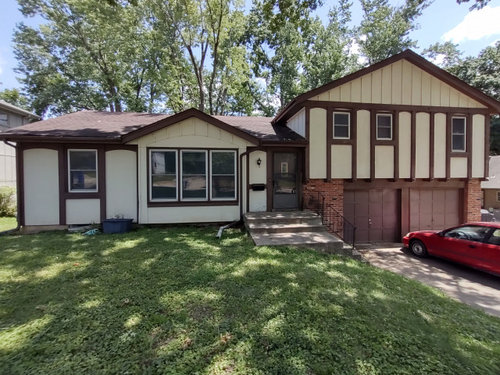
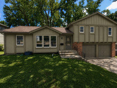
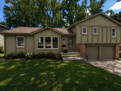
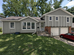
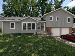
So it is what it is, a boxy 1970 split level with flat panel board and batten siding and little visual interest or shadowing to distract from the paint color. West-facing. The front is mostly shaded by a tree, but the south side is usually in full light and quite visible to the neighborhood.

Shoestring budget, two colors, getting pre-colored gutters that won't be painted. I will probably paint the door a different color myself after this is done, and hopefully get a new screen door, too.

Fixed elements/pre-existing color palette include two red brick columns and a very dark (chocolate) brown roof. You can see how the roof color reacts to full sun in the photo, and also see on the tree-shaded parts of the roof its true color in the evening and on overcast days.

The window frames are white vinyl, and it's hard to see in the picture, but the paintable brown PVC that surrounds each window is pretty narrow. The larger brown outlines you see around the windows are part of the cedar trim.

I'm getting new gutters that come pre-colored and won't be painted. Those colors are limited – basically white, off-white, cream, gray, dark brown or black. This likely affects the secondary color choice for the fascia and soffit.

I need to keep the Light Reflectance Value in the mid-to-upper range for the main color – roughly 30-plus. Meaning a medium-to-light main color, not the dark super-saturated stuff that's popular now (which I agree looks nice). This is to prevent needing extra coats of paint, and also b/c the location has long, hot summers. I don't want a dark color pulling extra heat into the wood siding in addition to what the dark roof is already doing.

I'm not actually adverse to the colors already on the house, but those stripes are killing me. A lot of neighbors with a similar trim situation have painted everything one color so the trim doesn't stand out. But it looks weird, at least on the AI visualizations, when you do that with a lighter color like the current cream. The house looks naked with an all-light-colored top. Maybe less so with a medium color.

Anyway, I know the color needs to lean warm b/c of the roof and bricks. I considered some different sage greens, but was scared off by online images of real houses painted Saybrook Sage and Clary Sage where they looked super minty in certain circumstances. I'm intrigued by their color-shifting abilities, but not willing to risk a minty green.

So there are a lot of constraints, but other than those I'm open to whatever.

I may only get to paint this house once in my life. Please let me know if you see a way that color can help this situation.


Comments (18)

  • 6 days ago

    My previous home was a more contemporary version of yours, similar trim but not as much ( yours has a lot, especially over the garage ). What I did was have it painted in a mid neutral & had the trim painted in a shade or two lighter. There lots of nice neutrals online, I agree with you, I don’t like anything that comes across as ”minty”. Check out neutrals such as ”felted wool”, Squirrel tail, & others. You should get some samples before you have it painted.

    Btw, add some landscaping after it’s painted, & when $ allows, a much larger porch light fixture. Good luck.

    Steven Gerrard thanked K Laurence
  • 6 days ago

    I like a sage green but I’d go with one that leans brown- definitely not minty, and then a brown that coordinates for the garage doors.

    After painting I’d do a very simple landscaping that would be easy to maintain.

    Steven Gerrard thanked Emily
  • 6 days ago
    last modified: 6 days ago

    ^ love that suggestion and totally agree on keeping the trim the same color as the body of the house (will really simplify the facade)

    eta - if you want less contrast with the white windows, you could look at lighter grieges with enough brown undertones to go with the roof

    • Agreeable Gray (Sherwin-Williams): A soft, warm greige that stays balanced in bright sunlight without turning cold or icy.
    • Revere Pewter (Benjamin Moore): A classic, slightly deeper greige that bridges the gap between gray siding and earthy brown roofs.
    • Accessible Beige (Sherwin-Williams): A heavy neutral leaning slightly more beige, making it one of the safest pairings for warm-toned brown roofs
    Steven Gerrard thanked la_la Girl
  • 6 days ago

    I agree on house and trim the same color, and I like the tans , beiges and creams for the paint. I dont like the sage green, it makes the house look a bit drab. I think Accessible beige might be a good color.

    Steven Gerrard thanked cat_ky
  • 6 days ago

    The pre-painted gutters limit what you can do with the trim -- none of them are great choices. You definitely want to get away from the severely contrasting trim and body colors like you have now. Can they be painted after installation or are you stuck with those choices?

    Steven Gerrard thanked nester44
  • 6 days ago

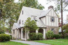
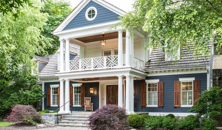
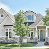
    I would do the gutters in brown, to match the roof. If you have downspouts, I'd get as close to the siding as possible. I like Tudor exteriors where the difference between the wood elements and the stucco is subtle, rather than stark, as you have:


    Stone & Stucco Addition-Towson Area · More Info


    I'd go with cream and a light brown. Like SW Creamy and Studio Taupe. Or Crisp Linen and Beigo Intenso.


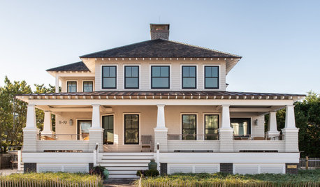
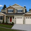
    If you like green, this is one of my faves.

    Craftsman Exterior · More Info


    Steven Gerrard thanked Sigrid
  • 5 days ago

    Thank you EVERYONE for your comments and suggestions!


    @Lyn Nielson That's a beautiful color choice, and exactly in range on the LRV. The AI rendering looked the best so far.


    I'm picking up new color samples Monday.


    @Sigrid and @K Laurence – I also like the idea of deemphasizing the trim without trying to totally erase it. I'm getting samples where the LRV of the trim color would be within 20 of the main color.


    @Emily Thank you so much for that landscaping rendering. It's incredible how much of a difference that would make in terms of the house being more inviting. I had no idea. I'm usually intimidated by landscaping, but this actually looks doable (even if it's not easy).

  • 5 days ago
    last modified: 5 days ago

    You could try the "no stripes" look on the left part of the house by painting the brown cedar trim on the left window and its two vertical stripes to match the cream color. If you don't have leftover cream paint, try using white primer tinted to match the cream color. The primer will also give you a nice headstart on prep work.


    If test painting as above is not feasible, try using wide beige masking tape on the brown trim.

    Steven Gerrard thanked apple_pie_order
  • 5 days ago

    You can lighten a color by adding more white. All paints are pigments added to a white. Our house is painted 75% pigment (SW Juniper Blue) and 25% white. I did the same with a interior room, 50% Pigment, 50% white. Sometimes, the paints have different undertones. By diluting a paint with the white that is the base, you are sure to have a paint that has the same undertones. And, when you do this, you get to claim it's a custom color!

    Steven Gerrard thanked Sigrid
  • 5 days ago
    last modified: 5 days ago

    For landscaping a great investment is getting a local nursery to do a professional plan for you and then you can install or have them install the plant materials gradually as time and budget allows (many nurseries will do a free plan if you buy from them)

    Steven Gerrard thanked la_la Girl
  • 4 days ago

    I'm not going w/ this color, but here are examples of the two approaches:


  • 4 days ago

    I like the second one where everything is painted the same color. There's a reason why your neighbors used that approach to minimize the appearance of the wood trim. The white window frames are enough "busy-ness" that you don't need additional painted trim in a different color. Also, I suggest that you find out if you can relocate the downspout that is currently next to the entry stairs. Regardless of its color, it is an eyesore. A larger porchlight, as others have suggested, and house numbers too -- those are not too expensive and will draw your eye to the entry. With some new landscaping and hardscaping, installed over time, you'll have a very attractive home. The trees in the back set it off beautifully.

    Steven Gerrard thanked nester44
  • 4 days ago

    I second the recommendation from @la_la girl. Get a professional design so you have a plan. I agree all the trim should be the same color as the body of the house. Olive green would be lovely, but try to find one a touch less drab than the example.

    Steven Gerrard thanked RedRyder
  • 4 days ago

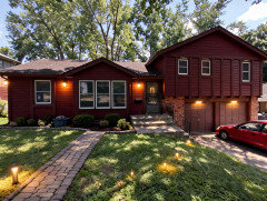
    I like this look.


    Steven Gerrard thanked freedomplace1
  • 4 days ago

    I like the both suggestion of Gourge Gray and Sage Green. I think gourge gray would look more classy and timeless!

    Steven Gerrard thanked Ronald Lambert
  • 4 days ago

    @freedomplace just set the bar higher. That is a fabulous, elegant color. Do you know the name of it?

  • 4 days ago

    Thank you so much, Red Ryder.


    And your question is a very good one... I wish I had an exact paint color name. I created this visual with AI, and did not specify a specific paint color. I wanted to see what AI would come up with. I ‘did’ specify that I wanted a deep reddish-brown - that would complement the brick and wood garage doors. I love what AI chose... It looked perfect to me- right out of the gate! I really did not have to do any edits, on anything I had requested. The walkway and garden pavers would of course need to be adjusted a bit... so that the walkway veers more toward the steps - with clear access.


    Paint colors can be matched from pictures. PPG Paints has a paint visualizer that I use. I uploaded the AI pic, and did a color match. I got PPG “Cherokee Red”.


    Then, I found some Benjamin Moore matches to PPG Cherokee Red here:

    https://www.matchmypaintcolor.com/hex/824e4a/benjamin-moore-matches

    I also found these BM color matches to Farrow & Ball’s “Deep Reddish Brown”:

    https://www.matchmypaintcolor.com/farrow-ball/deep-reddish-brown-w101/benjamin-moore-matches


    Paint store/Company people should be able to do better than me. :) They should be able to zero in on it.


    Ultimately, any color(s), in any color way that the OP chooses, will need to be tested on the actual house- in real time.