

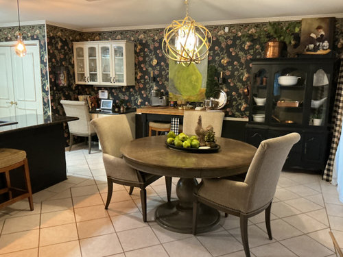
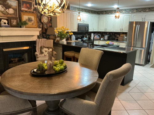
Why did I ever think this was unique?
2 days ago
Sort by:Oldest
Comments (9)
Related Stories
DECORATING GUIDESThe Dumbest Decorating Decisions I’ve Ever Made
Caution: Do not try these at home
Full Story
HOUZZ CALLEver Found or Left a Note in the Wall the Way This Couple Did?
The remodeling couple whose note from previous homeowners went viral tell us about their fun find. What’s yours?
Full Story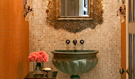
DECORATING GUIDESFor Your Next Sink, Think Unique
Any kind of vessel can do the trick — from buckets to barrels, outsized shells to old-fashioned washers
Full Story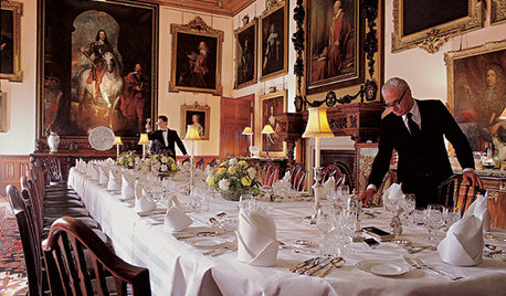
FUN HOUZZEverything I Need to Know About Decorating I Learned from Downton Abbey
Mind your manors with these 10 decorating tips from the PBS series, returning on January 5
Full Story
PETSSo You're Thinking About Getting a Dog
Prepare yourself for the realities of training, cost and the impact that lovable pooch might have on your house
Full Story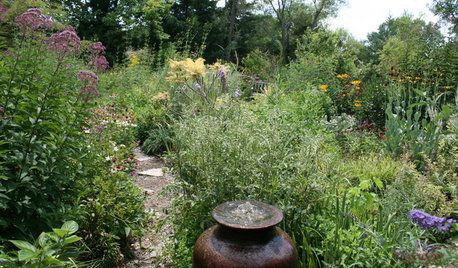
GARDENING GUIDESHow I Learned to Be an Imperfect Gardener
Letting go can lead to a deeper level of gardening and a richer relationship with the landscape. Here's how one nature lover did it
Full Story
FATHER’S DAYWhat Parts of Your Home Make You Think of Dad?
Did you inherit his favorite armchair? Learn to play on his piano? We want your stories for Father’s Day
Full Story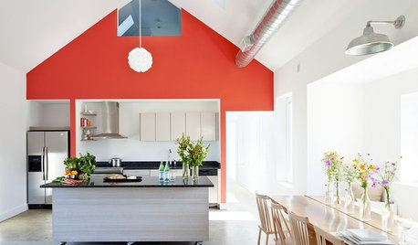
MODERN ARCHITECTUREBuilding on a Budget? Think ‘Unfitted’
Prefab buildings and commercial fittings help cut the cost of housing and give you a space that’s more flexible
Full Story
GARDENING GUIDESNew Ways to Think About All That Mulch in the Garden
Before you go making a mountain out of a mulch hill, learn the facts about what your plants and soil really want
Full Story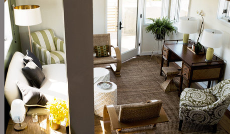
SMALL SPACESDownsizing Help: Think ‘Double Duty’ for Small Spaces
Put your rooms and furnishings to work in multiple ways to get the most out of your downsized spaces
Full StorySponsored

Leading Interior Designers in Columbus, Ohio & Ponte Vedra, Florida

JAN MOYER
Patricia Colwell Consulting
Related Professionals
Paducah Interior Designers & Decorators · Salina Interior Designers & Decorators · Aiken Interior Designers & Decorators · Tyler Interior Designers & Decorators · Grand Rapids Interior Designers & Decorators · Fergus Falls Interior Designers & Decorators · Altoona Interior Designers & Decorators · Southaven Architects & Building Designers · Dayton Architects & Building Designers · Bridgeport Architects & Building Designers · Minot Architects & Building Designers · Hilo Architects & Building Designers · Sebring Kitchen & Bathroom Designers · Watertown Kitchen & Bathroom Designers · Eau Claire Kitchen & Bathroom DesignersNorwood Architects
millworkman
shirlpp
BeverlyFLADeziner
Design Fan (NE z7a)
partim
Valinta