

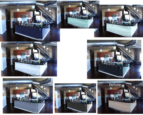
What's the best color if any... Just Using Photoshop for an idea..HELP
13 years ago
last modified: 12 years ago
Featured Answer
Sort by:Oldest
Comments (25)
 13 years ago
- 13 years ago
Related Professionals
Jackson Interior Designers & Decorators · Concord Interior Designers & Decorators · Kankakee Interior Designers & Decorators · Pueblo Interior Designers & Decorators · Chambersburg Architects & Building Designers · Aiken Architects & Building Designers · McAllen Architects & Building Designers · Lawrence Architects & Building Designers · New Bedford Architects & Building Designers · Canton Architects & Building Designers · Amarillo Architects & Building Designers · Lewiston Architects & Building Designers · Hilo Architects & Building Designers · Rolla Kitchen & Bathroom Designers · Abilene Kitchen & Bathroom Designers PRO13 years ago
- 12 years ago
 12 years ago
- 12 years ago
- 12 years ago
- 12 years ago
- PRO12 years ago
- 12 years ago
 PRO12 years ago
- 12 years ago
- 12 years ago
 PRO12 years ago
- PRO12 years ago
- 12 years ago





Related Stories
ENTERTAININGCozy Nooks Help Houseguests Sleep Tight
You don't need a full extra bedroom to host overnight guests. Just make use of your home's hidden nooks
Full Story
FURNITUREThe Classic Slipper Chair: A Handy Accent for Any Room
14 great ideas for using this superbly versatile armless chair around the house
Full Story
DECORATING GUIDESThe Most Helpful Furniture Piece You May Ever Own
Use it as a table, a seat, a display space, a footrest ... and indoors or out. Meet the ever-versatile Chinese garden stool
Full Story
GREEN BUILDING4 Ways Green Roofs Help Manage Stormwater
See how a living roof of any size can have a big impact
Full Story
MOST POPULAR7 Ways Cats Help You Decorate
Furry felines add to our decor in so many ways. These just scratch the surface
Full Story
ORGANIZING4 Questions to Help You Organize Your Favorite Photos
Organize your keeper photos with a system that's just right for you, whether it's in the cloud or you can hold it in your hand
Full Story
EARTH DAYHow to Help Your Town’s Beneficial Birds and Bugs
Make a habitat using local materials to provide a home to the creatures that help our gardens
Full Story
LANDSCAPE DESIGNHow to Help Your Home Fit Into the Landscape
Use color, texture and shape to create a smooth transition from home to garden
Full Story
ORGANIZINGHelp for Whittling Down the Photo Pile
Consider these 6 points your personal pare-down assistant, making organizing your photo collection easier
Full Story
KIDS’ SPACESCould Your Home Help Your Kid Be an Olympian?
Looking to nurture a future sports star or just get your kid up and moving? Take some coaching from these homes
Full StorySponsored

Customized Award-Winning Interior Design Solutions in Franklin Cnty OH



JWinteriors