

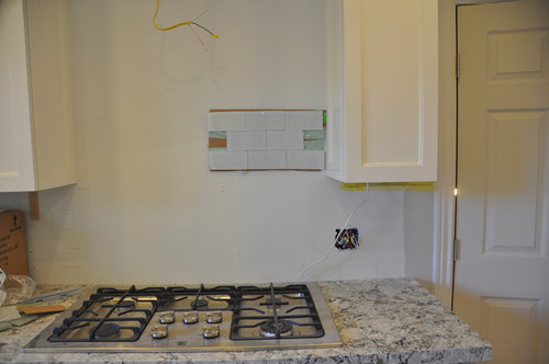
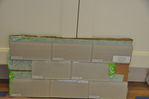
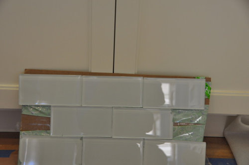
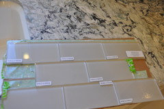
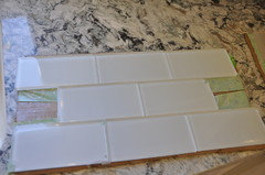
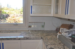
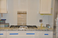
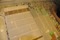
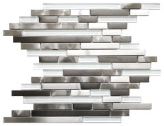
Need help picking between these two backsplash choices
12 years ago

Featured Answer
Sort by:Oldest
Comments (21)
Related Professionals
Tallahassee Interior Designers & Decorators · Marinette Interior Designers & Decorators · Oshkosh Interior Designers & Decorators · Murfreesboro Architects & Building Designers · Worcester Architects & Building Designers · Lincoln Architects & Building Designers · Murrieta Architects & Building Designers · Denver Architects & Building Designers · Everett Architects & Building Designers · Evanston Architects & Building Designers · Hot Springs Kitchen & Bathroom Designers · Springfield Kitchen & Bathroom Designers · Zanesville Kitchen & Bathroom Designers · Riverside Kitchen & Bathroom Designers · Las Cruces Kitchen & Bathroom Designers- 12 years ago
- 12 years ago
- 12 years ago
 12 years ago
 PRO12 years ago
- 12 years ago
- 9 years ago
- 9 years ago






Related Stories

COLORPick-a-Paint Help: How to Quit Procrastinating on Color Choice
If you're up to your ears in paint chips but no further to pinning down a hue, our new 3-part series is for you
Full Story
LIFE12 House-Hunting Tips to Help You Make the Right Choice
Stay organized and focused on your quest for a new home, to make the search easier and avoid surprises later
Full Story
COLORPick-a-Paint Help: How to Create a Whole-House Color Palette
Don't be daunted. With these strategies, building a cohesive palette for your entire home is less difficult than it seems
Full Story
COLORPaint-Picking Help and Secrets From a Color Expert
Advice for wall and trim colors, what to always do before committing and the one paint feature you should completely ignore
Full Story
KITCHEN DESIGNHow to Pick a Kitchen Backsplash That Wows
Design your ideal backsplash with help from these Houzz guides and inspiring ideas for every kitchen style
Full Story
ARCHITECTUREHouse-Hunting Help: If You Could Pick Your Home Style ...
Love an open layout? Steer clear of Victorians. Hate stairs? Sidle up to a ranch. Whatever home you're looking for, this guide can help
Full Story
COLORPick-a-Paint Help: 11 Ways to Mine Your World for Colors
Color, color everywhere. Discover the paint palettes that are there for the taking in nature, shops and anywhere else you roam
Full Story
Guest Picks: Give Your Home a Helping of Spring Greens
Celebrate garden growth with this collection of housewares and gardening gear in the shades of budding plants
Full Story
CURB APPEAL7 Questions to Help You Pick the Right Front-Yard Fence
Get over the hurdle of choosing a fence design by considering your needs, your home’s architecture and more
Full Story
BATHROOM VANITIESShould You Have One Sink or Two in Your Primary Bathroom?
An architect discusses the pros and cons of double vs. solo sinks and offers advice for both
Full Story



creeser