Software
Houzz Logo Print
sachin_sachdev

Need help for our kitchen

12 years ago
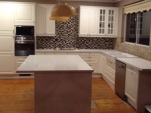
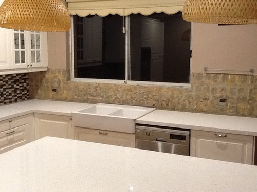
Hi experts, I need an urgent help with selecting the right tiles for our new kitchen. As you can see from the attached photos, we have used mosaic tiles for splash back however, it didn't turn out to be as good looking as we expected. I do not want to spend anymore money in replacing the tiles but I would love to have suggestions/advice for the wall with window. We are thinking of putting grey subway style tiles but not sure if they would look good.

Please help us select the right tiles. Thanks for the help in anticipation.

Thanks
Sachin

Comments (23)

  • 12 years ago
    I think the material on the right have side looks alot better than the black and white glass... Black n white only looks good in gray houses
  • 12 years ago
    that mosaic is quite pretty, but you're right, it's a bit overwhelming.

    if there's grey in the mosaic, then grey subways would be very nice.
    you could do the stainless steel peel and stick subways that you can get at HD or Lowe's for a super modern look, while still being grey.

    good luck!
  • 12 years ago
    What if you used the counter top material so it isn't competing with the tile? I would suggest different light fixtures over the island, and a new shade (sans the scalloped edge) to pull it more together. With a different light fixture, hardware and shade you might even like to continue with the tile
  • PRO
    12 years ago
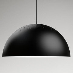
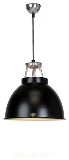
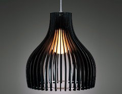
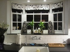
    I actually love the look of these mosaic tiles and would carry that to the back splash under the window. I think if you pulled in more black it would balance out the tile and you might find that you love it! I would paint the base of your island black to match. If you like the style and size of your current pendants, replace them with black. If not, I've included some photos of other choices. Add a black roman shade over your window and some splashes of color to your counter tops and you're done!
  • PRO
    12 years ago
    A couple of roman shade ideas...
  • PRO
    12 years ago
    I can't get the other photo of the roman shade to load. I will try again shortly.
    Sachin Sachdev thanked Rocky Mountain Color & Design
  • PRO
    12 years ago
    I am not sure I am tracking correctly here. Are you considering leaving the existing tile cooktop wall tile and selecting a completely different tile for be sink wall? If this correct, I would concur with the previous poster that you should use the countertop material on the sink wall, problem is the countertop material is significantly thicker than the tile on the wall so when you get to the corner it can get tricky. Further there will be seams in the countertop material as back splash, depending on how high you take it up the wall.
    Consider tiling the sink wall with the original tile and find some high contrast accessories such as canisters, Stand mixer, salt well, etc. to bring the room together.
    Where is the hood? Are you using a down draft or has it just not been installed yet? if not yet installed, the hood will help break up the 'sea' of tile. If you are using a down draft then consider a valance to bridge the wall cabs over the cooktop and provide additional visual interest.
    Sachin Sachdev thanked McCabe By Design LLC
  • 12 years ago
    last modified: 12 years ago
    I'm afraid that I think introducing another tile will only add to the chaos. I too find your mosaic a bit too busy for my taste, but it isn't unattractive. I'd either continue it on the sink and window wall or start over again with a more neutral backsplash throughout if it really is bothering you.
  • 12 years ago
    I think you should continue with the same tile ... it's not as bad as you think it is.

    Replacing your pulls with black ones would look nice too.
  • 12 years ago
    It is hard to tell, but is that a gas cooktop on the counter? If so, perhaps a modern stainless steel hood will "hide" much of the tile. I also agree with using the same material as the counter on the window wall.
  • 12 years ago
    last modified: 12 years ago
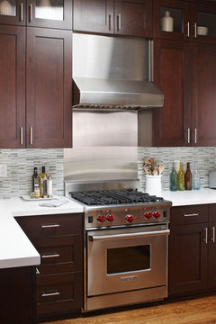
    That is a great point, thealings. I'd add to it that covering that wall behind the stovetop with a solid stainless steel backsplash that runs up to the hood would make a big difference in toning down the overwhelming effect of the mosaic, without requiring that you rip anything out. Then adding the mosaic backsplash to the sink wall would look consistent, but not so overwhelming. Here are a couple of examples of what I'm talking about:
    Stainless Steel Range · More Info

    My Houzz: Elegant DIY Updates for a 1970s Dallas Home · More Info
  • 12 years ago
    I would continue with the original tile. What is going over your stovetop?
  • 12 years ago
    Your tiles are out of place right now because your project isn't complete. When you make a bolder statement, this is panic time. Don't panic! Your lights should now make your color statement, your wall color choice will tie it together. You could either continue with your bold pattern, or tone it down with a white tile and just ad in a few black tiles to tie it in. Your pendant lights don't go in your kitchen now. They are warm and rustic and you could actually use a color choice to add your flare. Just don't panic now. You are in that "did I make a mistake" phase, in your project. Now you just need to own it!!!
  • 12 years ago
    I think you might be able to use white subway tile but would have to see how it looked honestly I think you probably should just continue with what you have, I feel like anything else might clash. I agree with removing shade and changing pendants. A stove hood would totally tone the stove wall down if you could do it.
  • 12 years ago
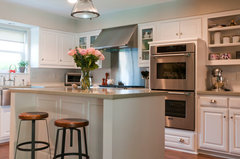
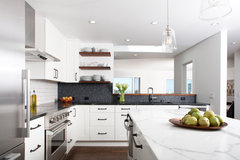
    I meant to comment earlier and I see a lot of what I was planning to suggest has already been mentioned - covering some area with a hood, white subway and new lights. Your photo reminded me of this kitchen which has white subway in one area and penny round in another. For me, I would do the white subway because right now the mosaic tile seems too contemporary for some of your other elements like the white farm sink. I think the white subway will tie that in better. And then if you add a hood - or if no hood you could add open shelving - and black more industrial or farmhouse looking pendant lights, I think things will start to tie together better.
    Here's a pic of the kitchen I was thinking of and an ideabook of "stuff" you can put above your range
    Rustic Modern Kitchen · More Info

    https://www.houzz.com/magazine/home-above-the-range-smart-uses-for-cooktop-space-stsetivw-vs~2327964
  • 12 years ago
    Do not change tile look. Keep going with backsplash on that area. Like your wall color. Change window cover to a accent color mixed with gray. Add chrome big lights over island. Restoration Hardware. Pulls in brush nickel. Add industrial bar stools also a Restoration. It's a nice room .looks great.
    Sachin Sachdev thanked Nancy Travisinteriors
  • 12 years ago
    Painting island a darker shade from tile would help too.
  • 12 years ago
    Thanks everyone for the great suggestions. As majority of posts are suggesting to stick with original tiles, I am inclined to think that thats not a bad idea. I acquiesce with the idea of pulling in high contrast accessories and lights might work a treat.

    We intend to install the stainles steel rangehood between the wall cabinets and as someone pointed once everything is in place, we probably wouldn't even think about the tiles being out if sync.

    Once again, thanks for your time and effort in replying to our design dilemma. Its much appreciated.
  • 12 years ago
    lessismoore's idea is great! It does look overwhelming right now because it isn't finished but as lessismoore envisioned it, it looks great!
  • 12 years ago
    I personally think your marble tops look fab, and should be continued over the work tops and up the wall too! Good luck. And you have an excellent shape and size kitchen. Hope you make it work.
  • PRO
    12 years ago
    the right wall color will balance the tile - in the photo it has a pink undertone which is also fighting the look. Think about a more warm neutral tone and incorporate a window valance and shade to pull it together
  • PRO
    12 years ago
    Lessismore has it... I think the way you have it right now is very disconnected. I think the black lights are good too.